lite-frames
v1.1.1
Published
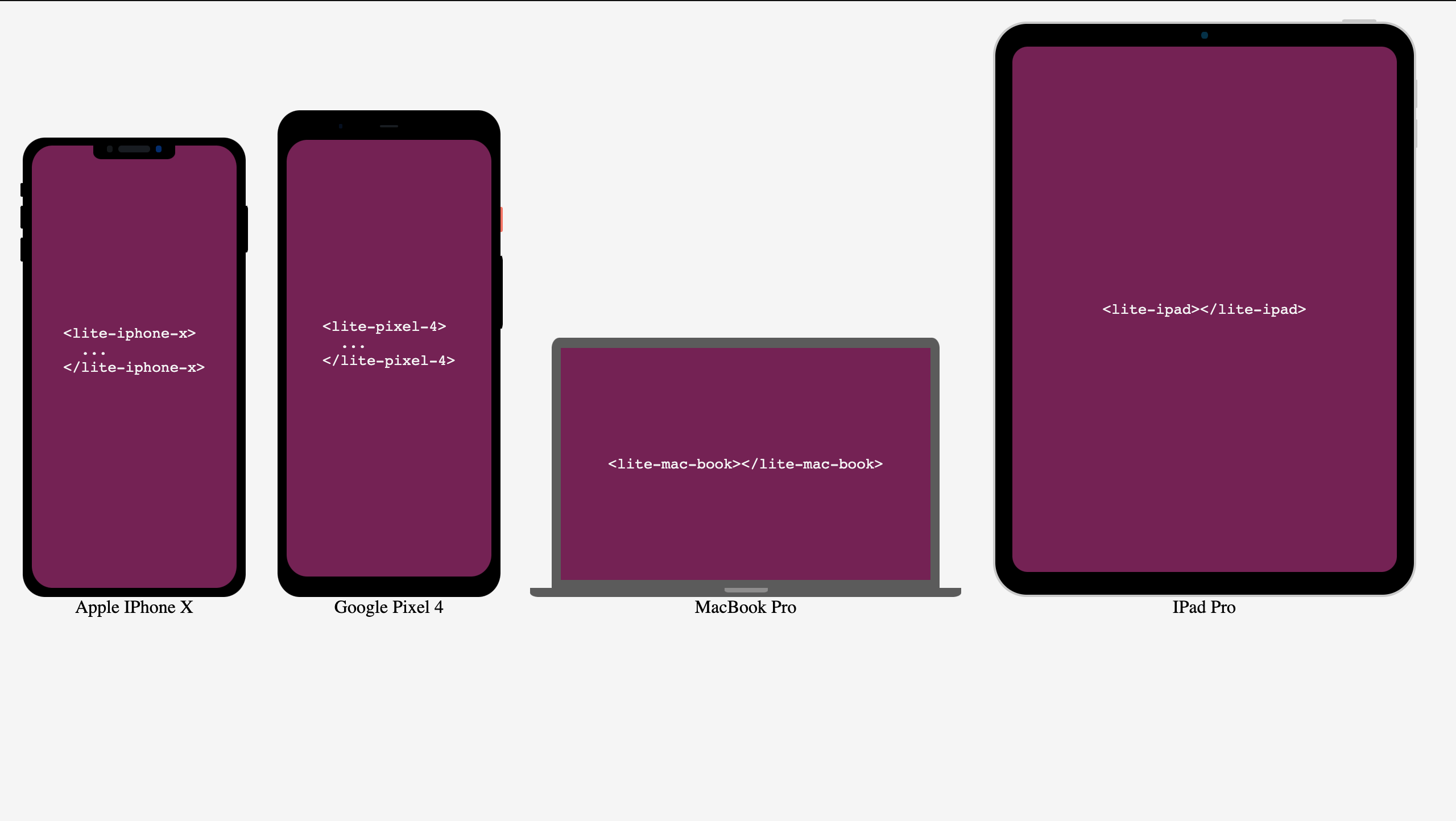
This is a library of light weight frames UI (device, screens) made into web-components. you are allowed to embed whatever inside the frames
Downloads
44
Maintainers
Readme
Lite Frames
This is a library of light weight frames UI (device, screens) made into web-components. you are allowed to embed whatever inside the frames
Why use It?
Lite frame provide quality and light-weight frames for your web project instead of using the conventional image format or building something from scratch.
These frame are build with HTML and CSS so they are definitely lighter than high quality png frames.
Lite Frames have plans to add more frames (and screens) e.g terminal frame, chrome browser frame, and other useful frames.

Demo
How to use
Import lite-frames into your project
Using
scripttag:<script src="https://unpkg.com/[email protected]/dist/lite-frames.js"> </script>using npm
install lite-frame
npm i lite-framesimport the package
import 'lite-frames'See Stencils Docs on how to use with any frameworks or libraries when using npm
Every Lite Frame is a individual element, e.g For
Iphone Xwe have<lite-iphone-x></lite-iphone-x>A Lite Frame
inheritsthewidthof itparentand must have a parent element with a width greater than 0px<div style="width:200px;"> <lite-iphone-x></lite-iphone-x> </div>Lite Frame have two theme modes
- Light mode
<lite-iphone-x theme="light"></lite-iphone-x>- Dark Mode (default)
<lite-iphone-x theme="dark"></lite-iphone-x>Contents to be embedded inside the frame can be added as a decendant of the frame.
<lite-iphone-x theme="dark">
    <!-- Html Content or text content -->
      <h1>This is the content<h1>
</lite-iphone-x>
Available Frames Tags
| Frame Name | Tag |
| -------------- | -------------------------------- |
| Iphone X | <lite-iphone-x></lite-iphone-x> |
| Google pixel 4 | <lite-pixel-4></lite-pixel-4> |
| Macbook | <lite-mac-book></lite-mac-book> |
| IPad Pro | <lite-ipad></lite-ipad> |
Attributes
| Atribute | Description | Possible Values | | -------- | ----------------- | --------------- | | theme | Component's theme | dark, light |

