
likerpx
v1.1.20
Published
通过 likerpx ,可以在 html 项目上使用小程序的 rpx 单位,体验跟小程序的 rpx 完全一致
Downloads
31
Maintainers
 peter214611026
Readme
通过 likerpx ,可以在 html 项目上使用小程序的 rpx 单位,体验跟小程序的 rpx 完全一致。
特性
- 跟小程序的 rpx 体验完全一致
- likerpx 的默认配置已经设置成跟小程序的 rpx 体验一致了
- 还可以另外自定义 rpx 配置
- 自动将设计图的长度转换为实际长度,写代码时再也不需要做长度转换
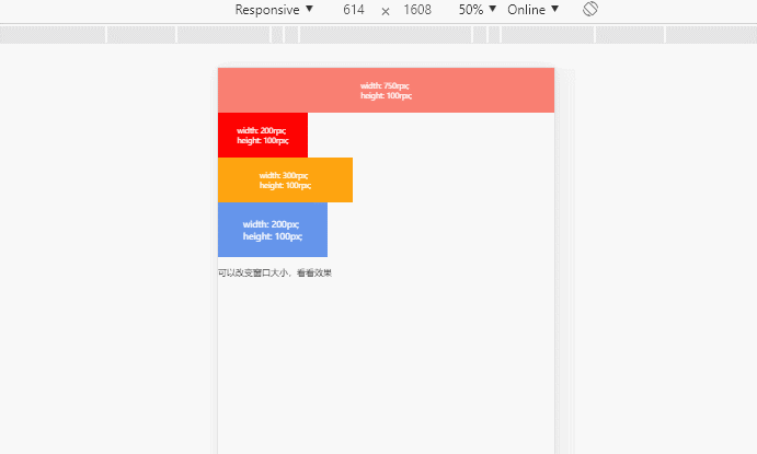
例子 demo
效果图
目录
Table of Contents generated with DocToc
- 基本使用教程 (webpack项目)
- 基本使用教程 (非webpack项目)
- 详细使用教程(webpack 项目) - 安装 - 引入 - 使用 - 配置
- 详细使用教程(非 webpack 项目) - 下载 - 引入 - 使用 - 配置参数
- 配置参数详解 - design-width - max-width - min-width - rate
- 问题与技巧
基本使用教程 (webpack项目)
这里是傻瓜式搭建“完美复现小程序rpx”的流程,照着下面的步骤做,即可使用跟小程序一样体验的rpx。
likerpx的默认配置已经是跟小程序rpx 一样的了 ^_^
这里不会有太多的讲解,如果想看更详细的教程,请看 详细使用教程(webpack 项目)
在命令行上运行
npm install --save likerpx
npm install --save-dev postcss-rpx2rem
在 .postcssrc.js 或 postscs.config.js 文件上添加 postcss-rpx2rem 插件
module.exports = {
  'plugins': {
    'postcss-rpx2rem': { // 添加这个插件
      proportion: 0.001, // 比率
      unitPrecision: 5 // 小数位最多5位
    }
  }
}
在 main.js 中引入
import 'likerpx'使用
<template>
  <div id="app">
    <div class="box"></div>
  </div>
</template>

<script>
export default {
  name: 'app'
}
</script>

<style lang="stylus">
.box
  width 100rpx
  height 100rpx
  background-color red
</style>
基本使用教程 (非webpack项目)
这里不会有太多的讲解,如果想看更详细的教程,请看 详细使用教程(非 webpack 项目)
下载 likerpx
https://github.com/devchn/likerpx
引入 likerpx
<script src="likerpx.js"></script>使用
<style>
.box {
  width: .100rem;
  height: .100rem;
  background-color: red;
}
</style>
详细使用教程(webpack 项目)
安装
在命令行上运行
npm install --save likerpx
npm install --save-dev postcss-rpx2rem
在 .postcssrc.js 或 postscs.config.js 文件上添加 postcss-rpx2rem 插件
module.exports = {
  'plugins': {
    'postcss-rpx2rem': { // 添加这个插件
      proportion: 0.001, // rpx 到 rem 的转换比例
      unitPrecision: 5 // rem 的小数位位数
    }
  }
}
这个 proportion 和 unitPrecision 的设定跟下面的 rate 配置参数一致即可。也就是说:
rate="1000"时,proportion=0.001,unitPrecision=5;
rate="10000"时,proportion=0.0001,unitPrecision=6。
具体看参数详解的 rate
引入
在 main.js 中引入
import 'likerpx'使用
使用方式跟小程序的 rpx 一模一样,效果也一模一样
<template>
  <div id="app">
    <div class="box"></div>
  </div>
</template>

<script>
export default {
  name: 'app'
}
</script>

<style lang="stylus">
.box
  width 100rpx
  height 100rpx
  background-color red
</style>
配置
在 <html> 标签上进行配置,例如:
<!DOCTYPE html>
<html lang="en" max-width="750" rate="1000">
</html>
详细使用教程(非 webpack 项目)
下载
https://github.com/devchn/likerpx
引入
<script src="likerpx.js"></script>使用
因为没有 postcss,所以只能使用 rem 来代替 rpx。
750rpx=.750rem
<style>
.box {
  width: .100rem;
  height: .100rem;
  background-color: red;
}
</style>
配置参数
在 <html> 标签上进行配置,例如:
<!DOCTYPE html>
<html lang="en" max-width="750" rate="1000">
</html>
配置参数详解
design-width
配置设计图宽度,默认 750,单位 px。
简单来说,设计图的宽度是 750px,那这个配置就应该设置 750 ,单位固定是 px。
likerpx 会通过这个配置,进行计算,当这个配置是 750 时,750rpx 将会占满全屏。
有了这个配置,我们再也不需要人工对设计图像素做转换了,例如,设计图里的长方形宽度像素是100px,我们代码编写的时候,长方形的宽度像素就写 100rpx。
max-width
设置 likerpx 应用的最大宽度,默认 -1(-1为没有限制),单位 px。
因为 likerpx 会通过窗口大小的变化而变化,不同窗口大小,会运算出 rpx 对应的实际 rem 值,实际 rem 是窗口大小变化而变化的。
likerpx 计算的最大窗口宽度。
例如 max-width="750",那么当窗口宽度大于 750px,likerpx的运算结果都是以窗口大小为 750px(max-width) 来计算的结果。
min-width
设置 likerpx 应用的最小宽度,默认-1(-1为没有限制),单位 px。
跟 max-width 相反,若 min-width="320",那么窗口小于320px时,likerpx 计算出的结果都是窗口大小为320px(min-width)的结果
rate
比率,默认为 1000。
- 这里的 rate,要跟 postcss-rpx2rem 上的 proportion 和 unitPrecision 一致
- rate 的设置只在 rem 的使用方式上有区别
列举以下例子
当 design-width=x;rate=y 时,占满屏幕宽度的 css 属性应该如何设置:
|design-width|rate|设置占满屏的css属性:width=?| |:-:|:-:|:-:| |750|1000(推荐)|.750rem| |750|10000|.0750rem| |750|100|7.50rem| ||| |1200|10000(推荐)|.1200rem| |1200|1000|1.200rem| |1200|100|12.00rem|
当 rate=x 时,postcss-rpx2rem 上的 proportion 应该如何设置:
|rate|proportion| |:-:|:-:| |10000|0.0001| |1000|0.001| |100|0.01| |10|0.1|
假如 rate=1000;proportion=0.001 设置 unitPrecision=x;rpx=y 时,最后结果 rem=?
|unitPrecision|rpx|rem=?| |:-:|:-:|:-:| |5|750.12345678rpx|.75012rem| |6|750.12345678rpx|.750123rem| |7|750.12345678rpx|.7501234rem| |8|750.12345678rpx|.75012345rem|
说白了,unitPrecision 就是最终 rem 的小数位数精度。
推荐配置
|rate|proportion|unitPrecision| |:-|:-|:-| |100|0.01|4| |1000|0.001|5| |10000|0.0001|6| |100000|0.00001|7| |...|...|...|
问题与技巧
使用 likerpx 后,html 将会被 likerpx 设置 font-size,也就是默认 font-size 将不会是我们预期的 16px
我们可以在css上编写如下代码,从而设置默认字体大小
body {
  font-size: 16px;
}
写响应式网站的时,也可以使用 likerpx 进行手机媒体的编写
假如手机端媒体查询小于等于750px,那么可以配置 likerpx 参数:
<!DOCTYPE html>
<html lang="en" design-width="750" max-width="750">
</html>
设计图宽度写 750px,max-width 写 750px。
那么在响应式项目中,整体都可以使用 rpx 单位。
网站在窗口宽度小于 750px 时,就会进行 rpx 响应式处理。
网站在窗口宽度大于 750px 时,1rpx=1px。
特殊处理才需要更改具体值:
.box
  width 400rpx
  @media only screen and (max-width: $max-xs)
    width 300rpx
vue 使用 css 内联样式时,不能使用 rpx,只能使用 rem
因为 postcss-rpx2rem 不会处理到 css 内联样式的 rpx 单位,所以只能使用 rem 单位。
其他 postcss-rpx2rem 不会处理到的地方,都只能使用 rem 单位。
使用例子:
<template>
  <div>
    <div style="width: .100rem; height: .100rem;">
  </div>
</template>