
leita-components-ui
v0.1.10
Published
Ejercicio de creación de libreria de componentes para React JS
Downloads
40

Readme
Leita Components UI
Ejercicio de creación de libreria de componentes para React JS
Installation
npm install leita-components-uiPara usar los iconos instalar @mdi/font
npm install @mdi/font import '@mdi/font/css/materialdesignicons.min.css';- MDIcons: https://materialdesignicons.com/
Componentes
- Theme
- SideBar
- BottomNavigation
- Button
- RadioButton
- TextField
- TextArea
- Select
- List
- ChipList
- Tabs
- Notification
- ImagePicker
- ToggleButton
- MDIcon
- Tooltip
Theme
El módulo Tema abarca completamente el uso de variables CSS para la tematización en tiempo de ejecución. Esto permite algunos casos de uso realmente potentes, como un modo oscuro incorporado o paletas personalizadas para sus clientes.
import { Theme } from 'leita-components-ui' <Theme primary="#2274A5" fontFamily={['Raleway', 'BlinkMacSystemFont']}>
<div className='container'> </div>
</Theme>Props
| Nombre | Tipo | Ejemplo | Descripción |
| ----------- | ---- | -----| ----------- |
| children | React.ReactNode | <div>Item</div> | Contenido especificado como hijo. |
| backgroundColor | String | '#fff' \| rgb(0, 0, 0) | Color de backgroud de etiqueta body. |
| primary | String | '#fff' \| rgb(0, 0, 0) | Color principal del tema. |
| darkPrimary| String | '#fff' \| rgb(0, 0, 0) | Color primario oscuro. |
| accent | String | '#fff' \| rgb(0, 0, 0) | Color de acento.|
| success | String | '#fff' \| rgb(0, 0, 0) | Color para acción correcta. |
| warning | String | '#fff' \| rgb(0, 0, 0) | Color para acción de advertencia. |
| danger | String | '#fff' \| rgb(0, 0, 0) | Color para acción de error. |
| white | String | '#fff' \| rgb(0, 0, 0) | Color blanco. |
| black | String | '#fff' \| rgb(0, 0, 0) | Color negro. |
| shadow | String | '#fff' \| rgb(0, 0, 0) | Color para sombra de elementos. |
| fontFamily | Array<String> | ['Raleway', 'BlinkMacSystemFont'] | Fuentes para el documento. |
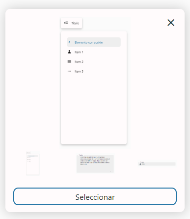
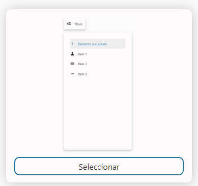
SideBar
Barra lateral desplegable
import { SideBar, SideBarItem } from 'leita-components-ui' <SideBar title="MyApp">
<SideBarItem label="Elemento con acción" icon="chevron-left" onClick={() => console.log('Hello')}/>
<SideBarItem label="Item 1" icon="account" />
<SideBarItem label="Item 2" icon="menu" />
<SideBarItem label="Item 3" icon="dots-horizontal" />
</SideBar>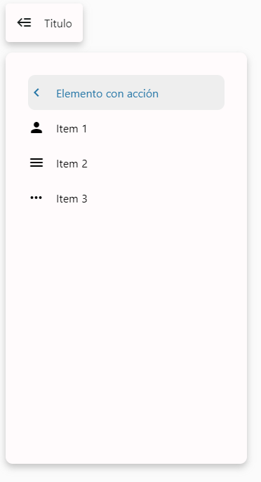
SideBar Props
| Nombre | Tipo | Descripción |
| ----------- | ---- | ----------- |
| children | React.ReactNode | Contenido especificado como hijo. |
| title | String \| null | Texto especificado como etiqueta. |
SideBarItem Props
| Nombre | Tipo | Descripción |
| ----------- | ---- | ----------- |
| label | String \| null | Texto especificado como etiqueta. |
| icon | String \| null | Icono perteneciente a @mdi/font |
BottomNavigation
Barra inferior de opciones
import { BottomNavigation, NavigationItem } from 'leita-components-ui' <BottomNavigation title="MyApp">
<NavigationItem active icon='logout' label='Cerrar sesión' />
<NavigationItem icon="view-list" label="Lista" />
<NavigationItem icon="plus" label="Agregar" />
<NavigationItem icon="account" label="Perfil" />
</BottomNavigation>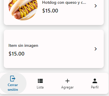
BottomNavigation Props
| Nombre | Tipo | Descripción |
| ----------- | ---- | ----------- |
| children | React.ReactNode | Contenido especificado como hijo. |
NavigationItem Props
| Nombre | Tipo | Descripción |
| ----------- | ---- | ----------- |
| label | String \| null | Texto especificado como etiqueta. |
| icon | String \| null | Icono perteneciente a @mdi/font |
| active | Boolean | Indica si el elemento se encuentra activado |
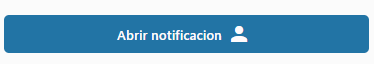
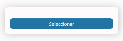
Button
Comunica la accion que se producirá cuando el usuario lo toque.
import { Button } from 'leita-components-ui' <Button loading label="Abrir notificacion" onClick={() => console.log('Hello')} type="danger" />
<Button loading label="Abrir notificacion" onClick={() => console.log('Hello')} trailingIcon="account" />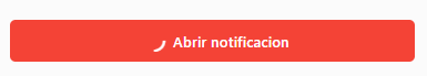
Props
| Nombre | Tipo | Ejemplo | Descripción |
| ----------- | ---- | ---- | ----------- |
| children | React.ReactNode | <div>Item</div> | Contenido especificado como hijo. |
| label | String \| null | - |Texto especificado como etiqueta. |
| className | String \| null | - | Clase css personalizada. |
| disabled | Boolean | - | Hace que el boton se inhabilite. |
| fullWidth | Boolean | - |Hace que el boton ocupe todo el ancho disponible.|
| icon | String \| null | - | Icono derecho perteneciente a @mdi/font |
| loading |Boolean | - | Activa animacion de carga del boton. |
| trailingIcon | String \| null | - | Icono izquierdo perteneciente a @mdi/font |
| type | String | primary \| danger \| primary-outline \| dark-outline \| dark \| link \| link-primary \| link-dark | Indica el estilo del boton. |
RadioButton
Permite al ususario seleccionar unicamente una opción.
import { RadioButton } from 'leita-components-ui' <div style={{ display: 'flex', flexDirection: 'row', gap: '10px', margin: '10px' }}>
<RadioButton label="Prueba2" id="prueba2" value="2" disabled name="test" onChange={(e) => console.log(e.target.value)}/>
<RadioButton label="Prueba3" id="prueba3" value="3" name="test" checked onChange={(e) => console.log(e.target.value)}/>
<RadioButton label="Prueba4" id="prueba4" value="4" name="test" onChange={(e) => console.log(e.target.value)}/>
</div>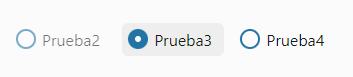
Props
Sin propiedades especiales.
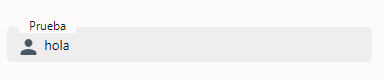
TextField
Permite a los usuarios ingresar editar y seleccionar texto.
import { TextField } from 'leita-components-ui' <TextField
icon='account'
label="Prueba"
id="prueba"
value="hola"
onChange={(e) => console.log(e)}
/>
Props
| Nombre | Tipo | Descripción |
| ----------- | ---- | ----------- |
| label | String | Texto especificado como etiqueta. |
| value | String \| null | Valor de entrada |
| type | html values | Valores que puede recibir el textfield. |
| icon | String \| null | Icono perteneciente a @mdi/font |
| disabled | Boolean | Hace que el textfield se inhabilite. |
| id | String | Identificador unico del textfield. |
TextArea
Permite a los usuarios ingresar editar y seleccionar texto.
import { TextArea } from 'leita-components-ui' <TextArea label="Prueba" id="area" value="Lorem ipsum dolor..." onChange={(e) => console.log(e)}/>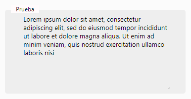
Props
| Nombre | Tipo | Descripción |
| ----------- | ---- | ----------- |
| label | String | Texto especificado como etiqueta. |
| value | String \| null | Valor de entrada. |
| type | html values | Valores que puede recibir el textarea. |
| icon | String \| null | Icono perteneciente a @mdi/font |
| disabled | Boolean | Hace que el textarea se inhabilite. |
| id | String | Identificador unico del textarea. |
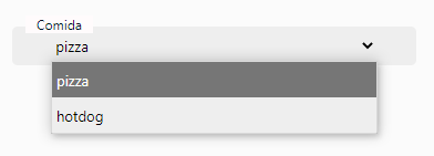
Select
Permite a los usuarios seleccionar opciones listadas.
import { Select } from 'leita-components-ui' <Select
id={"comida"}
label="Comida"
options={[{ label: 'pizza', value: '1'}, { label: 'hotdog', value: '2'}]}
value="1"
/>
Props
| Nombre | Tipo | Ejemplo | Descripción |
| ----------- | ---- | ---- | ----------- |
| label | String | - |Texto especificado como etiqueta. |
| value | String \| null | - | Valor de entrada. |
| options | Array<Object> | [{label, value}, {label, value}] | Opciones a listar por el componente. |
| disabled | Boolean | - | Hace que el textarea se inhabilite. |
| icon | String \| null | - | Icono perteneciente a @mdi/font |
| id | String | - | Identificador unico del textarea. |
List
Indices verticales continuos.
import { List, ListItem } from 'leita-components-ui' <List>
<ListItem
label="Hamburguesa"
value="1"
onClick={(e) => console.log(e)}
description="$10.00"
picture="https://www.infobae.com/NFO7LU.jpg"
trailingIcon="account"
/>
<ListItem
label="Hotdog con queso y cebolla"
value="2"
description="$15.00"
picture="https://cnnespanol.cnn.com/CNN-hotdog.jpeg?quality=100&strip=info"
trailingIcon="chevron-right"
/>
<ListItem
label="Item sin imagen"
value="2"
description="$15.00"
trailingIcon="chevron-right"
/>
</List>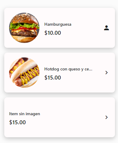
List Props
| Nombre | Tipo | Descripción |
| ----------- | ---- | ----------- |
| children | React.ReactNode | Contenido especificado como hijo. |
| loading |Boolean | Activa animacion de carga del boton. |
ListItem Props
| Nombre | Tipo | Descripción |
| ----------- | ---- | ----------- |
| label | String \| null | Texto principal. |
| value | String \| null | Valor de entrada. |
| description | String \| null | Texto secundario. |
| trailingIcon | String \| null | Icono izquierdo perteneciente a @mdi/font |
| className | String \| null | Clase css personalizada. |
| picture | String \| null | Url de recurso. |
ChipList
Lista horizontal de tarjetas.
import { ChipList, ChipListItem } from 'leita-components-ui' <ChipList>
<ChipListItem
label="Categoria 1"
value="0"
picture="https://cnnespanol.cnn.com/quality=100&strip=info"
/>
<ChipListItem
label="Categoria 1"
value="1"
active
/>
<ChipListItem
onClick={() => console.log('hola')}
label="Categoria 2"
value="2"
picture="https://cnnespanol.cnn.com/quality=100&strip=info"
/>
<ChipListItem
label="Categoria 3"
value="3"
picture="https://cnnespanol.cnn.com/quality=100&strip=info"
/>
</ChipList>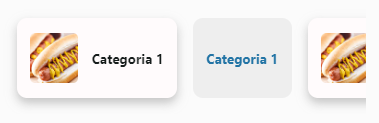
ChipList Props
| Nombre | Tipo | Descripción |
| ----------- | ---- | ----------- |
| children | React.ReactNode | Contenido especificado como hijo. |
| loading |Boolean | Activa animacion de carga del boton. |
ChipListItem Props
| Nombre | Tipo | Descripción |
| ----------- | ---- | ----------- |
| label | String \| null | Texto principal. |
| value | String \| null | Valor de entrada. |
| className | String \| null | Clase css personalizada. |
| active | Boolean | Indica si el elemento se encuentra activado |
| picture | String \| null | Url de recurso. |
Tabs
Permita explorar y cambiar entre vistas de manera sencilla.
import { Tabs, TabItem } from 'leita-components-ui' <Tabs>
<TabItem onClick={() => console.log('Hola')} label='Item 1' />
<TabItem label="Item 2" active/>
<TabItem label="Item 3" />
</Tabs>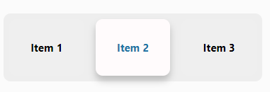
Tabs Props
| Nombre | Tipo | Descripción |
| ----------- | ---- | ----------- |
| children | React.ReactNode | Contenido especificado como hijo. |
TabItem Props
| Nombre | Tipo | Descripción |
| ----------- | ---- | ----------- |
| label | String \| null | Texto principal. |
| className | String \| null | Clase css personalizada. |
| active | Boolean | Indica si el elemento se encuentra activado |
Notification
Permite mantener informado al usuario de las acciones que realiza.
import { Notification } from 'leita-components-ui' <Notification
text='This is a notification'
description='This is a description'
icon='alert'
show={show}
type='success'
/>
Props
| Nombre | Tipo | Ejemplo | Descripción |
| ----------- | ---- | ----| ----------- |
| text | String | - | Texto principal. |
| description | String \| null | - |Texto secundario. |
| type | String | success \| danger \| warning | Énfasis de la notificación. |
| show | Boolean | - | Hace que la notificacion se muestre o no. |
| icon | String \| null | - | Icono perteneciente a @mdi/font |
| onClose | Function \| null | - | Accion de icono close |
| maxLengthDescription | Number | - | Numero de caracteres que permite la descripcion antes de mostrar la opcion de ver mas |
ImagePicker
import { ImagePicker } from 'leita-components-ui' <ImagePicker
multiple
imageList={imageList}
maxSize={5}
maxSizeMB={50000000}
onChange={(e) => testChange(e)}
/>
Cuando el componente cuenta con visualización de las imagenes cargadas, se puede cambiar el orden de las imagenes arrastrando y soltando las miniaturas en el orden deseado.
Props
| Nombre | Tipo | Ejemplo | Descripción |
| ----------- | ---- | ----- | ----------- |
| imageList | Array<String> |['', ''] | Lista de imagenes que se muestran. |
| multiple | Boolean | - | Hace que se puedan subir mas de una imagen. |
| maxSize | Number | 5 | Cuando se permitens subir mas de una imagen, este parametro limita la cantidad. |
| maxSizeMB | Number | 5000000 | Limita el tamaño de la imagen que se selecciona. |
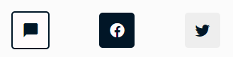
ToggleButton
Permite ocultar opciones en un unico boton.
import { ToggleButton, ToggleButtonItem } from 'leita-components-ui' <ToggleButton label="Contactame" icon="message">
<ToggleButtonItem value="facebook" icon="facebook" />
<ToggleButtonItem value="twitter" icon="twitter" />
</ToggleButton>
ToggleButton Props
| Nombre | Tipo | Descripción |
| ----------- | ---- | ----------- |
| children | React.ReactNode | Contenido especificado como hijo. |
| disabled | Boolean | Hace que el boton se inhabilite. |
| icon | String \| null | Icono perteneciente a @mdi/font |
| label | String \| null | Texto principal. |
ToggleButtonItem Props
| Nombre | Tipo | Descripción |
| ----------- | ---- | ----------- |
| icon | String \| null | Icono perteneciente a @mdi/font |
| value | String \| null | Valor de entrada. |
| active | Boolean | Indica si el elemento se encuentra activado |
MDIcon
Agerga iconos para reforzar el mensaje.
import { MDIcon } from 'leita-components-ui' <MDIcon name="loading" className="rotate" />Props
| Nombre | Tipo | Ejemplo | Descripción |
| ----------- | ---- | --- | ----------- |
| size | Number | 24 \| 36 \| 48 | Tamaño del icono. |
| name | String | - | Nombre del icono perteneciente a @mdi/font. |
| className | String \| null | - | Clase css personalizada. |
| style | Object | { margin: '1rem' } | Estilos personalizados para el icono. |
Tooltip
Permite mostrar mensajes cortos que aparecen cuando tienen el foco o el cursor pasa sobre el elemento.
import { Tooltip } from 'leita-components-ui' <Tooltip align='top' content='Pequeño tip'>
<RadioButton label="Prueba Tooltip " />
</Tooltip>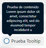
Props
| Nombre | Tipo | Ejemplo | Descripción |
| ----------- | ---- | ----- | ------ |
| align | String | top \| right \| bottom \| left \| auto | Posición en la que se muestra el tooltip. Cuando se elige auto, el tooltip se posiciona segun el espacio disponible. |
| content | String | - | Mensaje que muestra el tooltip. |
| className | String \| null | - | Clase css personalizada. |