
kan-editor
v2.8.1
Published
Markdown editor for vue3, developed in jsx and typescript, dark theme、beautify content by prettier、render articles directly、paste or clip the picture and upload it...
Downloads
11
Maintainers
 kanlai.com.cn
Readme
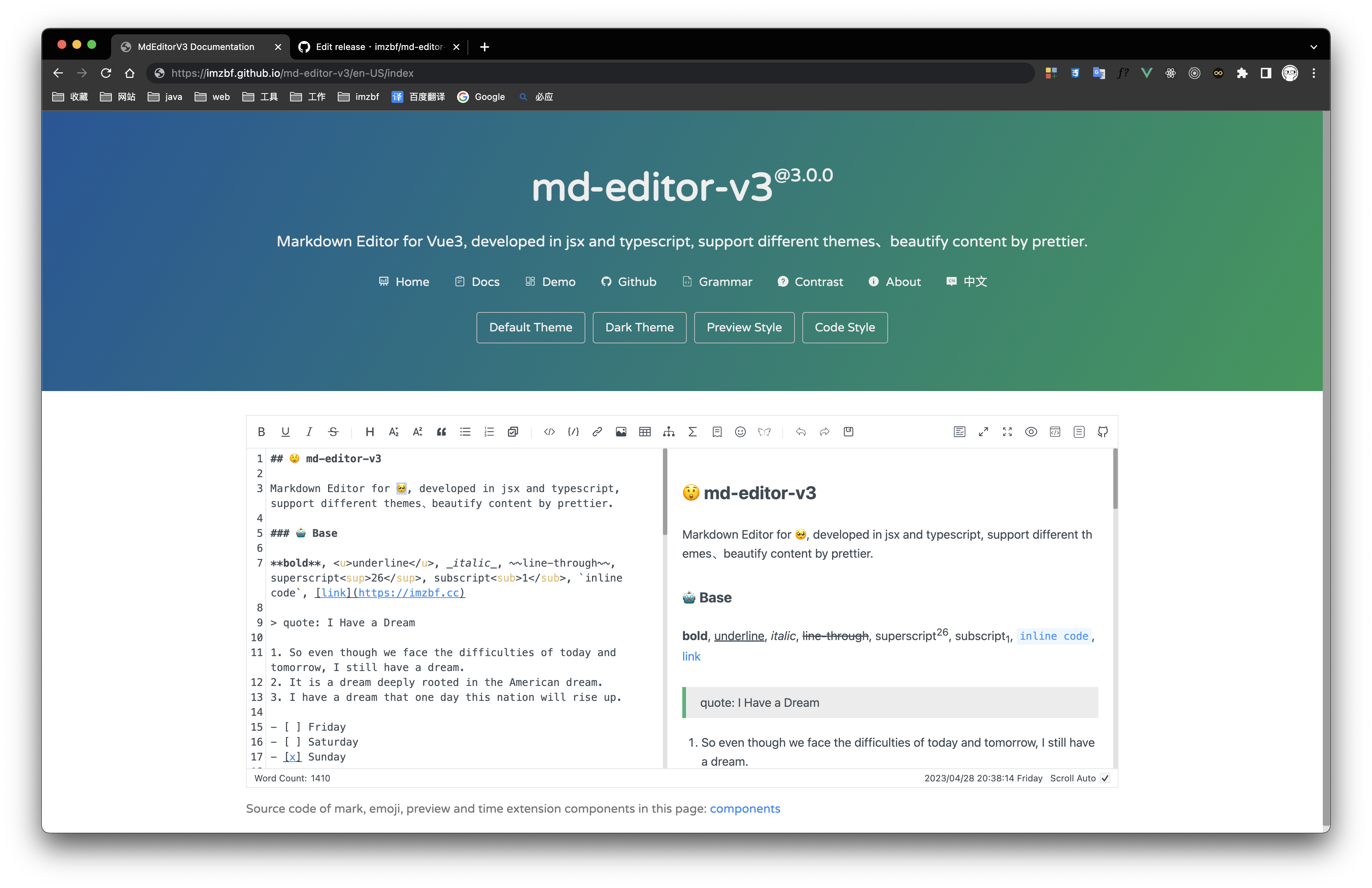
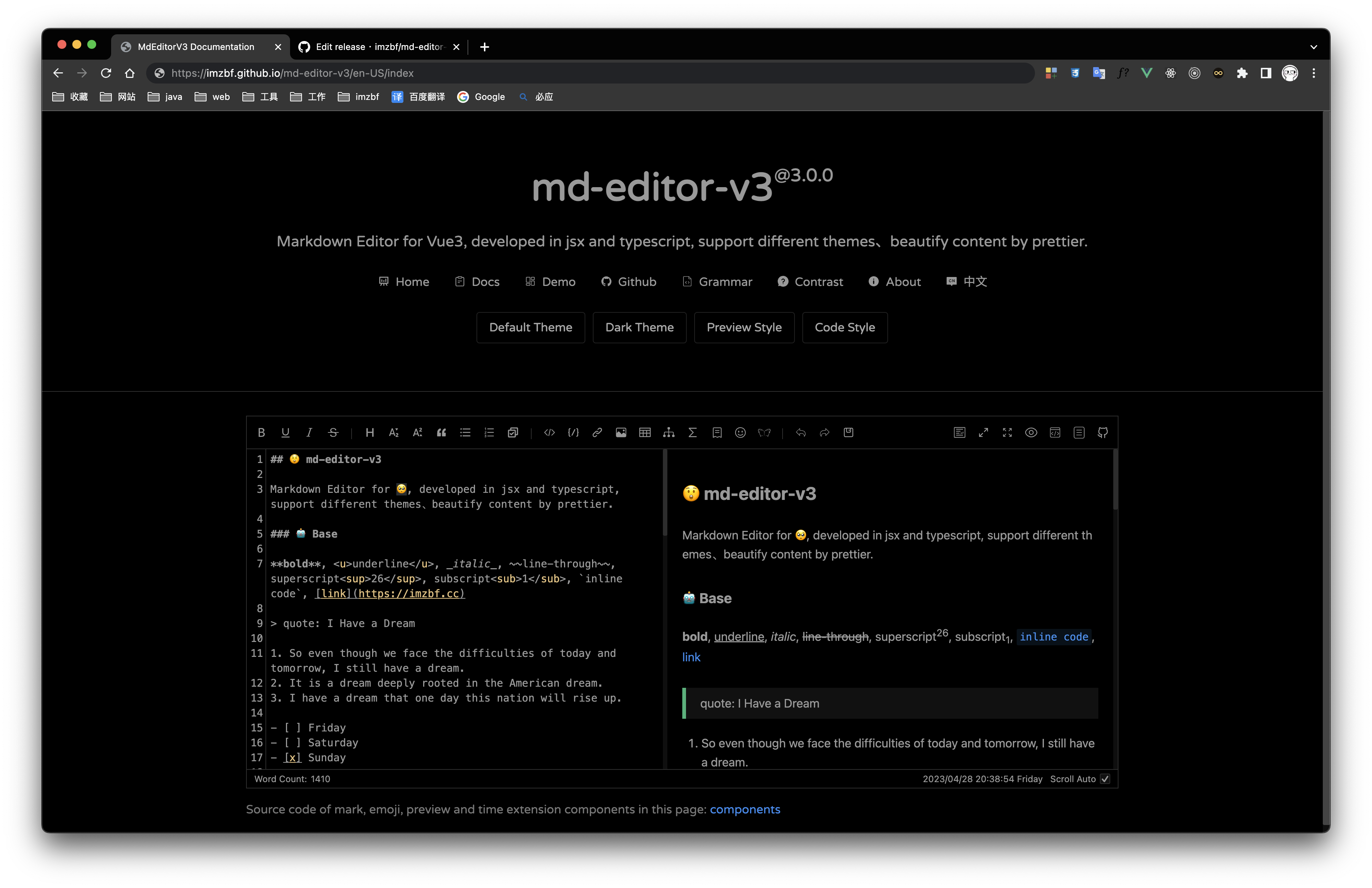
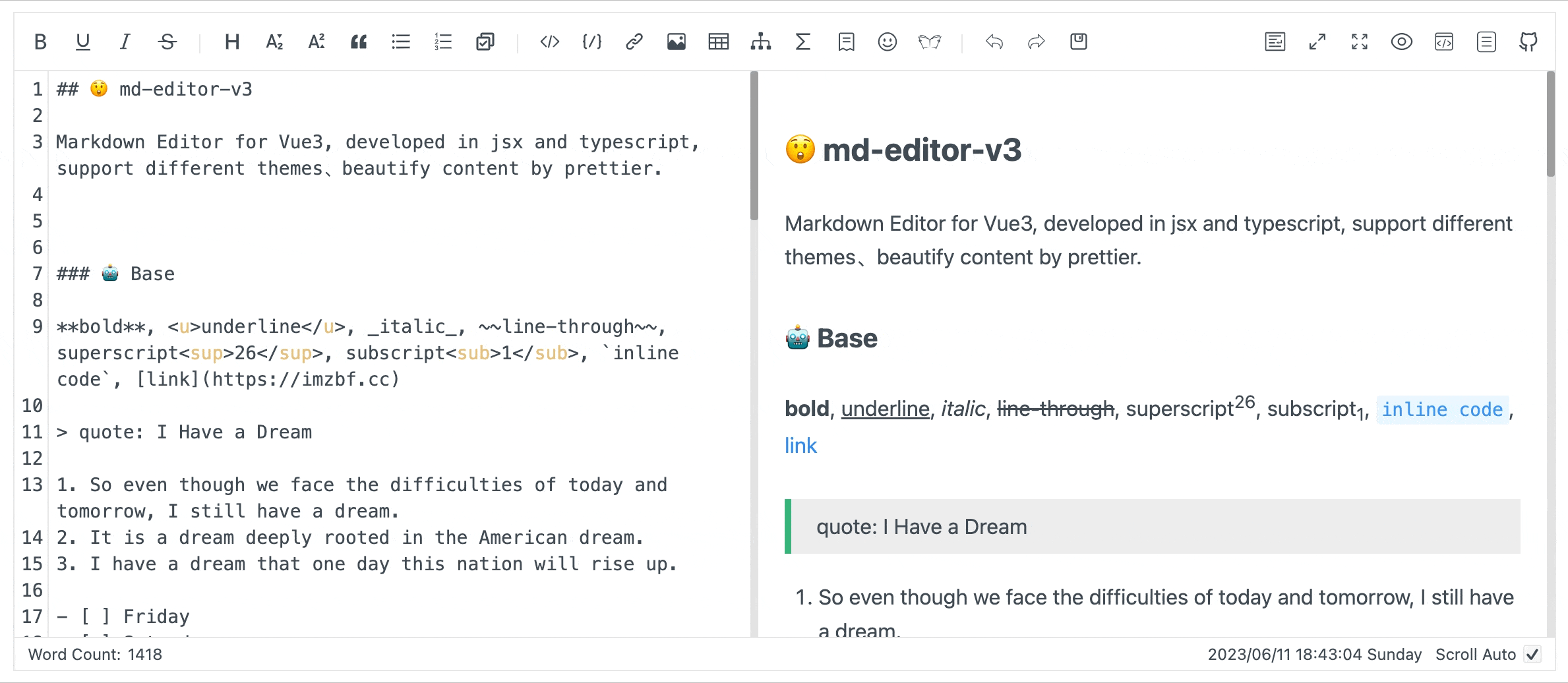
🎄 md-editor-v3


English | 中文
Markdown editor for vue3, developed in jsx and typescript.
Documentation and example: Go
Use it online: Go
The same series editor for react: md-editor-rt
⭐️ Features
- Toolbar, screenfull or screenfull in web pages and so on.
- Themes, Built-in default and dark themes.
- Shortcut key for editor.
- Beautify your content by
prettier(only for markdown content, not the code and other text). - Multi-language, build-in Chinese and English(default: Chinese).
- Upload picture, paste or clip the picture and upload it.
- Render article directly(no editor, no event listener, only preview of content).
- Theme of preview,
defalut,vuepress,github,cyanosis,mk-cute,smart-bluestyles(not identical). It can be customized also(Refer to example page). mermaid(>=1.8.0),katexmathematical formula(>=1.9.0).- Customize the toolbar as you like.
📦 Install
yarn add md-editor-v3Please install @types/marked in your typescript project if you want to configure renderer:
yarn add @types/marked -DInstall existing extension of language and theme of preview:
yarn add @vavt/md-editor-extensionFor more ways to use or contribute, please refer to: md-editor-extension
💡 Usage
<template>
  <md-editor v-model="text" preview-only />
</template>

<script setup>
import { ref } from 'vue';
import MdEditor from 'md-editor-v3';
import 'md-editor-v3/lib/style.css';

const text = ref('# Hello Editor');
</script>
🗺 Preview
| Default theme | Dark theme | Preview only |
| --- | --- | --- |
|  |
|  |
|  |
|
mark and emoji extensions
🎁 Apis
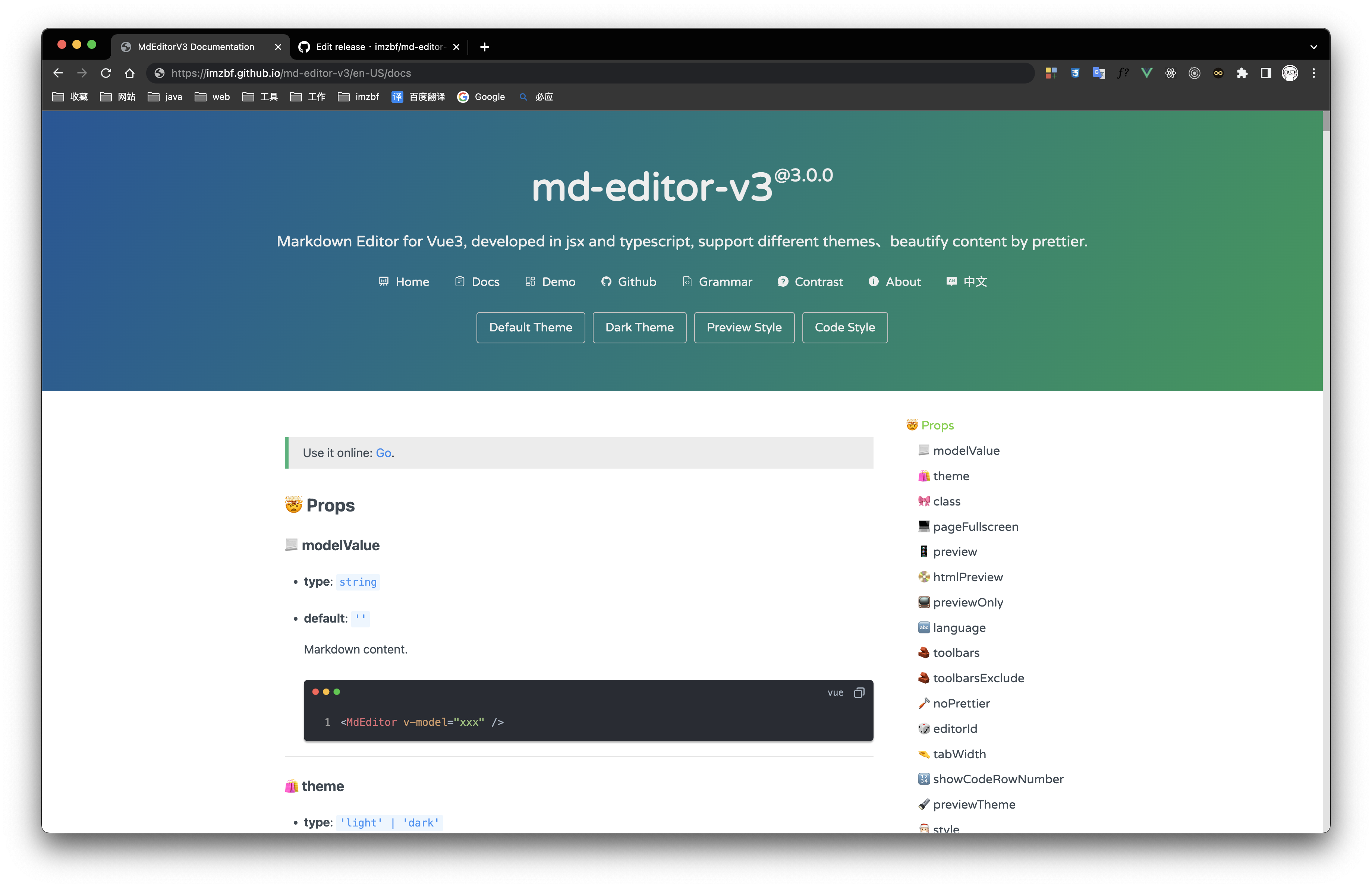
🔩 Props
| name | type | default | description |
| --- | --- | --- | --- |
| modelValue | string | '' | Markdown content, use v-model in vue template |
| theme | 'light' \| 'dark' | 'light' | Editor theme |
| class | string | '' | |
| historyLength | number | 10 | The max length of history(if it is too big, editor will use more RAM) |
| pageFullscreen | boolean | false | Screenfull in web page |
| preview | boolean | true | Preview content in editor |
| htmlPreview | boolean | false | Preview html in editor |
| previewOnly | boolean | false | Only render preview of content, no toolbar, no editing area |
| language | string | 'zh-CN' | Build-in language('zh-CN','en-US') |
| toolbars | Array<ToolbarNames \| number> | [toolbars] | Show contents of toolbar, all keyssee toolbars below |
| toolbarsExclude | Array<ToolbarNames \| number> | [] | Don't show contents of toolbar, all keystoolbars |
| noPrettier | boolean | false | Use prettier to beautify content or not |
| editorId | string | 'md-editor-v3' | Editor's id, it is used when there are more than two editors in the same page |
| tabWidth | number | 2 | One tab eq some spaces |
| showCodeRowNumber | boolean | false | Show row number for code block or not |
| previewTheme | 'default' \| 'github' \| 'vuepress' \| 'mk-cute' \| 'smart-blue' \| 'cyanosis' | 'default' | Theme of preview, can be customized |
| style | string \| CSSProperties | {} | Inline style |
| tableShape | [number, number] | [6, 4] | Preset the size of the table, [columns, rows] |
| noMermaid | boolean | false | Use mermaid or not |
| placeholder | string | '' | |
| noKatex | boolean | false | Use katex or not |
| codeTheme | 'atom' \| 'a11y' \| 'github' \| 'gradient' \| 'kimbie' \| 'paraiso' \| 'qtcreator' \| 'stackoverflow' | 'atom' | Highlight code style, can be customized also |
| markedHeadingId | (text: string, level: number, index: number) => string | (text) => text | H1-H6 ID generator |
| sanitize | (html: string) => string | (html) => html | Sanitize the html, prevent XSS |
| footers | Array<'markdownTotal' \| '=' \| 'scrollSwitch' \| number> | ['markdownTotal', '=', 'scrollSwitch'] | Show contents of footer, they are divided by '='. Set it to [] to hidden footer |
| scrollAuto | boolean | true | Scroll default setting |
| noIconfont | boolean | false | Not append iconfont script, download and import it by yourself |
| formatCopiedText | (text: string) => string | (text: string) => text | Format copied code |
| noUploadImg | boolean | false | Not show the entrance to upload pictures |
| codeStyleReverse | boolean | true | Code style will be reversed to dark while code block of the theme has a dark background |
| codeStyleReverseList | Array<string> | ['default', 'mk-cute'] | Themes to be reversed |
| autoFocus | boolean | false | same as autofocus in native textarea |
| disabled | boolean | false | same as disabled in native textarea |
| readOnly | boolean | false | same as readonly in native textarea |
| maxLength | number | | same as maxlength in native textarea |
| autoDetectCode | boolean | false | auto detect the type of pasted code, only support that copied from vscode |
[
  'bold',
  'underline',
  'italic',
  '-',
  'strikeThrough',
  'title',
  'sub',
  'sup',
  'quote',
  'unorderedList',
  'orderedList',
  'task', // ^2.4.0
  '-',
  'codeRow',
  'code',
  'link',
  'image',
  'table',
  'mermaid',
  'katex',
  '-',
  'revoke',
  'next',
  'save',
  '=',
  'pageFullscreen',
  'fullscreen',
  'preview',
  'htmlPreview',
  'catalog',
  'github'
];
After v1.6.0, You can sort the toolbar as you like, split tools by
'-', the left and right toolbars are divided by'='!
After v1.10.0, you can customize the toolbar. To display them, put index of
defToolbarsintotoolbars(this is not standard), for more usage, please refer to docs.
Expand language, you need to replace all the content here:
export interface ToolbarTips {
  bold?: string;
  underline?: string;
  italic?: string;
  strikeThrough?: string;
  title?: string;
  sub?: string;
  sup?: string;
  quote?: string;
  unorderedList?: string;
  orderedList?: string;
  task?: string; // ^2.4.0
  codeRow?: string;
  code?: string;
  link?: string;
  image?: string;
  table?: string;
  mermaid?: string;
  katex?: string;
  revoke?: string;
  next?: string;
  save?: string;
  prettier?: string;
  pageFullscreen?: string;
  fullscreen?: string;
  catalog?: string;
  preview?: string;
  htmlPreview?: string;
  github?: string;
  '-'?: string;
  '='?: string;
}

export interface StaticTextDefaultValue {
  // Toolbar hover tips(html title)
  toolbarTips?: ToolbarTips;
  // H1-H6 dropdown menu item
  titleItem?: {
    h1?: string;
    h2?: string;
    h3?: string;
    h4?: string;
    h5?: string;
    h6?: string;
  };
  imgTitleItem?: {
    link: string;
    upload: string;
    clip2upload: string;
  };
  // The modal tips of add link or upload picture
  linkModalTips?: {
    linkTitle?: string;
    imageTitle?: string;
    descLabel?: string;
    descLabelPlaceHolder?: string;
    urlLabel?: string;
    urlLabelPlaceHolder?: string;
    buttonOK?: string;
  };
  // The modal tips of clip the picture, v1.2.0
  clipModalTips?: {
    title?: string;
    buttonUpload?: string;
  };
  copyCode?: {
    text?: string;
    successTips?: string;
    failTips?: string;
  };
  mermaid?: {
    flow?: string;
    sequence?: string;
    gantt?: string;
    class?: string;
    state?: string;
    pie?: string;
    relationship?: string;
    journey?: string;
  };
  katex?: {
    // formula inline
    inline: string;
    // formula block
    block: string;
  };
  footer?: {
    markdownTotal: string;
    scrollAuto: string;
  };
}
🤱🏼 Expose
After 2.5.0, Editor exposes several methods on the instance, used to get or change the internal status of the editor.
<template>
  <md-editor ref="editorRef" />
</template>

<script setup>
import { ref, onMounted } from 'vue';
import MdEditor from 'md-editor-v3';
import type { ExposeParam } from 'md-editor-v3';

import 'md-editor-v3/lib/style.css';

const editorRef = ref<ExposeParam>();

onMounted(() => {
  editorRef.value?.on('catalog', console.log);

  editorRef.value?.toggleCatalog(true);
});
</script>
Switched to the opposite status, if toggle without input parameter.
👂🏼 on
Get the internal state of the editor, including pageFullscreen, fullscreen, preview, htmlPreview, catalog, etc.
pageFullscreen
editorRef.value?.on('pageFullscreen', (status) => console.log(status));fullscreen
editorRef.value?.on('fullscreen', (status) => console.log(status));preview
editorRef.value?.on('preview', (status) => console.log(status));htmlPreview
editorRef.value?.on('htmlPreview', (status) => console.log(status));catalog
editorRef.value?.on('catalog', (status) => console.log(status));
💻 togglePageFullscreen
Toggle status of fullscreen within the page.
editorRef.value?.togglePageFullscreen(true);🖥 toggleFullscreen
Toggle status of fullscreen widthin browser.
editorRef.value?.toggleFullscreen(true);📖 togglePreview
Toggle status of preview.
editorRef.value?.togglePreview(true);📼 toggleHtmlPreview
Toggle status of htmlPreview.
editorRef.value?.toggleHtmlPreview(true);🧬 toggleCatalog
Toggle status of catalog.
editorRef.value?.toggleCatalog(true);💾 triggerSave
editorRef.value?.triggerSave();💉 insert
Manually insert content into textarea.
/**
 * @params selectedText
 */
editorRef.value?.insert((selectedText) => {
  /**
   * @return targetValue    Content to be inserted
   * @return select         Automatically select content
   * @return deviationStart Start position of the selected content
   * @return deviationEnd   End position of the selected content
   */
  return {
    targetValue: `${selectedText}`,
    select: true,
    deviationStart: 0,
    deviationEnd: 0
  };
});
For more examples, refer to source code of extension component
🎯 focus
focus the textarea.
editorRef.value?.focus();🎍 Slots
| name | type | default | description |
| --- | --- | --- | --- |
| defToolbars | Array<DropdownToolbar \| NormalToolbar \| ModalToolbar> | null | Custom toolbar in DropdownToolbar, NormalToolbar or ModalToolbar |
| defFooters | Array<string \| VNode \| JSX.Element> | null | Custom footer |
NormalToolbar example:
<template>
  <md-editor>
    <template #defToolbars>
      <normal-toolbar title="mark" @onClick="handler">
        <template #trigger>
          <svg class="md-editor-icon" aria-hidden="true">
            <use xlink:href="#md-editor-icon-mark"></use>
          </svg>
        </template>
      </normal-toolbar>
    </template>
  </md-editor>
</template>

<script setup>
import MdEditor from 'md-editor-v3';

const NormalToolbar = MdEditor.NormalToolbar;

const handler = () => {
  console.log('NormalToolbar clicked!');
};
</script>
🪢 Events
| name | param | description |
| --- | --- | --- |
| onChange | value: string | Content changed event(bind to oninput of textarea) |
| onSave | value: string, html: Promise<string> | Save content event, ctrl+sand click button will be triggered also |
| onUploadImg | files: Array<File>, callback: (urls: Array<string>) => void | Upload picture event, when picture is uploading the modal will not close, please provide right urls to the callback function |
| onHtmlChanged | html: string | Compile markdown successful event, you can use it to get the html code |
| onGetCatalog | list: Array<HeadList> | Get catalog of article |
| onError | err: { name: string; message: string } | Catch run-time error, Cropper, fullscreen and prettier are used when they are not loaded |
| onBlur | event: FocusEvent | Blur the textarea element |
| onFocus | event: FocusEvent | Focus the textarea element |
💴 Config Editor
Use MdEditor.config(option: ConfigOption) to reconfigure renderer.
markedRenderer:
(renderer: RewriteRenderer) => RewriteRendererOpen target page in a new browser window:
MdEditor.config({
  markedRenderer(renderer) {
    renderer.link = (href, title, text) => {
      return `<a href="${href}" title="${title}" target="_blank">${text}</a>`;
    };

    return renderer;
  }
});
Reference: https://marked.js.org/using_pro#renderer, RewriteRenderer extends Renderer and rewrites heading, now provides
indexas the fifth parameter andheadingIdas the sixth parameter.type RewriteHeading = ( text: string, level: 1 | 2 | 3 | 4 | 5 | 6, raw: string, slugger: Slugger, index: number, headingId: string ) => string;markedExtensions:
Array<marked.TokenizerExtension & marked.RendererExtension>import MdEditor from 'md-editor-v3'; MdEditor.config({ markedExtensions: [your extension] });Reference: https://marked.js.org/using_pro#extensions
markedOptions:
marked.MarkedOptionsDo not render
<br>on a single line break:import MdEditor from 'md-editor-v3'; MdEditor.config({ markedOptions: { breaks: false } });Reference: https://marked.js.org/using_advanced#options
editorConfig: Add more languages, reset
mermaidtemplate or delay rendering time:import MdEditor from 'md-editor-v3'; MdEditor.config({ editorConfig: { languageUserDefined: { lang: StaticTextDefaultValue }, mermaidTemplate: { flow: `flow tempalte`, ...more }, // Default 500ms. It is set to 0ms when preview only and not set. renderDelay: 500 } });editorExtensions: Config some dependency libraries, like highlight..
import MdEditor from 'md-editor-v3';

MdEditor.config({
  editorExtensions: { iconfont: 'https://xxx.cc' }
});
import MdEditor from 'md-editor-v3'; interface EditorExtensions { highlight?: { instance?: any; js?: string; css?: { [key: string]: { light: string; dark: string; }; }; }; prettier?: { standaloneJs?: string; parserMarkdownJs?: string; }; cropper?: { instance?: any; js?: string; css?: string; }; iconfont?: string; screenfull?: { instance?: any; js?: string; }; mermaid?: { instance?: any; js?: string; }; katex?: { instance?: any; js?: string; css?: string; }; }
🪡 Shortcut Key
Pay attention: shortcut keys are only available when the textarea is focused!
| key | function | description |
| --- | --- | --- |
| TAB | insert space | Insert space, the length eq tabWidth, default: 2, support multiline |
| SHIFT + TAB | delete space, setting is the same as Tab | |
| CTRL + C | copy | When selected, copy the selected content. When not selected, copy the content of the current line |
| CTRL + X | shear | When selected, cut the selected content. When not selected, cut the current line |
| CTRL + D | delete | When selected, delete the selected content. When not selected, delete the current line |
| CTRL + S | save | Trigger onSave event |
| CTRL + B | bold text | **bold** |
| CTRL + U | underline | <u>underline</u> |
| CTRL + I | italic | *italic* |
| CTRL + 1-6 | h1-h6 | # title |
| CTRL + ↑ | superscript | <sup>superscript</sup> |
| CTRL + ↓ | subscript | <sub>subscript</sub> |
| CTRL + Q | quote | > quote |
| CTRL + O | ordered list | 1. ordered list |
| CTRL + L | link | [link](https://github.com/imzbf/md-editor-v3) |
| CTRL + Z | withdraw | Withdraw history in editor, not the function of system |
| CTRL + SHIFT + S | line-through | ~line-through~ |
| CTRL + SHIFT + U | unordered list | - unordered list |
| CTRL + SHIFT + C | code block | |
| CTRL + SHIFT + I | picture |  |
| CTRL + SHIFT + Z | forward | Forward history in editor, not the function of system |
| CTRL + SHIFT + F | Beautify | |
| CTRL + ALT + C | code row | |
| CTRL + SHIFT + ALT + T | table | \|table\| |
🪤 Components
They are used as attributes of the editor component, eg: Editor.DropdownToolbar. For more examples, refer to document.
🐣 NormalToolbar
Editor.NormalToolbar
props
title:string, not necessary, title of toolbar.
events
onClick:(e: MouseEvent) => void, necessary.
slots
trigger:string | JSX.Element, necessary, it is usually an icon, which is displayed on the toolbar.
🐼 DropdownToolbar
Editor.DropdownToolbar
props
title:string, not necessary, title of toolbar.visible:boolean, necessary.
events
onChange:(visible: boolean) => void, necessary.
slots
trigger:string | JSX.Element, necessary, it is usually an icon, which is displayed on the toolbar.overlay:string | JSX.Element, necessary, content of dropdown box.
🦉 ModalToolbar
Editor.ModalToolbar
props
title:string, not necessary, title of toolbar.modalTitle:string, not necessary, title of the Modal.visible:boolean, necessary, visibility of Modal.width:string, not necessary, width of Modal, defaultauto.height:string, same aswidth.showAdjust:boolean, not necessary, visibility of fullscreen button.isFullscreen:boolean, necessary whenshowAdjust = true, status of fullscreen.
events
onClick:() => void, necessary.onClose:() => void, necessary, close event.onAdjust:(val: boolean) => void, fullscreen button click event.
slots
trigger:string | JSX.Element, necessary, it is usually an icon, which is displayed on the toolbar.overlay:string | JSX.Element, necessary, content of Modal.
🐻 MdCatalog
Editor.MdCatalog
props
editorId:string, necessary, same as editor'seditorId, used to register listening events.class:string, not necessary.markedHeadingId:MarkedHeadingId, not necessary, same as editor.scrollElement:string | HTMLElement, not necessary, it is an element selector when its type is string. WhenpreviewOnlyeqtrue, it is usually set todocument.documentElement.theme:'light' | 'dark', not necessary, provide it when you want to change theme online, it is the same as Editortheme.offsetTop:number, not necessary, highlight current item of catalogs when title isoffsetToppixels from the top, defalut 20.scrollElementOffsetTop:number, not necessary, offsetTop of the scroll container,defalut 0.
events
onClick:(e: MouseEvent, t: TocItem) => void, not necessary.
🗂 Examples
🎸 Jsx Template
import { defineComponent, reactive } from 'vue';
import MdEditor from 'md-editor-v3';
import 'md-editor-v3/lib/style.css';

export default defineComponent({
  setup() {
    const md = reactive({
      text: '# Hello Editor'
    });
    return () => (
      <MdEditor modelValue={md.text} onChange={(value) => (md.text = value)} />
    );
  }
});
🥹 Upload Picture
Tips: When you paste and upload GIF, it will upload a static picture. So you should upload it by file system!
<template>
  <md-editor v-model="text" @onUploadImg="onUploadImg" />
</template>

<script setup>
import { ref } from 'vue';
import MdEditor from 'md-editor-v3';
import 'md-editor-v3/lib/style.css';

const text = ref('# Hello Editor');

const onUploadImg = async (files, callback) => {
  const res = await Promise.all(
    files.map((file) => {
      return new Promise((rev, rej) => {
        const form = new FormData();
        form.append('file', file);

        axios
          .post('/api/img/upload', form, {
            headers: {
              'Content-Type': 'multipart/form-data'
            }
          })
          .then((res) => rev(res))
          .catch((error) => rej(error));
      });
    })
  );

  callback(res.map((item) => item.data.url));
};
</script>🧙♂️ Change Styles
.css-vars(@isDark) {
  --md-color: if(@isDark, #999, #222);
  --md-hover-color: if(@isDark, #bbb, #000);
  --md-bk-color: if(@isDark, #000, #fff);
  --md-bk-color-outstand: if(@isDark, #111, #f6f6f6);
  --md-bk-hover-color: if(@isDark, #1b1a1a, #f5f7fa);
  --md-border-color: if(@isDark, #2d2d2d, #e6e6e6);
  --md-border-hover-color: if(@isDark, #636262, #b9b9b9);
  --md-border-active-color: if(@isDark, #777, #999);
  --md-modal-mask: #00000073;
  --md-scrollbar-bg-color: if(@isDark, #0f0f0f, #e2e2e2);
  --md-scrollbar-thumb-color: if(@isDark, #2d2d2d, #0000004d);
  --md-scrollbar-thumb-hover-color: if(@isDark, #3a3a3a, #00000059);
  --md-scrollbar-thumb-avtive-color: if(@isDark, #3a3a3a, #00000061);
}

.md-editor {
  .css-vars(false);
}

.md-editor-dark {
  .css-vars(true);
}
Change background color in dark mode:
.md-editor-dark {
  --md-bk-color: #333 !important;
}