just-a-modal
v1.1.2
Published
just a modal. simple modal with no dependencies for confirmation and info modals
Downloads
3
Maintainers
Readme
Just A Modal
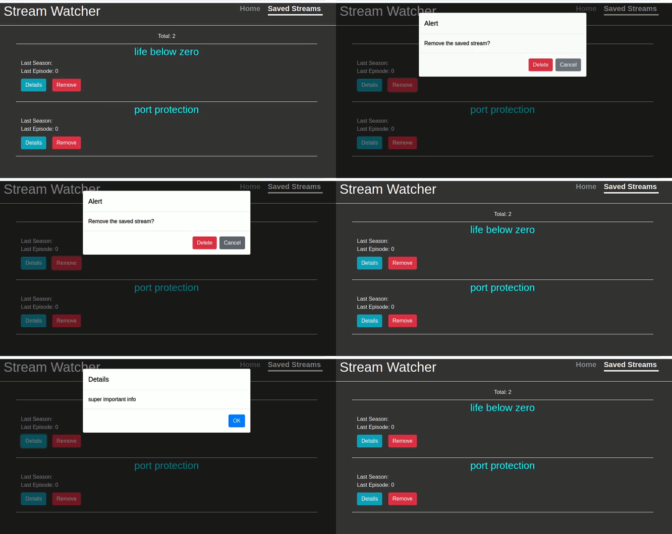
Sometimes you just need a simple modal, to either get a confirmation before deleting something or to present some info to a user. This is one. You won't get 500 npm modules added to your project with this.
- zero dependencies
- overlay automatically added to dim the background
- small, currently around 16KB
- easy to get started with and use
Installation
npm install --save just-a-modalUsage
import React, { useState } from 'react';
import JustAModal from 'just-a-modal';

const [modalInfo, setModalInfo] = useState({
    showModal: false,
    actionID: '',
    action: '',
    config: {}
});

const handleDelete = (id) => {
    let modalInfo = {
        showModal: true,
        actionID: id,
        action: 'deleteBook',
        config: {}
    };

    setModalInfo(modalInfo);
};

const handleCancel = () => {
    let modalInfo = {
        showModal: false,
        actionID: '',
        action: '',
        config: {}
    };

    setModalInfo(modalInfo);
};

const handleAction = (actionID) => {
    if(modalInfo.action === 'deleteBook'){
        //api call to delete book with id of actionID
        //after it completes, close the modal
        handleCancel();
    }
};

<JustAModal modalInfo={modalInfo} handleCancel={handleCancel} handleAction={handleAction} />
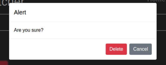
with an actionID set:

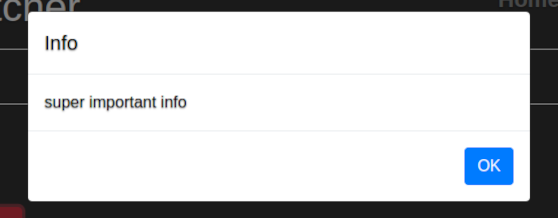
set actionID to 0 and modal will change from a delete confirmation to a info box:


|modalInfo|| |---|---| |showModal|boolean true to show the modal, false to hide it| |actionID|id of item to delete. if missing, modal will be be an info modal| |action|action that you want to perform if user clicks ok| |config|object, modal config options|
|config|| |---|---| |title|default for confirmation is "Alert", info is "Info"| |body|default for confirmation is "Are you sure?", info needs a body| |buttonOKText|default is "OK"| |buttonDeleteText|default is "Delete"| |buttonCancelText|default is "Cancel"|
config:{
    title: 'Alert!!',
    buttonDeleteText: 'I am super sure'
}