
influtech-filters
v1.0.47
Published
Dynamic form of filters to several Fluvip projects.
Downloads
22

Readme
Dynamic Filters Form
Dynamic form of filters to several Fluvip projects.
Development
To run with ssr:
- with npm
npm start- with yarn
yarn startTo run with no ssr
- with npm
npm run nossr- with yarn
yarn run nossrComponentes
Jerarquia de los componentes
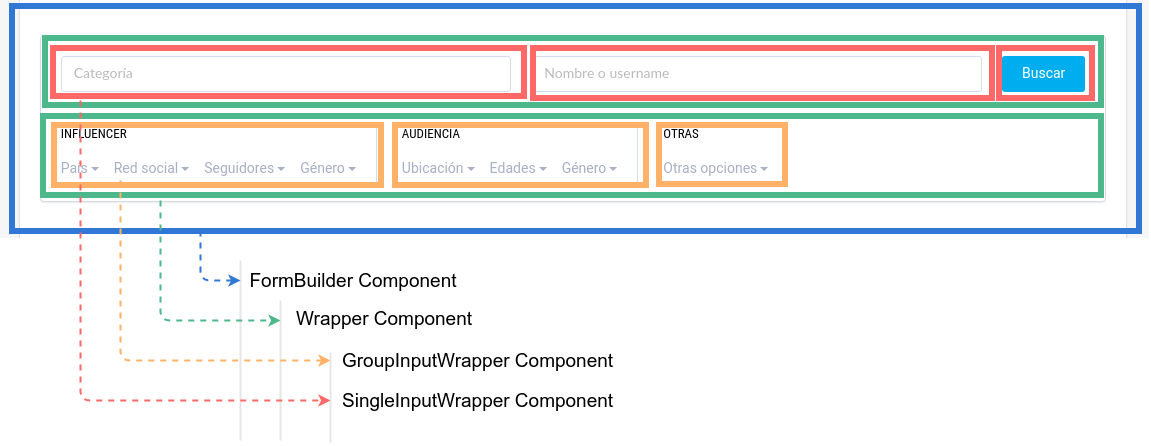
FormBuilder Component
src/components/FormBuilder/FormBuilder.jsxEste componente recibe la estructura del formulario (formStructure prop), ver ejemplo en sample/initialData.js
La estruturura principal es un Array, que contendra diferentes wrappers (Arreglos)
FormBuilder:
[]
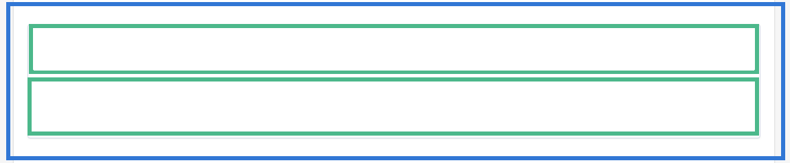
Wrapper Component
src/components/FormBuilder/Wrapper.jsxLa estrutura de este componente es un Array cada arreglo puede contener inputs o grupos de inputs (Objetos {})
[[],[]]
Un wrapper puede ser:
- un Array de inputs (SingleInputWrapper)
{} - un Array de grupos de inputs (GroupInputWrapper)
{type: "group" ...}
La estructura visual de los elementos contenidos en un Wrapper estara determinada por los componentes incluidos dentro de este; De acuerdo a la cantidad y tipo de elementos se determina el Grid haciendo uso del 'CSS Grid Layout Module'
Ejemplos:
SingleInputWrapper Component
[
  [
    {
      //props for input
    },
    {
      //props for input
    }
  ]
]
Genera un SingleInputWrapper con grid: grid-template-columns: 1fr 1fr;

[
  [
    {
      //props for input
    },
    {
      //props for input
    },
    {
      //props for input
    }
  ]
]
Genera un SingleInputWrapper con grid: grid-template-columns: 1fr 1fr 1fr;

Los input de tipo submit dentro de un SingleInputWrapper tiene un espacio 'auto', de forma que el grid-item tomara el ancho del elemento de typo submit
[
  [
    {
      //props for input
    },
    {
      //props for input
    },
    {
      //props for input
      type: 'submit',
      ...
    }
  ]
]
Genera un SingleInputWrapper con grid: grid-template-columns: 1fr 1fr auto;

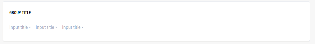
GroupInputWrapper Component
[
  [
    {
      //props for group of inputs
      type: "group", title: "Group title",
      inputs [
        {
          //props for input
        },
        {
          //props for input
        },
        {
          //props for input
        }
      ]
      ...
    }
  ]
]
Genera un GroupInputWrapper con grid: grid-template-columns: 1fr;
[
  [
    {
      //props for group of inputs
      type: "group", title: "Group title",
      inputs [{},{},{}]
      ...
    },
    {
      //props for group of inputs
      type: "group", title: "Group title",
      inputs [{},{}]
      ...
    }
  ]
]
Genera un GroupInputWrapper con grid: grid-template-columns: 1fr 1fr;
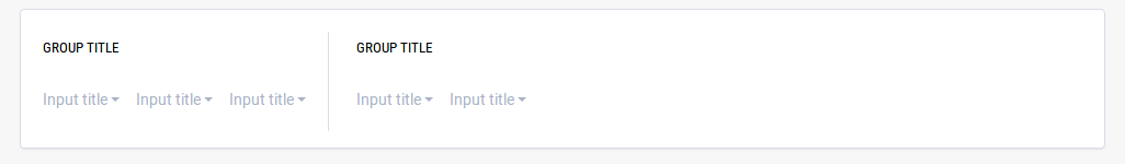
Collapsible Wrapper
Para hacer que un Wrapper sea colapsable, alguno de los inputs hijo debe tener la propiedad collapsible, a su vez recibe la propiedad title que funciona como el header del Wrapper.
*
[
  [
    {
      //props for group of inputs, also the general wrapper is collapsible
      type: "group", title: "Group title", collapsible: { title: "Collapsible Wrapper"}
      inputs [{},{},{}]
      ...
    },
    {
      //props for group of inputs
      type: "group", title: "Group title",
      inputs [{},{}]
      ...
    },
    ...
  ]
]
Genera un GroupInputWrapper con grid: grid-template-columns: 1fr 1fr;, a su vez también genera la acción de colapso del Wrapper

Inputs
un wrapper puede contener los siguientes tipos de input
Text Component
{ type: "text", name: "screen_name", placeholder: "Nombre o username", emptyValue: "" }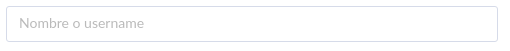
Submit Component
{ type: "submit", name: "submit", value: "Buscar" }
SelectAutocompleter Component
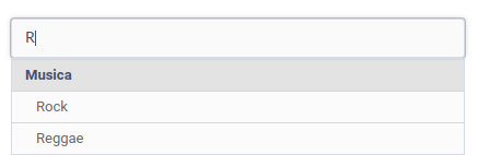
SelectAutocompleter en SingleInputWrapper:
    {
      type: "select_autocompleter", name: "content_term", placeholder: "input", emptyValue: "", onSingleWrapper: true, withSubOptions: true, searchOnChange: true,
      options: [
        { value: "Musica", valueToSend: "musica", subOptions: [{ value: "Rock", valueToSend: "rock" }, { value: "Reggae", valueToSend: "reggae" }] },
        { value: "Motos", valueToSend: "motorcycles", subOptions: [{ value: "Apache", valueToSend: "apache" }, { value: "Himalayan", valueToSend: "himalayan" }] },
        { value: "sobresdrújulas", valueToSend: "sobre", subOptions: [{ value: "ágilmente", valueToSend: "agil" }, { value: "instantáneamente", valueToSend: "insta" }] }
      ]
    }
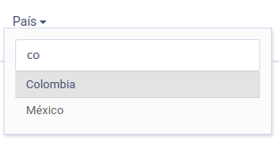
SelectAutocompleter en GroupInputWrapper:
  {
    type: "select_autocompleter", name: "influencer_country", label: "País", placeholder: "País del influenciador", emptyValue: "",
    options: [
      { value: "Colombia", valueToSend: "1" },
      { value: "Narnia", valueToSend: "2" },
      { value: "México", valueToSend: "3" }
    ]
  }
Opciones especiales
- onSingleWrapper: true, determina el estilo visual dependiendo del tipo de wrapper en el que es incluido
- withSubOptions: true, determina la posibilidad de relizar busqueda en sub opciones
- searchOnChange: true, determina la opción de buscar o no, cuando el evento OnChange es detectado en el input
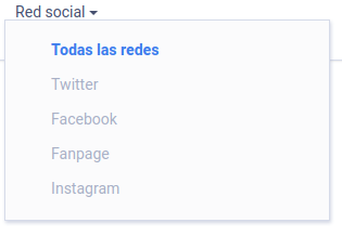
Checkbox Component
{
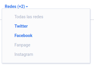
type: "checkbox", name: "social_network", label: "Red social", pluralLabel: "Redes (+#count)",
options: [
{ value: "", id: "all_networks", label: "Todas las redes", isDefaultOption: true, allOptions: true },
{ value: "twitter", id: "twitter", label: "Twitter" },
{ value: "facebook", id: "facebook", label: "Facebook" },
{ value: "fanpage", id: "fanpage", label: "Fanpage" },
{ value: "instagram", id: "instagram", label: "Instagram" }
]
}
CustomOptions:
Los componentes Custom soportados por el Checkbox Component son:
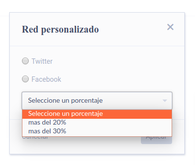
- PercentageOption
{
  ...

  customOption: {
    title: "Red personalizado",
    cancelLabel: "Cancelar",
    applyLabel: "Aplicar",
    linkLabel: "Range personalizado ...",
    type: "percentage_option",
    valueFormat: "#sValue_#iPercentage", //indicates field type using integer(i), string(s), float(f)
    labelFormat: "#value (mayor a #percentage%)",
    labels: {
      "twitter": "Twitter",
      "facebook": "Facebook",
    },
    options: {
      name: "custom_social_network",
      values: [
        { value: "twitter", label: "Twitter" },
        { value: "facebook", label: "Facebook" }
      ],
      percentages: [
        { value: 20, label: "mas del 20%" },
        { value: 30, label: "mas del 30%" },
      ],
      emptyPercentage: "Seleccione un porcentaje",
      error: {
        percentage: {
          required: "Debe seleccionar un porcentaje"
        },
        value: {
          required: "Debe seleccionar una opcion"
        }
      }
    },
    id: "custom-social-network"
  }
}
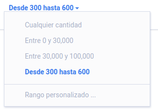
Radio Component
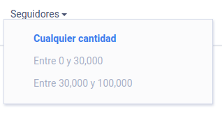
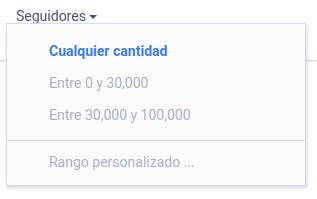
{
  type: "radio", name: "followers", label: "Seguidores",
  options: [
    { value: "", id: "all_followers", label: "Cualquier cantidad", isDefaultOption: true },
    { value: "0-30000", id: "0_30000", label: "Entre 0 y 30,000" },
    { value: "30000-10000", id: "30000_10000", label: "Entre 30,000 y 100,000" },
  ]
}
CustomOptions:
Los componentes Custom soportados por el Radio Component son:
- RangeOption
{
...
customOption: {
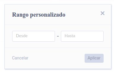
title: "Rango personalizado",
cancelLabel: "Cancelar",
applyLabel: "Aplicar",
linkLabel: "Rango personalizado ...",
type: "range_option",
valueFormat: "#iFrom-#iTo", //indicates field type using integer(i), string(s), float(f)
labelFormat: "Desde #from hasta #to",
options: {
label: {
from: "Desde",
to: "Hasta",
},
error: {
required: "Ambos valores son requeridos",
positive: "Ambos valores deben ser mayores a cero",
greater: "El limite superior debe ser mayor al inferior"
}
},
id: "custom-followers"
}
- PercentageOption
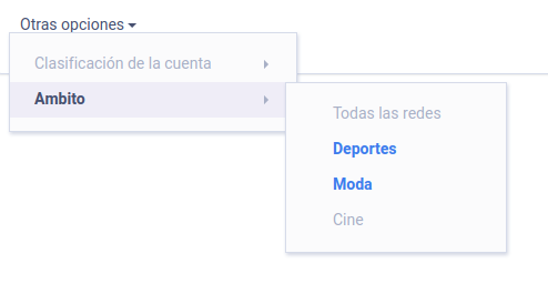
Dropdown Component
{
  type: "dropdown", label: "Otras opciones",
  inputs: [
    {
      type: "radio", name: "account_type", label: "Clasificación de la cuenta",
      options: [
        { value: "", id: "all_accounts", label: "Todas", isDefaultOption: true },
        { value: "celebrity", id: "celebrity", label: "Celebridad" },
        { value: "professional", id: "professional", label: "Profesional" },
        { value: "citizen", id: "citizen", label: "Ciudadano" }
      ]
    },
    {
      type: "checkbox", name: "tags", label: "Ambito", pluralLabel: "Ambito (+#count)",
      options: [
        { value: "", id: "all_tags", label: "Todas las redes", isDefaultOption: true, allOptions: true },
        { value: "sport", id: "sport", label: "Deportes" },
        { value: "fashion", id: "fashion", label: "Moda" },
        { value: "cinema", id: "cinema", label: "Cine" }
      ]
    }
  ]
}
InputSeletor Component
{
  type: "input_selector", title: "Selecciona la opción de búsqueda", keepValues: false
  inputs: [
    { type: "text", name: "screen_name", placeholder: "Nombre o username" }
    { type: "text", name: "category", placeholder: "Categoria" }
  ]
}
Genera un InputSelector con dos opciones de inputs para seleccionar el campo de busqueda
Opciones especiales
- keepValues: true, mantiene el valor ingresado en el actual input al cambiar la seleccion de input
- keepValues: false, le asigna al valor del input actual el emptyValue definido para él al cambiar el input seleccionado

Estilos Visuales del Componente
Existen dos versiones de estilos disponibles para agregar al componente, para usar una de las versiones debe importar la hoja de estilos de la siguiente manera en el componente donde sea importado FormBuilder:
import 'influtech-filters/dist/theme_v1.css'
o
import 'influtech-filters/dist/theme_v2.css'
Adicional debe agregar la clase 'theme-v1' 0 'theme-v2' al elemento html que preceda el renderizado del componente FormBuilder, ejemplo:
<div className='theme-v1'>
  <FormBuilder
    ...props
  />
</div>