
hrnet-packages
v1.1.3
Published
A Data Base component for OC-P14-HRNet
Downloads
8

Readme
OC-P14-HRNet-Packages
Table of Contents
Introduction
HRNet Packages is a set of packages used by the HRNet application, which is an application that manages employee files.
It currently contains two packages:
Modal: displays a modal containing text or a component
DataTable: displays data in the form of a table. Offers the option of sorting the elements of the table in ascending/descending order according to the category indicated at the head of the column, performing a search to filter the elements present, and choosing the quantity of data to be displayed per page.
Instalation
To install, you can use npm or yarn:
$ npm install --save hrnet-packages
$ yarn add hrnet-packages
Using style props
Each package can be customised by applying your own className (ccs or module.css) to replace the default ones. There are two types of className:
| Name | Description | | -------------- | ------------------------------------------------------------------------------- | | className | Affects the design | | className_base | Modifies the structure: will have an impact on the architecture of the element. |
By modifying only the className, you only affect the design of the element, without affecting the structure.
Modal
Mandatory props
| Name | Type | Description | | -------- | --------------- | ----------------------------------------------------------------------------- | | open | boolean | A boolean value indicating whether the modal should be open or closed | | setOpen | boolean | A function to manage the state of the modal when the close button is clicked. | | children | React.ReactNode | The content or components that will be displayed inside the modal. |
Optional props for customization
| Name | Type | Description | | ----- | ------ | ------------------------------------------------------------------ | | style | object | Containing a list of elements for modifying the style of the modal |
style?:{[key:string]:string}
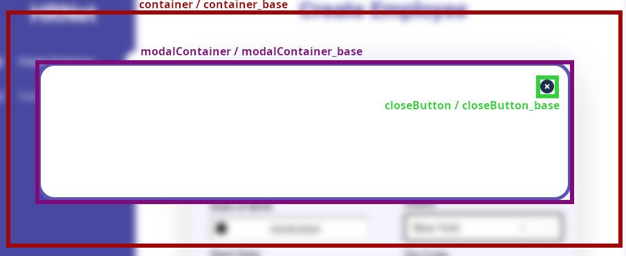
| Style key | Description | | ------------------------------------ | --------------------------------------- | | container / container_base | container with blur effect (by default) | | modalContainer / modalContainer_base | modal's container | | closeButton / closeButton_base | close's button |
Prerequisites
Before using the modal import useState from React
import { useState } from 'react';And in you component create open and setOpen variable :
const [open, setOpen] = useState(false);Exemple
import { Modal } from 'hrnet-packages';
import { useState } from 'react';

const yourModalStyles = {
   /*container: styles.yourContainer, (module.css)*/
   modalContainer: 'yourModalContainer' /*(css)*/
}

const MyElement () => {
   const [ open, setOpen ] = useState(false);

   return (
      <div>
            My Element
            <button onClick={()=>setOpen(true)}>Open Modal</button>
            <Modal open={open} setOpen={setOpen} style={yourModalStyles}>
               <div>Your Modal !</div>
            </Modal>
      </div>
   )

}

export default MyElement
DataTable
Mandatory props
| Name | Type | Description | | ------- | ------ | ------------------------------------------------------------------------------------------ | | data | object | An object containing the list of data to be displayed | | columns | array | An object containing the list of column headings and the elements to which they are linked |
data: {[key:string]:{[key:string:string | number]}};
columns: { title: string; data: string }[];
Optional props for customization
| Name | Type | Description | | ----- | ------ | ----------------------------------------------------------------- | | style | object | the className you wish to apply to the elements of each component |
style?: {
    dataTable?: { [key: string]: string };
    column?: { [key: string]: string };
    search?: { [key: string]: string };
    pageList?: { [key: string]: string };
    tableInfo?: { [key: string]: string };
};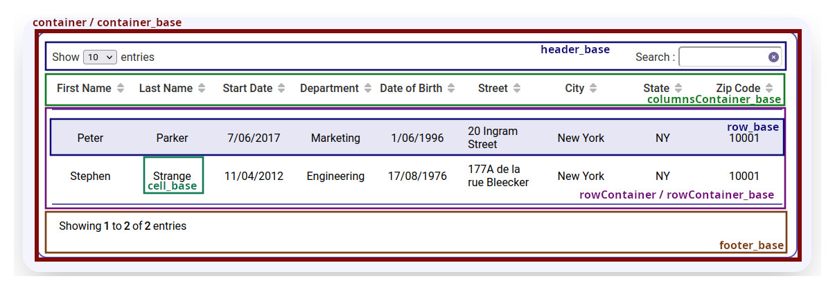
| dataTable Style key | Description | | --------------------------------------------- | ----------------------------------------------------------------------------------------------------- | | container / container_base | container of dataTable | | header_base | contains the select for the number of data items displayed per page and the input search | | selectContainer_base | label and input of the select | | selectContainer_select_base | select element | | columnsContainer_base | contains all the column headers | | noData | text displayed when there is no data | | rowContainer / rowContainer_base | contains all rows | | row / row_base(alone or :hover or :nth-child) | affect all rows | | cell / cell_base | affects all cells except those in the column header | | footer_base | contains an indication of the number of elements contained and displayed in the table and page number | | activeCell | cells linked to the selected column |
| column Style key | Description | | --------------------------------- | ----------------------------------------- | | cell / cell_base(alone or :hover) | all cells in the column header | | arrow | affect all arrows | | inactiveArrow | only double arrows | | arrowsContainer_base | contain arrow when the column is selected |
| search Style key | Description | | ------------------------------ | --------------------- | | container_base | component's container | | searchInput / searchInput_base | input | | resetButton / resetButton_base | reset button |
| pageList Style key | Description | | ---------------------------- | ------------------------------------------ | | pagesList_base | contains page numbers and scrolling arrows | | arrowIcone(alone or :hover) | scrolling arrows | | pageButton | page buttons | | activePage (alone or :hover) | page selected |
| tableInfo Style key | Description | | -------------------------- | ---------------- | | container / container_base | all the text | | number | only the numbers |
Exemples
import { DataTable } from 'hrnet-packages';

const data = {
   parker_833580000: {
      id: 'peter_833580000',
      firstName: 'Peter',
      lastName: 'Parker',
      dateOfBirth: '1/06/1996',
      startDate: '7/06/2017',
      department: 'Marketing',
      street: '20 Ingram Street',
      city: 'New York',
      state: 'NY',
      zipCode: '10001',
   },
   strange_231890400: {
      id: 'strange_231890400',
      firstName: 'Stephen',
      lastName: 'Strange',
      dateOfBirth: '17/08/1976',
      startDate: '11/04/2012',
      department: 'Engineering',
      street: '177A de la rue Bleecker',
      city: 'New York',
      state: 'NY',
      zipCode: '10001',
   },
};

const columns = [
   { title: 'First Name', data: 'firstName' },
   { title: 'Last Name', data: 'lastName' },
   { title: 'Start Date', data: 'startDate' },
   { title: 'Department', data: 'department' },
   { title: 'Date of Birth', data: 'dateOfBirth' },
   { title: 'Street', data: 'street' },
   { title: 'City', data: 'city' },
   { title: 'State', data: 'state' },
   { title: 'Zip Code', data: 'zipCode' },
];

const yourDataTableStyles = {
   dataTable: { container: 'yourDataTableContainer', cell: 'yourDataTableCell' },
   search: { searchInput: 'yourDataTableSearchInput },
};

const YourTable = () => {
   return (
      <div>
         <DataTable data={data} columns={columns} styles={yourDataTableStyles}/>
      </div>
   );
};

export default YourTable;