
hrnet-maxew-library
v1.0.3
Published
oc P14 components library
Downloads
5

Readme
HRNet-maxew-library

This library includes 3 usefull components for the Wealth Health Human Resources Network application (HRNet app) : a Modal, a Dropdown and a Table.
Table of contents
Installation
Install easily this library with npm :
npm i hrnet-maxew-library@latest
Examples
A modal

import { useState } from 'react'
import { Modal } from 'hrnet-maxew-library'

export default function App() {
    const [count, setCount] = useState(0)
    const [openCard, setOpenCard] = useState(true)

    const handleClick = () => {
        setCount((count) => count + 1)
    }

    const handleOpenCard = () => {
        setOpenCard(!openCard)
    }

    return (
        <>
            {openCard && (
                <Modal
                    confirm={handleClick}
                    close={handleOpenCard}
                    label={'add 1'}
                    message={['Here is my count :', 'count is ' + count]}
                    overlay={true}
                />
            )}
        </>
    )
}
A dropdown
import { useState } from 'react'
import { Dropdown } from 'hrnet-maxew-library'
export default function App() {
const [value, setValue] = useState('')
const handleSelect = (_id: string, value: string) => {
setValue(value)
}
return (
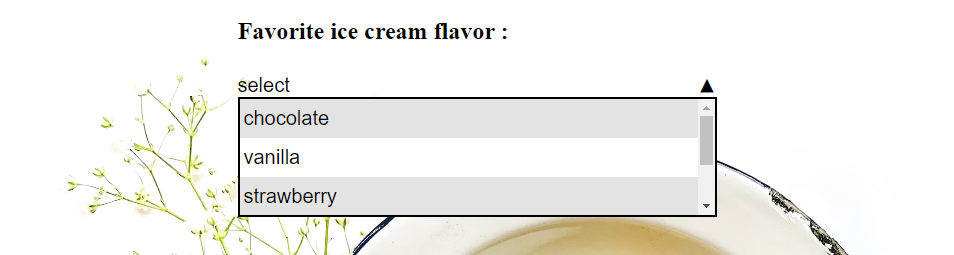
<div className="wrapper">
<h2>Favorite ice cream flavor : {value}</h2>
<Dropdown
items={[
'chocolate',
'vanilla',
'strawberry',
'pineapple',
'rum raisin',
]}
selectItem={handleSelect}
fFam="arial"
fSize="1.25rem"
height="2.5rem"
/>
</div>
)
}A table
import { Table } from 'hrnet-maxew-library'

export default function App() {
    const data = [
        {
            firstName: 'Homer',
            lastName: 'Simpson',
            birthday: '1956-05-12',
        },
        {
            firstName: 'Marge',
            lastName: 'Simpson',
            birthday: '1956-10-19',
        },
        {
            firstName: 'Bart',
            lastName: 'Simpson',
            birthday: '1979-04-01',
        },
        {
            firstName: 'Lisa',
            lastName: 'Simpson',
            birthday: '1981-05-09',
        },
        {
            firstName: 'Maggie',
            lastName: 'Simpson',
            birthday: '1989-12-17',
        },
    ]

    return (
        <Table
            data={data}
            title={'Simpson family infos'}
            fFam="roboto"
            background="#fed517"
        />
    )
}
Documentation
Modal
Props
message (optional, array)
An array of strings representing the message of the modal.
label (optional, string)
The label for the confirmation button. Defaults to "OK" if not provided.
confirm (optional, function)
A callback function to handle the confirmation action.
close (optional, function)
A callback function to handle the close action.
Styling Props (optional)
You can customize the modal and button styles using the following props:
fFam(string): The font family for modal content.fSize(string): The font size for modal content.fCol(string): The font color for modal content.bg(string): The background color for the modal.pad(string): The padding for the modal.width(string): The width of the modal.bordW(string): The border width for the modal.bordC(string): The border color for the modal.bordR(string): The border radius for the modal.lineHeight(string): The line height for the modal messages.bfFam(string): The font family for modal button.bfSize(string): The font size for modal button.bfCol(string): The font color for modal button.bbg(string): The background color for modal button.bpad(string): The padding for modal button.bwidth(string): The width for modal button.bbordW(string): The border width for modal button.bbordC(string): The border color for modal button.bbordR(string): The border radius for modal button.hoverBg(string): The background color for modal button on hover.hoverCol(string): The font color for modal button on hover.
Dropdown
Props
selectItem (required, function)
A callback function that is triggered when an item is selected in the dropdown.
items (required, array)
An array of items (numbers or strings) to be displayed in the dropdown.
currentValue (optional, string | number)
The currently selected value in the dropdown.
dataName (optional, string)
A data attribute name that can be applied to the dropdown.
dataLabel (optional, string)
A label to display above the dropdown.
Styling Props (optional)
You can customize the appearance of the dropdown and its items using the following props:
width(string): The width of the dropdown.height(string): The height of the dropdown.fFam(string): The font family for dropdown content.fSize(string): The font size for dropdown content.fCol(string): The font color for dropdown content.textAlign('center' | 'right' | 'left'): The text alignment for the dropdown content.underline(boolean): Enable or disable underlining of the dropdown content.lBg(string): The background color for the dropdown list.lWidth(string): The width of the dropdown list.lHeight(string): The height of the dropdown list.lBordW(string): The border width for the dropdown list.lBordC(string): The border color for the dropdown list.lBordR(string): The border radius for the dropdown list.greyLine(boolean): Enable or disable grey lines between dropdown items.itemPad(string): The padding for each dropdown item.
Table
Props
title (optional, string)
A title for the table.
headingNames (optional, { [key: string]: string })
An object specifying custom heading names for table columns. Only the data with the same key will be displayed.
data (required, { [key: string]: string | number })
An array of objects representing the data to be displayed in the table.
closeUp (optional, boolean)
Enable or disable close-up view for table rows. Defaults to true.
background (optional, string)
The background color of the table.
Styling Props (optional)
Customize the appearance of the table and its elements:
width(string): The width of the table.fFam(string): The font family for table content.fSize(string): The font size for table content.fCol(string): The font color for table content.tableFCol(string): The font color for table headers.tBordW(string): The border width for the table.tBordC(string): The border color for the table.tBordR(string): The border radius for the table.prevTxt(string): The text for the "Previous" button in table navigation.nextTxt(string): The text for the "Next" button in table navigation.buttonEllipsis(boolean): Enable or disable ellipsis in the page navigation buttons.greyLine(boolean): Enable or disable grey lines between table rows.