npm package discovery and stats viewer.

Discover Tips

  • General search

    [free text search, go nuts!]

  • Package details

    pkg:[package-name]

  • User packages

    @[username]

Sponsor

Optimize Toolset

I’ve always been into building performant and accessible sites, but lately I’ve been taking it extremely seriously. So much so that I’ve been building a tool to help me optimize and monitor the sites that I build to make sure that I’m making an attempt to offer the best experience to those who visit them. If you’re into performant, accessible and SEO friendly sites, you might like it too! You can check it out at Optimize Toolset.

About

Hi, 👋, I’m Ryan Hefner  and I built this site for me, and you! The goal of this site was to provide an easy way for me to check the stats on my npm packages, both for prioritizing issues and updates, and to give me a little kick in the pants to keep up on stuff.

As I was building it, I realized that I was actually using the tool to build the tool, and figured I might as well put this out there and hopefully others will find it to be a fast and useful way to search and browse npm packages as I have.

If you’re interested in other things I’m working on, follow me on Twitter or check out the open source projects I’ve been publishing on GitHub.

I am also working on a Twitter bot for this site to tweet the most popular, newest, random packages from npm. Please follow that account now and it will start sending out packages soon–ish.

Open Software & Tools

This site wouldn’t be possible without the immense generosity and tireless efforts from the people who make contributions to the world and share their work via open source initiatives. Thank you 🙏

© 2024 – Pkg Stats / Ryan Hefner

hcxcomponents

v1.0.2

Published

`hcxcomponents` is a collection of reusable React components styled using tailwindcss designed to simplify the development of user interfaces.

Downloads

14

Readme

HCX components

hcxcomponents is a collection of reusable React components styled using tailwindcss designed to simplify the development of user interfaces.

Installation

1. React App Setup

To use hcxcomponents, you'll need to set up a React app first. If you haven't already done so, you can create a new React app using Create React App:

npx create-react-app my-app
cd my-app

2. Install hcxcomponents

npm i hcxcomponents

3. Tailwindcss Setup

Next, configure tailwindcss in your React app:

Install Tailwind CSS

npm install -D tailwindcss
npx tailwindcss init

Configure your template paths tailwind.config.js

/** @type {import('tailwindcss').Config} */
module.exports = {
  content: ["./src/**/*.{html,js}","./node_modules/hcxcomponents/dist/**/*"],
  theme: {
    extend: {},
  },
  plugins: [],
}

Add the Tailwind directives to your CSS src/input.css

@tailwind base;
@tailwind components;
@tailwind utilities;

Usage

Import the components you need from hcxcomponents and use them in your React application:

App.js

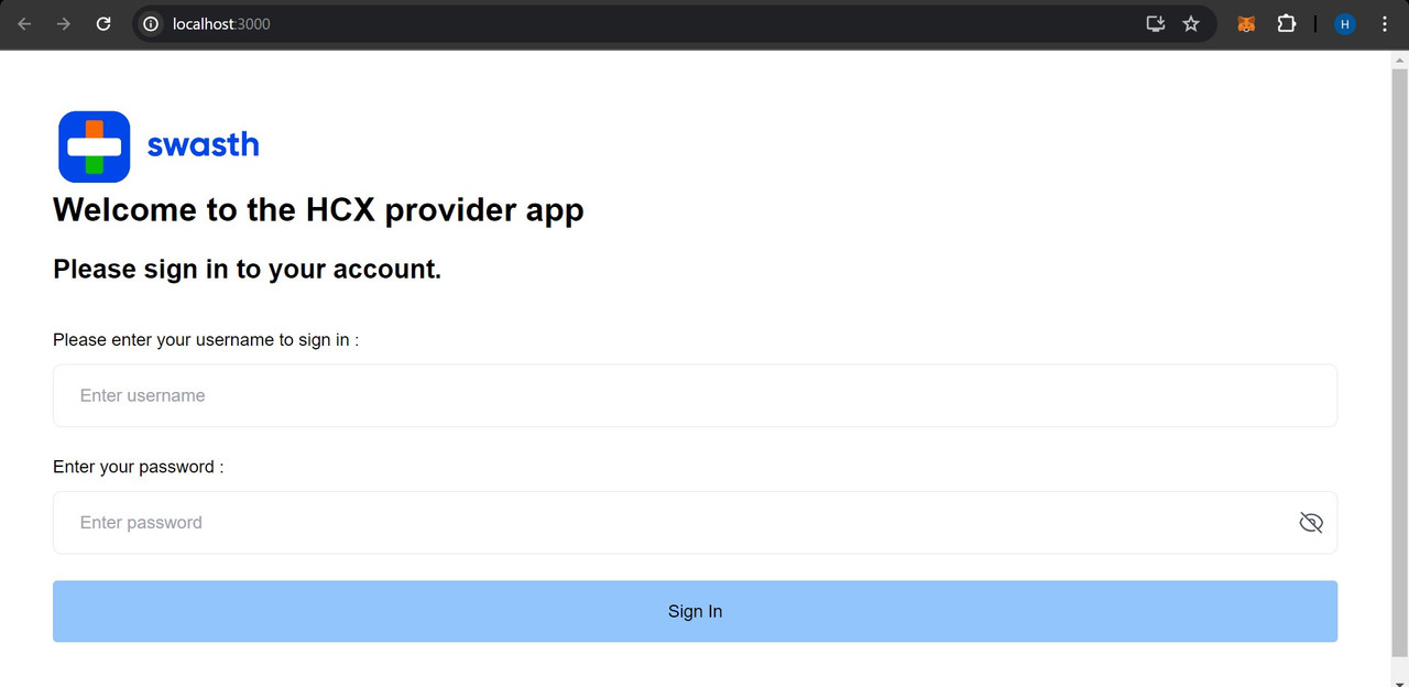
import logo from './logo.svg';
import './App.css';

import { Input, Container, LogoAndHeadings, Button } from 'hcxcomponents';

function App() {
  return (
    <Container>
            <LogoAndHeadings
                mainHeading="Welcome to the HCX provider app"
                subHeading="Please sign in to your account."
            />
            <form>
                <Input label="Please enter your username to sign in :"
                    type="email"
                    placeholder="Enter username"
                />
                <Input label="Enter your password :"
                    type="password"
                    placeholder="Enter password"
                />
                <Button>
                    Sign In
                </Button>
            </form>
        </Container>
  );
}

export default App;

Screenshots