npm package discovery and stats viewer.

Discover Tips

  • General search

    [free text search, go nuts!]

  • Package details

    pkg:[package-name]

  • User packages

    @[username]

Sponsor

Optimize Toolset

I’ve always been into building performant and accessible sites, but lately I’ve been taking it extremely seriously. So much so that I’ve been building a tool to help me optimize and monitor the sites that I build to make sure that I’m making an attempt to offer the best experience to those who visit them. If you’re into performant, accessible and SEO friendly sites, you might like it too! You can check it out at Optimize Toolset.

About

Hi, 👋, I’m Ryan Hefner  and I built this site for me, and you! The goal of this site was to provide an easy way for me to check the stats on my npm packages, both for prioritizing issues and updates, and to give me a little kick in the pants to keep up on stuff.

As I was building it, I realized that I was actually using the tool to build the tool, and figured I might as well put this out there and hopefully others will find it to be a fast and useful way to search and browse npm packages as I have.

If you’re interested in other things I’m working on, follow me on Twitter or check out the open source projects I’ve been publishing on GitHub.

I am also working on a Twitter bot for this site to tweet the most popular, newest, random packages from npm. Please follow that account now and it will start sending out packages soon–ish.

Open Software & Tools

This site wouldn’t be possible without the immense generosity and tireless efforts from the people who make contributions to the world and share their work via open source initiatives. Thank you 🙏

© 2024 – Pkg Stats / Ryan Hefner

green-red-react-progress-bar

v1.2.0

Published

It is a progress bar to reactivate which can go from green to red or from red to green. Its background colors and size can also be modified.

Downloads

3

Readme

green-red-react-progress-bar

It is a library of react, in short, a progress bar.

  • It is easy to implement, with several options.
  • It can go from green to red or red to green.
  • It can have dark theme or light theme.
  • It has an extended or small version.
  • It can receive classes or styles.
  • It can may or may not include title.
  • It can may or may not include button.
  • It can may or may not include description.
  • It can be with rounded or straight edges.

To install

npm install --save green-red-react-progress-bar

Parameters

The following parameters can be passed to it.

| PARAMETERS | ACTION | TYPE | DEFAULT | ------ | ------ | ------ | ------ | | darkTheam | set dark theme | boolean | false | expand | set expand mode | boolean | false | redToGreen | set red to green progress bar | boolean | false | roundProgressbar | set round progressbar | boolean | true | containerClass | pass a class to container | string | - | containerStyle | pass a style to container | object | - | titleClass | pass a class to title | string | - | titleStyle | pass a style to title | object | - | buttonClass | pass a class to button | string | - | buttonStyle | pass a style to button | object | - | descriptionClass | pass a class to description | string | - | descriptionStyle | pass a style to description | object | - | handleButton | the function of the button | function | ()=>{} | titleText | the title text | string | - | showButton | set the button | boolean | false | titleButton | the text button | string | - | descriptionText | the description text | string | - | percentage | the percentage | number | 0

Ej:

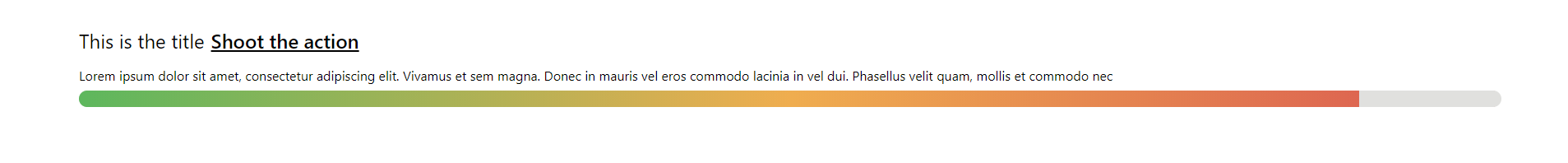
import ProgressBar from "green-red-react-progress-bar";

<ProgressBar
    darkTheam={true}
    expand={true}
    titleText={`This is the title`}
    showButton={true}
    titleButton={'Shoot the action'}
    descriptionText={`Lorem ipsum dolor sit amet, consectetur adipiscing elit. Vivamus et sem magna. Donec in mauris vel eros commodo lacinia in vel dui. Phasellus velit quam, mollis et commodo nec`}
    handleButton={()=>{console.log('click')}}
    percentage={30}
/>

Ej images:

progress image, dark theme 40% progress image, 90% progress image, dark theme 90% progress image, dark theme 90%, red to green progress image, dark theme 90%, no button progress image, dark theme 90%, no button, no description progress image, 90%, no title, no button, description progress image, 90%, no button, no description, no title, grey background progress image, 90%, no button, no description, no title, white background progress image, 90%, no button, no description, no title, square edges, white background

GitHub

https://github.com/leonelyo99/react-progress-bar