
gradient-react
v1.0.6
Published
create gradients easily
Downloads
13
Maintainers
 minattafederico
Readme
English
gradient-react is a React component library that simplifies the creation of gradient elements. It includes components like GradientCircle, GradientContent, and GradientContain to help you design attractive user interfaces with gradients easily.
Installation
npm install gradient-reactor you can use yarn
yarn add gradient-reactUsage Example
import {
	GradientContain,
	GradientCircle,
	GradientContent,
} from 'gradient-react';

const MyComponent = () => (
	<GradientContain styles={{ margin: '100px', padding: '20px' }}>
		<GradientCircle
			color1='#7701cc'
			color2='#01a7cc'
			width='350px'
			height='350px'
		/>
		<GradientCircle
			color1='#eb540e'
			blur='50'
			color2='#cc0101'
			width='450px'
			height='450px'
		/>
		<GradientContent>
			<h2>Section title</h2>
			<p>Generic text</p>
		</GradientContent>
	</GradientContain>
);
Components
GradientCircle
The GradientCircle component allows you to create circles with custom gradients.
import { GradientCircle } from 'gradient-react';

const MyComponent = () => (
	<GradientCircle
		color1='#7701cc'
		color2='#01a7cc'
		width='350px'
		height='350px'
		styles={{ left: '130px', top: '300px' }}
	/>
);
| Property | Description | Default Value | | -------- | ------------------------------------ | ------------- | | color1 | The color of the circle's center | '#ED0101' | | color2 | The color of the circle's outer edge | '#CC2A01' | | width | The width of the circle | '200px' | | height | The height of the circle | '200px' | | blur | The intensity of the circle's blur | '80' | | styles | CSS styles applied to the container | {} |
GradientContent
GradientContent is used to wrap content within an area with a gradient background.
import { GradientContent } from 'gradient-react';

const MyComponent = () => (
	<GradientContent
		styles={{
			display: 'flex',
			flexDirection: 'column',
			alignContent: 'center',
			justifyContent: 'center',
			width: '100%',
		}}
	>
		<h2>Section Title</h2> <p>Generic text</p>
	</GradientContent>
);
| Property | Description | Default Value | | -------- | ----------------------------------- | ------------- | | styles | CSS styles applied to the container | {} |
GradientContain
GradientContain is a container that can house multiple components with gradients.
import {
	GradientContain,
	GradientCircle,
	GradientContent,
} from 'gradient-react';

const MyComponent = () => (
	<GradientContain styles={{ margin: '100px', padding: '20px' }}>
		<GradientCircle
			color1='#7701cc'
			color2='#01a7cc'
			width='350px'
			height='350px'
		/>
		<GradientCircle
			color1='#eb540e'
			blur='50'
			color2='#cc0101'
			width='450px'
			height='450px'
		/> <GradientContent>
			<h2>Section Title</h2> <p>Generic text</p>
		</GradientContent>
	</GradientContain>
);
| Property | Description | Default Value | | -------- | ----------------------------------- | ------------- | | styles | CSS styles applied to the container | {} |
Contributing
If you would like to contribute to this library, you're welcome!
Spanish
gradient-react es una librería de componentes React que facilita la creación de elementos con gradientes. Incluye componentes como GradientCircle, GradientContent y GradientContain para ayudarte a diseñar interfaces de usuario atractivas con gradientes de manera sencilla.
Instalación
npm install gradient-reacto puedes usar yarn
yarn add gradient-reactEjemplo de uso
import {
GradientContain,
GradientCircle,
GradientContent,
} from 'gradient-react';
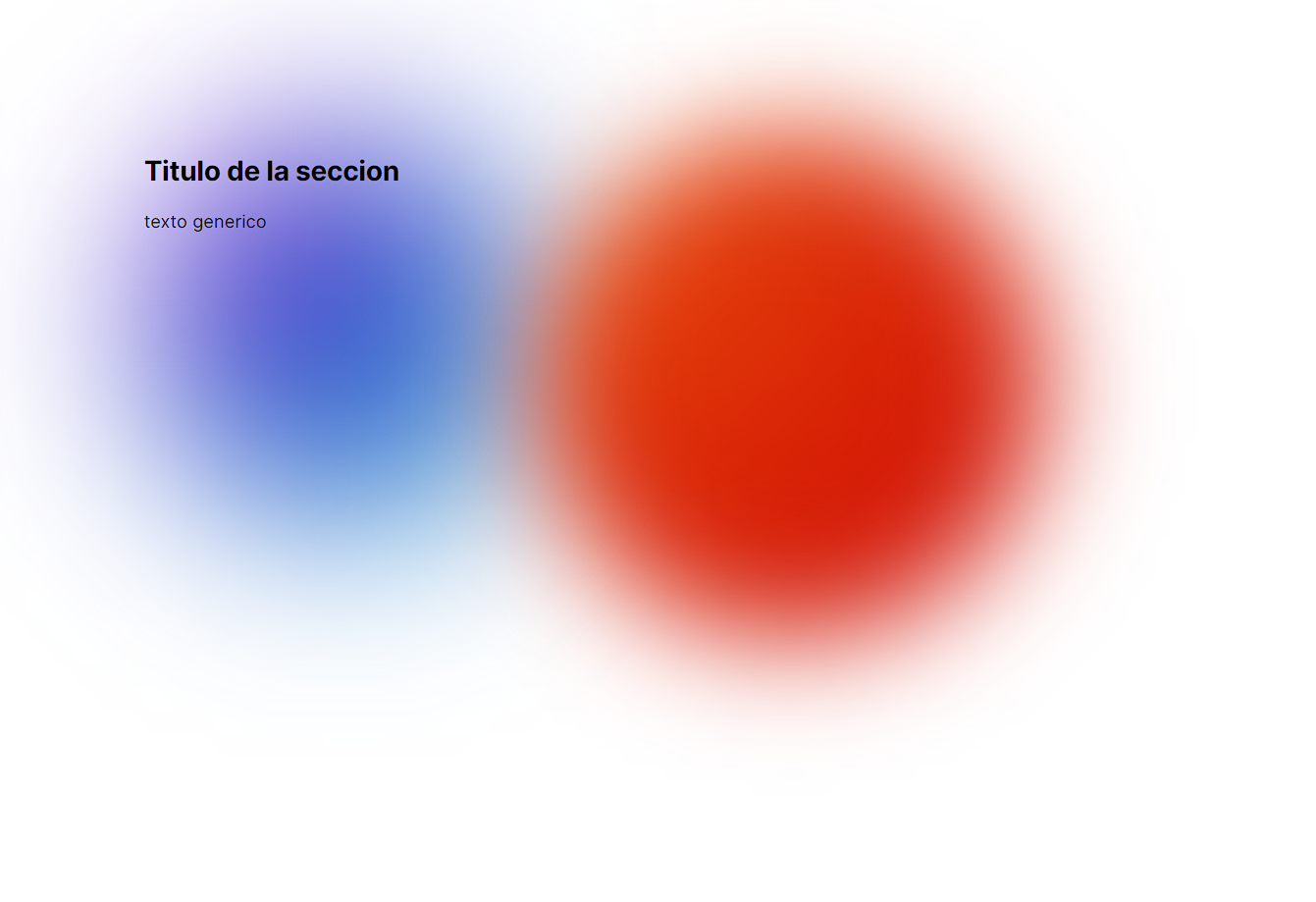
const MyComponent = () => (
<GradientContain styles={{ margin: '100px', padding: '20px' }}>
<GradientCircle
color1='#7701cc'
color2='#01a7cc'
width='350px'
height='350px'
/>
<GradientCircle
color1='#eb540e'
blur='50'
color2='#cc0101'
width='450px'
height='450px'
/>
<GradientContent>
<h2>Título de la sección</h2>
<p>Texto genérico</p>
</GradientContent>
</GradientContain>
);Componentes
GradientCircle El componente GradientCircle te permite crear círculos con gradientes personalizados.
import { GradientCircle } from 'gradient-react';
import { GradientCircle } from 'gradient-react';

const MyComponent = () => (
	<GradientCircle
		color1='#7701cc'
		color2='#01a7cc'
		width='350px'
		height='350px'
		styles={{
			left: '130px',
			top: '300px',
		}}
	/>
);
| Propiedad | Descripción | Valor por Defecto | | --------- | ------------------------------------- | ----------------- | | color1 | Color del centro del círculo | '#ED0101' | | color2 | Color del borde exterior del círculo | '#CC2A01' | | width | Ancho del círculo | '200px' | | height | Altura del círculo | '200px' | | blur | Intensidad del desenfoque del círculo | '80' | | styles | Estilos CSS aplicados al contenedor | {} |
GradientContent
GradientContent se utiliza para envolver contenido dentro de un área con un fondo de gradiente.
import { GradientContent } from 'gradient-react';

const MyComponent = () => (
	<GradientContent
		styles={{
			display: 'flex',
			flexDirection: 'column',
			alignContent: 'center',
			justifyContent: 'center',
			width: '100%',
		}}
	>
		<h2>Título de la sección</h2>
		<p>Texto genérico</p>
	</GradientContent>
);
| Propiedad | Descripción | Valor por Defecto | | --------- | ----------------------------------- | ----------------- | | styles | Estilos CSS aplicados al contenedor | {} |
GradientContain
GradientContain es un contenedor que puede albergar varios componentes con gradientes.
import {
	GradientContain,
	GradientCircle,
	GradientContent,
} from 'gradient-react';

const MyComponent = () => (
	<GradientContain styles={{ margin: '100px', padding: '20px' }}>
		<GradientCircle
			color1='#7701cc'
			color2='#01a7cc'
			width='350px'
			height='350px'
		/>
		<GradientCircle
			color1='#eb540e'
			blur='50'
			color2='#cc0101'
			width='450px'
			height='450px'
		/>
		<GradientContent>
			<h2>Título de la sección</h2>
			<p>Texto genérico</p>
		</GradientContent>
	</GradientContain>
);
| Propiedad | Descripción | Valor por Defecto | | --------- | ----------------------------------- | ----------------- | | styles | Estilos CSS aplicados al contenedor | {} |
Contribuir
Si quieres contribuir a esta librería, ¡te damos la bienvenida!