geetork-lib
v1.0.10
Published
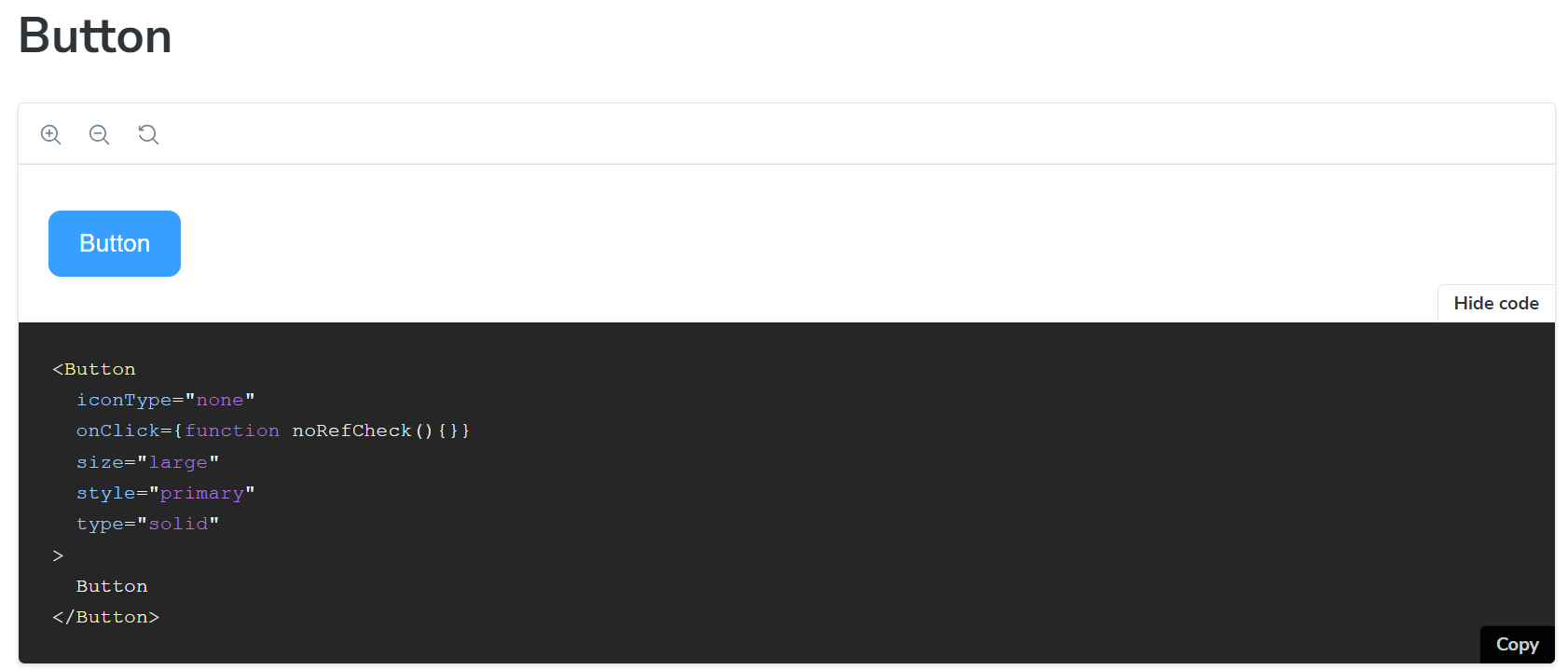
Go to [playground](https://geetork.github.io/geetork-lib/?path=/docs/button--docs) to see all available properties for the button component. 
Downloads
4
Readme
React UI Button component
Go to playground to see all available properties for the button component.
Install
npm i geetork-libImport example
import { Button } from geetork-libCustom properties
| Propery | Values | | --- | --- | | type | 'solid' | 'outline' | 'soft' | 'ghost'| | size | 'smaill' | 'medium' | 'large' | | style | 'primary' | 'secondary' | 'danger' | | iconType | 'none' | 'leading' | 'trailing' | 'leadingTrailer' | 'standalone'| | disabled | true | false | | onClick | () => void |
Component supports both dark and light themes.
