
fly-select
v1.4.0
Published
Customizable select component for Angular 6
Downloads
29
Maintainers
 idge
idgeReadme
Fly Select
Fly Select is a customizable select component for Angular 6+. Used for displaying options and groups of options with default minimalistic design.
Contents
- Installing
- Simple usage
- Custom Option Templates
- Groups
- Reactive Forms
- Styling
- Inputs
- Outputs
- Directives
- Keyboard Events
Installing
Install the package from npm:
npm i fly-select --saveSimple usage
Add the FlySelectModule in the imports array in AppModule:
import {FlySelectModule} from 'fly-select';Add the fly-select component in your component:
<fly-select
    [data]="data">
</fly-select>
Add the data array in you component class:
const data = [
    {
        label: 'Tony Stark',
        value: 'ironman'
    },
    {
        label: 'Bruce Wayne',
        value: 'batman'
    },
    {
        label: 'Clark Kent',
        value: 'superman'
    }
];
The basic data structure (obecjts in the array must have label and value properites) looks like the above example, but you can use a different structure. If your data don't have label nad value properties, there is no need to transform the data to the previous structure. In this case you specify two additioanl inputs (labelProperty, valueProperty) on the component:
<fly-select
    [data]="data"
    [labelProperty]="'name'"
    [valueProperty]="'id'">
</fly-select>
const data = [
{
id: 1,
name: 'Tony Stark',
alias: 'Ironman',
company: 'Stark Industries',
avatar: 'https://cdn0.iconfinder.com/data/icons/superhero-2/256/Ironman-512.png'
}
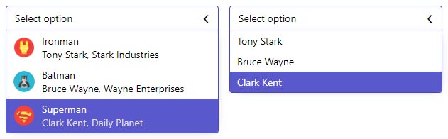
];Custom Option Templates
You can customize the options by adding template inside the fly-select component with the directive flySelectItemBody, you can use the data inside the template if you create option (which will contain the original data under the property original) varaible:
<fly-select
    [data]="data"
    [labelProperty]="'name'"
    [valueProperty]="'id'">
    <ng-template let-option="option" flySelectItemBody>
        <div class="hero-card">
            <div class="image" [style.backgroundImage]="'url(' + option.original.avatar + ')'"></div>

            <div class="info">
                <div class="alias">{{option.original.alias}}</div>
                <div class="name-copmany">{{option.original.name}}, {{option.original.company}}</div>
            </div>
        </div>
    </ng-template>
</fly-select>
Groups
Fly Select support option groups, the data structure is different from previous examples. Group objects must contain groupLabel and groupOptions properties or two additional inputs (groupLabelProperty, groupOptionsProperty) to be specified on the component.
groups = [
    {
        groupLabel: 'Marvel',
        avatar: 'https://cdn3.iconfinder.com/data/icons/movie-company/129/MARVEL.png',
        groupOptions: [
            {
                  id: 1,
                  name: 'Tony Stark',
                  alias: 'Ironman',
                  gender: 'Male',
                  company: 'Stark Industries',
                  avatar: 'https://cdn0.iconfinder.com/data/icons/superhero-2/256/Ironman-512.png'
            }
        ]
    }
];
You can also change the body of the group label by adding template inside fly-select component with directive flySelectGroupBody. You can access the group data by creating group variable in the template, if your data objects have more properties they will be moved in the groupOriginal.
<form [formGroup]="formOne">
    <fly-select
      [data]="groups"
      [labelProperty]="'name'"
      [valueProperty]="'id'">
        <ng-template let-group="group" flySelectGroupBody>
            <div class="universe-card">
                <div class="image" [style.backgroundImage]="'url(' + group.groupOriginal.avatar + ')'"></div>

                <div class="info">{{group.groupLabel}}</div>
            </div>
        </ng-template>

        <ng-template let-option="option" flySelectItemBody>...</ng-template>
    </fly-select>
</form>
Reactive Forms
You can use the component with reactive forms:
form = new FormGroup({
    hero: new FormControl('', [Validators.required])
});
<fly-select
[data]="data"
[formControlName]="'hero'">
</fly-select>If you want to set a default value, lets say you want Superman to be selected on component init:
ngOnInit() {
  this.form.get('hero').setValue(this.data[2]);
}
Styling
You can style the select to your need, just set the input style to false on the component and you are good to go. Useful css classes for stying:
- .fly-select-head-wrapper (have :hover)
- .fly-select-body-wrapper
- .fly-select-option-wrapper
- .fly-select-group-wrapper
- .fly-select-group-label
Added classes after some event:
- fly-select.host-focus
- .fly-select-wrapper.open
- .fly-select-head-wrapper.disabled
- .fly-select-option-wrapper.highlight
Inputs
| Input | Type | Description | | ------ | ------ | ------ | | data | Array | Data of the options or the groups | | placeholder | string | Custom text to show when no option is selected | | labelProperty | string | Property to get the option label from | | valueProperty | string | Property to get the option value from | | groupLabelProperty | string | Property to get the group label value from | | groupOptionsProperty | string | Property to get the group options from | | style | boolean | Switch component styling |
Outputs
| Output | Type | Description | | ------ | ------ | ------ | | selected | EventEmitter | Emitted when option is selected |
Directives
| Directive Name | Description | | ------ | ------ | | flySelectGroupBody | Use it for customizing the groups template | | flySelectItemBody | Use it for customizing the options template |
Keyboard events
Keyboard events are available for esc, enter, arrowup, arrowdown.
| Key | Description | | ------ | ------ | | Esc | Close the select if opened | | Enter | Select option from the select if highlighted | | ArrowUp/ArrowDown | Navigate through the options |