
fitx-form
v1.0.12
Published
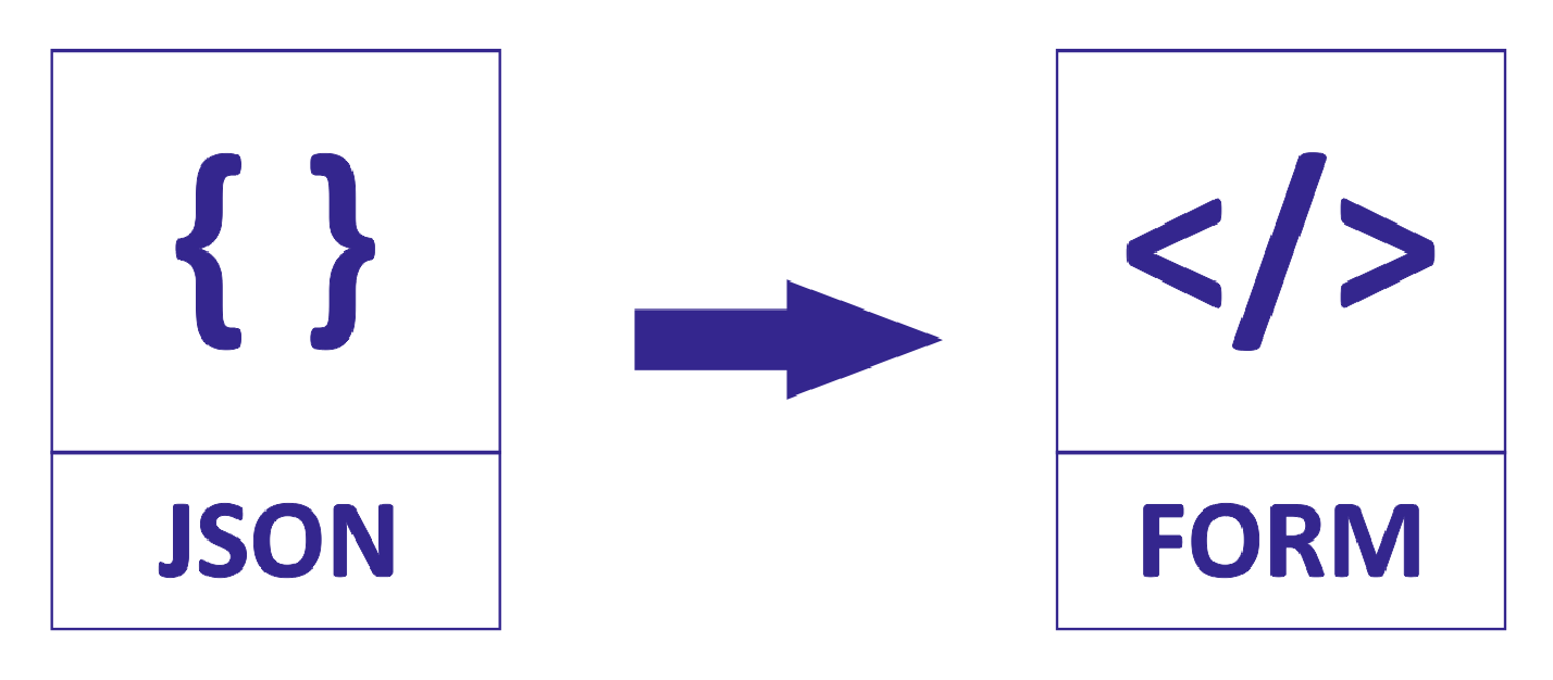
JSON controlled responsive react form
Downloads
46

Readme
A responsive React form for various input types controlled by a JSON component for faster and easier web development.


Installation
fitx-form is available as an npm package.
// with npm
npm install fitx-form

// with yarn
yarn add fitx-form
Please note that @next will only point to pre-releases; to get the latest stable release use @latest instead.
Usage
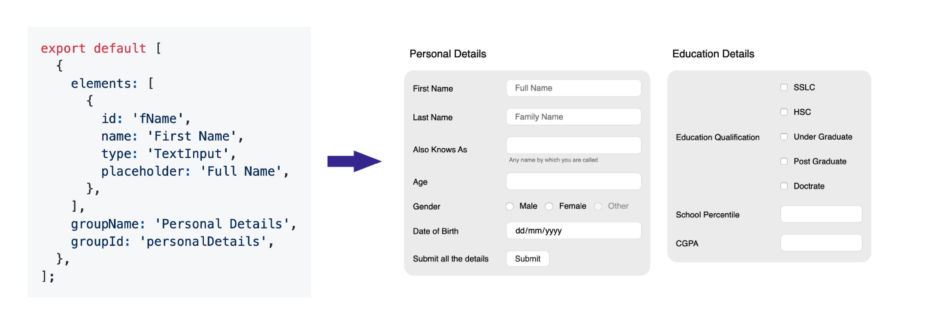
constants.js
export default [
  {
    elements: [
      {
        id: 'fName',
        name: 'First Name',
        type: 'TextInput',
        placeholder: 'Full Name',
      },
    ],
    groupName: 'Personal Details',
    groupId: 'personalDetails',
  },
];
Here is a quick example to get you started, it's all you need:
import React from 'react';
import ReactDOM from 'react-dom';
import FitxForm from 'fitx-form';
import * as R from 'ramda';
import * as Constants from './constants';

function App() {
  return (
    <FitxForm
      metaData={Constants.metaData}
    />
  );
}

ReactDOM.render(<App />, document.querySelector('#app'));
Full working exapmle with handlers is given in the Example section
Documentation
FitxForm Props
| Props | Type | Description |
|-----------|:-----------|:-----------|
| formValues | object | The value object |
| metaData | array | Array of the components |
| onChange | func | On Change event |
| onClick | func | On Click event |
| columns | number | Number of columns to be displayed |
Component Props
| Props | Type | Description |
|-----------|:-----------|:-----------|
| allowClear | bool | Enables date clear button |
| defaultValue | Based on the type | Default value for the field, Triggers onChange when component renders |
| disabled | bool | Mark the element to be disabled |
| displayName | string | Display text of ButtonInput |
| emptyOption | bool | Display empty option in SelectInput as placeHolder |
| error | bool | Show the error container and display errorText |
| errorText | string | String to be displayed in the error container |
| helperText | string | String to be displayed as a helper text in error container |
| max | number | The max input for Number and Date |
| maxLength | number | Max length of the input in chars |
| min | number | The min input for Number and Date |
| onClick | func | Triggers on a ButtonInput click () => (groupId, elementId) |
| onChange | func | Triggers on a value change () => (groupId, elementId, value) |
| onSelect | func | Triggers on a value select () => (groupId, elementId, value) |
| options | array | List of options as { label, value, disabled} |
| options.label | string | The display name of the option |
| options.value | string | The id of the option |
| options.disabled | bool | Disables the option |
| placeholder | string | String to be displayed as a placeholder |
| readOnly | bool | Marks the field as read only |
| regex | regexp | Regex for input value -> error is true if regex fails |
| spellCheck | bool | Enables native spell check in text inputs |
| value | string | The value to be hardcoded |
| type | ButtonInput, CheckboxInput, DateInput, RadioInput, SelectInput, TextInput| The Component Type |
| subType | string | Sub type of available components |
Example
Full Working Example
import React, { useState } from 'react';
import ReactDOM from 'react-dom';
import FitxForm from 'fitx-form';
import * as R from 'ramda';
import * as Constants from './constants';

function App() {
  const [values, setValues] = useState({});
  const onFormValuesChange = (groupId, elementId, value) => {
    const lensProp = R.lensPath([groupId, elementId]);
    const newValue = R.set(lensProp, value, { ...values });
    setValues(newValue);
  };
  const onFormElementClick = (groupId, elementId) => {
    let query = `${groupId} ${elementId}`;
    switch (query) {
      case 'personalDetails submit':
        onPartySave();
        break;
      default: {
        query = '';
      }
    }
  };
  return (
    <FitxForm
      formValues={values}
      metaData={Constants.metaData}
      onChange={onFormValuesChange}
      onClick={onFormElementClick}
      columns={2}
    />
  );
}

ReactDOM.render(<App />, document.querySelector('#app'));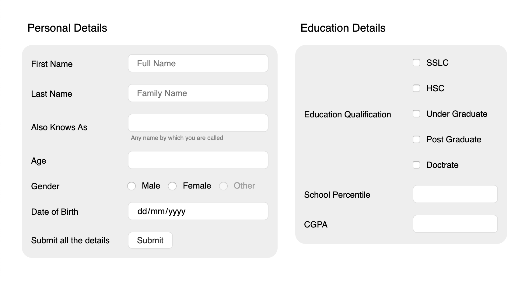
Changelog
Recently Updated? Please read the changelog.
Roadmap
- To Add custom themes
- Make is more backward compactible
Author
Balkishan S
License
This project is licensed under the terms of the MIT license.