
ffp-carousel
v0.0.3
Published
FFP Carousel is an Angular library that provides a simple and customizable carousel component for displaying slides with images and content. Can be used as informative banner of application

Readme
FFP-Carousel Library
FFP Carousel is an Angular library that provides a simple and customizable carousel component for displaying slides with images and content. Can be used as informative banner of application
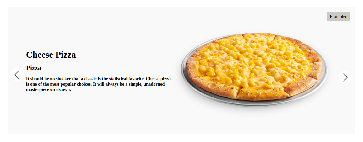
Example
Features
- Carousel component to display a collection of slides with images and content
- Previous and Next navigation buttons for manual slide control
- Auto-play functionality for continuous sliding
- Customizable slide content and appearance
Installation
To use FFP Carousel in your Angular project, you can install it via npm:
npm install ffp-carousel --saveUsage
Import Module
Import the FfpCarouselModule into your Angular module:
import { FfpCarouselModule } from 'ffp-carousel';

@NgModule({
  imports: [
    // Other imports
    FfpCarouselModule
  ],
  // Other declarations, providers, etc.
})
export class YourModule { }
Use the Component
Use the component in your templates to display the carousel:
<div class="carousel-wrapper">
  <ffp-carousel [slides]="slides"
                [height]="'450px'"
                [backgroundColor]="'#f9f9f9'"
                [autoPlay]="true">
  </ffp-carousel>
</div>- slides: An array of SlideModel objects (refer to SlideModel interface below) to display in the carousel.
- height: Height of the carousel (optional).
- backgroundColor: Background color of the carousel (optional).
- autoPlay: Boolean flag to enable/disable auto-play (optional).
SlideModel Interface
The SlideModel interface represents the structure of each slide:
 const slideModel = {
      title: 'Cheeseburger',
      subtitle: 'Burger',
      description: 'A cheeseburger is a hamburger topped with cheese. Traditionally, the slice of cheese is placed on top of the meat patty. The cheese is usually added to the cooking hamburger patty shortly before serving, which allows the cheese to melt. Cheeseburgers can include variations in structure, ingredients and composition. As with other hamburgers, a cheeseburger may include toppings such as lettuce, tomato, onion, pickles, bacon, mayonnaise, ketchup, and mustard.',
      imageUrl: 'https:/exampleimage.png'
} as SlideModel;- title: Title of the slide.
- subtitle: Optional subtitle of the slide.
- description: Optional description/content of the slide.
- label: Optional label for the slide.
- imageUrl: URL of the image to be displayed in the slide.
- expandedObject: Optional additional data for expansion.
Customization
You can customize the carousel appearance by overriding the provided SCSS styles or by passing additional parameters to the component.
Repository
Find the source code and contribute to this library on GitHub repository.