f-layout
v1.0.15
Published
An easy to use alternative to grid layouts. A family of composable CSS classes designed to quickly enable flexbox based layout on IE 11+, Edge, Chrome, Firefox and Safari browsers.
Downloads
51
Readme
f-layout CSS layout system
f-layout is an easy to use alternative to grid layouts. A family of composable CSS classes designed to quickly enable responsive flexbox-based layout on IE 11+, Edge, Chrome, Firefox and Safari browsers.
Using CSS for laying out pages has always been tricky and before CSS3 was done mainly by misusing CSS features in order to get the job done. The idea behind f-layout is use modern CSS (now well supported in browsers) to create a small set of easily learned classes to enable web designers to build layouts quickly.
It uses the flexbox CSS model but tries to avoid complexity by surfacing only its most useful features and to have sensible defaults to make layout building as simple as possible.
Here's a simple example:
<div class="toolbar f-row f-middle f-padding">
  <i class="material-icons">menu</i>
  <strong class="f-grow">Welcome to f-layout </strong>
  <i class="material-icons">email</i>
  <img style="width:56px;height:56px;border-radius:50%;"
      src="https://s.gravatar.com/avatar/f850593bdae3cb1c8c535b4acfdfdb98?s=80">
</div>
and this is what it looks like:

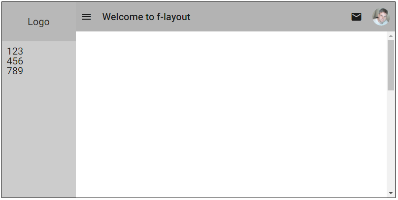
Here's a reasonably complicated example:
<div class="f-row f-stretch">
  <div class="f-hide-s f-column f-stretch f-padding">
    <div class="f-row f-center" style="height:80px;">
      Logo
    </div>
    <div class="f-grow">
      <div>123</div>
      <div>456</div>
      <div>789</div>
    </div>
  </div>
  <div class="f-column f-stretch f-grow">
    <div class="f-row f-padding">
      <i class="material-icons">menu</i>
      <strong class="f-grow">Welcome to f-layout </strong>
      <i class="material-icons">email</i>
      <img style="width:56px;height:56px;border-radius:50%;"
          src="https://s.gravatar.com/avatar/f850593bdae3cb1c8c535b4acfdfdb98?s=80">
    </div>
    <div class="f-grow" style="overflow-y:auto">
      <div style="height:1000px;">
      </div>
    </div>
  </div>
</div>
which looks like this:

In f-layout, all layout is either in a row or a column or a nested combination. Flow is from left to right, top to bottom.
For element alignment, it follows CSS conventions of using terms like "left", "right", "top" and "bottom". It also uses the term "center" to denote horizontal centering as opposed to "middle" for vertical centering.
Elements can be hidden or shown and reordered. All of the features of f-layout can be applied responsively so as to deal with different device screen widths.
All classes can be suffixed with s, m or l and these suffixes correspond to screen width break points:
Installing
Using Npm
npm install f-layout --saveAdd this tag to your html:
<link href="node_modules/f-layout/dist/f-layout.min.css" rel="stylesheet">Using Bower
bower install f-layout --saveAdd this tag to your html:
<link href="bower_components/f-layout/dist/f-layout.min.css" rel="stylesheet">Documentation
Go here to read the f-layout documentation.
