
elishaya-react-modal-lib
v1.0.18
Published
A modal lib component for React
Downloads
3

Readme
Modal React
elishaya-react-modal-lib is a React modal component library created to provide reusable modal component for your React projects.
Installation
You can install the library via npm:
npm install elishaya-react-modal-libPrerequisites
To use elishaya-react-modal-lib, you will need to have Node.js installed on your system. The minimum required version is Node.js version 12.x or higher.
This library has been developed and tested with Node.js version 20. While it should work correctly with compatible versions, compatibility with other versions of Node.js has not been formally tested.
Usage/Examples
<Modal
    isOpen={isOpen}
    onClose={handleClose}
    title='Modal Title'
    message='This is a custom modal'
    buttonMsg='Close'
    iconColor='#5c469b'
    btnTextColor='white'
    btnBgColor='#5c469b'
    styleIcon='check'
    btnBorderRadius='50px'
    modalBorderRadius='15px'
    gapContent={10}
/>
import { useState } from 'react'
import { Modal } from 'elishaya-react-modal-lib'
function App() {
const [isOpen, setIsOpen] = useState(false)
const handleOpen = () => {
setIsOpen(true)
}
const handleClose = () => {
setIsOpen(false)
}
return (
<div className='App'>
<button onClick={handleOpen}>Open Modal</button>
<Modal
isOpen={isOpen}
onClose={handleClose}
title='Modal Title'
message='This is a custom modal'
buttonMsg='Close'
iconColor='#5c469b'
btnTextColor='white'
btnBgColor='#5c469b'
styleIcon='check'
btnBorderRadius='50px'
modalBorderRadius='15px'
gapContent={10}
/>
</div>
)
}
export default AppProperties
| Prop | Type | Description | | ------- | -------- | ------------------------------------------------------------------------------------------------- | | isOpen | boolean | Indicates whether the modal is open or closed.| | onClose | function | Callback to close the modal component | | title | string | Title displayed in the modal header. | | message | string | Content message displayed in the body of the modal. | | buttonMsg | string | Text displayed on the modal's action button. | | gapContent | number | Space between content. | | styleIcon | string | Style of the icon displayed in the modal. Possible values are "check", "error", or "none". | | iconColor | string | Color of the icon displayed in the modal. | | btnTextColor | string | Text color of the modal's action button. | | btnBgColor | string | Background color of the modal's action button. | | btnBorderRadius | string | Border radius of the modal's action button. Possible values are "0px", "5px", "10px", "15px", or "50px". | | modalBorderRadius | string | Border radius of the modal itself. Possible values are "0px", "5px", "10px", "15px", or "50px". |
Screenshots
| Modal | Error Modal |
|-------|-------------|
| 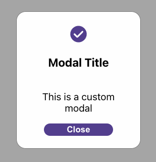 |
| 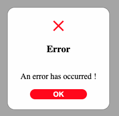 |
|
Tech Stack
Client: React, TypeScript
Demo
License
Distributed under MIT license.