dynamic-pie-chart
v1.4.2
Published
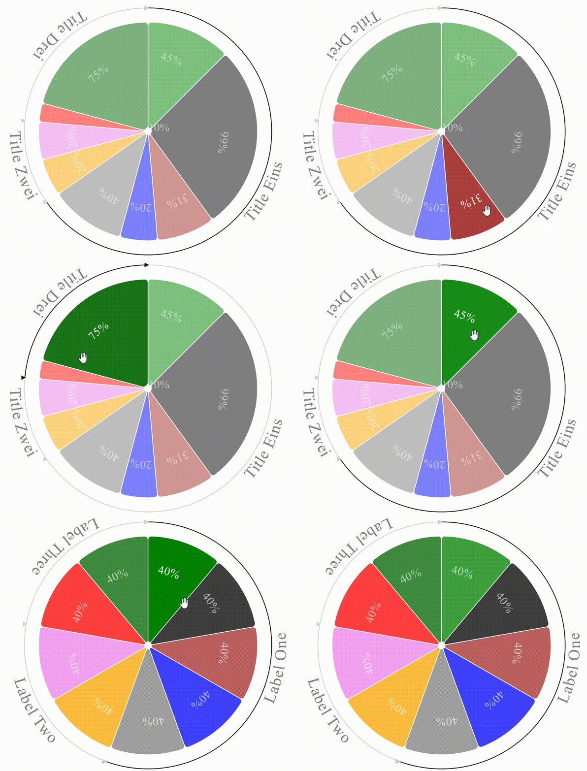
This library provides a dynamic pie chart, i.e. a sector diagram widget, which is linked to a dynamic source, and available for user interaction. Each sector can be activated, or selected with the mouse pointer.
Downloads
54
Maintainers
Readme
The Dynamic Pie Chart
This library provides a dynamic pie chart, i.e. a sector diagram widget, which is linked to a dynamic source, and available for user interaction. Each sector can be activated, or selected with the mouse pointer.
A sample usage of this library can be previewed (and admired) in the Fitzhì solution.

- The release 1.1.x is associated with Angular 9.
- The release 1.2.x is associated with Angular 10.
- The release 1.3.x is associated with Angular 11.
- The release 1.4.x is associated with Angular 12.
Installing this library in your project ?
The most simple command npm install dynamic-pie-chart will install this library
To import the module inside your application, just add the module DynamicPieChartModule in your app.module.ts.
location :
import {DynamicPieChartModule} from 'dynamic-pie-chart';
2 mock files are provided for testing purpose. Each one is containing a sample array of slices :
- MockSlicesOne
- MockSlicesTwo
Using this library in your application ?
To include this component into a container, you just have to declare this section into the HTML template.
<lib-dynamic-pie-chart
	[pie]=1
	[radius]=150
	[active]=true
	[legend]=legend
	[slices$]=slices$
	[filteredSlices$]=filteredSlices$
	[typeSlices$]=typeSlices$
	(selected)="sliceSelection($event)"
	(activated)="sliceActivation($event)">
</lib-dynamic-pie-chart>
The parameters are :
Parameter | Decorator | Comment
------------ | ------------- | -------------
pie | INPUT | the pie identifier inside the container. There can be multiple pies in the same component. Each pie must have a unique pie.
radius | INPUT | the radius of the Pie in pixel.
active | INPUT | Does this pie have to be active, or not ? A pie is a set of slices. An active pie allows each slice to be activated, or selected, by the mouse cursor.
legend | INPUT | true or false. Does this pie has a legend ? In this current release (1.0.0), the legend is a circle with lebel surrounding the pie.
slices$ | INPUT | an observable which publishes an array of slices to be drawn. Each sector diagram is made up of pieces, from various angles, and whose sum is equal to 360. (This widget supports a sum of tranches lower than 360). This array will be internally sorted on the type property to provide a legend.
filteredSlices$ | INPUT | an OPTIONAL observable which broadcasts an array of slices to be filtered on the chart.
typeSlices$ | INPUT | an observable which publishes an array of type of slices. the array ol slices
selected | OUTPUT | an EventEmitter to inform the parent component that a slice has been activated
activated | OUTPUT | an EventEmitter to inform the parent component that a slice has been selected
What is a slice ?
For the component, the pie is an array of slices.
A slice is a piece of pie.
Property | type | Comment
------------ | ------------- | -------------
id | number | the identifier of the slice, un unique number per pie
type | number | the type of slice
angle | number | the angle of this slice in degree
offset | number | the offset (in degrees) of this slice within the pie. This property is there for internal use. Its value will be processed by the component.
backgroundColor | string | the background color of this slice
textColor | string | the color of the 'numeric' value associated to slice
textFontSize | string | the font size attributed to this value
data | any | the data object associated to this child.
children | array of any | an array of data which can be considered as the children linked to this slice
activated | boolean | true or false if this slice is activated (the end-user has moved the mouse on it)
selected | boolean | true or false if this slice is selected (the end-user has clicked on it)
What is a type of slice ?
A type of slices is a reference table of legend.

