
dvalert
v1.0.5
Published
'DvAlert' is a custom alert box built with JavaScript. It allows developers to create custom alert messages with a variety of options, including custom titles and types (e.g. success, error, warning, info, simple alert,conform box , input box). DvAlert is
Downloads
6
Maintainers
 mygift2018
Readme
DvAlert
"DvAlert" is a custom alert box built with JavaScript. It allows developers to create custom alert messages with a variety of options, including custom titles and types (e.g. success, err, warning, info, simple alert,confirm box , input box). "DvAlert" is easy to use and can be easily integrated into any project that requires custom alert messages.
Features
- Light Weight
- Beautiful designing
- NO Extra dependency
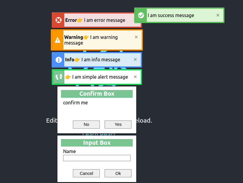
Type
- Success message
- warning message
- Error message
- Info message
- Alert message
- Confirm box
- Input box
supporting
- React js
- vue js
- Electron js
- Next js
Screenshots
Installation
Install dvalert with npm
npm install dvalert
Usage/Examples
// CommonJS modules

const {success,err,warning,info,alert,confirm,input} = require('dvalert');
or
const dvalert = require('dvalert');

    // ES6 module

import {success,err,warning,info,alert,confirm,input} from 'dvalert';
or
import dvalert from "dvalert";


success('I am success message'); // auto hide 2 second

err('I am error message');

// with callback
err('I am error message with callback',(e)=>{

// when close button clicked return always true

console.log(e);
});


warning('I am warning message ');

// with callback
warning('I am warning message with callback',(e)=>{

// when close button clicked return always true

console.log(e);
});


info('I am info message');

// with callback
info('I am info message with callback',(e)=>{

// when close button clicked return always true

console.log(e);
});


alert('I am simple alert message ');

// with callback
alert('I am simple alert message with callback',(e)=>{

// when close button clicked return always true

console.log(e);
});


confirm({text:'confirm me'},(e)=>{
// return true or false
console.log(e);

});


input({lable:'Name'},(name)=>{

// return input value
console.log(name);

// if input box cancel return ''
});


/*
 confirm box accept first parameter
 {
    title: "",
    titleColor: "",
    titleBg: "",
    text: "",
    confirmButtonText: "",
    cancelButtonText: ""
  }


 input box accept first parameter
 {
    title: "",
    titleColor: "",
    titleBg: "",
    lable: "",
    value: "",
    confirmButtonText: "",
    cancelButtonText: ""
  }

*/
Contributing
We welcome contributions to this project! If you have an idea for a new feature or find a bug, please open an issue or submit a pull request.