directus-extension-theme-clean-compact-light
v0.2.0
Published
CleanCompactLight is a minimalist Directus theme that enhances UI compactness and component clarity, based on the default light theme.
Downloads
80
Maintainers
Readme
Clean Compact Light Theme for Directus
CleanCompactLight is a minimalist Directus theme that enhances UI compactness and component clarity, based on the default light theme.

List of Principal Changes
Basic Settings:
- Input field height reduced to 20px
- Padding is reduced
- Gap between elements is reduced
- Borders are set to 1px with a radius of 5px (these can be changed in the theme editor)
Custom Style:
- Various fixes due to the input size reduction
- Reduced global font size
- Reduced title font size
- Reduced button size
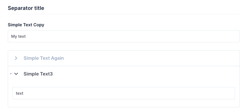
- Groups and Accordions wrap all items with a border
- Separator title font size is reduced
Bugs
This theme is under development. You may see artifacts or alignment issues.
You can report them, and I will look into fixing them.
Examples:
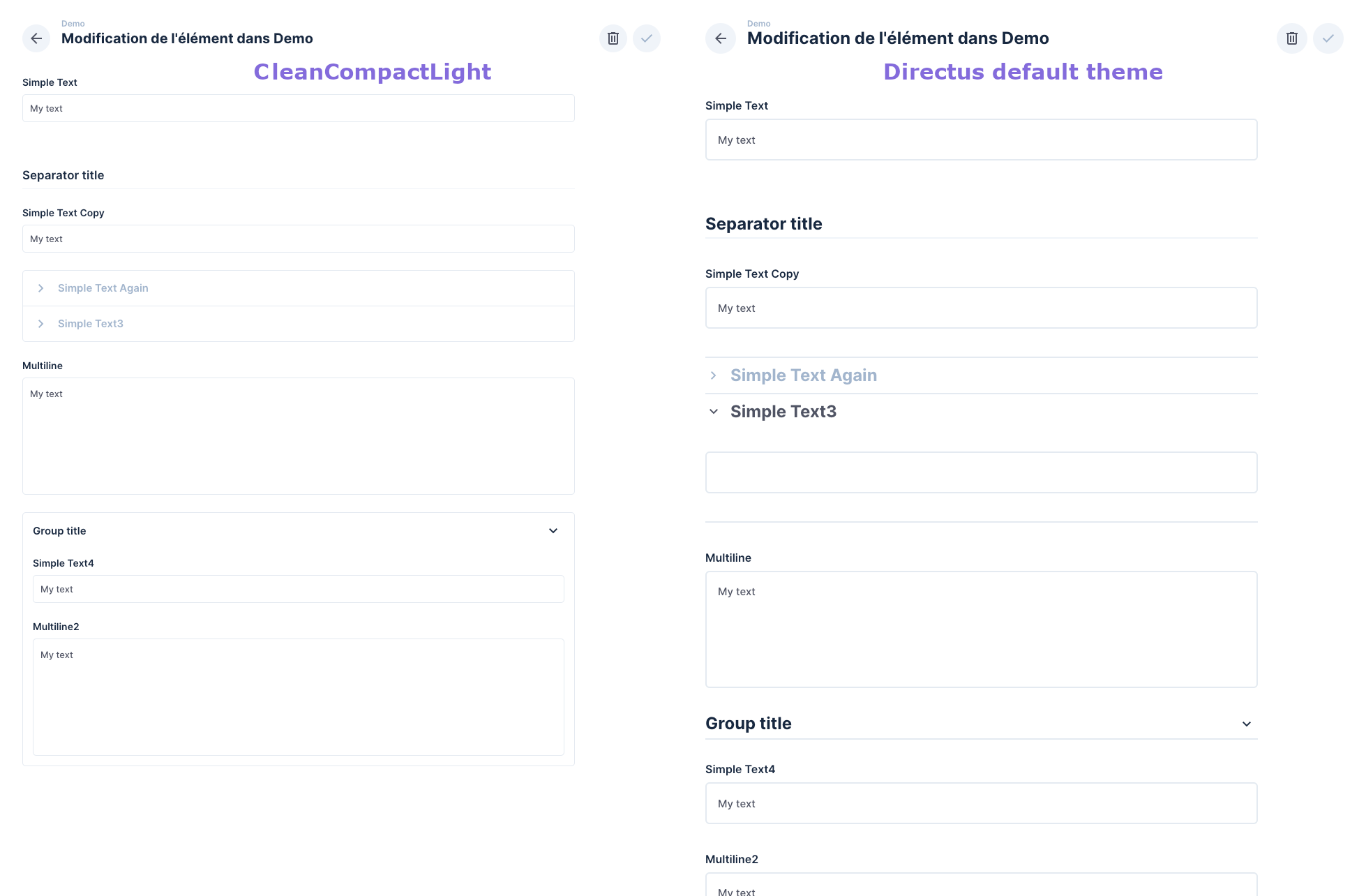
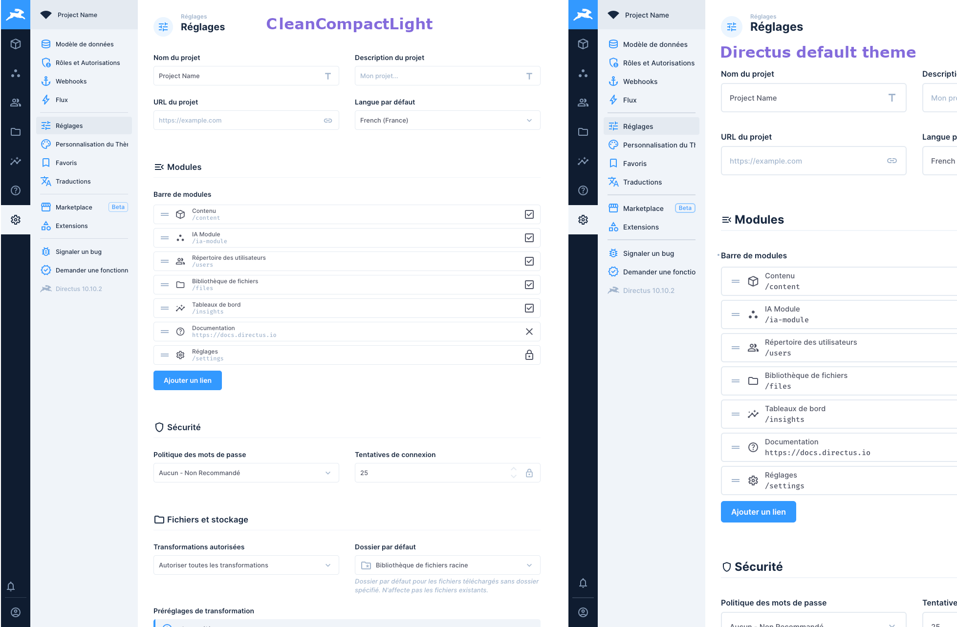
These screenshots were taken at a high resolution. Open them at full size to see the real text size.
Example 1: A Basic Form with Accordion, Group, and Separator Fields
- You see more on one screen.
- The Accordion is more beautiful and doesn't look like the separator field.
- Group fields are based on the accordion, with a clear distinction between fields outside and inside the group. All fields are wrapped with a border line.

Example 2: The Settings Page
- You see more on one screen.
- All elements are smaller, but not too much.

