
datepicker-custom-react
v2.1.5
Published
Customizable datepicker for react
Downloads
4

Readme
Module Description
This module allows you to integrate a customizable datepicker into your React projects. It utilizes an internal reducer and has no specific dependencies.
Module Installation
In a REACT project, you can add it via :
npm i datepicker-custom-react
Module Usage
You can add the component using:
import {Datepicker} from "datepicker-custom-react"List of Props
| Property | Description | Required | |-----------------------|---------------------------------------------------------|------------| | setChoice | A function for setting a useState | Yes | | date | A JavaScript Date object | No | | userGlobalConfig | Global configuration objects | No | | userHeaderConfig | Header configuration objects | No | | userCalendarConfig | Calendar configuration objects | No | | userInputConfig | User input configuration objects | No |
Configuration globalConfig :
- globalContainerClassName: class of the container containing the entire datepicker.
- datepickerLang: FR or EN
- iconCalendarClassName: class of the calendar icon.
- iconCalendar: A React Node that allows for modularity (button, image, etc.).
- iconCalendarHidden: boolean
- inputAndIconContainerClassName: class of the container containing the input and the icon.
Configuration headerConfig
- headerClassName: Class of the header within the calendar container.
- headerPreviousButtonClassName: Class of the previous button.
- headerPreviousButtonText: Text of the previous button.
- headerNextButtonClassName: Class of the next button.
- headerNextButtonText: Text of the next button.
- headerResetButtonClassName: Class of the reset button.
- headerResetButtonText: Text of the reset button.
- selectYearClassName: Class of the year selection input.
- selectYearGapBefore: Number of years before the component's passed year for year selection.
- selectYearGapAfter: Number of years after the component's passed year for year selection.
- selectYearHidden: boolean to show or hide the year selection.
- resetButtonClassName: Class of the reset button.
- resetButtonText: Text of the reset button.
- resetButtonHidden: boolean to show or hide the reset button.
Configuration CalendarConfigType
- calendarTableClassName: Class of the main calendar table.
- theadContent: FL for first letter, TL for three letters, FW for full word.
- calendarPreviousMonthDayClassName: Class for different days displayed from the previous month.
- calendarNextMonthDayClassName: Class for different days displayed from the next month.
- calendarCurrentMonthDayClassName: Class for different days displayed from the current month.
InputConfigType
- inputClassName: Class of the input provided by the component.
- errorFormatMessage: Error message in case of incorrect date input by the user.
- errorFormatContainerClass: Class of the container for the error message.
- regexDateFR | US | CustomRegex: Regular expressions to detect the date input by the user.
- characterSplitDate: Character used to decompose the date.
- openCalendar: Boolean managing whether the calendar opens or not when the input is focused.
- labelText: Label text for the input.
Exemple
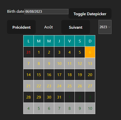
      <Datepicker
        date={new Date()}
        setChoice={setChoice}
        userHeaderConfig={{
          selectYearHidden: false,
          selectYearGapBefore: 15,
          selectYearGapAfter: 15,
        }}
        userGlobalConfig={
          {
            datepickerLang: "FR"
          }
        }

        userInputConfig={
          {
            labelText: "Birth date"
          }
        }

      />
Licence
You are free to use this component. If you encounter any issues, please feel free to post an issue on GitHub.
Description du module.
Ce module permet d'avoir un datepicker dont le style est modifiable en CSS. Ce composant react utilise un reducer et n'a pas de dépendance particulière.
Installation du module
Dans un projet REACT vous pouvez l'ajouter via
npm i datepicker-custom-react
Utilisation du module
Vous pouvez ajouter le composant via un :
import {Datepicker} from "datepicker-custom-react"Liste des props
| Propriété | Description | Requis | |-----------------------|---------------------------------------------------------|------------| | setChoice | Une fonction pour définir un useState | Oui | | date | Un objet Date JavaScript | Non | | userGlobalConfig | Objets de configuration globale | Non | | userHeaderConfig | Objets de configuration de l'en-tête | Non | | userCalendarConfig | Objets de configuration du calendrier | Non | | userInputConfig | Objets de configuration de l'entrée utilisateur | Non |
Configuration globalConfig :
- globalContainerClassName : classe du bloc contenant l'ensemble du datepicker.
- datepickerLang : FR ou EN
- iconCalendarClassName : classe de l'icone du calendrier
- iconCalendar : Node REACT permettant d'être modulable (bouton, image,etc...).
- iconCalendarHidden : boolean
- inputAndIconContainerClassName : classe du bloc contenant l'input et l'icône.
Configuration headerConfig
- headerClassName : Classe du header du bloc contenant le calendrier.
- headerPreviousButtonClassName : Classe du bouton précédent.
- headerPreviousButtonText : Texte du bouton précédent.
- headerNextButtonClassName : Classe du bouton suivant.
- headerNextButtonText : Texte du bouton suivant.
- headerResetButtonClassName : Classe du bouton reset.
- headerResetButtonText : Texte du bouton reset.
- selectYearClassName : Classe de l'input de sélection de l'année.
- selectYearGapBefore : nombre d'année précédent l'année passée en props du composant pour la sélection de l'année.
- selectYearGapAfter : nombre d'année suivant l'année passée en props du composant pour la sélection de l'année.
- selectYearHidden : boolean pour la présence ou non de la sélection d'année.
- resetButtonClassName : Classe du bouton reset.
- resetButtonText : Texte du bouton de reset
- resetButtonHidden : Boolean pour afficher ou non le bouton reset.
Configuration CalendarConfigType
- calendarTableClassName : Classe du tableau principal.
- theadContent : FL pour la première lettre, TL pour trois lettres, FW pour le mot en entier.
- calendarPreviousMonthDayClassName:classe des différents jours affichés.
- calendarNextMonthDayClassName: classe des différents jours affichés.
- calendarCurrentMonthDayClassName: classe des différents jours affichés.
InputConfigType
- inputClassName : Classe de l'input proposé par le composant.
- errorFormatMessage : Message d'erreur en cas de date incorrecte saisie par l'utilisateur.
- errorFormatContainerClass : Classe du bloc contenant le message d'erreur.
- **regexDateFR | US | CustomRegex **: Regex pour détecter la date saisie par l'utilisateur.
- characterSplitDate : Caractère utilisé pour décomposé la date.
- openCalendar : Boolean gérant lorsque l'input est focus, ouvrant ou non le calendrier.
- labelText : Texte du label pour l'input.
Exemple
      <Datepicker
        date={new Date()}
        setChoice={setChoice}
        userHeaderConfig={{
          selectYearHidden: false,
          selectYearGapBefore: 15,
          selectYearGapAfter: 15,
        }}
        userGlobalConfig={
          {
            datepickerLang: "FR"
          }
        }

        userInputConfig={
          {
            labelText: "Birth date"
          }
        }

      />
Licence
Vous pouvez utilisez librement ce composant. En cas de soucis n'hésitez pas à poster une issue sur github.