date-of-birth-js-fork
v1.0.1
Published
A datepicker specific for date of birth
Downloads
1
Maintainers
Readme
Date-of-birth JS

A datepicker specific for collecting date of birth with straight forward user interface. Bundle size 6.9kB gzipped (Source: Bundlephobia).
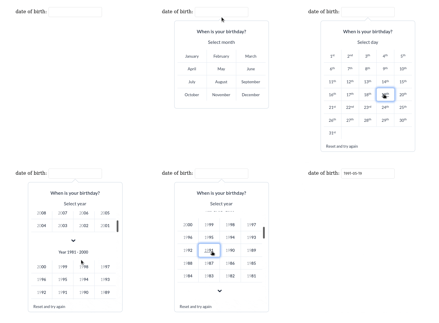
Clicking unintuitive datepicker 15 times just to get your date of birth is kinda annoying, right? With this package you only need 4 click to get your date of birth.
Tl;dr feature
- Responsive
- Popup mode (if opted-in)
- Basic validation (if opted-in)
- You can change the text to other language
- Basic keyboard navigation Tab, Esc, Enter, and Shift+Tab
- Customizable date format
Manual installation
Include stylesheet to head tag
Include date-of-birth-js.min.css in the <head> tag:
<head>
	...
	<link rel="stylesheet" href="date-of-birth-js.min.css">
	<!-- Or remotely via Unpkg CDN -->
	<link rel="stylesheet" href="https://unpkg.com/date-of-birth-js@^2/dist/css/date-of-birth-js.min.css">
</head>
Include JS library
and include date-of-birth-js.min.js just above your closing </body> tag
<body>
	  ...
	  <script src="date-of-birth-js.min.js"></script>
	  <!-- Or remotely via Unpkg CDN -->
	  <script src="https://unpkg.com/date-of-birth-js@^2/dist/js/date-of-birth-js.min.js"></script>
</body>
If you downloaded the package via zip file from Github, these files are located in the dist folder. Otherwise, you can use the Unpkg CDN as shown in the examples above.
Installation Via NPM
Install via NPM
npm i date-of-birth-jsImport JS library to your project
ES6 module:
import dobDatepicker from 'date-of-birth-js'Or, Common JS:
const dobDatepicker = require('date-of-birth-js')Import stylesheets to your project
Import SCSS to your projects
@import '~js-date-of-birth/src/stylesheet/main'Import CSS file to your projects
@import '~js-date-of-birth/dist/css/date-of-birth-js.min.css'How to use it in your code
const dob = dobDatepicker(selector, options)So what are selector and options arguments?
Selectoris the element you want the datepicker mounted to. As recommendation, use<input>element withtextattribute.Selectorcan receive :String- CSS selector such as'#my-id','.my-class','div', etc. Or,DOM Node- DOM Node such asdocument.querySelector('#my-id')
Optionsis optional argument,Optionsis an Object containing datepicker's configurations, you can adjust it according to your need. You can read more below.
NOTE: Datepicker will not change the value of input fields with a type of date - <input type="date">. This is because those input's already have a built in calendar and can cause problems. Use <input type="text"> instead.
Options argument
Options arguments contains datepicker's configuration, if you do not supply any optionshere is the default values:
{
	display_mode:  'inline',
	year_range:  120,
	enable_built_in_validation:  true,
	enable_ordinal_number:  true,
	show_long_month:  true,
	dateFormat:  null,
	zIndex: {
		targetNode:  "150",
		datepickerWidget:  "150",
		invisibleBackground:  "100"
	},
	long_month: ['January', 'February', 'March', 'April', 'May', 'June', 'July', 'August', 'September', 'October', 'November', 'December'],
	short_month: ['Jan', 'Feb', 'Mar', 'Apr', 'May', 'Jun', 'Jul', 'Aug', 'Sep', 'Oct', 'Nov', 'Dec'],
	labels: {
		header_label:  'When is your birthday?',
		select_day_label:  'Select day',
		select_month_label:  'Select month',
		select_year_label:  'Select year',
		reset_button_label:  'Reset and try again',
		date_range_label:  'Year '  //label for year section -> "Year 2000 - 2020"
	},
	alerts: {
		invalid_date_alert:  'Date is invalid'
	}
}
here is explanation of each property:
display_mode - display the datepicker inline or in a popup
Type: String
Possible value: 'inline' or 'popup'
Description: Display the datepicker whether inline (right in the bottom of the selected element) or in popup. example:
// display datepicker in popup mode
const dob = dobDatepicker('#dob-input', {display_mode: 'popup'})
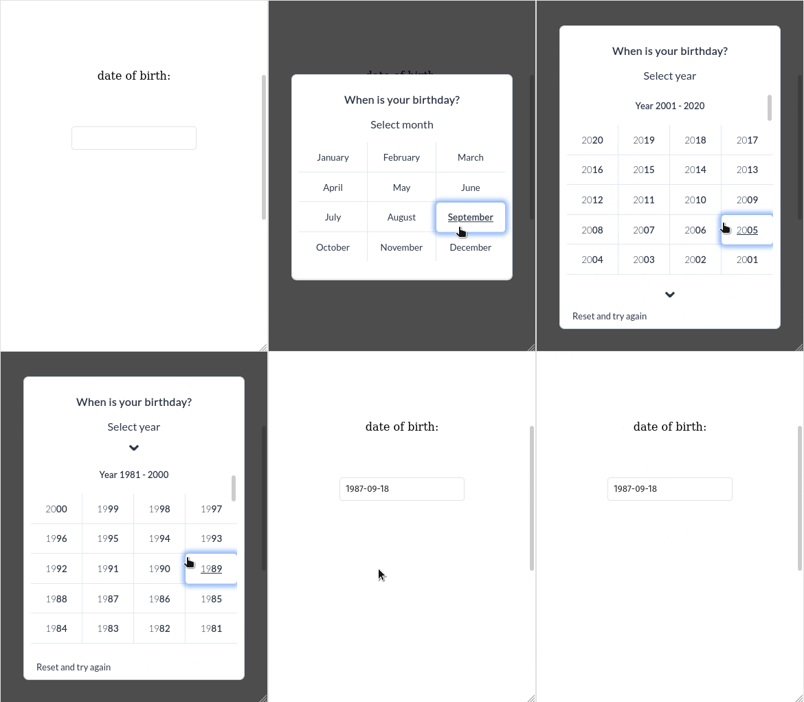
Note: in screen smaller than 768px the datepicker will automatically using popup mode. For now you can't change this behavior.
year_range - determine how many year options to display
Type: Number
Possible value: Any
Description: By default the datepicker will show the last 120 years in select year page, you can the number using this property
example:
// this will show all last 140 years in select year page
const dob = dobDatepicker('#dob-input', {year_range: 140})
enable_built_in_validation - should the datepicker apply basic validation or not
Type: Boolean
Possible value: True or False
Description: By default after user selecting a date the datepicker will do some basic validation. Here is the the validation rule:
- Date should be exist - the selected date should be exist in a calendar.
- Date should not be in future (Date of birth <= Date now)
If the selected date do not pass the validation, the datepicker will return to the first page (select month page) and show an alert that says Date is invalid. To change the alert message use alert.invalid_date_alert options.
If you want to disable the basic validation, supply falseto this enable-built_in_validationproperty.
example:
// disable built it validation
const dob = dobDatepicker('#dob-input', {enable_built_in_validation: false})alerts.invalid_date_alert- change built in validation's error message
Type: String
Possible value: Any
Description: As you can read in enable_built_in_validationsection, upon failed validation the datepicker will show an alert message, the default message is Date is invalid. You can the message in this property.
example:
// custom alert message
const dob = dobDatepicker('#dob-input', {
	alerts: {
		invalid_date_alert: 'Yooo dude, the date is wroong'
	}
})long_month- Change name of the months to another language
Type: Array
Possible Value: Array with 12 string type elements
Description: Change name of the months to another language. The default value is in English such as ['January', 'February', 'March', etc...]
example:
// change name of the months to another language
const dob = dobDatepicker('#dob-input', {
	long_month: ['Januari', 'Februari','Maret', 'April', 'Mei', 'Juni', 'Juli', 'Agustus', 'September', 'Oktober', 'November', 'Desember']
}
short_month - Change abbreviation for name of the months to another language
Type: Array
Possible Value: Array with 12 string type elements with String type
Description: Change abbreviation for months to other language.
example:
// change name of the months to another language
const dob = dobDatepicker('#dob-input', {
	short_month: ['Jen', 'Feb','Mor', 'Apr', etc ...]
}show_long_month- Determine whether to show full month name or the abbreviation on the select month page
Type: Boolean
Possible Value: Trueor False
Description: Determine whether to show full month name or the abbreviation on the select month page.
example:
// show month abbreviation on select month page
const dob = dobDatepicker('#dob-input', {
	show_long_month: false
}enable_ordinal_number- Determine whether to show ordinal numbers or not
Type: Boolean
Possible value: True or False
Description: On select day page, determine whether to show ordinal numbers such as 1st, 2nd, 3rd, 4th, etc or not.
Example:
// disable ordinal numbers
const dob = dobDatepicker('#dob-input', {
	enable_ordinal_number: false
}labels- Change text labels to another language
Type: Object
Possible value: Object with predefined property keys with string values
Description: Change the text label to another language. By the default here is the default texts:
{
	labels: {
		header_label:  'When is your birthday?',
		select_day_label:  'Select day',
		select_month_label:  'Select month',
		select_year_label:  'Select year',
		reset_button_label:  'Reset and try again',
		date_range_label:  'Year '  //label for year section -> "Year 2000 - 2020"
	}
}
And here is how to change it to another language:
// change text anohter language
const dob = dobDatepicker('#dob-input', {
	labels: {
		header_label:  'Kapan tanggal ulang tahunmu?',
		select_day_label:  'Pilih tanggal',
		select_month_label:  'Pilih bulan',
		select_year_label:  'pilih tahun',
		reset_button_label:  'Ulangi dari awal',
		date_range_label:  'Tahun '
	}
}dateFormat- Change the date format returned by the datepicker
Type: Function
Possible Value: Function that returns string value
Description: Change date format returned by the datepicker to input field. The default format is 'YYYY-MM-DD' format.
example:
// change format from 'YYYY-MM-DD' to another format
const dob = dobDatepicker('#dob-input', {
	dateFormat: function(date){
		return new Date(date).toString()
	}
}
date argument is the selected date (type: string) in 'YYYY-MM-DD' format, you can manipulate it the way you want.
zIndex- Change z-index CSS property of the datepicker
Type: Object
Possible Value: Object with predefined property keys with any valid z-index value (string)
Description: Just in case the datepicker z-index order is conflicting with your layout, you can tune it without recompiling the stylesheets.
Here is the default value:
{
zIndex: {
		targetNode:  "150",
		datepickerWidget:  "150",
		invisibleBackground:  "100"
	}
}
Explanation:
targetNode- is to changez-indexCSS property of the element containing the datepicker (element of the selector your have provided when initializing the datepicker).datepickerWidget- is to changez-indexCSS property of the datepicker itself.invisibleBackground- is to changez-indexCSS property of the invisible background behind the datepicker widget. If you resize the screen to less than 768px, the "invisible background" is the transparent black background around the datepicker.
example:
// change the z-index property
const dob = dobDatepicker('#dob-input', {
	zIndex: {
		targetNode:  "9999",
		datepickerWidget:  "9999",
		invisibleBackground:  "9000"
	}
}
Acknowledgement
This package and documentation is inspired by js-datepicker package by qodesmith and contributors.
License
MIT
