customizable-react-modal-by-lazez
v0.3.6
Published
customizable modal by lazez
Downloads
5
Readme
A modal React component, customize it with your favorite colors!
About
Simple component for React project. Keep the default theme or chose your colors simply.
Installation
You can install this component with npm or yarn:
npm i customizable-react-modal-by-lazezor
yarn add customizable-react-modal-by-lazezcaution
You'll perhaps have to do npm start or yarn start again
so that it works in your project (it'll be opened in another port then)
NPM link
customizable react modal by lazez on NPM
Use in your React project
Import the Modal component into the file
import { Modal } from customized-react-modal-lazezExample ( in a React project)
App.js
import { useState } from "react";
import "./App.css";
import { Modal } from "customizable-react-modal-by-lazez";

function App() {
  // Set here your own colors or keep  my theme if you like it
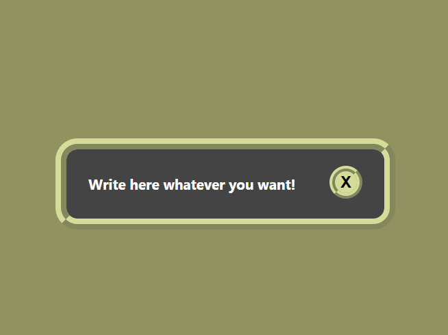
  const myTheme = {
    containerBg: "rgba(146, 146, 96, 1)",
    messageBg: "#444444",
    messageHoverBg: "#aebf8e",
    messageHoverTxt: "black",
    borderColor: "#d5db99",
    buttonBg: "#d5db99",
    buttonHoverBg: "#444444",
    buttonHoverTxt: "white",
  };

  //to open and close Modal
  const [openModal, setOpenModal] = useState(false);
  const onOpenModal = () => setOpenModal(true);
  const onCloseModal = () => setOpenModal(false);
  const handleSubmit = (e) => {
    e.preventDefault();
    onOpenModal();
  };

  return (
    <div className="App">
      <form onSubmit={handleSubmit}>
        <button type="submit" className="submit">
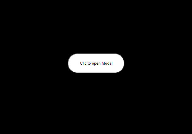
          Clic to open Modal
        </button>
      </form>

      {openModal && (
        <Modal
          theme={myTheme}
          close={onCloseModal}
          text="Write here whatever you want!"
        />
      )}
    </div>
  );
}

export default App;
App.css
.App {
  width: 100vw;
  height: 100vh;
  margin: auto;
  text-align: center;
  background-color: black;
}
.submit {
  width: 12rem;
  margin-top: 16.5rem;
  background-color: white;
  padding: 1.5rem;
  border-radius: 2rem;
}
Want to see what it's like?
Live
Screenshots


