customizable-date-range-picker
v1.7.0
Published
A customizable date range picker component for React
Downloads
12

Readme
Props
| Prop | Default | Description |
|-|-|-|
| minDate | "" | Minimum selectable date |
| maxDate | "" | Maximum selectable date |
| showOnlyOneDay | "" | Show only a single day selection |
| startDate | "" | Initial start date value |
| endDate | "" | Initial end date value |
| onApply | () => {} | Apply callback ([start,end])=>{}, date formate always "YYYY-MM-DD" |
| onCancel | () => {} | Cancel callback |
| onClear | () => {} | Clear callback |
| onNextClick | () => {} | Next month callback |
| onPreviousClick | () => {} | Previous month callback |
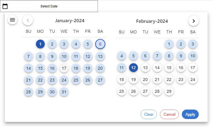
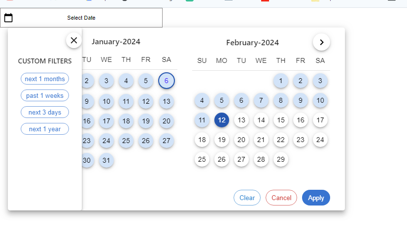
| filterLabels | [] | Array of filter label objects |
| placeHolder | "Select Start Date And End Date" | Placeholder text |
| dateFormat | "MMMM D, YYYY" | Display Date format |
| mainWrapperProps | {} | Props for main wrapper |
| nextButtonProps | {} | Props for next button |
| previousButtonProps | {} | Props for previous button |
| monthYearFormat | "MMMM-YYYY" | Month/year format |
| daysHeaderProps | {} | Props for days header |
| dayProps | () => {} | Day cell props callback |
| dateProps | () => {} | Date cell props callback |
| clearButtonProps | {} | Props for clear button |
| applyButtonProps | {} | Props for apply button |
| cancelButtonProps | {} | Props for cancel button |
| onDateClicks | () => {} | Date cell click callback |
| onFilterClick | () => {} | Filter click callback |
| selectedDateColor | "#0059B2" | Selected date color |
| selectedDateRangeColor | "#cfe4f9" | Selected range color |
| disabledColor | "#dcdcdc" | Disabled date color |
| filterLabelProps | () => {} | Filter label props callback |
| calenderIcon | Element | Calendar icon component |
| nextArrowIcon | Element | Next arrow icon component |
| previousArrowIcon | Element | Previous arrow icon component |
| hamburgerProps | {} | Hamburger icon props |
| filterWrapperProps | {} | Filter wrapper props |
| customFilterText | "CUSTOM FILTERS" | Custom filter text |
| customFilterProps | {} | Custom filter props |
| filterOptionCloseIconProps | {} | Filter option close icon props |
| days | ["Sun", "Mon", "Tue", "Wed", "Thu", "Fri", "Sat"] | Array of day names |
Example
import { Datepicker } from "customizable-date-range-picker";
import { useState } from "react";

function Component() {
  const [startDate, setStartDate] = useState("");
  const [endDate, setEndDate] = useState("");
  return (
    <div className="App">
      <div style={{ width: "200px" }}>
          <Datepicker
          days={["SU", "MO", "TU", "WE", "TH", "FR", "SA"]}
          startDate={startDate}
          endDate={endDate}
          onApply={([startDate, endDate]) => {
            console.log(startDate, endDate);
            setStartDate(startDate);
            setEndDate(endDate);
          }}
          // minDate formate must be YYYY-MM-DD
          minDate="2024-01-01"
          // maxDate formate must be YYYY-MM-DD
          maxDate="2025-12-31"
          // showOnlyOneDay formate must be "Monday" or "Sunday" . first letter should be capital
          // showOnlyOneDay="Monday"
          // handle cancel click
          onCancel={() => {}}
          // handle clear click
          onClear={() => {}}
          //handel next click
          onNextClick={() => {}}
          // handle previous click
          onPreviousClick={() => {}}
          // handle filter click
          onFilterClick={(filter) => console.log(filter)}
          // handle date click
          onDateClicks={(date) => console.log(date)}
          // customize filter label
          filterLabelProps={() => {}}
          // filters only apply today date according
          filterLabels={[
            {
              type: "month",
              value: 1,
              next: true,
              label: <> next 1 months</>,
            },
            {
              type: "week",
              value: 5,
              past: true,
              label: "past 1 weeks",
            },
            {
              type: "day",
              value: 3,
              next: true,
              label: "next 3 days",
            },
            {
              type: "year",
              value: 1,
              next: true,
              label: <> next 1 year</>,
            },

          ]}
          // customize date label
          placeHolder="Select Date"
          //use moment formate
          dateFormat="dd-MM-yyyy"
          dayProps={(day) => {
            return {
              // allow mui tabelcell props and th props
              className: "custom-day-class",
              style: {

              },
            };
          }}
          dateProps={({ date, isToday }) => {
            // change the style of today date and all date
            if (isToday) {
              return {
                className: "custom-date-class",
                style: {
                  color: "blue",
                },
              };
            }
            return {
              className: "custom-other-date-class",
                style: {

                },
              };
            }
          }
        />
      </div>
    </div>
  );
}

export default Component;
Output