
custom-element-jsx-integration
v1.6.0
Published
Tools for integrating custom elements into JSX projects
Downloads
1,364
Maintainers
 breakstuff
Readme
Custom Elements JSX Integration
This package is designed to generate types for your custom elements in a project using JSX. These types will generate inline documentation, autocomplete, and type-safe validation for your custom elements in non-react frameworks that use JSX like Preact and StencilJS.
NOTE: If you are using react 18 or below, check out our react wrappers.

Usage
This package includes two ways to generate the custom data config file:
- calling a function in your build pipeline
- as a plugin for the Custom Element Manifest Analyzer
Install
npm i -D custom-element-jsx-integrationBuild Pipeline
import { generateJsxTypes } from "custom-element-jsx-integration";
import manifest from "./path/to/custom-elements.json";

const options = {...};

generateJsxTypes(manifest, options);
CEM Analyzer
Set-up
Ensure the following steps have been taken in your component library prior to using this plugin:
- Install and set up the Custom Elements Manifest Analyzer
- Create a config file
Import
// custom-elements-manifest.config.js

import { customElementJsxPlugin } from "custom-element-jsx-integration";

const options = {...};

export default {
  plugins: [
    customElementJsxPlugin(options)
  ],
};
Configuration
The configuration has the following optional parameters:
{
  /** Path to output directory */
  outdir?: string;
  /** File name for the types */
  fileName?: string | null;
  /** Class names of any components you would like to exclude from the custom data */
  exclude?: string[];
  /** The property name from the component object that you would like to use for the description of your component */
  descriptionSrc?: "description" | "summary" | string;
  /** Indicates if the component classes are a default export rather than a named export */
  defaultExport?: boolean;
  /** Displays the slot section of the element description */
  hideSlotDocs?: boolean;
  /** Displays the event section of the element description */
  hideEventDocs?: boolean;
  /** Displays the CSS custom properties section of the element description */
  hideCssPropertiesDocs?: boolean;
  /** Displays the CSS parts section of the element description */
  hideCssPartsDocs?: boolean;
  /** Displays the methods section of the element description */
  hideMethodDocs?: boolean;
  /** Overrides the default section labels in the component description */
  labels?: {
    slots?: string;
    events?: string;
    cssProperties?: string;
    cssParts?: string;
    methods?: string;
  };
  /** Used to get type reference for components from a single source */
  globalTypePath?: string;
  /** Used to get types from specific path for a given component */
  componentTypePath?: (name: string, tag?: string) => string;
  /** The property form your CEM component object to display your types */
  typesSrc?: string;
  /** Used to add global element props to all component types */
  globalEvents?: string;
  /** Hides logs produced by the plugin */
  hideLogs?: boolean;
  /** Prevents plugin from executing */
  skip?: boolean;
}
Implementation
In order for teams to take advantage of this, all they need to do is import the types in their project and extend JSX's IntrinsicElements. They should immediately begin seeing the type support for your components in the editor.
// custom-elements-types.d.ts
import type { CustomElements } from "path/to/jsx-types";

declare module "my-app" {
  namespace JSX {
    interface IntrinsicElements extends CustomElements {}
  }
}
NOTE: Libraries will often have their own module names you will need to use when extending the
IntrinsicElementsinterface. For example, Preact requires you to use the"preact"module name instead of"my-app"(declare module "preact") and StencilJS uses "@stencil/core" (declare module "@stencil/core").
Configuration
Output
You can configure the destination and the file name of the generated type file using the outdir and fileName configuration.
{
  /** Path to output directory */
  outdir: 'dist',
  /** File name for the types */
  fileName: 'jsx-integration.d.ts'
}
Descriptions
Using the descriptionSrc configuration, you can determine the source of the text that gets displayed in the editor autocomplete bubble. This is useful if you want to provide alternate descriptions for your React users.
If no value is provided, the plugin will use the summary property and then fall back to the description property if a summary is not available.
Note: Descriptions support multiple lines by breaking the comment up into multiple lines whereas summaries do not and will need to be manually added using \n.
// description example
/**
*
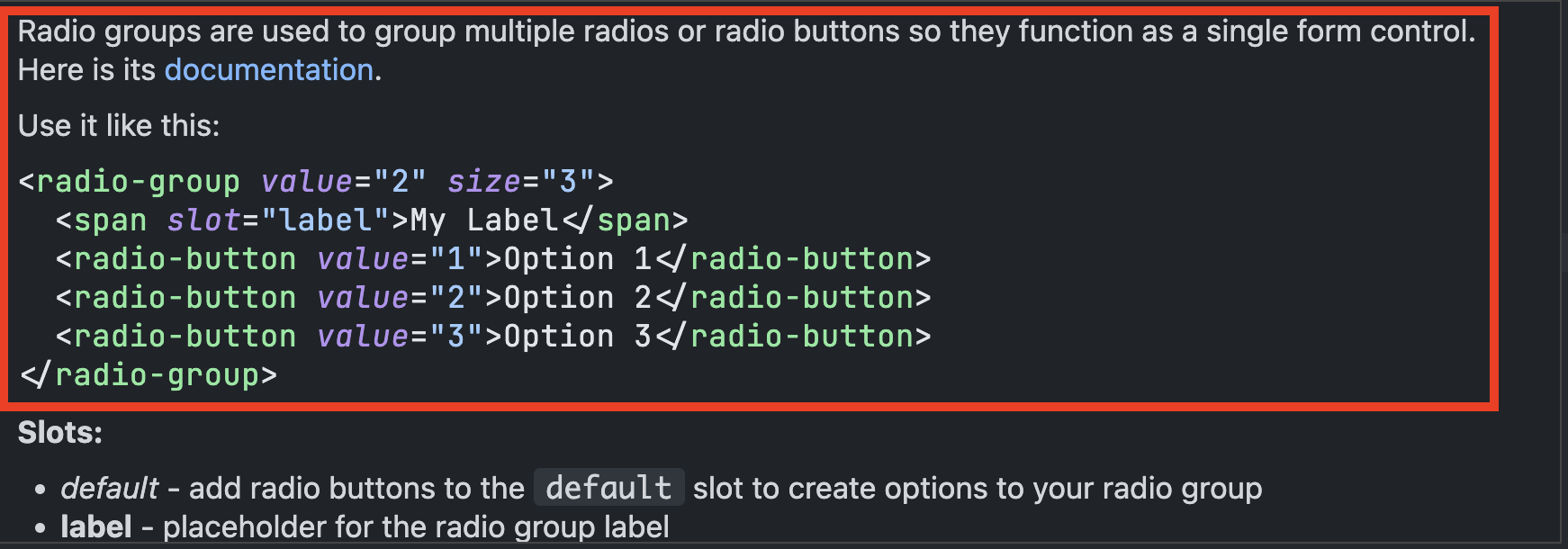
* Radio groups are used to group multiple radios or radio buttons so they function as a single form control. Here is its [documentation](https://my-docsite.com).
*
* Use it like this:
* ```html
* <radio-group value="2" size="3">
* <span slot="label">My Label</span>
* <radio-button value="1">Option 1</radio-button>
* <radio-button value="2">Option 2</radio-button>
* <radio-button value="3">Option 3</radio-button>
* </radio-group>
* ```
*
*/// summary example
/**
*
* @summary Radios buttons allow users to select a single option from a group. Here is its [documentation](https://my-site.com/documentation).\n\nUse it like this:\n```html\n<radio-button value="1" disabled>Your label</radio-button>\n```
*
* /Default Exports
If you component class does not provide a named export and is the default export, be sure to set defaultExport to true. This will endure the import for the class gets resolved correctly.
Contextual Information
The contextual information provided when hovering over the custom element can be configured using the hideSlotDocs, hideEventDocs, hideCssPropertiesDocs, hideCssPartsDocs, as well as the hideMethodDocs. The headings for each of the sections can also be configured using the labels option.
Types
If your components were built using TypeScript, you should define a path to your type declarations to pass that type-safety on to the JSX project.
NOTE: All type paths should be relative to the location specified in the
outdiroption.
If your types are rolled up into a single type declaration file, you can set the globalTypePath option to the location of that file.
{
  globalTypePath: ".dist/types.d.ts";
}
If each of the component type definitions are split out by each component, you can use the componentTypePath to reference individual component paths.
{
  componentTypePath: (name, tag) => `./types/${tag}/${name}.d.ts`;
}
NOTE: It's important to note that if a type path is not provided, the generator will fall back to the type defined in the Custom Elements Manifest.
Custom Types
If you have custom types configured in your Custom Elements Manifest and do not have types or are unable to use them, you can specify the property name of that type using the typeSrc option.
Adding Events
By default the types will be mapped with the attributes, properties, and custom events that have been documented for it. There are, however the native events that are available to them because they are HTML elements. If you would like to add the events to your types, you can assign them to the globalEvents option and they will be included in your component's type.
{
  globalEvents: `
  // Mouse Events

  /** Triggered when the element is clicked by the user by mouse or keyboard. */
  onClick?: (event: MouseEvent) => void;

  // Keyboard Events

  /** Fired when a key is pressed down. */
  onKeyDown?: (event: KeyboardEvent) => void;
  /** Fired when a key is released.. */
  onKeyUp?: (event: KeyboardEvent) => void;
  /** Fired when a key is pressed down. */
  onKeyPressed?: (event: KeyboardEvent) => void;

  // Focus Events

  /** Fired when the element receives focus, often triggered by tab navigation. */
  onFocus?: (event: FocusEvent) => void;
  /** Fired when the element loses focus. */
  onBlur?: (event: FocusEvent) => void;
  `;
}
NOTE: It is not required, but highly recommended that you include descriptions for these events as code editors will often provide that information.
Native Events Template
Here is a list of some popular native events that are pre-configured for SolidJS. This list is not exhaustive and can be modified to meet your needs.
// Mouse Events

/** Triggered when the element is clicked by the user by mouse or keyboard. */
onClick?: (event: MouseEvent) => void;
/** Fired when the context menu is triggered, often by right-clicking. */
onContextMenu?: (event: MouseEvent) => void;
/** Fired when the element is double-clicked. */
onDoubleClick?: (event: MouseEvent) => void;
/** Fired repeatedly as the draggable element is being dragged. */
onDrag?: (event: DragEvent) => void;
/** Fired when the dragging of a draggable element is finished. */
onDragEnd?: (event: DragEvent) => void;
/** Fired when a dragged element or text selection enters a valid drop target. */
onDragEnter?: (event: DragEvent) => void;
/** Fired when a dragged element or text selection leaves a valid drop target. */
onDragExit?: (event: DragEvent) => void;
/** Fired when a dragged element or text selection leaves a valid drop target. */
onDragLeave?: (event: DragEvent) => void;
/** Fired when an element or text selection is being dragged over a valid drop target (every few hundred milliseconds). */
onDragOver?: (event: DragEvent) => void;
/** Fired when a draggable element starts being dragged. */
onDragStart?: (event: DragEvent) => void;
/** Fired when a dragged element is dropped onto a drop target. */
onDrop?: (event: DragEvent) => void;
/** Fired when a mouse button is pressed down on the element. */
onMouseDown?: (event: MouseEvent) => void;
/** Fired when the mouse cursor enters the element. */
onMouseEnter?: (event: MouseEvent) => void;
/** Triggered when the mouse cursor leaves the element. */
onMouseLeave?: (event: MouseEvent) => void;
/** Fired at an element when a pointing device (usually a mouse) is moved while the cursor's hotspot is inside it. */
onMouseMove?: (event: MouseEvent) => void;
/** Fired at an Element when a pointing device (usually a mouse) is used to move the cursor so that it is no longer contained within the element or one of its children. */
onMouseOut?: (event: MouseEvent) => void;
/** Fired at an Element when a pointing device (such as a mouse or trackpad) is used to move the cursor onto the element or one of its child elements. */
onMouseOver?: (event: MouseEvent) => void;
/** Fired when a mouse button is released on the element. */
onMouseUp?: (event: MouseEvent) => void;

// Keyboard Events

/** Fired when a key is pressed down. */
onKeyDown?: (event: KeyboardEvent) => void;
/** Fired when a key is released.. */
onKeyUp?: (event: KeyboardEvent) => void;
/** Fired when a key is pressed down. */
onKeyPressed?: (event: KeyboardEvent) => void;

// Focus Events

/** Fired when the element receives focus, often triggered by tab navigation. */
onFocus?: (event: FocusEvent) => void;
/** Fired when the element loses focus. */
onBlur?: (event: FocusEvent) => void;

// Form Events

/** Fired when the value of an input element changes, such as with text inputs or select elements. */
onChange?: (event: Event) => void;
/** Fires when the value of an <input>, <select>, or <textarea> element has been changed. */
onInput?: (event: Event) => void;
/** Fired when a form is submitted, usually on pressing Enter in a text input. */
onSubmit?: (event: Event) => void;
/** Fired when a form is reset. */
onReset?: (event: Event) => void;

// UI Events

/** Fired when the content of an element is scrolled. */
onScroll?: (event: UIEvent) => void;

// Wheel Events

/** Fired when the mouse wheel is scrolled while the element is focused. */
onWheel?: (event: WheelEvent) => void;

// Animation Events

/** Fired when a CSS animation starts. */
onAnimationStart?: (event: AnimationEvent) => void;
/** Fired when a CSS animation completes. */
onAnimationEnd?: (event: AnimationEvent) => void;
/** Fired when a CSS animation completes one iteration. */
onAnimationIteration?: (event: AnimationEvent) => void;

// Transition Events

/** Fired when a CSS transition has completed. */
onTransitionEnd?: (event: TransitionEvent) => void;

// Media Events

/** Fired when an element (usually an image) finishes loading */
onLoad?: (event: Event) => void;
/** Fired when an error occurs during the loading of an element, like an image not being found. */
onError?: (event: Event) => void;

// Clipboard Events

/** Fires when the user initiates a copy action through the browser's user interface. */
onCopy?: (event: ClipboardEvent) => void;
/** Fired when the user has initiated a "cut" action through the browser's user interface. */
onCut?: (event: ClipboardEvent) => void;
/** Fired when the user has initiated a "paste" action through the browser's user interface. */
onPaste?: (event: ClipboardEvent) => void;

// ... Add more events as needed
Scoping Types
If you are scoping your component tags using a custom prefix or suffix, you can use the ScopedElements utility type to provide types for those elements without having to generate new custom types.
// scoped-types.d.ts

import type { ScopedElements } from "path/to/jsx-types";

declare module "my-app" {
  namespace JSX {
    interface IntrinsicElements extends ScopedElements<"prefix-", "-suffix"> {}
  }
}
NOTE: The scoped types will lose the contextual information when hovering over the tag in the editor.