npm package discovery and stats viewer.

Discover Tips

  • General search

    [free text search, go nuts!]

  • Package details

    pkg:[package-name]

  • User packages

    @[username]

Sponsor

Optimize Toolset

I’ve always been into building performant and accessible sites, but lately I’ve been taking it extremely seriously. So much so that I’ve been building a tool to help me optimize and monitor the sites that I build to make sure that I’m making an attempt to offer the best experience to those who visit them. If you’re into performant, accessible and SEO friendly sites, you might like it too! You can check it out at Optimize Toolset.

About

Hi, 👋, I’m Ryan Hefner  and I built this site for me, and you! The goal of this site was to provide an easy way for me to check the stats on my npm packages, both for prioritizing issues and updates, and to give me a little kick in the pants to keep up on stuff.

As I was building it, I realized that I was actually using the tool to build the tool, and figured I might as well put this out there and hopefully others will find it to be a fast and useful way to search and browse npm packages as I have.

If you’re interested in other things I’m working on, follow me on Twitter or check out the open source projects I’ve been publishing on GitHub.

I am also working on a Twitter bot for this site to tweet the most popular, newest, random packages from npm. Please follow that account now and it will start sending out packages soon–ish.

Open Software & Tools

This site wouldn’t be possible without the immense generosity and tireless efforts from the people who make contributions to the world and share their work via open source initiatives. Thank you 🙏

© 2024 – Pkg Stats / Ryan Hefner

custom-bootstrap-card

v1.3.4

Published

a responsive custom Bootstrap 4 card component with hover animation effects

Downloads

31

Readme

custom-bootstrap-card

A responsive custom Bootstrap 4 card component with hover animation effects
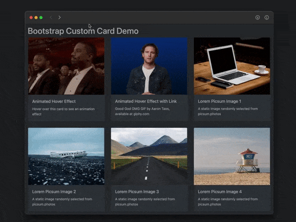
custom card screenshot

Features

  • responds to window width and height
  • responds to dark/light preference (optional)
  • animates upon hover (zoom in with box shadow)
  • animates upon touch on non-hover devices (iPhone, etc.)
  • displays alternate image upon hover/touch (optional)
  • displays Open link button upon hover/touch (optional)

Usage

In HTML head:

<!-- link Bootstrap CSS [REQUIRED] -->
<link rel="stylesheet"
href="https://cdn.jsdelivr.net/npm/[email protected]/dist/css/bootstrap.css">

<!-- link for dark mode support [OPTIONAL] -->
<link rel="stylesheet"
href="https://cdn.jsdelivr.net/npm/bootsdark@latest/dist/bootsdark.min.css">

In HTML body:

<div id="exampleCards" class="row tms-cards">
      <!-- cards will go here -->
</div>

<script type="module">
  import {addCard} from
    'https://cdn.jsdelivr.net/npm/custom-bootstrap-card/src/bootstrap-card.js';

  addCard({
    containerId: "exampleCards",
    imageUrl: "https://picsum.photos/400/300",
    imageAlt: "sample picsum image",
    title: "Random Image Number",
    text: "A random image from picsum.photos",
    href: "https://example.com",
    imgHoverURL: "https://via.placeholder.com/400x300?text=hover+image"
  });
</script>

Custom Styles

Override default styling by placing:

<style id="tms-card-style">
    ...
</style>

in the document's <head> section.