
cre-ui
v1.1.3
Published
版本:v-1.0.26
Downloads
68


Readme
cre-ui 文档
版本:v-1.0.26
一、组件库介绍
组件库 cre-ui 基于 Vue2.6.11 实现。组件库的使用分为全量引入和按需引入两种方式。
- 组件库安装
npm i cre-ui --save- 全量引入
import Vue from "vue";
import CreUi from "cre-ui";
// 需引入全局样式表
import "cre-ui/lib/theme-chalk/index.css";

Vue.use(CreUi);- 按需引入
import Vue from "vue";
import { Component1, Component12, Component3 } from "cre-ui";
// 按需引入样式
import "cre-ui/lib/theme-chalk/component1.css";
// ...

const components = [Component1, Component12, Component3];
components.forEach((component) => {
  Vue.use(component);
});
二、组件详情
组建名称均以 cre-开头,使用规则类似 element-ui。
1. IePage
不兼容 ie 浏览器环境时展示页面
例:
<cre-ie-page
  content-text="网站暂时不支持IE浏览器,请改用其他浏览器访问。"
  content-tip="我是提示信息"
  logo="http://mall-dev.crealitygroup.com/_nuxt/img/29dc86f.png"
  content-foot="我是底部版权信息"
  theme-color="#cca558"
  content-bg="http://pic-cdn-dev.creality.com//iePageIcon/ie-title-icon-2.png"
/>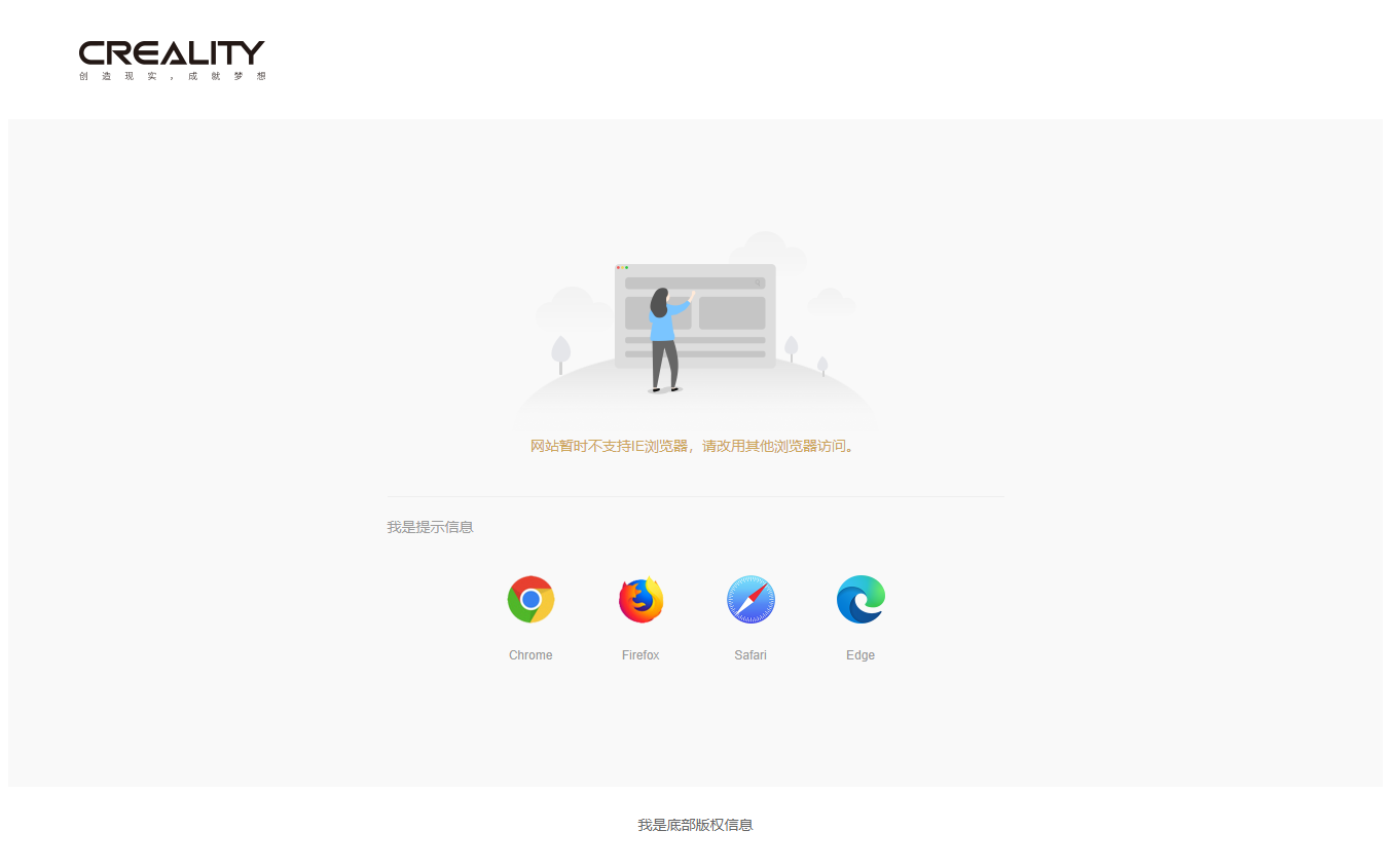
IePage Attributes
| 参数 | 说明 | 类型 | 可选值 | 默认值 | | ------------ | ------------------ | ----- | ------ | ---------------------------------------------------------------------------------------------------------------------------------- | | content-text | 错误主要内容(必填) | Sring | -- | -- | | content-tip | 提示信息 | Sring | -- | -- | | logo | logo 完整路径 | Sring | -- | -- | | content-foot | 底部版权信息 | Sring | -- | -- | | theme-color | 主题色 | Sring | -- | #42bdd8 | | content-bg | 主要提示内容背景图 | Sring | -- | http://pic-cdn-dev.creality.com//iePageIcon/ie-title-icon-2.png |
2. Pagination
分页组件
例:
<cre-pagination
  :page="1"
  :page-size="10"
  :total="100"
  :hide-on-single-page="true"
/>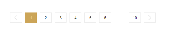
Pagination Attributes
| 参数 | 说明 | 类型 | 可选值 | 默认值 | | ------------------- | -------------------- | ------- | ---------- | ------ | | page | 页码 | Number | -- | 1 | | page-size | 每页数据条数 | Number | -- | 20 | | total | 数据总条数 | Number | -- | 0 | | hide-on-single-page | 是否在只有一页时隐藏 | Boolean | true/false | true |
Pagination Event
| 事件名称 | 说明 | 回调参数 | | ---------- | -------------- | ------------------ | | pageChange | 页码变化时触发 | 当前页码 page 的值 |
3. ImageZoom
图片放大组件,若指定 video-src 属性可播放视频
例:
<cre-image-zoom
  url="http://pic-cdn-dev.creality.com/vip_mall/2d1aae3d-fb6c-4570-8782-9af131692f37"
  :cale="2"
  :scroll-disabled="true"
  video-src="http://video-cdn-dev.creality.com/vip_mall/cb262684-a211-4c07-a759-e90f9a64eb13"
  width="400"
  height="400"
/>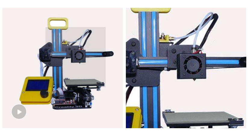
ImageZoom Attributes
| 参数 | 说明 | 类型 | 可选值 | 默认值 | | --------------- | ---------------------- | ------------- | ---------- | ----------------- | | url | 图片完整路径 | String | -- | -- | | big-url | 放大后显示的图片 | String | -- | 默认等于 url 的值 | | scale | 放大倍数 | Number | -- | 1.5 | | scroll-disabled | 放大时是否禁用页面滚动 | Boolean | true/false | false | | video-src | 视频完整路径 | String | -- | -- | | width | 图片宽度 | String/Number | -- | 500 | | height | 图片高度 | String/Number | -- | 500 |
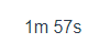
4. Timer
倒计时组件,样式需要自定义
例:
<cre-timer :init-time="120" :locale="en" />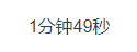
Timer Attributes
| 参数 | 说明 | 类型 | 可选值 | 默认值 | | --------- | -------------- | ------ | ------------- | ------ | | init-time | 计时秒数(必填) | Number | -- | -- | | locale | 语言 | String | zh / en | zh |
Timer Event
| 事件名称 | 说明 | 回调参数 | | -------- | ---------------- | -------- | | timerEnd | 倒计时结束时触发 | -- |
5. BackTop
回到顶部按钮
例:
<cre-back-top />
BackTop Attributes
| 参数 | 说明 | 类型 | 可选值 | 默认值 | | ---- | ------------------------------------ | ------ | ------ | ------ | | edge | 页面滚动距离占页面总高度比例的边界值 | Number | -- | 0.5 | | right | 按钮与页面右边缘的距离 | String/Number | -- | 100 | | bottom | 按钮与页面下边缘的距离 | String/Number | -- | 180 |
6. Comment
评论组件
例:
<cre-comment-item :user-info="userInfo" :comment="comment" />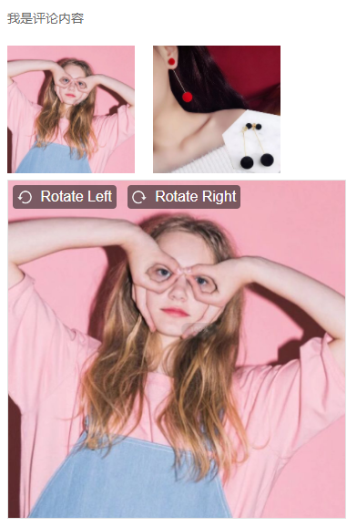
Comment Attributes
| 参数 | 说明 | 类型 | 可选值 | 默认值 | | ----------------- | ------------ | ------------- | ------ | ------------ | | comment | 评论对象,包含: 内容 (string) content,图片(array) pictures,规格 (array) skuList,时(number) createTime | Object: { content: ”“, Pictures: [], skuList: [{key:'',value:''}], createTime: } | -- | -- | | userInfo | 发表人{ nickName,avatar,userId } | Object | -- | -- | | locale | 语言 | String | zh / en | zh |
Comment Slot
| name | 说明 | | ------ | ---------------------------- | | createTime | 评论时间: 默认以 2004-09-11 00:00:00输出 | | rotateLeft | 大图左旋转图标 | | rotateReft | 大图又旋转图标 |
7. Collapse
大下拉框组件
例:
<cre-collapse width="300" height="300" trigger="hover">
  <template slot="entry">
    <el-button>我是按钮</el-button>
  </template>
  <template slot="body">
    <div>我是下拉框内容</div>
  </template>
</cre-collapse>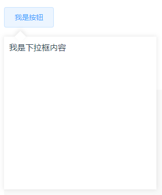
Collapse Attributes
| 参数 | 说明 | 类型 | 可选值 | 默认值 | | ----------- | -------------- | ------------- | ----------- | ------ | | width | 下拉框宽度 | Number/String | -- | 200 | | height | 下拉框高度 | Number/String | -- | 200 | | trigger | 触发方式 | String | hover/click | hover | | placement | 显示位置 | String | left/right | left | | angle-space | 尖角离边缘距离 | Number/String | -- | 24 |
Collapse Slots
| name | 说明 | | ----- | ------------------------------ | | entry | 下拉框所挂载的元素,通常为按钮 | | body | 下拉框内容容器 |
Collapse Events
| 事件名称 | 说明 | 回调参数 | | -------- | ---------------- | -------- | | onOpen | 下拉框展开时触发 | -- | | onClose | 下拉框收起时触发 | -- |
8. TagList
标签列表
例:
<cre-tag-list :tag-list="tagList" @tagClick="tagClick" />TagList Attributes
| 参数 | 说明 | 类型 | 可选值 | 默认值 | | --------- | -----------------------------------| ------ | ------ | --------- | | label | 标签label文本 | String | -- | 大家都在说:| | tagList | 包含id, name属性的标签列表 | Array | -- | [] | | activeId | 被选中的标签id(默认列表第一个为选中) | Number | -- | -- |
TagList Attributes | 事件 | 说明 | 回调参数 | | ----- | ---- | ------ | | tagClick | 点击标签回调 | tag对象 |
9. Input
输入框
例:
<cre-input v-model="inputValue" :width="200" />| 参数 | 说明 | 类型 | 可选值 | 默认值 | | ----- | -------------| ---------| --------| -------- | | value/v-model | 绑定输入值 | String/Number | -- | -- | | width | 宽度 | String/Number | -- | 600 | | placeholder | 提示文字 | String | -- | 请填写内容 | | maxlenghth | 最大输入字符串长度 | Number | -- | 100 | | type | 原生输入类型 | String | text/number/password | text | | disabled | 是否禁用 | Boolean | true/false | false | | readonly | 是否只读 | Boolean | true/false | false |
Input Event
| 事件 | 说明 | 回调参数 | | ---- | ---- | ------- | | change | 输入时触发 | 当前输入值 |
10. Textarea
文本域
例:
<cre-textarea v-model="textAreaValue" width="500" rows="4" />Textarea Attributes
| 参数 | 说明 | 类型 | 可选值 | 默认值 | | ----- | -------------| ---------| --------| -------- | | value/v-model | 绑定输入值 | String | -- | -- | | placeholder | 提示文字 | String | -- | 请填写内容 | | width | 宽度 | String/Number | -- | 600 | | rows | 行数 | Number | -- | 5 | | maxlenghth | 最大输入长度 | Number | -- | 200 | | disabled | 是否禁用 | Boolean | true/false | false | | readonly | 是否只读 | Boolean | true/false | false | | resize | 是否可改变大小 | Boolean | true/false | false |
Textarea Event
| 事件 | 说明 | 回调参数 | | ----- | ---- | ----- | | change | 输入时触发 | 当前输入值 |
11. Select
选择框
例:
<cre-select
  v-model="selectValue"
  :options="selectOptions"
  filterable
  clearable
  @change="selectChange"
/>
Select Attributes
| 参数 | 说明 | 类型 | 可选值 | 默认值 | | ----- | -------------| ---------| --------| -------- | | value/v-model | 绑定选中值 | String/Number | -- | -- | | options | 选项列表 | Array(包含 {label, value}) | -- | -- | | width | 宽度 | String/Number | -- | 500 | | placeholder | 提示文字 | String | -- | 请选择 | | clearable | 是否可清空选项 | Boolean | true/false | false | | disabled | 是否禁用 | Boolean | true/false | false | | name | input | 原生name属性 | String | -- | -- | | filterable | 是否可搜索 | Boolean | true/false | false | | filterMethod | 自定义搜索方法 | Function | -- | undefined | | loading | 是否在加载中 | Boolean | true/false | false | | noMatchText | 搜索条件无匹配时显示的文字 | String | -- | 无匹配数据 | | defaultFirstOption | 在输入框按下回车,选择第一个匹配项。需配合 filterable 使用 | Boolean | true/false | false | | popperAppendToBody | 是否将弹出框插入至 body 元素 | Boolean | true/false | false | | automaticDropdown | 对于不可搜索的 Select,是否在输入框获得焦点后自动弹出选项菜单 | Boolean | true/false | false |
Select Event
| 事件 | 说明 | 回调参数 | | ----- | --------- | ------- | | change | 选中选项时触发当前 | 选项option的value值 |
12. Checkbox
复选框
例:
<cre-checkbox
  v-model="checkboxValue"
  label="我是Checkbox"
  type="box"
  @change="handleCheckboxChange"
/>
Checkbox Attributes
| 参数 | 说明 | 类型 | 可选值 | 默认值 | | ----- | -------------| ---------| --------| -------- | | value/v-model | 绑定值 | Boolean | true/false | false | | label | 文字 | String | -- | -- | | type | UI类型 | String | normal/box | normal |
Checkbox Event
| 事件名称 | 说明 | 回调参数 | | ------- | ---- | -------- | | change | 切换选中状态时触发 | 当前是否选中 |
13. CheckboxGroup
复选框组
例:
<cre-checkbox-group
  v-model="checkboxGroupValue"
  :options="checkboxGroupOptions"
  @change="handleCheckboxGroupChange"
/>
按需引入样式依赖:
@import 'cre-ui/lib/theme-chalk/checkbox.css'CheckboxGroup Attributes
| 参数 | 说明 | 类型 | 可选值 | 默认值 | | ----- | -------------| ---------| --------| -------- | | value/v-model | 绑定值,选中选项的value列表 | Array(元素为String/Number) | aa | [] | | options | 选项列表 | Array(元素为{label, value}) | aa | [] |
CheckboxGroup Event
| 事件名称 | 说明 | 回调参数 | | -------- | --- | ------- | | change | 切换选中状态时触发 | 当前选中选项的value列表 |
14. RadioGroup
单选按钮组
例:
<cre-radio-group v-model="radioValue" :options="radioOptions" />RadioGroup Attributes
| 参数 | 说明 | 类型 | 可选值 | 默认值 | | ----- | -------------| ---------| --------| -------- | | value/v-model | 绑定值,选中选项的value | String/Number | -- | -- | | options | 选项列表 | Array(元素为{label, value}) | -- | [] |
RadioGroup Event
| 事件名称 | 说明 | 回调参数 | | -------- | ---- | ------- | | change| 切换选项时触发 | 当前选中选项的value |
15. Datepicker
日期选择
例:
<cre-datepicker
  :value.sync="dateValue"
  @change="handleDatepickerChange"
/>
按需引入样式依赖:
@import 'cre-ui/lib/theme-chalk/select.css'Datepicker Attributes
| 参数 | 说明 | 类型 | 可选值 | 默认值 | | ----- | -------------| ---------| --------| -------- | | value | 日期绑定值,需要自动同步需要加sync | Object({ year, month, date }) | -- | -- |
Datepicker Event
| 事件名称 | 说明 | 回调参数 | | -------- | ---- | ------- | | change | 年/月/日选中项变化时触发 | 当前选中日期 |
16. Image
图片展示
例:
<cre-image
  src="http://pic-cdn-dev.creality.com/vip_mall/03218e36-9feb-4662-8a89-83533b6af5f7"
  width="200"
  height="200"
/>
Image Attributes
| 参数 | 说明 | 类型 | 可选值 | 默认值 | | ----- | -------------| ---------| --------| -------- | | src | 图片地址 | String | -- | -- | | width | 图片宽度 | String/Number | -- | 80 | | height | 图片高度 | String/Number | -- | 80 | | fit | 确定图片如何适应容器框,同原生 object-fit| String | fill / contain / cover / none / scale-down | cover | | alt | 原生alt | String | -- | -- | | lazy | 是否开启懒加载 | Boolean | true / false | false | | scrollContainer | 开启懒加载后,监听 scroll 事件的容器。 | String/HTMLElement | -- | 最近一个 overflow 值为 auto 或 scroll 的父元素 | | defaultSrc | 占位图片地址 | String | -- | -- | | errorSrc | 加载失败时图片地址 | String | -- | -- |
17. ImagesPreview
图片放大预览组件
例:
<cre-images-preview
  :image-list="[
    'http://pic-cdn-dev.creality.com/vip_mall/20c1336c-6a64-4ab7-8833-b06496ebee31',
    'http://pic-cdn-dev.creality.com/vip_mall/f00d9e5d-307d-47eb-a7da-b4f4e54644fa'
  ]"
/>
Image Attributes
| 参数 | 说明 | 类型 | 可选值 | 默认值 | | ----- | -------------| ---------| --------| -------- | | imageList | 图片地址列表 | Array | -- | [] | | imageSize | 展示图片大小(像素) | String / Number | -- | 140 | | previewSize | 放大图片大小(像素) | String / Number | -- | 400 | | locale | 语言 | String | zh / en | zh |
18. ImageUpload
图片上传
例:
<cre-image
  src="http://pic-cdn-dev.creality.com/vip_mall/03218e36-9feb-4662-8a89-83533b6af5f7"
  width="200"
  height="200"
/>
按需引入样式依赖:
@import 'cre-ui/lib/theme-chalk/image.css'ImageUpload Attributes
| 参数 | 说明 | 类型 | 可选值 | 默认值 | | ----- | -------------| ---------| --------| -------- | | limit | 最大上传文件数 | Number | -- | 3 | | sizeLimit | 上传文件大小限制 | Number | -- | 5 * 1024 * 1024 | | imageSize | 展示图片大小 | String / Number | -- | 80 | | previewSize | 放大预览图大小 | String / Number | -- | 600 | | locale | 语言 | String | zh / en | zh |
ImageUpload Event
| 事件名称 | 说明 | 回调参数 | | -------- | ---- | ------ | | onFilesChange | 文件列表变化时触发 | 当前选中图片的文件列表 |
19. Dialog
弹窗组件
例:
<cre-dialog
  :visible.sync="addressDialogVisible"
  width="659"
  height="511"
  title="添加收货地址"
  confirm-button-text="保存新地址"
  button-width="160"
  button-height="48"
/>
Dialog Attributes
| 参数 | 说明 | 类型 | 可选值 | 默认值 | | ----- | -------------| ---------| --------| -------- | | visible | 是否显示 | Boolean | true / false | false | | title | 标题 | String | -- | 提示 | | width | 宽度 | String / Number | -- | 520 | | height | 高度 | String / Number | -- | 280 | | buttonWidth | 按钮宽度 | String / Number | -- | 88 | | buttonHeight | 按钮高度 | String / Number | -- | 36 | | confirmButtonText | 确定按钮文字 | String | -- | 确定 | | cancelButtonText | 取消按钮文字 | String | -- | 取消 |
Dialog Slot
| name | 说明 | | ---- | ------ | | body | 窗口中的内容 |
Dialog Events
| 事件名称 | 说明 | 回调参数 | | -------- | ---- | -------- | | confirm | 点击确定按钮时触发 | -- | | cancel | 点击取消按钮时触发 | -- |
20. MessageDialog
消息弹窗
例:
<cre-message-dialog
  :visible.sync="messageDialogVisible"
  title="我是提示标题"
  message="我是提示信息"
/>
按需引入样式依赖:
@import 'cre-ui/lib/theme-chalk/dialog.css'MessageDialog Attributes
| 参数 | 说明 | 类型 | 可选值 | 默认值 | | ----- | -------------| ---------| --------| -------- | | visible | 是否显示 | Boolean | True / false | false | | title | 标题 | String | -- | 提示 | | message | 信息内容 | String | -- | -- | | confirmButtonText | 确定按钮文字 | String | -- | 确定 | | cancelButtonText | 取消按钮文字 | String | -- | 取消 |
MessageDialog Events
| 事件名称 | 说明 | 回调参数 | |--------- | ----- | ------- | | confirm | 点击确定按钮时触发 | -- | | cancel | 点击取消按钮时触发 | -- |
21. Message
顶部弹出提示
引入:
import Vue from 'vue'
import { Message } from 'cre-ui'

Vue.prototype.$message = Message
使用:
// 钩子函数中
this.$message.info('提示信息')
this.$message.warning('警告信息')
this.$message.success('成功信息')
this.$message.error('错误信息')
22. Breadcrump
面包屑
例:
<cre-breadcrump
  :list="[
    { name: '首页', path: '/index' },
    { name: '个人订单', path: '/my-orders' },
    { name: '确认收货', path: '/receive' }
  ]"
/>
Breadcrump Attribute
| 参数 | 说明 | 类型 | 可选值 | 默认值 | | ----- | ----------| ---------| --------| -------- | | list | 面包屑列表 | Array (元素为{ name, path, newTab }) | newTab: true/false 是否打开新标签页 | [] |
附录 项目维护相关
Project setup
npm install

cd .\packages\theme-chalk

npm install

cd ..\..\
Compiles and hot-reloads for development
npm run serve打包
整体打包
npm run dist清理旧版本打包文件
npm run clean生成 src/index.js 文件
npm run build:file打包样式文件
npm run build:themeLints and fixes files
npm run lint