
country-dropdown
v0.1.4
Published
Easily create fully customizable country, state, and city dropdowns with this comprehensive package. Perfect for any web form or application requiring accurate geographic selection, this package supports dynamic and dependent dropdowns, ensuring a seamles
Downloads
14
Maintainers
 omnish
Keywords
Readme
Country Dropdown
A customizable React component for country, state, and city dropdowns.
Installation
Step 1: Install the package from npm.
To get started with the Country Dropdown component, follow these steps:
npm i country-dropdownStep 2: Request an API key from Country State City API.
Before using the component, you need to get an API key from the Country State City API website.
Step 3: Set the API key in the environment(.env) file.
Please make sure to replace the your_api_key in the .env file with your actual API key.
REACT_APP_COUNTRY_STATE_CITY_API_KEY = your_api_keyStep 4: Wrap your component using ValueProvider.
Wrap your components using the ValueProvider component to ensure proper functionality.
import { ValueProvider } from "country-dropdown";

<ValueProvider>
    <YourComponents>
</ValueProvider>
Step 5: Import the Dropdown component and use it.
Import the Dropdown component and integrate it into your application, providing a suitable onChange function.
import { Dropdown, ValueProvider } from "country-dropdown";

<ValueProvider>
    <Dropdown
        onChange={(value, type) => handleChange(value, type)}
    />
</ValueProvider>
| Prop Name | Type | Description |
| -------------------------------------- | --------------------------------------- | --------------------------------------------------------------------------------------------------------------------------------------------------------------------------- |
| onChange | (value: object, type: string) => void | A callback function triggered when the value of the dropdown changes. Receives the selected value and the type of dropdown (e.g., "Country", "State", "City"). |
| dropdownOptions (optional) | Array<string> | An array of strings representing the dropdown options. Determines the number of dropdowns to display. Example: ["Country", "State", "City"]. |
| cityPlaceholder (optional) | string | The placeholder text to display in the city dropdown. |
| statePlaceholder (optional) | string | The placeholder text to display in the state dropdown. |
| countryPlaceholder (optional) | string | The placeholder text to display in the country dropdown. |
| containerClassName (optional) | string | A CSS class name or Tailwind classes to customize the styling of the container that wraps the dropdown component. |
| inputClassName (optional) | string | A CSS class name or Tailwind classes to customize the styling of the dropdown input field. |
| optionItemClassName (optional) | string | A CSS class name or Tailwind classes to customize the styling of the dropdown options. |
| optionItemSelectedClassName (optional) | string | A CSS class name or Tailwind classes to customize the styling of the selected dropdown options. |
| optionsListClassName (optional) | string | A CSS class name or Tailwind classes to customize the styling of the dropdown options list. |
| optionItemHoverClassName (optional) | string | A CSS class name or Tailwind classes to customize the styling of the dropdown options when hovered. Use hover: for Tailwind classes and :hover for regular CSS classes. |
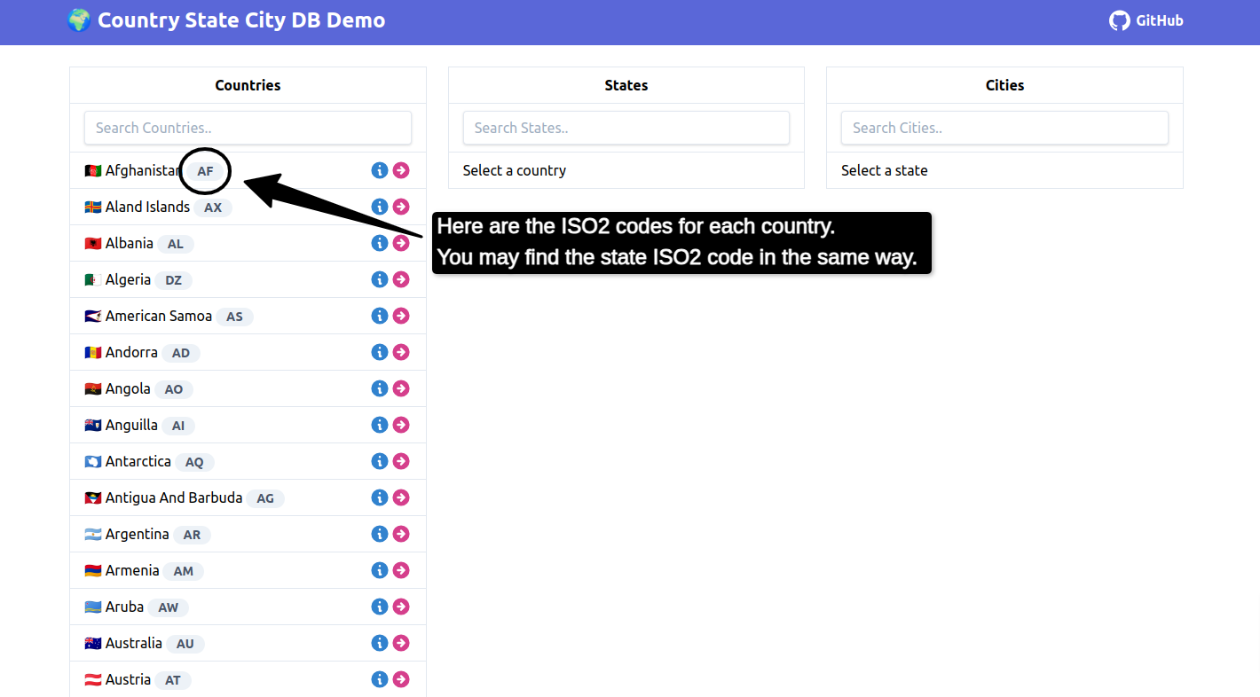
| defaultCountryValue (optional) | string | The ISO2 code for the default country to be selected if Country is not present in the dropdown options. |
| defaultStateValue (optional) | string | The ISO2 code for the default state to be selected if Country and State are not present in the dropdown options. |
| labelClasses (optional) | string | A CSS class name or Tailwind classes to customize the styling of the input label. |
| cityLabel (optional) | string | A label for the city dropdown. |
| countryLabel (optional) | string | A label for the country dropdown. |
| stateLabel (optional) | string | A label for the state dropdown. |
| cityDropdownName (optional) | string | A name for the city dropdown. |
| stateDropdownName (optional) | string | A name for the state dropdown. |
| countryDropdownName (optional) | string | A name for the country dropdown. |
| |
Click here to visit Countries States Cities Demo for reference
Use Dropdown with react-hook-form Library
import { DropdownWithReactHookForm } from "country-dropdown";

<DropdownWithReactHookForm
    onDropdownChange={(value, type) =>
        handleChange(value, type)
    }
    dropdownOptions={["City", "State", "Country"]}
/>
| Prop Name | Type | Description |
| -------------------------------------- | --------------------------------------- | --------------------------------------------------------------------------------------------------------------------------------------------------------------------------- |
| onDropdownChange | (value: object, type: string) => void | A callback function triggered when the value of the dropdown changes. Receives the selected value and the type of dropdown (e.g., "Country", "State", "City"). |
| dropdownOptions (optional) | Array<string> | An array of strings representing the dropdown options. Determines the number of dropdowns to display. Example: ["Country", "State", "City"]. |
| cityPlaceholder (optional) | string | The placeholder text to display in the city dropdown. |
| statePlaceholder (optional) | string | The placeholder text to display in the state dropdown. |
| countryPlaceholder (optional) | string | The placeholder text to display in the country dropdown. |
| containerClassName (optional) | string | A CSS class name or Tailwind classes to customize the styling of the container that wraps the dropdown component. |
| inputClassName (optional) | string | A CSS class name or Tailwind classes to customize the styling of the dropdown input field. |
| optionItemClassName (optional) | string | A CSS class name or Tailwind classes to customize the styling of the dropdown options. |
| optionItemSelectedClassName (optional) | string | A CSS class name or Tailwind classes to customize the styling of the selected dropdown options. |
| optionsListClassName (optional) | string | A CSS class name or Tailwind classes to customize the styling of the dropdown options list. |
| optionItemHoverClassName (optional) | string | A CSS class name or Tailwind classes to customize the styling of the dropdown options when hovered. Use hover: for Tailwind classes and :hover for regular CSS classes. |
| defaultCountryValue (optional) | string | The ISO2 code for the default country to be selected if Country is not present in the dropdown options. |
| defaultStateValue (optional) | string | The ISO2 code for the default state to be selected if Country and State are not present in the dropdown options. |
| labelClasses (optional) | string | A CSS class name or Tailwind classes to customize the styling of the input label. |
| cityLabel (optional) | string | A label for the city dropdown. |
| countryLabel (optional) | string | A label for the country dropdown. |
| stateLabel (optional) | string | A label for the state dropdown. |
| cityDropdownName (optional) | string | A name for the city dropdown. |
| stateDropdownName (optional) | string | A name for the state dropdown. |
| countryDropdownName (optional) | string | A name for the country dropdown. |
| errorClassNames (optional) | string | CSS class name or Tailwind classes to customize the styling of the error message. |
| cityValidations (optional) | RegisterOptions | Validations for city dropdown |
| stateValidations (optional) | RegisterOptions | Validations for state dropdown |
| countryValidations (optional) | RegisterOptions | Validations for country dropdown |