
common-popup
v1.1.1
Published
Used to display pop-up windows, message prompts, and other content.
Downloads
4

Readme
common-popup
用于展示弹窗、信息提示等内容。
引入
通过以下方式来全局注册组件。
import { createApp } from 'vue'
import commonPopup from "common-popup"
const app = createApp()
app.use(commonPopup)
基础用法
1.中间弹出
<CommonPopup
  v-if="showPopup"
  title="提示"
  contentText="内容内容内容内容"
  :showPopup="showPopup"
  :showPopupClose="true"
  @onClose="onClose"
>
</CommonPopup>
import { ref } from 'vue';
export default {
  setup() {
    const showPopup = ref(true)
    const onClose = () => {
      showPopup.value = false
    }
    return {
      showPopup,
      onClose
    };
  },
};
示例效果: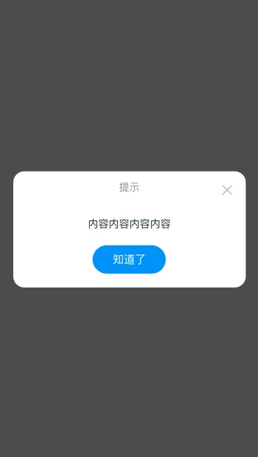
2.底部弹出
<CommonPopup
  v-if="showPopup"
  title="提示"
  height="60%"
  :showPopup="showPopup"
  :showPopupClose="true"
  @onClose="onClose"
  :hideCloseButton="true"
  popPosition="bottom"
  :isFixBottom="true"
  >
  <template v-slot:content>
    <div>内容内容内容内容内容内容</div>
  </template>
  <template v-slot:footer>
    <div class="footer">底部固定</div>
  </template>
</CommonPopup>
  import { ref } from 'vue';
  export default {
    setup() {
      const showPopup = ref(true)
      const onClose = () => {
        showPopup.value = false
      }
      return {
        showPopup,
        onClose
      };
    },
  };
<style>
  .footer {
    height: 80px;
    line-height: 80px;
    box-shadow: 0 0 24px 10px rgba(0, 0, 0, 0.08);
  }
</style>
示例效果: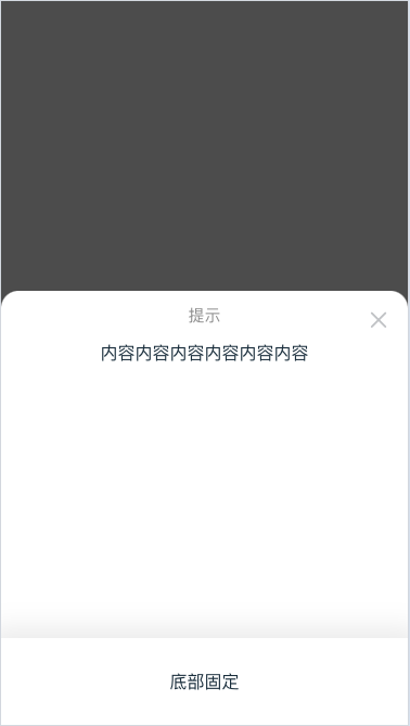
API
| 参数 | 说明 | 类型 | 默认值 | | :---------- | :--------- | :--------- | :--------- | | showPopup | 是否显示弹出层 | boolean | false | | title | 弹窗标题 | string | 提示 | | contentText | 弹窗内容文本 | string | - | | width | 弹窗宽度 | string | 中间弹出为90%;否则100% | | height | 弹窗高度,非中间弹窗时可设置 | string | - | | showPopupClose | 是否显示关闭图标 | boolean | false | | isOverlayClose | 是都可以点击遮罩层时关闭 | boolean | false | | hideCloseButton | 是否隐藏关闭按钮 | boolean | false | | buttonText | 关闭按钮文本 | string | 知道了 | | buttonColor | 按钮颜色 | string | #0099ff | | isRound | 是否显示圆角 | boolean | true | | isFixTop | 是否固定顶部标题区域(一般用于底部弹出框) | boolean | false | | isFixBottom | 是否固定底部区域(一般用于底部弹出框) | boolean | false | | popPosition | 弹出位置,可选值为 top bottom right left | string | center |
Events
| 参数 | 默认值 | | :---------- | :--------- | | onClose | 弹窗关闭事件 | | onOverlayClose | 点击遮罩层时触发 |
Slots
| 名称 | 说明 | 前置条件 | | :---------- | :--------- | :--------- | | top | 用于需要固定弹窗顶部区域 | isFixTop=true | | content | 内容区域 | - | | footer | 用于需要固定弹窗底部区域 |isFixBottom=true- |