
collapsible-react-component
v3.0.6
Published
Collapses and expands content with an animation.
Downloads
567
Maintainers
 onset
onsetReadme
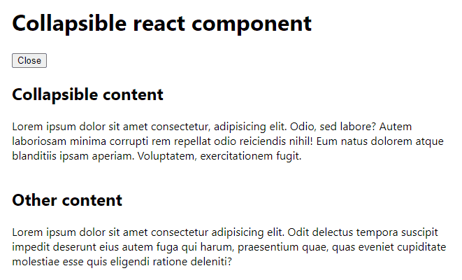
Collapsible react component
Collapses and expands content with an animation.


Install
npm install collapsible-react-componentUsage
Try CodeSandbox interactive demo or see Storybook examples.
import { useState } from 'react'
import { Collapsible } from 'collapsible-react-component'
import 'collapsible-react-component/dist/index.css'

const Example = () => {
	const [open, setOpen] = useState(true)

	return (
		<>
			<button
				type="button"
				onClick={() => {
					setOpen(!open)
				}}
			>
				{open ? 'Close' : 'Open'}
			</button>
			<Collapsible
				open={open}
				onTransitionStart={(open) => {
					console.log('Collapsible box used to be', open ? 'open' : 'closed')
				}}
				onTransitionEnd={(open) => {
					console.log('Collapsible box is now', open ? 'open' : 'closed')
				}}
				revealType="bottomFirst"
			>
				Lorem ipsum dolor sit amet consectetur, adipisicing elit. Odio, sed
				labore? Autem laboriosam minima corrupti rem repellat odio reiciendis
				nihil! Eum natus dolorem atque blanditiis ipsam aperiam. Voluptatem,
				exercitationem fugit.
			</Collapsible>
		</>
	)
}
Props
| Name | Required | Default | Type | Description |
| --------------------------- | -------- | ------------- | ------------------------- | ------------------------------------------------------------------------------------ |
| open | ✅ | | boolean | Determines whether the children content should be visible. |
| children | ✅ | | ReactNode | Collapsible content. |
| onTransitionStart | | noop | (open: boolean) => void | Callback invoked when transition starts. open is the starting state. |
| onTransitionEnd | | noop | (open: boolean) => void | Callback after content is fully expanded or fully closed. open is the final state. |
| revealType | | bottomFirst | bottomFirst \| topFirst | Type of transition animation. |
| alwaysKeepChildrenMounted | | false | boolean | If true then children won't be unmounted when collapsed. |
Development
Run
npm ci
npm run dev
and
cd example
npm ci
npm run dev