code-input-react
v0.0.6
Published
best code input for react
Downloads
54
Readme
Best input code for react
Current situation with code-input components for React on npm:
- Some of them use keyCode, which is deprecated and don't work correctly in some mobile browsers
- Some of them are not controllable. You cannot just set value to whatever you want
- Some of them don't correctly handle paste event
- Some of them don't have a blur when the last digit gets filled
- Some of them don't select previous unfilled digit after the last digit gets filled
- Some of them have style unnecessary inline object styling
- Some of them use overhead like styled-components for such a simple component
Give it up! Best input code component for React

Basic usage example
import {CodeInputReact} from 'code-input-react';
import 'code-input-react/dist/style.min.css';

const App = () => {
    const [value, setValue] = useState('');

    return <CodeInputReact
        length={4}
        value={value}
        onChange={setValue}
        onComplete={(code) => alert(`COMPLETE: ${code}`)}
    />
}
Full usage example
Clone this repo, go to example directory and run
yarn install && yarn start.
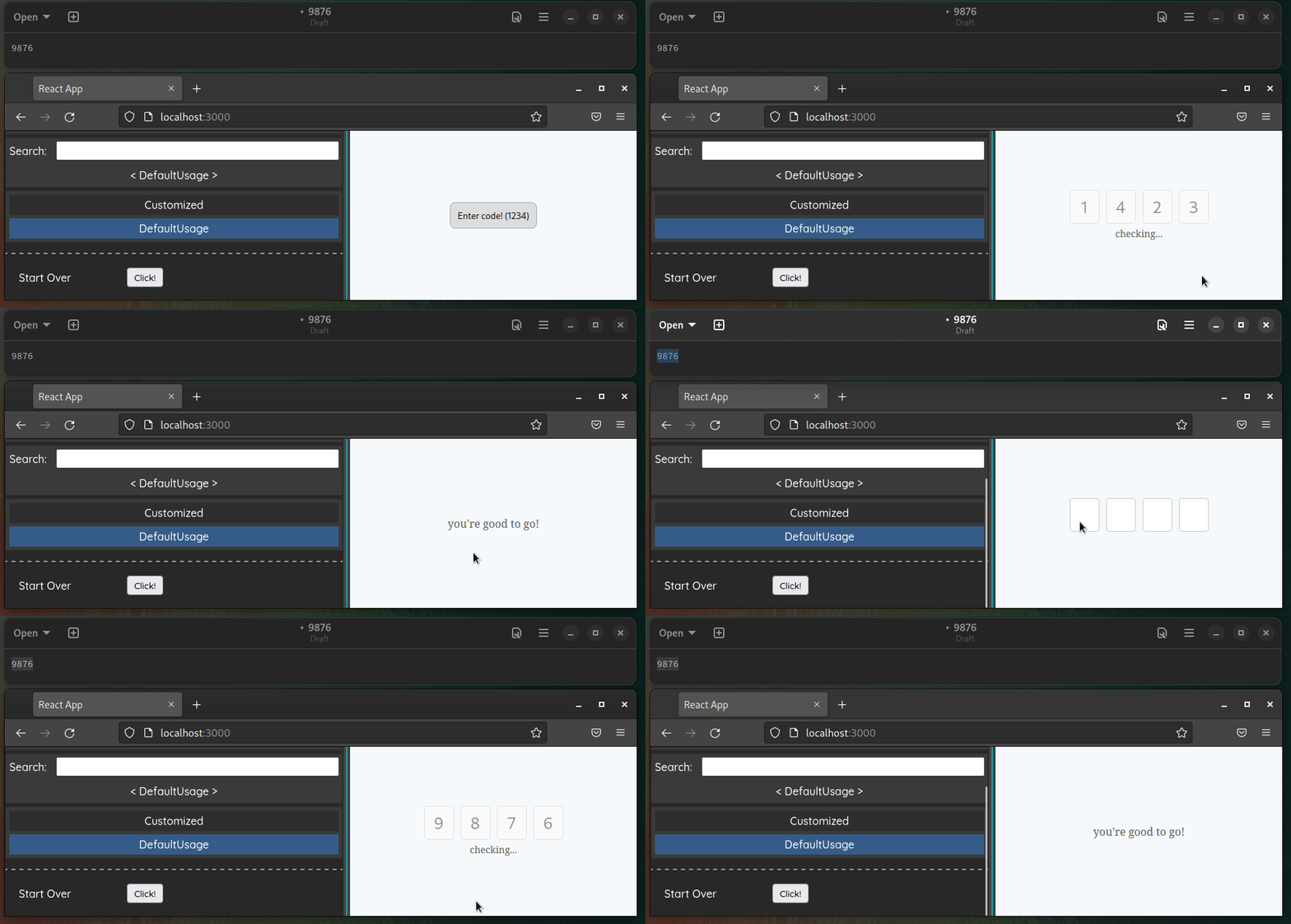
Check it out live!
- Play with props in the first story (Customized)
- See more real-world like example in the second story (DefaultUsage)
Styling
You can import styles from
code-input-react/dist/style.min.css, or write your own.
.code-input-react {
    /* container class */
}
.code-input-react--invalid {
    /* invalid container class. appears when <valid> prop is false */
}
.code-input-react--disabled {
    /* disabled container class. appears when <disabled> prop is true */
}
.code-input-react__digit {
    /* input cell class */
}
SMS Autofill
Tested on iOS 14
CodeInputReact Props
| Prop | Type | Description | |:---------------|:------------------------------------------------|:----------------------------------------------------------------------------| | length | number | Digits count | | value | string | Current value | | onChange | (value: string) => void | Change handler | | onComplete | (value: string) => void | Change handler, invokes only if all digits are filled | | disabled | boolean | Disabled flag | | valid | boolean | Valid flag | | autoFocus | boolean | Focus first digit on mount flag | | type | 'number' | 'text' | Digit type. Any text symbols or numbers | | focusOnInvalid | boolean | Focus on first digit when valid becomes false, so user can fill out again | | innerRef | MutableRefObject<CodeInputReactRef | null> | Ref to control input outside | | className | string | Container className |
CodeInputReactRef
export type CodeInputReactRef = {
  /** Focus n-th digit. */
  focus: (nth?: number) => void;
  /** Use it if you need access for input */
  inputs: Array<HTMLInputElement | null>;
};
CHANGELOG
0.0.1 20.07.2022
- Initial release
0.0.2 20.07.2022
- Fix export
0.0.3 20.07.2022
- Add new API
0.0.4 20.07.2022
- Change default [valid] param
- Add usage example
0.0.5 20.07.2022
- Add sms autofill
- Update example
0.0.6 07.08.2022
- Update readme
