cm-text_editor
v0.1.3
Published
A rich text editor for Angular applications with essential formatting options, customizable toolbar, and ngModel binding support.
Downloads
46
Maintainers
Readme
CM-TextEditor
CM-TextEditor is a rich text editor for Angular applications, offering a simple yet powerful interface. It’s open source and free to use, making it accessible to everyone. This library is designed to provide easy integration, full customization options, and seamless two-way data binding.
Key Features
- Rich Text Editing: Provides all essential text formatting options, including bold, italic, underline, lists, links, and more.
- ngModel Binding: Works effortlessly with Angular's
ngModel, ensuring two-way data binding for reactive and template-driven forms. - Customizable: Easily customize toolbar options, styles, and behavior to match your application's design and functionality needs.
- User-Friendly: Intuitive interface that provides an easy text editing experience for both developers and users.
- Lightweight: Quick and easy to install, making it suitable for both small projects and large-scale applications.
Changelog
- What's New:
- Changed component selector name to
cm-text-editor. - Added labels to toolbar options for better user experience.
- Added tootips to toolbar options for better user experience.
- Added new type interface for custom toolbar you can now simply import it from the library.
- Added integration with reactive forms.
- Added more responsiveness to the UI.
- Changed component selector name to
- Bug Fixes:
- Resolved an issue where some css of toolbar buttons was being applied to buttons in your components.
- Increased specificity of css selectors so they do not override other elements of your components.
- And Other minor bug fixes.
- Note:
- CSS selctors are changed, If you are using custom styles then make changes according to the new stylesheet
- What's New:
- Added improved text editor toolbar options for better user experience.
- Introduced a new way for custom styling of the text editor.
- Bug Fixes:
- Resolved an issue where some toolbar buttons were not showing active after click.
- Resolved an issue where some toolbar buttons were showing active even for non formatted text.
- Fixed cursor behavior when editing long text fields.
Installation
Install the library via npm:
npm install cm-text_editorUsage
Usage For Standalone Components :
first import
CMTextEditorComponentfrom thecm-text_editorlibrary in your standalone component and also create variable for data binding with the editor. You'll also need to importFormsModulefrom@angular/formsto use two way binding with text editor via[(ngModel)]for example :import { CMTextEditorComponent } from "cm-text_editor"; import { FormsModule } from "@angular/forms"; @Component({ selector: "app-my-app", standalone: true, imports: [ CMTextEditorComponent, FormsModule, // other modules... ], templateUrl: "./my-app.component.html", styleUrl: "./my-app.component.css", }) export class MyAppComponent { text = "hello!"; }after that you need to add this component in your html where you want to place this editor in your page And then bind your
textvariable with editor via[(ngModel)]like as follows :<cm-text-editor [(ngModel)]="text" name="editor"> </cm-text-editor>
Usage For Non-Standalone Components :
- first import
CMTextEditorComponentfrom thecm-text_editorlibrary in your standalone component and also create variable for data binding with the editor. You'll also need to importFormsModulefrom@angular/formsto use two way binding with text editor via[(ngModel)]for example :import { CMTextEditorComponent } from "cm-text_editor"; import { FormsModule } from "@angular/forms"; @NgModule({ imports: [ CMTextEditorComponent, FormsModule, // other modules... ], declarations: [ // your components... ], bootstrap: [AppComponent], }) export class AppModule { text = "hello!"; } - after that you need to add this component in your html where you want to place this editor in your page And then bind your
textvariable with editor via[(ngModel)]like as follows :<cm-text-editor [(ngModel)]="text" name="editor"> </cm-text-editor>
- first import
Customisations
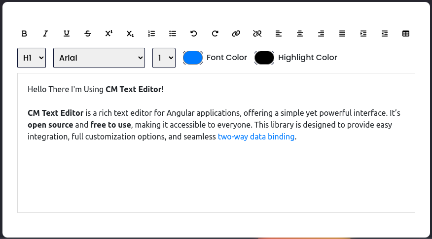
Full Mode :
- In this Mode this editor will have the the full toolbar and default styling. It is the default mode of text editor you don't need to do anything explicitly.

- In this Mode this editor will have the the full toolbar and default styling. It is the default mode of text editor you don't need to do anything explicitly.
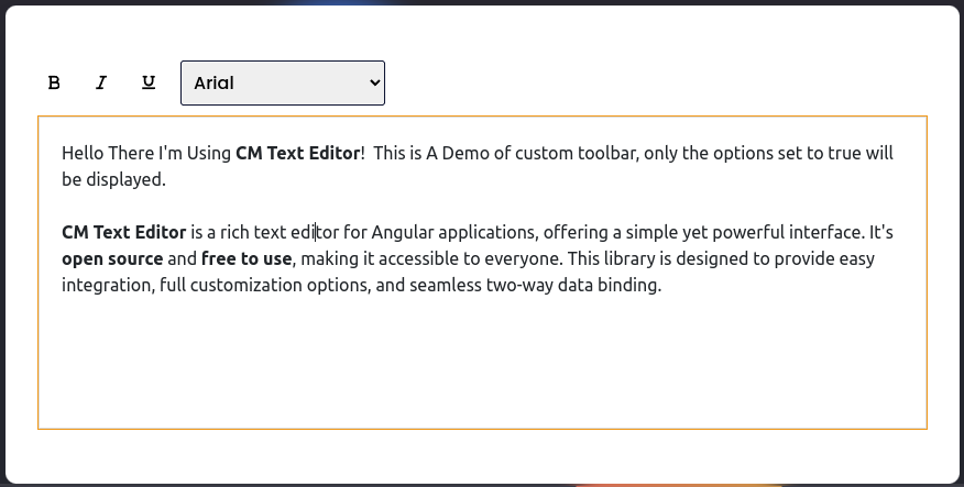
Custom Toolbar : As this is fully customisable text editor so you can also customise the toolbar of the text editor. You can decide which toolbar options you want in the editor follow the following steps
STEP 1 : after done importing
CMTextEditorComponentfrom thecm-text_editorand including it in your html, ImportToolbarConfigTypeinterface from thecm-text_editorthen create a variable of typeToolbarConfigTypein your component which will hold the names of toolbar options you want to include.import { CMTextEditorComponent, ToolbarConfigType } from "cm-text_editor"; import { FormsModule } from "@angular/forms"; @Component({ selector: "app-my-app", standalone: true, imports: [ CMTextEditorComponent, FormsModule, // other modules... ], templateUrl: "./my-app.component.html", styleUrl: "./my-app.component.css", }) export class MyAppComponent { toolbarConfig: toolbarConfigType = { //you can choose any name for this variable bold: true, italic: true, underline: true, fontName: true, }; text = `Hello There I'm Using CM Text Editor! This is A Demo of custom toolbar, You might see an empty toolbar like this, If you passed an empty object {} to the component. only the options set to true will be displayed. CM Text Editor is a rich text editor for Angular applications, offering a simple yet powerful interface. It's open source and free to use, making it accessible to everyone. This library is designed to provide easy integration, full customization options, and seamless two-way data binding.`; }here as shown there you can mention the required tools as true. there are more tools but you don't need to worry about remembering their names because I got covered you, You can use this following interface for it. It s included in the library you can import it instead.
export interface toolbarConfigType {
  bold?: boolean; // Enables or disables bold text formatting.
  italic?: boolean; // Enables or disables italic text formatting.
  underline?: boolean; // Enables or disables underline text formatting.
  strikethrough?: boolean; // Enables or disables strikethrough text formatting.
  superscript?: boolean; // Enables or disables superscript formatting (text raised above the baseline).
  subscript?: boolean; // Enables or disables subscript formatting (text lowered below the baseline).
  orderedList?: boolean; // Enables or disables ordered list creation (numbered lists).
  unorderedList?: boolean; // Enables or disables unordered list creation (bulleted lists).
  undo?: boolean; // Enables or disables the undo action to revert the last change.
  redo?: boolean; // Enables or disables the redo action to restore the last undone change.
  hyperlink?: boolean; // Enables or disables hyperlink creation (adding links to text).
  unlink?: boolean; // Enables or disables the option to remove hyperlinks from selected text.
  alignLeft?: boolean; // Enables or disables left text alignment.
  alignRight?: boolean; // Enables or disables right text alignment.
  alignCenter?: boolean; // Enables or disables center text alignment.
  justify?: boolean; // Enables or disables justified text alignment (text aligned to both left and right).
  indent?: boolean; // Enables or disables the indent option (increasing the left margin of a paragraph).
  outdent?: boolean; // Enables or disables the outdent option (decreasing the left margin of a paragraph).
  table?: boolean; // Enables or disables table insertion functionality.
  formatBlock?: boolean; // Enables or disables the format block option (changing paragraph styles).
  fontName?: boolean; // Enables or disables font name selection for text styling.
  fontSize?: boolean; // Enables or disables font size selection for text styling.
  fontColor?: boolean; // Enables or disables font color selection for text styling.
  highlightColor?: boolean; // Enables or disables highlight color selection for text.
}
STEP 2 : After that you have to pass this variable via the input property I added on this component
[customToolbar]you can pass this value to theCMTextEditorComponentas follows:<cm-text-editor [(ngModel)]="text" name="editor" [customToolbar]="toolbarConfig"> </cm-text-editor>and you're done now your text editor will kinda look like this :

If you don't pass any values to the
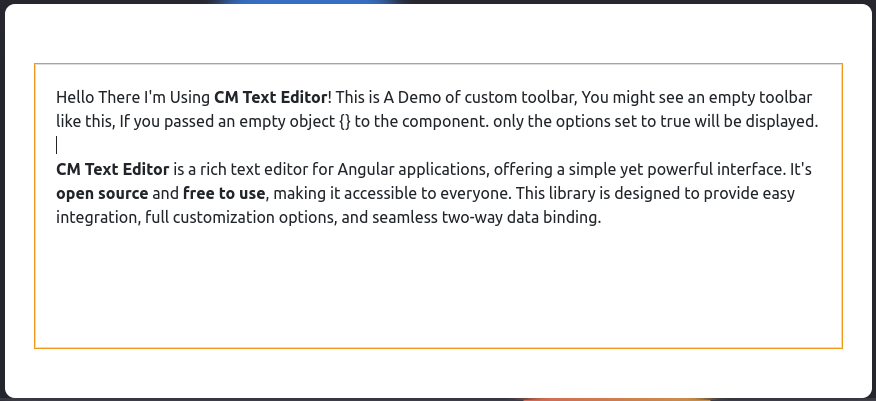
CMTextEditorComponentthen it will display all the tools.Note: But if you are passing an empty object
{}to theCMTextEditorComponentthen all the values will be considered as false and None of the tools will be shown in the toolbar you will see an Empty toolbar. like this :
Custom Styling : As this is fully customisable text editor so you can also customise the Styling of the text editor. You can use this default style sheet in your components styles file and customise it according to your preferences.
Deafult Stylesheet
```css * { padding: 0; margin: 0; box-sizing: border-box; } /*div containing Whole Editor*/ .container { background-color: #ffffff; color: #000; width: 100%; padding: 25px 30px 50px 30px; border-radius: 10px; box-shadow: 0 25px 50px rgba(7, 20, 35, 0.2); } /*div containing all the buttons of toolbar*/ .options { display: flex; flex-wrap: wrap; align-items: center; gap: 15px; } /*div containing all the select & inputs of toolbar*/ .opt-group { display: flex; flex-wrap: wrap; align-items: center; justify-content: space-between; gap: 15px; } /*All the buttons of toolbar*/ .options button { height: 28px; width: 28px; display: grid; place-items: center; border-radius: 3px; border: none; background-color: #ffffff; outline: none; color: #020929; } /*all the active buttons*/ .active { background-color: #e0e9ff !important; } /*all the select options of toolbar*/ .opt-group select { padding: 7px; border: 1px solid #020929; border-radius: 3px; } /*all the select options of toolbar & their labels*/ .opt-group label, .opt-group select { font-family: "Poppins", sans-serif; font-weight: bold; font-size: 13px; } /*div wrapping select options of toolbar and their labels*/ .select-wrapper { display: flex; flex-direction: column; } /*div wrapping input options of toolbar and their labels*/ .input-wrapper { display: flex; flex-direction: column; justify-content: space-between; } /*color input options of toolbar*/ .opt-group input[type="color"] { -webkit-appearance: none; -moz-appearance: none; appearance: none; background-color: transparent; width: 100%; height: 28px; border: none; cursor: pointer; } .opt-group input[type="color"]::-webkit-color-swatch { border-radius: 15px; box-shadow: 0 0 0 2px #ffffff, 0 0 0 3px #020929; } .opt-group input[type="color"]::-moz-color-swatch { border-radius: 15px; box-shadow: 0 0 0 2px #ffffff, 0 0 0 3px #020929; } /*text input area*/ #text-input { margin-top: 25px; border: 1px solid #dddddd; padding: 10px; height: 100px; overflow-x: auto; } /*Inserted table*/ table { border: 1px solid #000; } td { border: 1px solid #000; padding: 8px; } ```- Note : If any styles property is not being applied then you should use
!importantfor that property as follows:
.options button { height: 28px !important; /* you can forcefully override the default styling*/ width: 28px; display: grid; place-items: center; border-radius: 3px; border: none; background-color: #ffffff; outline: none; color: #020929; }- Note : If any styles property is not being applied then you should use
Custom Styling via component properties : - You can write the styles as a string and store it in a variable and then bind that variable with the
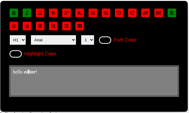
[customStyleSheet]input property of the editor component. write your custom styles as follows:import {CMTextEditorComponent} from "cm-text_editor"; import { FormsModule } from '@angular/forms'; @Component({ selector: 'app-my-app', standalone: true, imports: [ CMTextEditorComponent, FormsModule, // other modules... ], templateUrl: './my-app.component.html', styleUrl: './my-app.component.css', }) export class MyAppComponent { text = 'hello editor!'; //you can use variable name of your choice customStyleSheet = ` .active{ background: green !important; } button{ background: red; } .container{ background: black; color: red; } #text-input{ background-color : grey; color: white; } ` }you can refer to the default stylesheet I provided above for more understanding.
Now you need to bind this variable with the
[customStyleSheet]input property of editor component as follows:<cm-text-editor [(ngModel)]="text" [customStyleSheet]="customStyleSheet" ></cm-text-editor>And done now your custom stylings should be applied and your text editor will look like this:

Contributing
Contributions are welcome! If you would like to contribute to CM-TextEditor, please fork the repository and create a pull request. We appreciate any improvements, bug fixes, or new features you can offer.
Acknowledgments
Thank you to all the contributors and the community for supporting CM-TextEditor. Your feedback and contributions are greatly appreciated!
Contact
For questions or suggestions, feel free to reach out:
- Email: [email protected]
- GitHub: codes-by-chetan
