cleantile
v0.1.0
Published
A tiling display manager with a twist.
Readme
Clean Tile
Clean Tile is a flexible tiling layout system, written for Polymer.
The following badges report the status of the last build from any branch, and do not reflect the health of the latest
release.
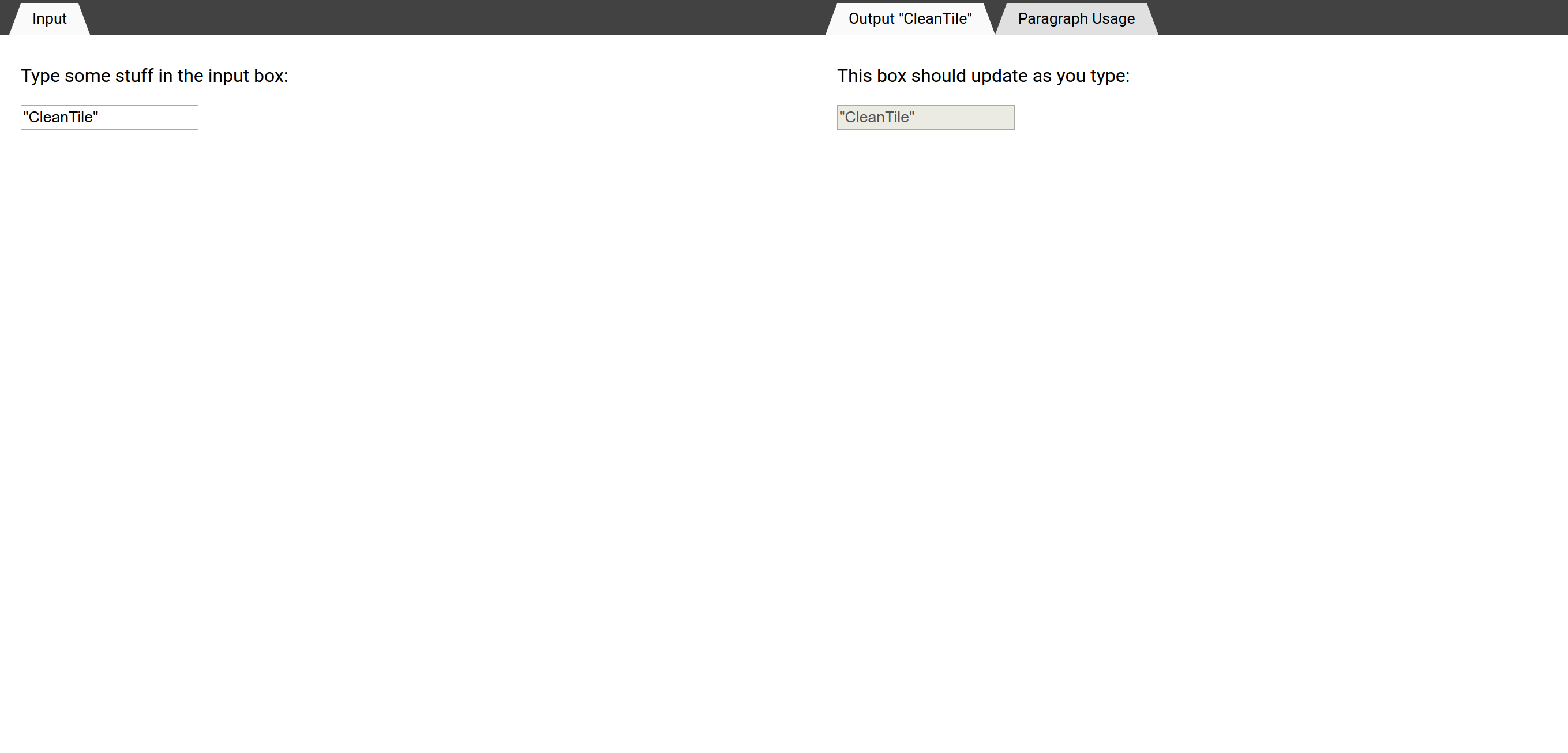
Screenshot

See the documentation for demos.
Installation
Clean Tile is cross-published on NPM and Bower.
As the Bower polymer package is named @polymer/polymer on NPM, either a symlink or Vulcanize redirect is needed
to make node_modules/polymer point to node_modules/@polymer/polymer for all NPM installs.
npm install --save cleantile
cat node_modules/cleantile/pane/cleantile-pane.html # (same as in source)
cat node_modules/cleantile/cleantile-pane.html # (shortcut)
bower install cleantile/cleantile
cat bower_components/cleantile/pane/cleantile-pane.html # (same as in source)
cat bower_components/cleantile/cleantile-pane.html # (shortcut)Components
To provide lightweight downloads, each element is published separately on NPM and Bower.
npm install --save @cleantile/pane
cat node_modules/@cleantile/pane/cleantile-pane.html
bower install cleantile/pane
cat bower_components/cleantile-pane/cleantile-pane.htmlGuide
This is not extensive documentation. See cleantile.codelenny.com for the full documentation.
Most of the examples in this guide will demonstrate Clean Tile being used in an integrated development environment.
Fictitious elements such as <file-editor> are used as filler content.
Elements
cleantile-pane
:new: Added in v0.1.0.
<cleantile-pane> is one of the essential items for Clean Tile. A pane defines a space where dynamic application
content can be inserted. Inserted application contents are called views.
Clean Tile is designed with tabs in mind. If you are using tabs, you can insert multiple views into a single pane.
<cleantile-pane>
  <file-editor file="README.md" syntax="markdown"></file-editor>
  <file-editor file="LICENSE" syntax="text"></file-editor>
</cleantile-pane>
To disable tab-like behavior, the singular attribute will enforce that only one view is inserted into a pane.
<cleantile-pane singular>
  <file-editor file="README.md" syntax="markdown"></file-editor>
</cleantile-pane>
cleantile-split
:new: Added in v0.1.0.
<cleantile-split> allows dividing a container into two sections, in either a vertical or horizontal direction.
Each side of the split needs to be either a cleantile-pane or a nested cleantile-split.
<cleantile-split direction="horizontal">
  <!-- The left side is a pane that only contains a file browser -->
  <cleantile-pane singular>
    <file-browser directory="/home/"></file-browser>
  </cleantile-pane>
  <!-- The right side is split vertically into two panes, each containing text editors -->
  <cleantile-split direction="vertical">
    <!-- The right-top pane contains a single file editor -->
    <cleantile-pane>
      <file-editor file="README.md" syntax="markdown"></file-editor>
    </cleantile-pane>
    <!-- The right-bottom pane contains two file editors -->
    <cleantile-pane>
      <file-editor file="LICENSE" syntax="text"></file-editor>
      <file-editor file="AUTHORS" syntax="text"></file-editor>
    </cleantile-pane>
  </cleantile-split>
</cleantile-split>
cleantile-container
:new: Added in v0.1.0.
Splits can be collapsed, and panes can be split. <cleantile-container> provides a consistent shell wrapping panes
and splits.
<body>
  <cleantile-container id="tiling">
    <cleantile-pane>
      <!-- ... -->
    </cleantile-pane>
  </cleantile-container>
</body>
Panes and splits expect to be wrapped in a container. All interactive features will require that content is enclosed
inside a <cleantile-container>.
cleantile-tabs
:new: Added in v0.1.0.
<cleantile-tabs> adds an automatically generated tab bar to <cleantile-pane> elements, allowing the user to switch
between the views inside a pane.
:memo: In a later release, <cleantile-tabs> will support additional buttons and layout controls.
<cleantile-pane>
  <cleantile-tabs></cleantile-tabs>
  <file-editor file="README.md" syntax="markdown"></file-editor>
  <file-editor file="LICENSE" syntax="text"></file-editor>
</cleantile-pane>
Views
As mentioned above, views are application-specific elements that are inserted into Clean Tile layout elements.
Clean Tile imposes an API on elements used as view elements to pass information between the application and the layout.
Views are given attributes, including if they are currently active. They are also sent events when a split changes the size of the pane, and when they are moved between different panes.
Views can report to Clean Tile the name to display in the tab, impose minimum or maximum widths, or give an icon to display in the tab, like a favicon.
When designing application elements, we suggest that you have them conform to the Clean Tile API. However, third-party and legacy elements can be easily wrapped.
Required properties are provided in a Polymer behavior that can be imported and used in custom elements. However, optional event listeners are not included in the behavior definition.
See the CleanTile.ViewBehavior documentation for examples of views.
Future Elements
cleantile-drag
:memo: This element will be included in a future release.
<cleantile-drag> can be included in a <cleantile-split> to provide a draggable bar to change the split's width.
By having the drag bar be an explicit element, styling and behavior options are more localized.
<cleantile-split>
  <cleantile-pane> <!-- ... --> </cleantile-pane>
  <cleantile-drag width="5px" move="clone"></cleantile-drag>
  <cleantile-pane> <!-- ... --> </cleantile-pane>
</cleantile-split>
cleantile-rearrange
:memo: This element will be included in a future release.
Splits can be manually resized, created, and deleted, but that can be tedious when trying to rearrange many views at once. A proposed overlay would allow manipulating the layout at a higher level. A mockup is below.

