cap-angular-schematic-auth-auth0
v1.2.4
Published
Angular schematic dedicated to the authentication of users with auth0 services.
Downloads
26
Readme
cap-angular-schematic-auth-auth0 
Schematics are generators that transform an existing filesystem. They can create files, refactor existing files, or move files around.
Previous requirements
cap-angular-schematic-auth-auth0 use bootstrap's classes, You can use a CAP product to configure and install bootstrap to your project the installation is as follows cap-angular-schematic-bootstrap.
ng add cap-angular-schematic-bootstrap@latest 4.0.0 true
Installation
To run the schematic you have to execute the following command on your terminal. Note the schematic only works within an angular project.
ng add cap-angular-schematic-auth-auth0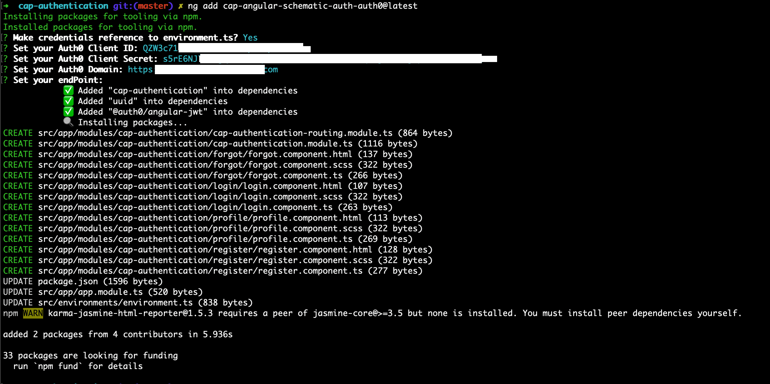
previously the schematic will ask the Auth0 authentication services credentials to be configured in the module.
- Set your Auth0 Client ID : < your-client-id >
- Set your Auth0 Client Secret : < your-client-secret >
- Set your Auth0 Domain : < your-domain >
- Set your Auth0 EndPoint : < end-point > (OPTIONAL)
Next, the Schematic will create a component for each of the authentication actions along with the routing configuration.
modules
    |
    cap-authentication
        |-- forgot/
        |-- login/
        |-- profile/
        |-- register/
        |-- routing.ts
        |-- module.ts
Usage
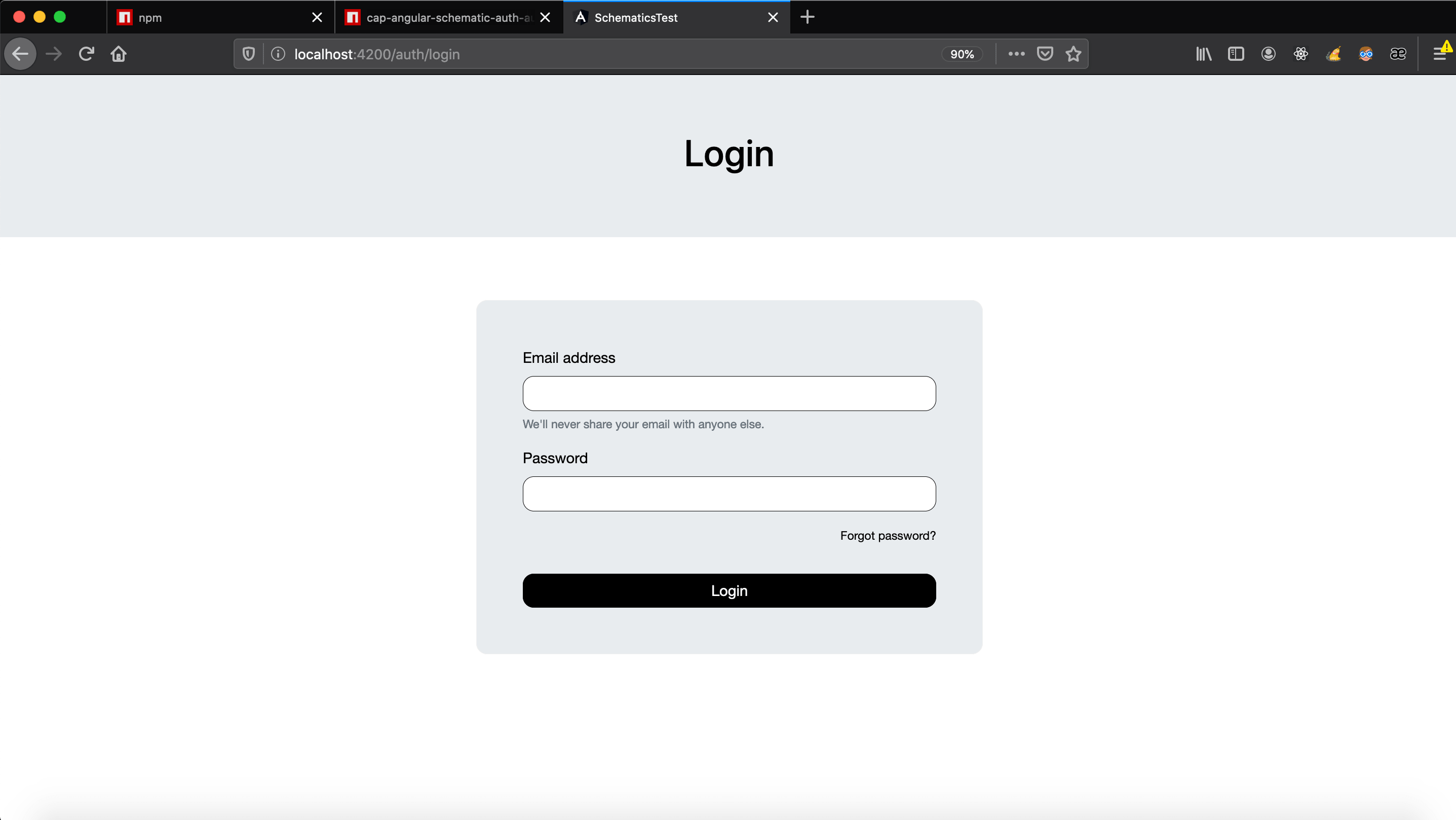
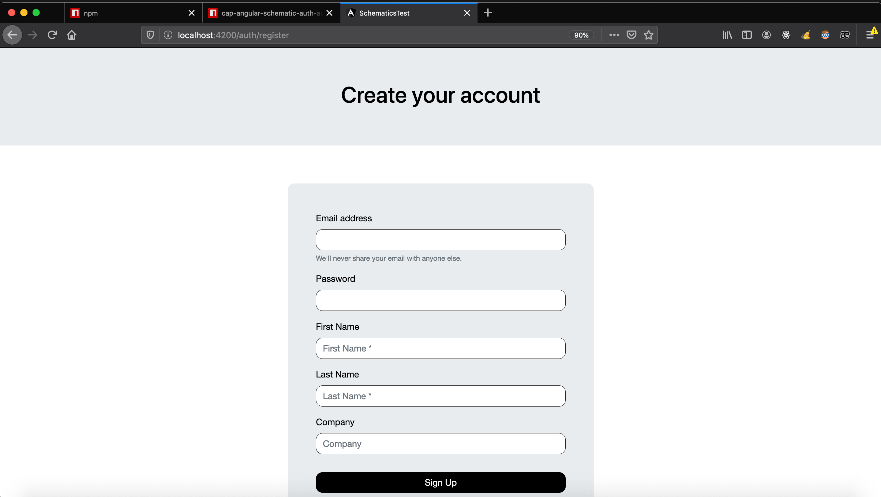
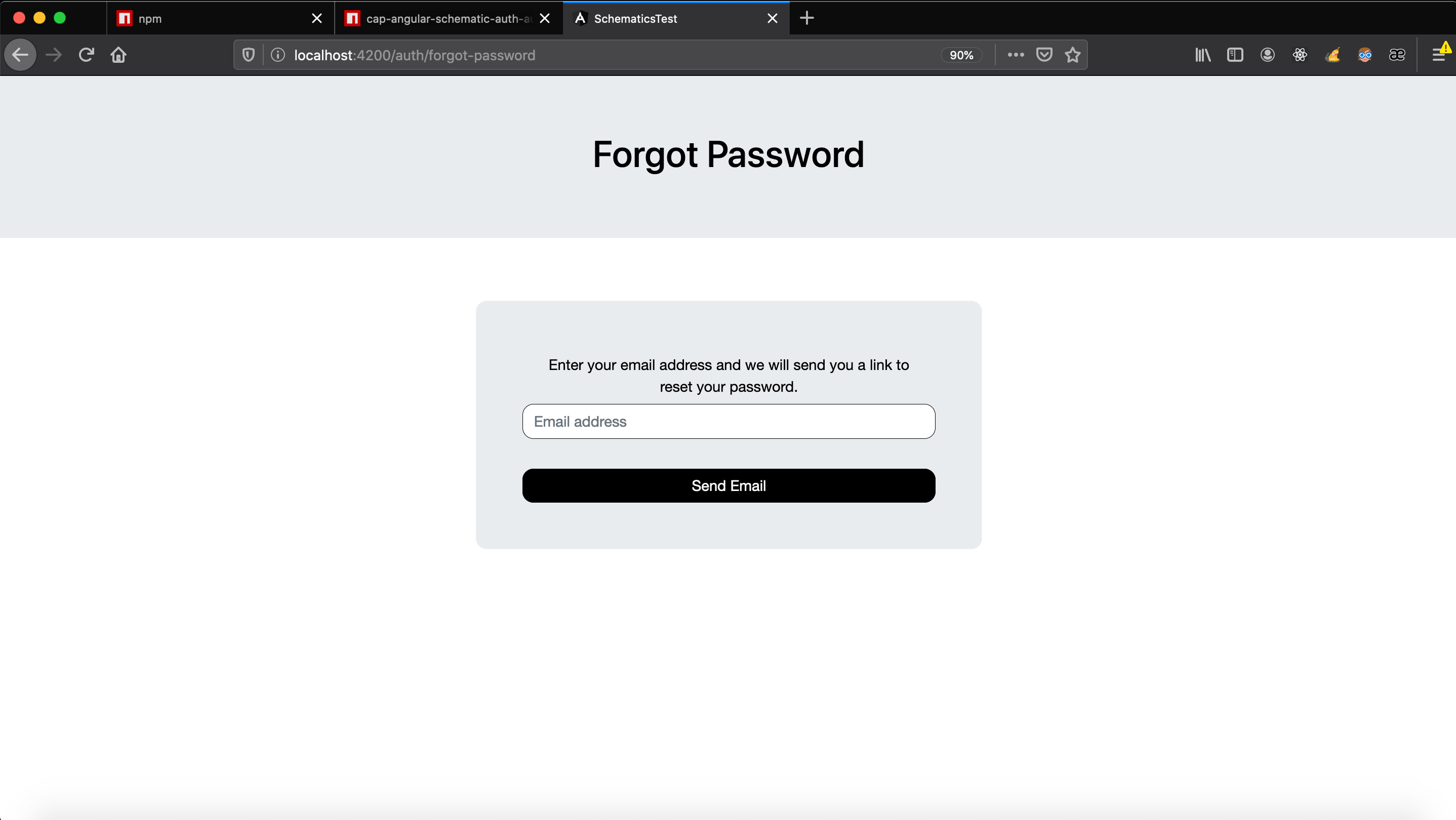
Now you can run your server from your angular project that we just modified and open the browser at http://localhost:4200/ and navigate on the different routes of the components of this schematic.
- Login
/auth/login
- Register
/auth/register
- Forgot
/auth/forgot-password
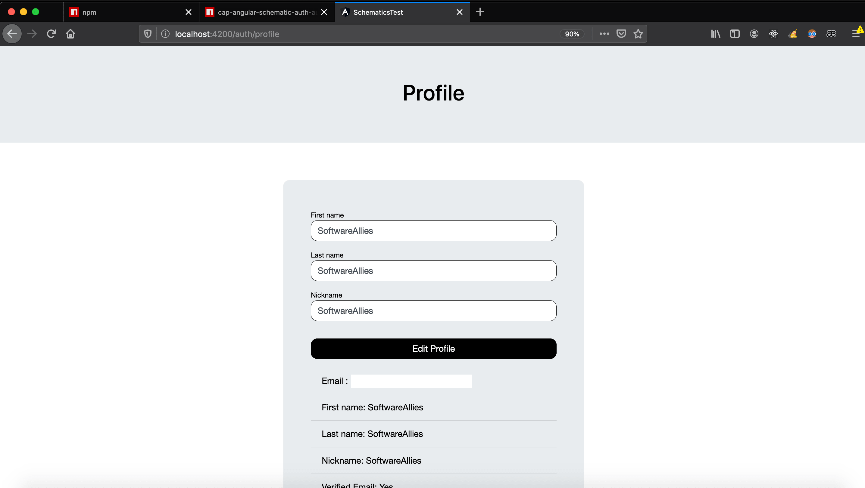
- Profile
/auth/profile
- LogOut function
import { AuthenticationService } from 'cap-authentication';

export class Component implements OnInit {
  constructor (public authenticationService: AuthenticationService) { }

  logoutFunction() {
   this.authenticationService.signOut() // Return to home page
  }
}
Styles
In order to edit and create classes that affect the components above, a class will have to be overwritten globally! all kinds and styles will have to go in the src/styles.scss file. with Pseudo-classes we will be able to modify the styles of the components, the component structure will be illustrated immediately to be able to access with scss each one of the nodes.
You can see an example of how to edit this module with your design styles.scss.
<div class="box">
    <div>
        <form>

            <!-- Register -->
            <!-- Login -->
            <!-- Forgot -->
            <div class="form-group">
                <label></label>
                <input class="form-control">
                <small class="form-text text-muted"></small>
            </div>
            <div class="form-group">
                <label></label>
                <input class="form-control">
                <div class="form-control-feeback text-danger text-center">ErrorMessage</div>
            </div>
             <div class="form-group form-check">
                <small class="form-text text-right">
                    <a routerLink="#"> goTo </a>
                </small>
            </div>
            <button type="submit" class="btn btn-primary btn-block"></button>
            <!-- Register -->
            <!-- Login -->
            <!-- Forgot -->

            <!-- Profile -->
            <!-- Profile -->
            <div class="row">
                <div class="col-12">
                    <div class="form-group">
                        <small class="form-text"></small>
                        <input class="form-control"/>
                        <small class="form-text"></small>
                    </div>
                    <div class="form-control-feeback mb-2 text-success text-center">
                    </div>
                    <button class="btn btn-info btn-block btnSubmit"></button>
                </div>
            </div>
            <div class="row">
                <div class="col-12">
                    <ul class="list-group list-group-flush">
                        <li class="list-group-item">{{}}</li>
                    </ul>
                </div>
            </div>
            <!-- Profile -->
            <!-- Profile -->

        </form>
    </div>
</div>