
buton
v1.0.0
Published
React Buton is a simple yet fully configurable button component you can quickly use in your project
Downloads
11
Maintainers
 abhishekchotaliya
Readme
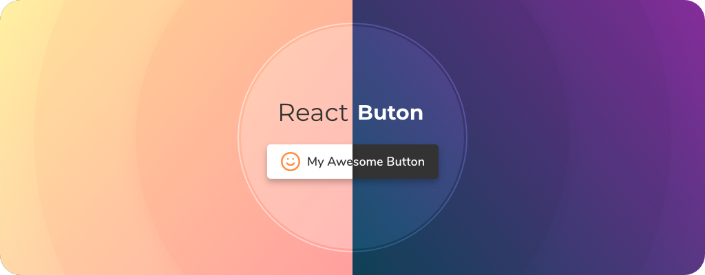
React Buton
React Buton is a simple yet fully configurable button component you can quickly use in your project.
Supported Props
||Description|Supported Values|Default Value|
|-|-|-|-|
|text|button Text (string)|||
|className|custom button class|||
|disabled|custom button class|boolean|false|
|onClick|click event handler|function||
|type|button type/theme|'light', 'dark', 'light_ghost', 'dark_ghost'|'light'|
|size|button size|'small', 'medium', 'large'|'medium'|
|textColor|color of button text|html supported color||
|bgColor|color of button background|html supported color||
|fontFamily|button font||Sans-serif|
|zoomEffect|button hover zoom effect|boolean|true|
|shadow|button drop shadow effect|boolean|true|
|icon|icon in the button|||
|iconSize|size of the icon (will be provided as font-size)||same as button font size|
|iconColor|color of the icon (will be provided as color)||same as button font color|
Upcoming Features
- [ ] web ui to generate the button
- [ ] predefined social media buttons
- [ ] gradient support
- [ ] loading status
- [ ] more button styles
- [ ] more button effects
- [ ] additional event listeners support