blocksin-system
v1.6.1
Published
[](https://system.blocksin.com/)
Downloads
389
Readme
BlocksInSystem
Click logo to visit system.blocksin.com
Table of Contents
- Avatar Component
- AvatarGroup Component
- Badge Component
- BadgeLevel Component
- Button Component
- Calendar Component
- Card Component
- Checkbox Component
- ComboBox Component
- CodeHighlight Component
- Toast Component
- DropdownMenu Component
- Flex Component
- Heading Component
- IconButton Component
- Iframe Component
- Input Component
- Loader Component
- Paragraph Component
- Pill Component
- Spinner Component
- Switch Component
- Table Component
- Tabs Component
- Tag Component
- TextArea Component
- Toggle Component
- ToggleGroup Component
- Toolbar Component
- Tooltip Component
- TopBanner Component
- UserOnHoldItem Component
- UserListItem Component
- UserItem Component
- Youtube Component
- ScrollArea Component
- Select Component
- Separator Component
- Slider Component
- Stepper Component
Introduction
Welcome to BlocksIn System, a custom React component library designed to extend the functionalities of the Radix component library. This library offers a range of components, from basic UI elements to complex functionalities, tailored for developers looking to streamline their React application development.
To ensure optimal appearance and functionality, BlocksIn System uses 'Open Sans' for body text and 'Darker Grotesque' for accent fonts. Add these fonts to your application by declaring the following variables in your main app.css file:
--font-body: "OpenSans";
--font-body-bold: "OpenSans-Bold";
--font-accent: "DarkerGrotesque";
--font-accent-bold: "DarkerGrotesque-Bold";
--font-accent-light: "DarkerGrotesque-Light";
Avatar Component
![]()
Overview
Avatar is a React component that displays a user's avatar image. It optionally shows a tooltip with the user's name and role when hovered over. If no avatar image is provided, it randomly selects one from a set of demo avatars.
Properties
avatar: String (optional)
- The URL or path of the avatar image.
- If not provided, a random avatar from demo images is used.
altText: String (optional)
- Alternative text for the avatar image for accessibility purposes.
- Defaults to "Avatar" if not provided.
text: String (optional)
- Text for the avatar image for accessibility purposes.
- Defaults to "Avatar" if not provided.
role: String (optional, deprecated)
- The role or title associated with the user.
- Displayed in the tooltip alongside the
altText.
size: String (optional)
- Default "large".
Usage
Here is an example of how to use the Avatar component:
import { Avatar } from "blocksin-system";

<Avatar
  avatar="/path/to/image.jpg"
  altText="John Doe"
  role="Software Engineer"
  size="medium
/>;
AvatarGroup Component
![]()
Overview
AvatarGroup is a React component that provides a container for displaying a group of avatars. It uses the Flex component to align the avatars horizontally.
Properties
- children: ReactNode:
- The avatar components to be grouped together.
Usage
Here's an example of how to use the AvatarGroup component:
import AvatarGroup from "./AvatarGroup";
import Avatar from "./Avatar";

<AvatarGroup>
  <Avatar avatar="/path/to/image1.jpg" altText="John Doe" />
  <Avatar avatar="/path/to/image2.jpg" altText="Jane Doe" />
  <Avatar avatar="/path/to/image3.jpg" altText="Alice Smith" />
</AvatarGroup>;
Badge Component
Overview
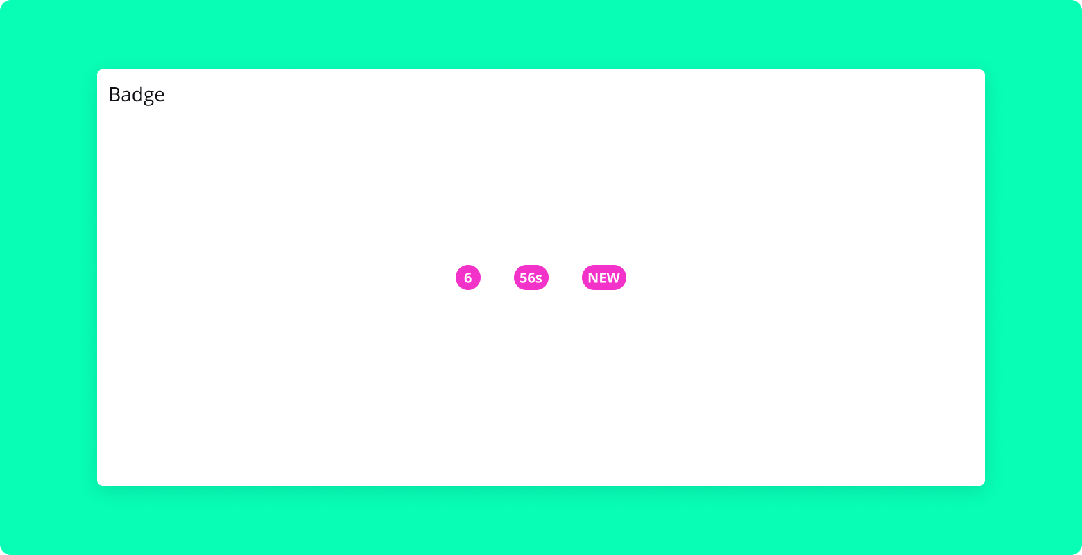
The Badge component is a simple React component used to display a small badge, typically used to show a count or to label an element. This component is styled using SCSS.
Properties
label: String (required)
- The text to be displayed inside the badge.
Usage
Here's an example of how to use the Badge component:
import { Badge } from "blocksin-system";

<Badge label="New" />;
BadgeLevel Component
Overview
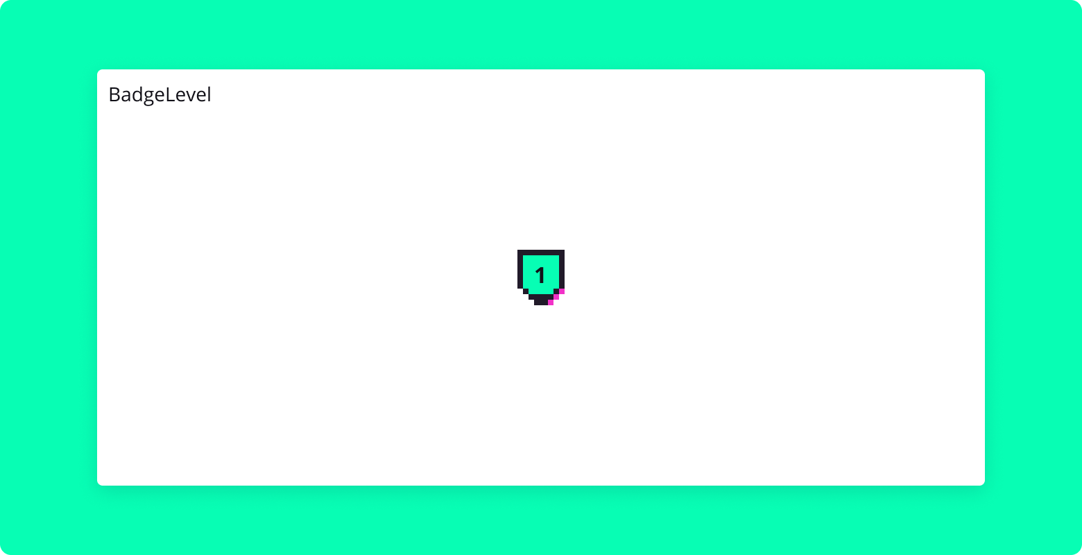
The BadgeLevel component is a React component designed to display a badge level using numbers and accompanying images. It's a simple, visually appealing way to represent different levels, such as user achievements, proficiency levels, etc.
Properties
badge: Number (optional)
- Represents the badge level to be displayed.
- Defaults to 1 if not provided.
Usage
Here's an example of how to use the BadgeLevel component:
import { BadgeLevel } from "blocksin-system";

<BadgeLevel badge={3} />;
Button Component
Overview
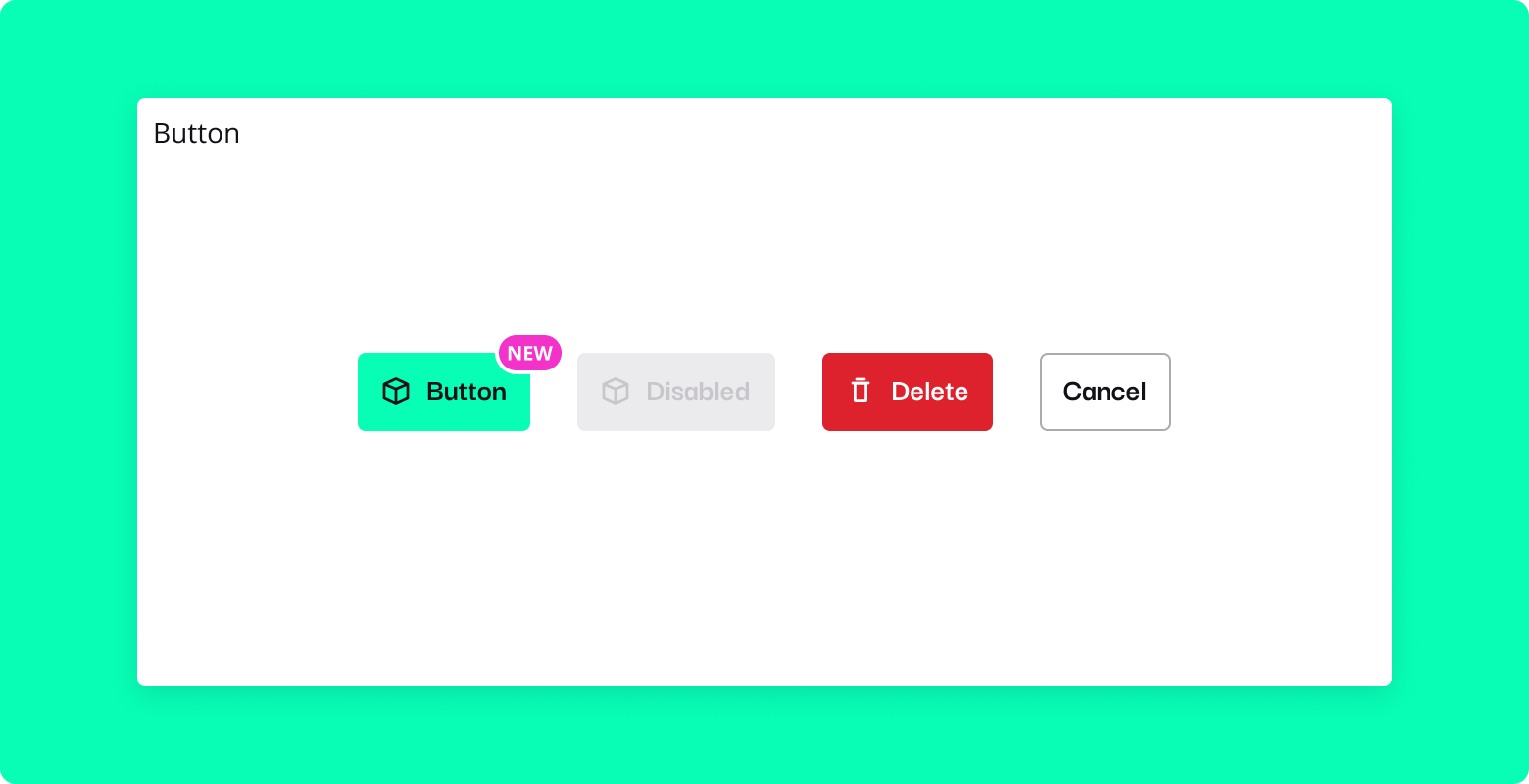
The Button component is a versatile and customizable button for React applications. It supports different sizes, styles, badges, loading states, and more. It is styled using SCSS and can be easily integrated into various parts of your application.
Properties
disabled: Boolean (optional)
- Disables the button when
true. - Default is
false.
- Disables the button when
showBadge: Boolean (optional)
- Shows a badge on the button when
true. - Default is
false.
- Shows a badge on the button when
badgeLabel: String (optional)
- The text to be displayed inside the badge.
size: String (optional)
- Sets the size of the button (
small,medium,large). - Default is
medium.
- Sets the size of the button (
variant: String (optional)
- Sets the button's style variant (
solid,outline, etc.). - Default is
solid.
- Sets the button's style variant (
onClick: Function (optional)
- Callback function to be called when the button is clicked.
onDrop: Function (optional)
- Callback function to be called on drop event.
fluid: Boolean (optional)
- If
true, the button takes the full width of its container. - Default is
false.
- If
isLoading: Boolean (optional)
- Shows a loading spinner and disables the button when
true. - Default is
false.
- Shows a loading spinner and disables the button when
helper: String (optional)
- A helper text to be displayed alongside the button content.
iconLeft: Component (optional)
- A React component (icon) to be displayed on the left side of the button text.
children: Node (optional)
- The content to be displayed inside the button.
Usage
Here's an example of how to use the Button component:
import { Button } from "blocksin-system";

<Button
  onClick={handleClick}
  variant="solid"
  size="large"
  showBadge
  badgeLabel="New"
>
  Click Me
</Button>;
Here's an example of how to use the helper in component:
import { Button } from "blocksin-system";
import { YourIconComponent } from "your-icon-library";

<Button
  onClick={handleClick}
  variant="solid"
  size="large"
  showBadge
  badgeLabel="New"
  helper="This is a helper text"
  iconLeft={YourIconComponent}
>
  Click Me
</Button>;
Calendar Component
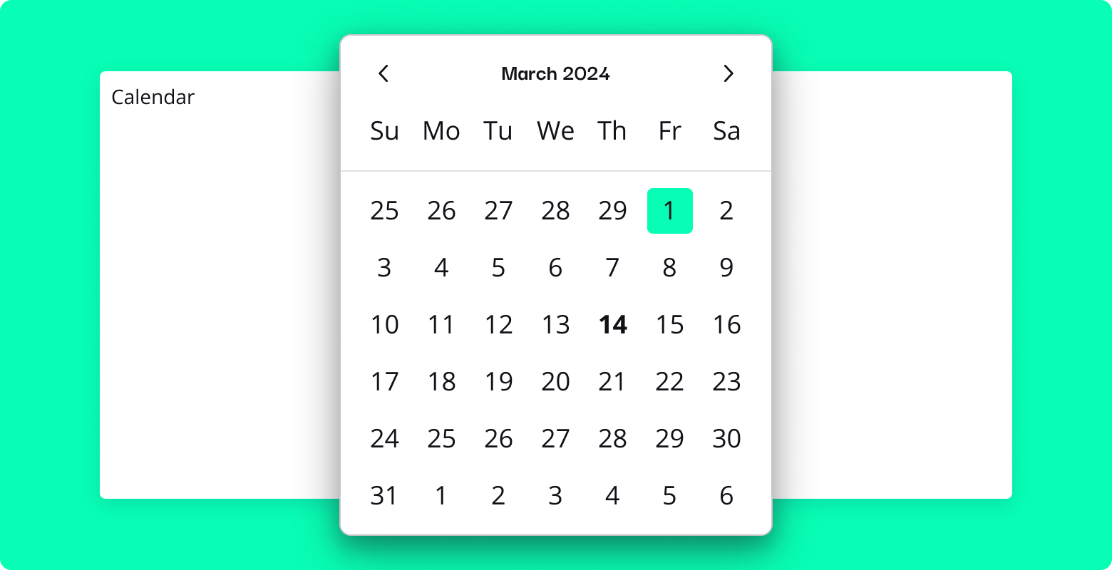
Overview
Calendar is a React component that provides a customizable date picker. It allows users to select a single date or a range of dates. The component is built on top of react-datepicker and can be integrated with custom input components.
Properties
children: ReactElement (required)
- The custom input component that will be used as the trigger for the calendar.
selectedDate: Date | [Date, Date] (required)
- The currently selected date or date range.
onChange: Function (required)
- A function that will be called with the new date or date range when the selection changes.
range: Boolean (optional)
- If
true, enables the selection of a date range. Defaults tofalse.
- If
...props: Object (optional)
- Any additional props will be passed to the underlying
react-datepickercomponent.
- Any additional props will be passed to the underlying
Usage
Here is an example of how to use the Calendar component with a custom input component:
import React, { useState } from "react";
import { Calendar, Input } from "bloksin-system";

function MyComponent() {
  const [selectedDate, setSelectedDate] = useState(new Date());

  return (
    <Calendar
      selectedDate={selectedDate}
      onChange={(date) => setSelectedDate(date)}
    >
      <Input placeholder="Select a date" readOnly />
    </Calendar>
  );
}

export default MyComponent;
Card Component
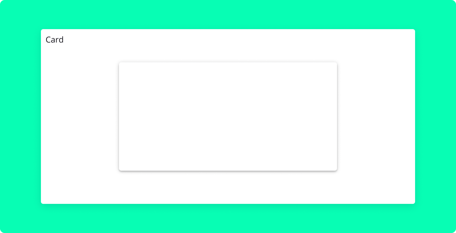
Overview
Card is a React component that provides a flexible container for content. It supports different variants, such as outline and ghost, and allows for customization through props like noPadding.
Properties
children: ReactNode
- The content to be displayed inside the card.
noPadding: Boolean
- If true, removes padding from the card content.
variant: String
- The variant of the card. Possible values are "outline" and "ghost".
Usage
Here is an example of how to use the Card component:
import { Card } from "blocksin-system";

<Card noPadding variant="outline">
  {/* Card Content */}
</Card>;
ComboBox Component
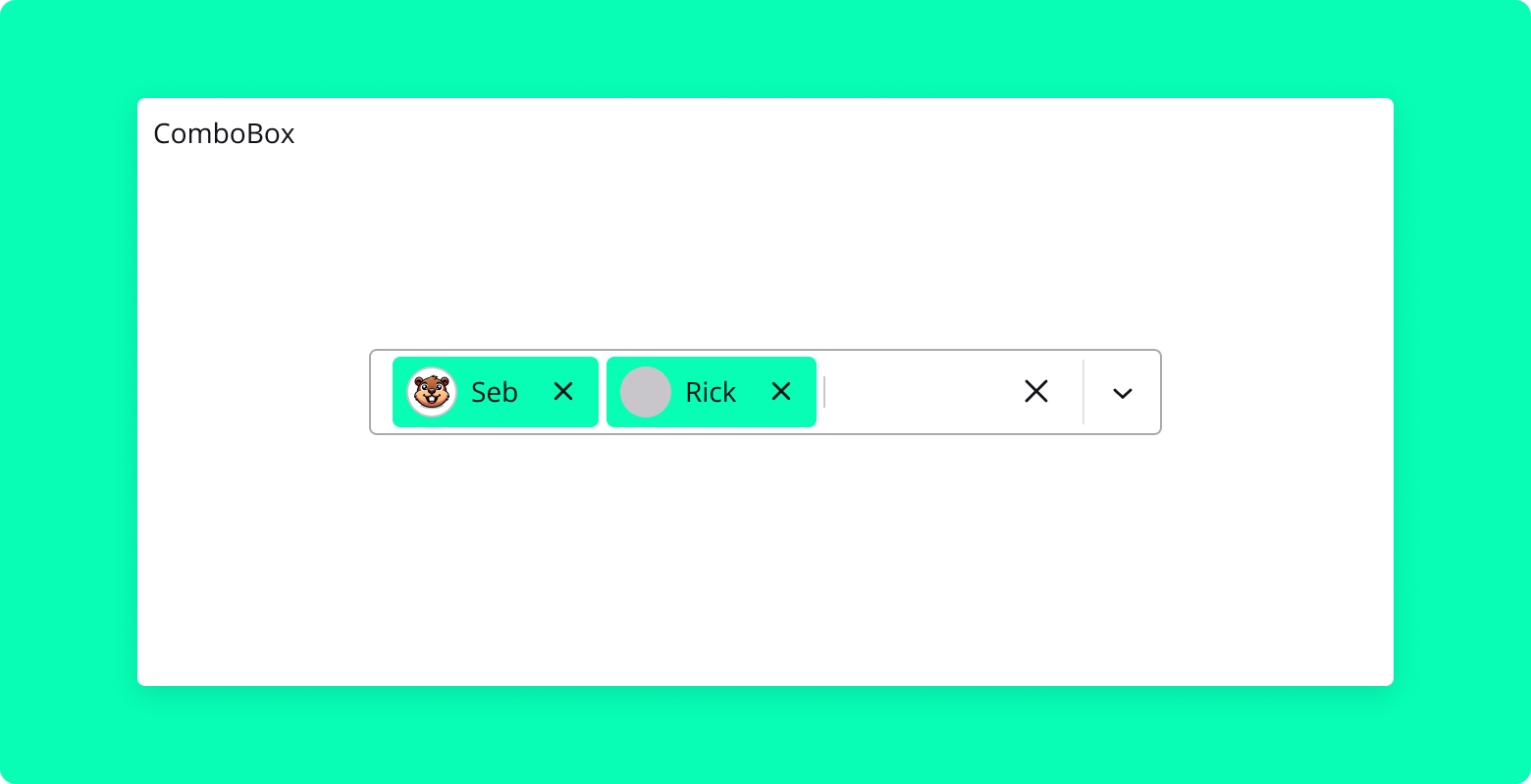
Overview
The ComboBox component is a multi-select dropdown component that allows users to select multiple options from a list. It supports custom rendering of options, including displaying avatars and other custom elements.
Properties
options: Array (required)
- An array of option objects that can be selected. Each option object should have a
label,value, and optionally anavatarproperty.
- An array of option objects that can be selected. Each option object should have a
value: Array (required)
- An array of selected option objects.
onChange: Function (required)
- A callback function that is called when the selected options change. It receives the updated array of selected options as an argument.
placeholder: String (optional)
- A placeholder text to display when no options are selected.
isMulti: Boolean (optional)
- A boolean indicating whether multiple options can be selected. Defaults to
true.
- A boolean indicating whether multiple options can be selected. Defaults to
fluid: Boolean (optional)
- A boolean indicating whether the component should expand to fill its container's width.
Usage
Here's an example of how to use the ComboBox component:
import { ComboBox } from "blocksin-system";

const options = [
  { label: "John Doe", value: "1", avatar: "path/to/avatar1.jpg" },
  { label: "Jane Doe", value: "2", avatar: "path/to/avatar2.jpg" },
  { label: "Bob Smith", value: "3", avatar: "path/to/avatar3.jpg" },
];

const App = () => {
  const [selectedOptions, setSelectedOptions] = useState([]);

  const handleChange = (options) => {
    setSelectedOptions(options);
  };

  return (
    <ComboBox
      options={options}
      value={selectedOptions}
      onChange={handleChange}
      placeholder="Select owners..."
      isMulti={true}
      fluid
    />
  );
};

export default App;
Checkbox Component
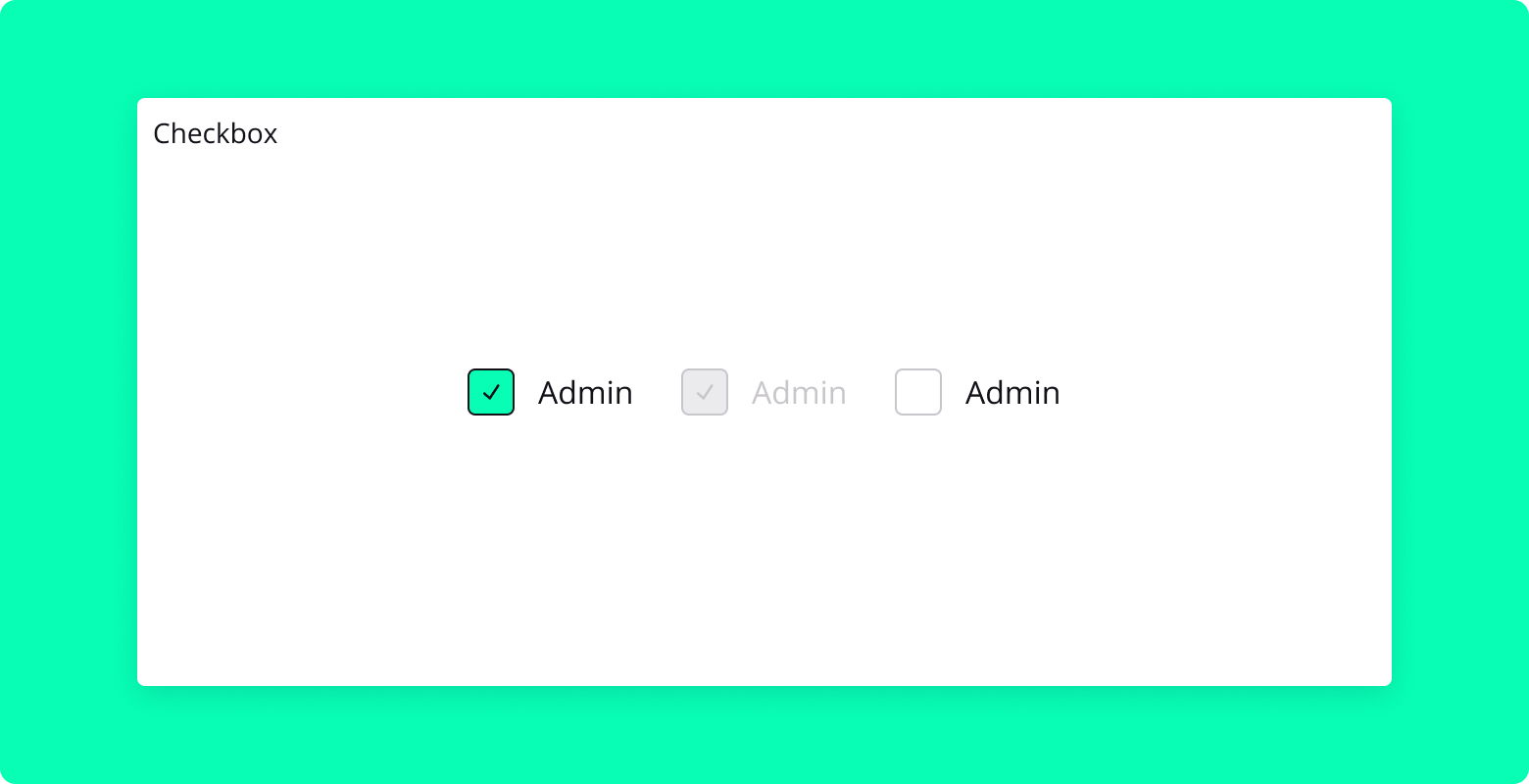
Overview
Checkbox is a React component that provides a customized checkbox experience. Built using @radix-ui/react-checkbox, this component offers a flexible and accessible way to integrate checkbox functionality into your application, with support for custom styling and additional content.
Properties
customID: String (required)
- A unique identifier for the checkbox. It is used to associate the checkbox with its label.
children: Node (optional)
- The content to be displayed alongside the checkbox. Typically used for the label text.
checked: Boolean (optional)
- Determines whether the checkbox is checked.
- Default is
false.
onChange: Function (optional)
- Callback function that is called when the checkbox's checked state changes.
disabled: Boolean (optional)
- Disables the checkbox when set to
true. - Default is
false.
- Disables the checkbox when set to
Usage
Here's an example of how to use the CheckboxCustom component:
import { Checkbox } from "blocksin-system";

<Checkbox customID="agreeTerms" onChange={handleCheckboxChange}>
  I agree to the terms and conditions
</Checkbox>;
CodeHighlight Component
Overview
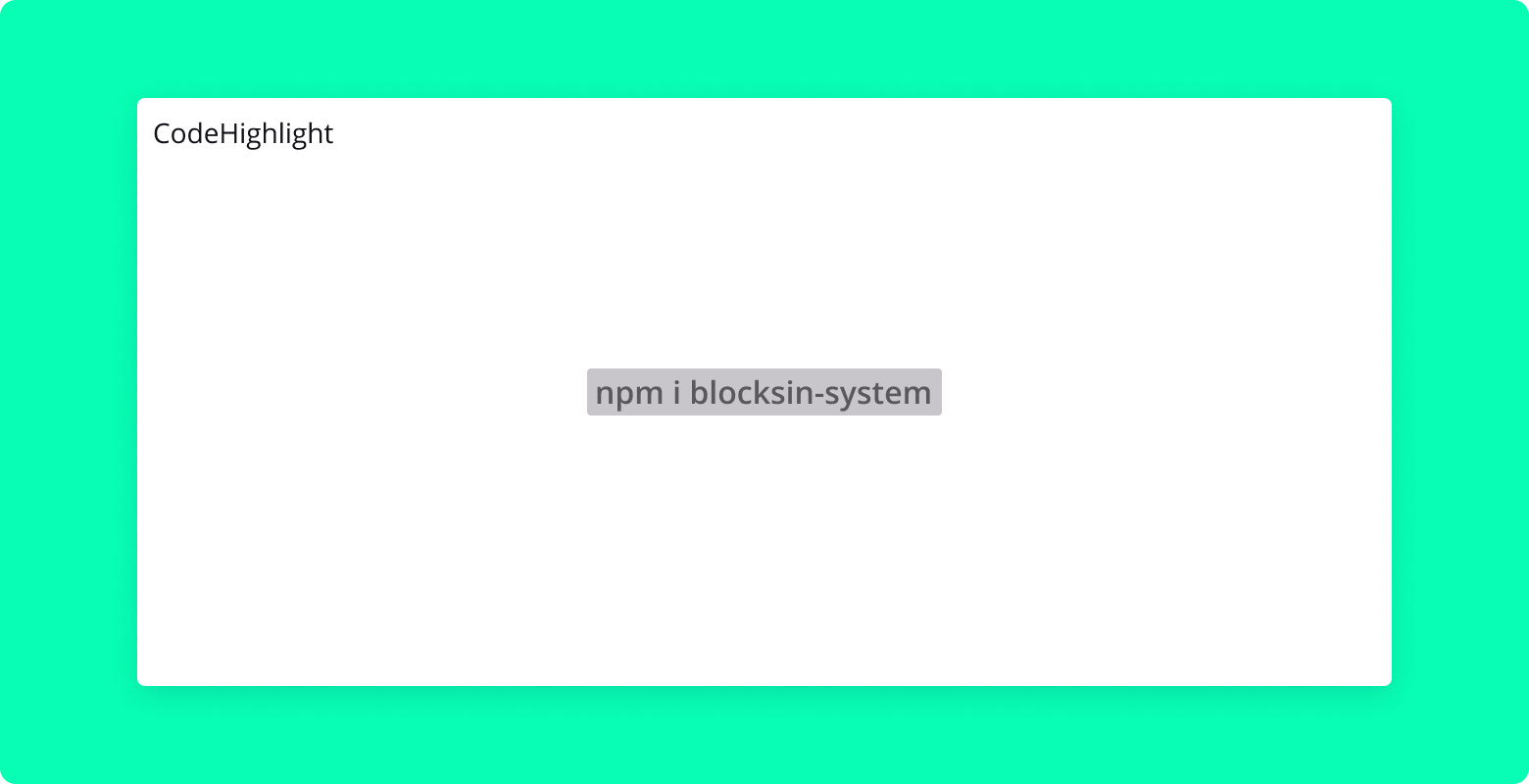
CodeHighlight is a simple React component designed to display blocks of code with basic styling. It is suitable for rendering code snippets or configurations in a clear and readable format.
Properties
text: String (required)
- The code text to be displayed within the component.
Usage
Here's an example of how to use the CodeHighlight component:
import { CodeHighlight } from "blocksin-system";

<CodeHighlight text={`const greeting = "Hello, world!";`} />;
Toast Component
Overview
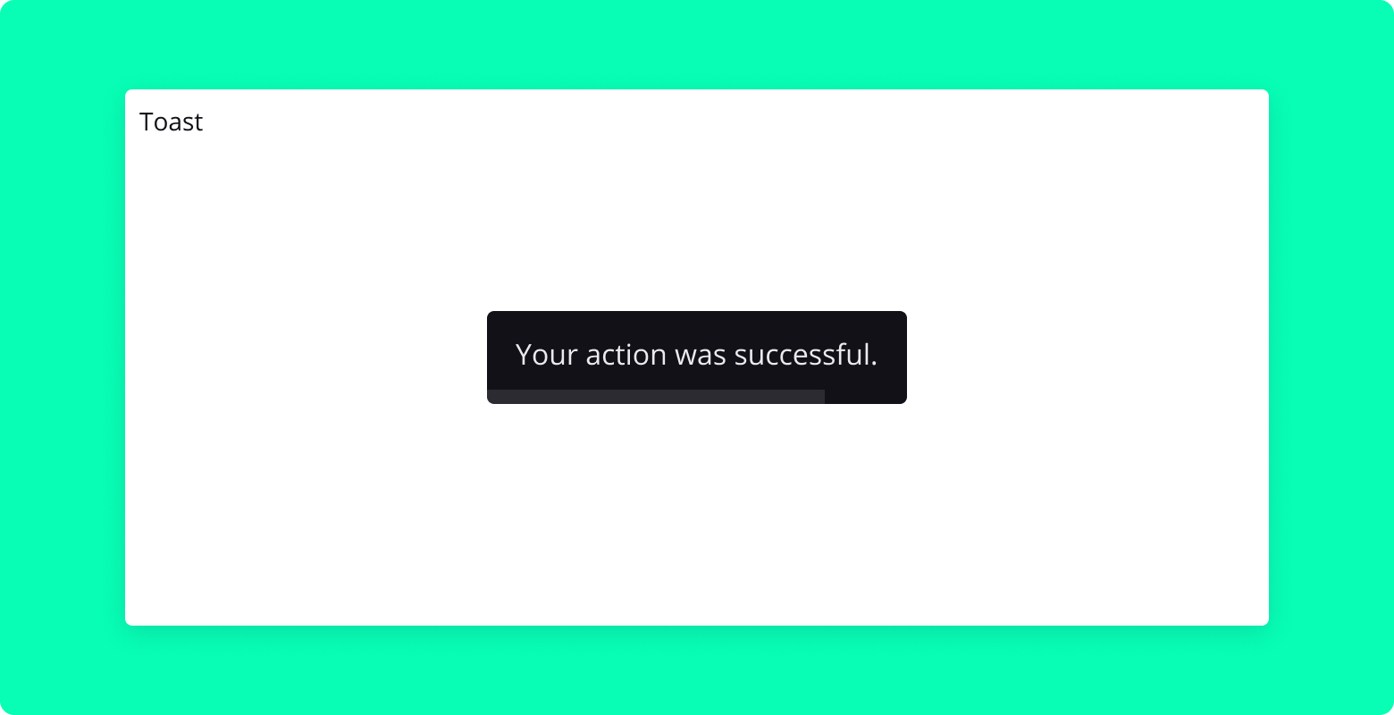
Toast is a React component built using @radix-ui/react-toast that provides a customizable toast notification with an optional progress bar and a 'Don't Show Again' button. It can be used to display brief messages or alerts to users, with a smooth fade-out effect controlled by a timer.
Properties
showToast: Boolean (required)
- Controls the visibility of the toast. When
true, the toast is shown.
- Controls the visibility of the toast. When
setShowToast: Function (required)
- A callback function to update the
showToaststate.
- A callback function to update the
headline: String (optional)
- The headline or title text of the toast.
text: String (required)
- The main content text of the toast.
time: Number (required)
- The duration (in milliseconds) for which the toast is displayed.
showAgain: Boolean (optional)
- When
true, displays a 'Don't Show Again' button.
- When
onDismissForever: Function (optional)
- A callback function triggered when the 'Don't Show Again' button is clicked.
simple: Boolean (optional)
- If
true, displays the toast in a simple style without a headline.
- If
Usage
Here's an example of how to use the CustomToast component:
import { Toast } from "blocksin-system";

<Toast
  showToast={showToastState}
  setShowToast={setShowToastState}
  headline="Success!"
  text="Your action was successful."
  time={3000}
  showAgain={true}
  onDismissForever={handleDismissForever}
/>;
DropdownMenu Component
Overview
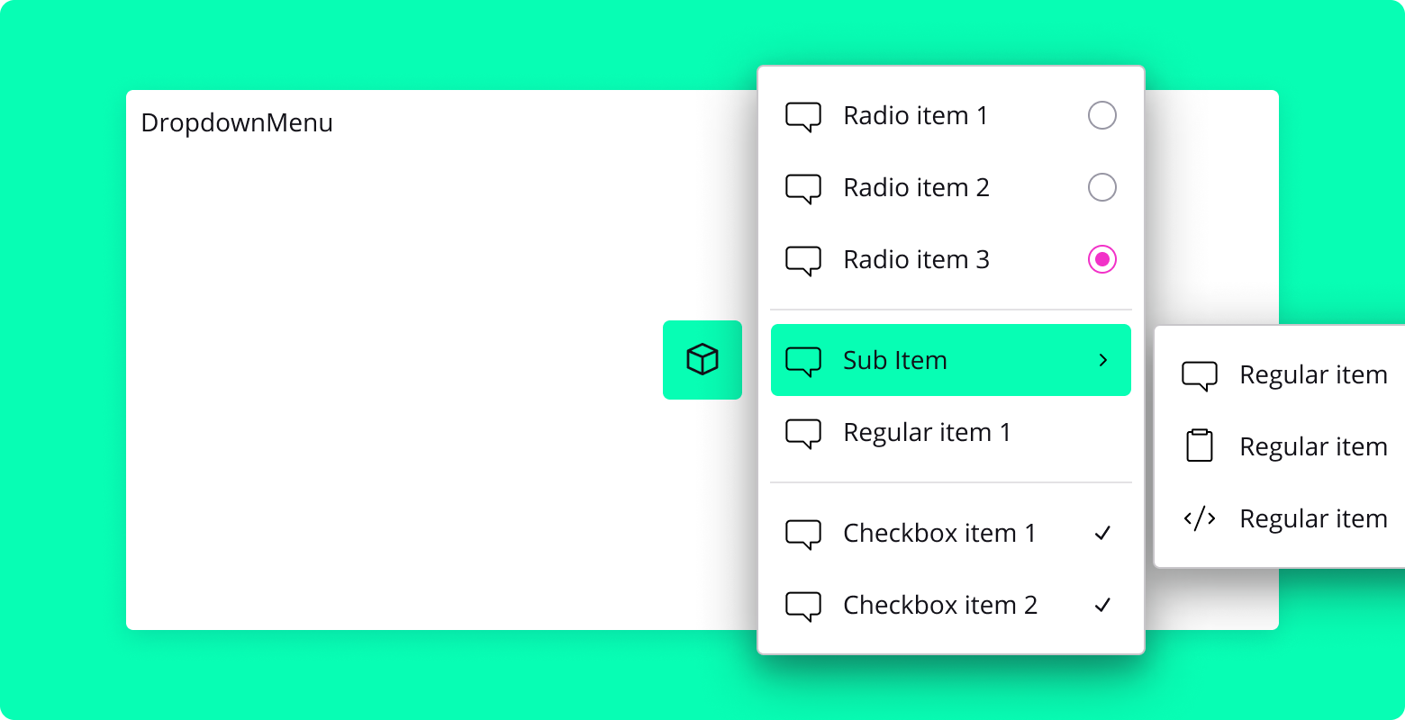
DropdownMenu is a React component that provides a customizable dropdown menu for various actions or options. It is built using the Radix UI Dropdown Menu primitive and includes features such as submenus, radio groups, checkbox items, and custom icons.
Properties DropdownMenu.Content
sideOffset: Number (optional)
- The distance in pixels from the trigger element to the content.
align: String (optional)
- The alignment of the content relative to the trigger. Can be "start", "center", or "end".
Usage
Here is an example of how to use the DropdownMenu component:
import { DropdownMenu, IconButton } from "blocksin-system";
import { SliderIcon } from "./path/to/your/components";

const MyComponent = () => {
  return (
    <DropdownMenu>
      <DropdownMenu.Trigger asChild>
        <IconButton variant="outline">
          <SliderIcon />
        </IconButton>
      </DropdownMenu.Trigger>
      <DropdownMenu.Content side="bottom" align="start">
        <DropdownMenu.RadioGroup defaultValue="Item1">
          <DropdownMenu.RadioItem value="Item1">Item 1</DropdownMenu.RadioItem>
          <DropdownMenu.RadioItem value="Item2">Item 2</DropdownMenu.RadioItem>
          <DropdownMenu.RadioItem value="Item3">Item 3</DropdownMenu.RadioItem>
        </DropdownMenu.RadioGroup>
      </DropdownMenu.Content>
    </DropdownMenu>
  );
};
Flex Component
Overview
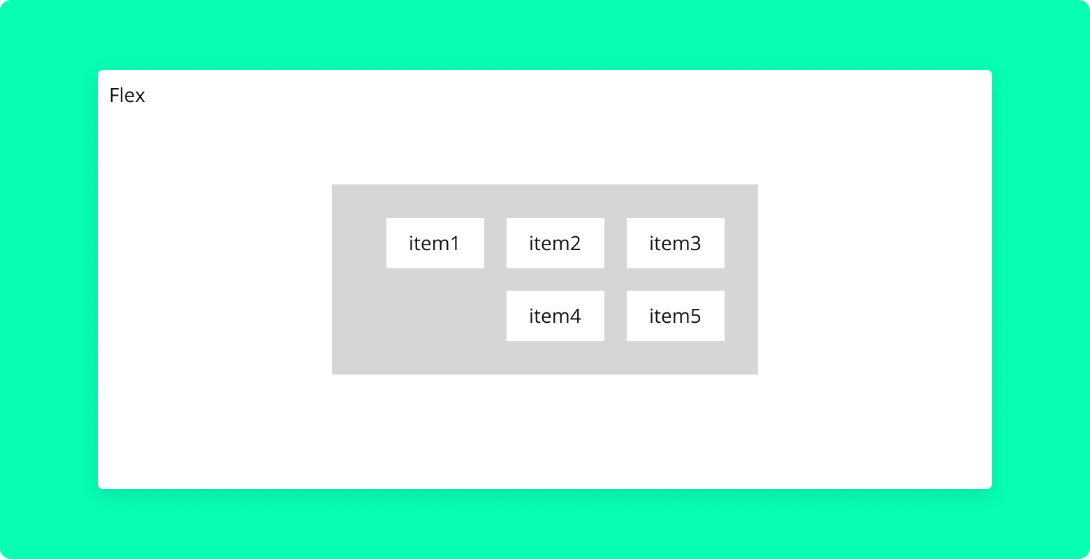
The Flex component is a React utility component designed to streamline the usage of CSS flexbox layout. It provides a simple and intuitive way to create flexible and responsive layouts with ease.
Properties
children: Node (required)
- The child elements to be rendered inside the flex container.
direction: String (optional)
- Specifies the flex direction (
row,column, etc.). - Default is
row.
- Specifies the flex direction (
gap: Number (optional)
- The space between the child elements (in pixels).
style: Object (optional)
- Custom inline styles to be applied to the flex container.
align: String (optional)
- Aligns items along the cross axis (
center,flex-start,flex-end, etc.).
- Aligns items along the cross axis (
justify: String (optional)
- Justifies items along the main axis (
center,space-between,space-around, etc.).
- Justifies items along the main axis (
id: String (optional)
- The ID attribute of the flex container.
className: String (optional)
- Additional custom CSS class names to be applied.
onClick: Function (optional)
- Callback function to be called when the flex container is clicked.
wrap: String (optional)
- Allows flex items to wrap as needed (wrap, nowrap, wrapreverse).
fluid: Boolean (optional)
- If true, the container will take up all available space.
Usage
Here's an example of how to use the Flex component:
import { Flex } from "blocksin-system";

<Flex direction="column" align="center" justify="space-between" gap={10}>
  <div>Item 1</div>
  <div>Item 2</div>
  <div>Item 3</div>
</Flex>;
Heading Component
Overview
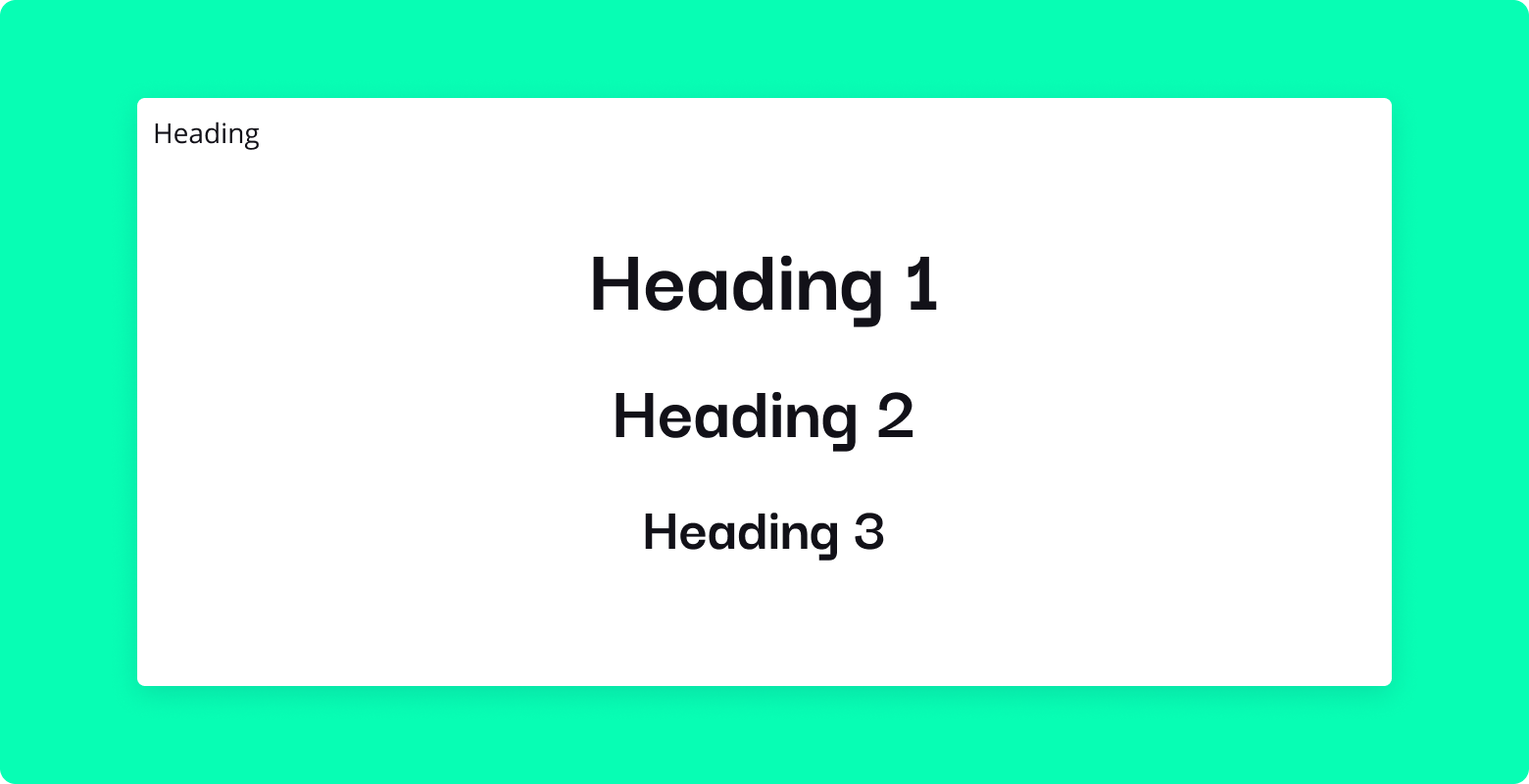
The Heading component is a versatile React component for rendering heading text. It allows for dynamic heading levels and customizable font weights, making it suitable for various textual hierarchies and styles across your application.
Properties
level: Number (optional)
- Specifies the heading level (1 through 6).
- Corresponds to HTML heading tags (
h1,h2,h3, etc.). - Default is
1.
weight: String (optional)
- Sets the font weight of the heading (
regular,bold, etc.). - Default is
regular.
- Sets the font weight of the heading (
children: Node (required)
- The content to be displayed inside the heading tag.
style: String (optional)
- Custom style tag.
Usage
Here's an example of how to use the Heading component:
import { Heading } from "blocksin-system";

<Heading level={2} weight="bold">
  Your Main Title Here
</Heading>;
IconButton Component
![]()
Overview
The IconButton component is a React component designed for creating icon-based buttons. It supports different sizes and styles and can optionally include a badge. The component is styled using SCSS and is ideal for actions that are better represented with icons rather than text.
Properties
disabled: Boolean (optional)
- Disables the button when
true. - Default is
false.
- Disables the button when
isLoading: Boolean (optional)
- Shows a loading spinner and disables the button when
true. - Default is
false.
- Shows a loading spinner and disables the button when
size: String (optional)
- Specifies the size of the icon button (
small,medium,large). - Default is
medium.
- Specifies the size of the icon button (
variant: String (optional)
- Sets the button's style variant (
solid,outline, etc.). - Default is
solid.
- Sets the button's style variant (
onClick: Function (optional)
- Callback function to be called when the button is clicked.
children: Node (required)
- The icon to be displayed inside the button.
showBadge: Boolean (optional)
- Shows a badge on the button when
true. - Default is
false.
- Shows a badge on the button when
badgeLabel: String (optional)
- The text to be displayed inside the badge.
Usage
Here's an example of how to use the IconButton component:
import { IconButton } from "blocksin-system";
import { YourIconComponent } from "your-icon-library";

<IconButton onClick={handleClick} size="large" variant="outline">
  <YourIconComponent />
</IconButton>;
Iframe Component

Overview
Iframe is a React component designed to embed an iframe within your application. It's ideal for integrating external web content, such as videos, web pages, or other resources that support iframe embedding. Additionally, this component offers a fallback display for Figma integration when no URL is provided.
Properties
url: String (optional)
- The URL of the web page or resource to be embedded in the iframe.
- If not provided, a default Figma integration message is displayed.
title: String (optional)
- A descriptive title for the iframe, which is useful for accessibility.
- Default is
"Iframe Title".
Usage
Here's an example of how to use the Iframe:
import { Iframe } from "blocksin-system";

<Iframe url="https://example.com" title="Embedded Content" />;
Input Component
Overview
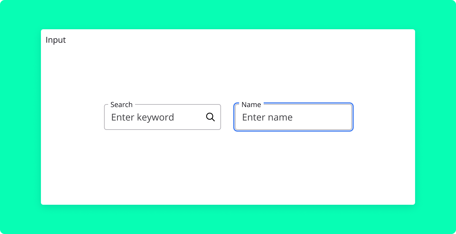
Input is a versatile React component for rendering various types of input fields. It supports text, search, number, date, and other input types, along with customizable labels, placeholders, error messages, and an optional search icon for search inputs.
Properties
pattern: String (optional)
- A regular expression pattern that the input's value must match.
label: String (optional)
- The label text displayed alongside the input field.
- Default is
"First name".
icon: Component (optional)
- A React component (icon) to be displayed on the right side of the Input field.
placeholder: String (optional)
- The placeholder text displayed inside the input field.
- Default is
"Enter first name".
errormsg: String | Boolean (optional)
- The error message to display when the input's value is invalid.
- Set to
falseto hide the error message. - Default is
"Invalid format.".
type: String (optional)
- The type of the input (
text,search,number,date, etc.). - Default is
"text".
- The type of the input (
value: String (required)
- The current value of the input.
onChange: Function (required)
- Callback function to handle changes to the input's value.
className: String (optional)
- Additional custom CSS class names to be applied.
disabled: Boolean (optional)
- Disables the input field when set to
true.
- Disables the input field when set to
onClick: Function (optional)
- Callback function to be called when the input field is clicked.
validation: Boolean (optional)
- Enables validation display for the input field.
name: String (optional)
- The name attribute of the input field.
fluid: Boolean (optional)
- If true, the container will take up all available space.
Usage
Here's an example of how to use the Input component:
import { Input } from "blocksin-system";

<Input
  label="Email Address"
  placeholder="Enter your email"
  type="email"
  value={email}
  onChange={handleEmailChange}
/>;
Loader Component
Overview
The Loader component is a React component that displays an animated loading indicator. It uses lottie-react to render a smooth and visually appealing animation, making it ideal for indicating loading states or processing actions in your application.
Dependencies
lottie-react: This package is required to handle the Lottie animations. Ensure it is installed in your project.
Usage
The component does not accept any props and is used simply by rendering it where a loading indicator is needed:
import { Loader } from "blocksin-system";

<Loader />;
Paragraph Component
Overview
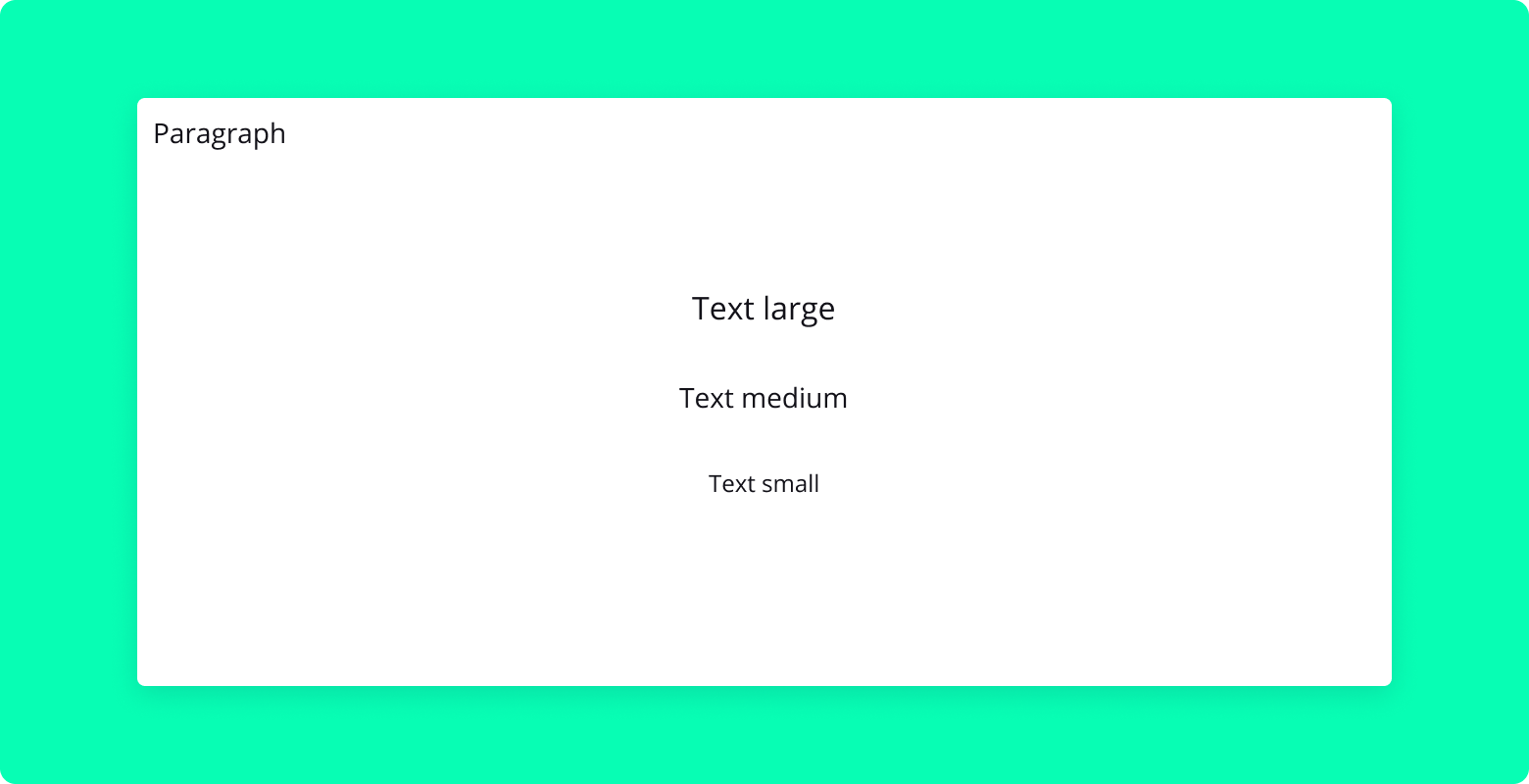
The Paragraph component is a React component for rendering text content. It provides options to customize the size and weight of the text, making it a versatile choice for displaying paragraphs or other textual elements in your application.
Properties
className: String (optional)
- Additional custom CSS class names to be applied to the paragraph.
size: String (optional)
- Specifies the size of the text (
small,medium,large, etc.). - Default is
medium.
- Specifies the size of the text (
weight: String (optional)
- Sets the font weight of the text (
regular,bold, etc.). - Default is
regular.
- Sets the font weight of the text (
children: Node (required)
- The text content to be displayed inside the paragraph.
Usage
Here's an example of how to use the Paragraph component:
import { Paragraph } from "blocksin-system";

<Paragraph size="large" weight="bold">
  This is a large, bold paragraph.
</Paragraph>;
Pill Component
Overview
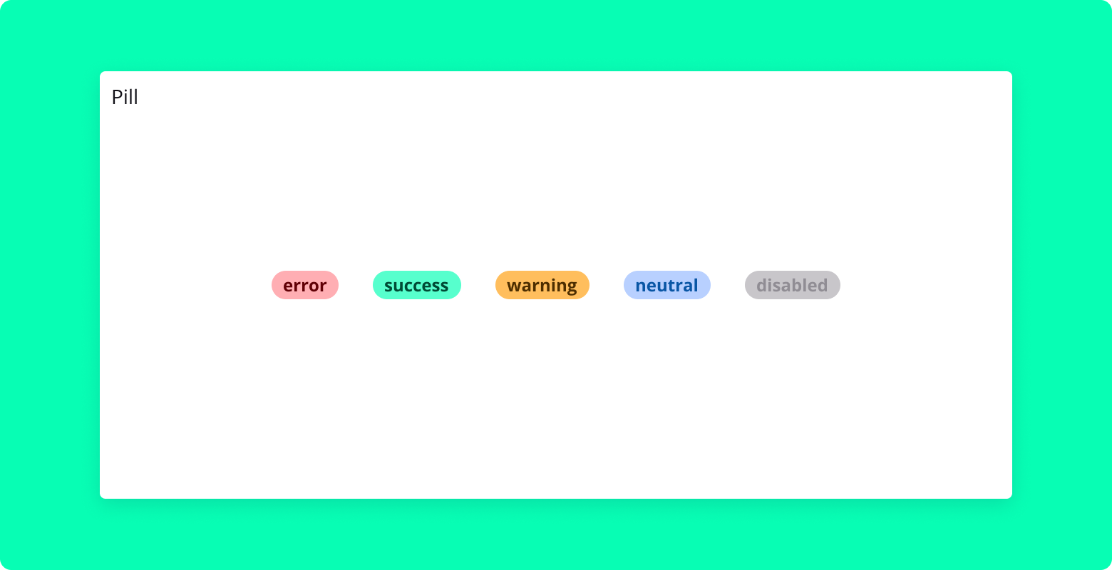
Pill is a React component that represents a pill-shaped element, commonly used to display status or category information. It accepts a status prop to determine its visual appearance.
Properties
children: ReactNode
- The content to be displayed inside the pill.
status: String
- The status of the pill, which determines its color and styling. Possible values are "error", "warning", "success", or "disabled".
Usage
Here is an example of how to use the Pill component:
import { Pill } from "blocksin-system";

<Pill status="success">Active</Pill>;
Spinner Component
Overview
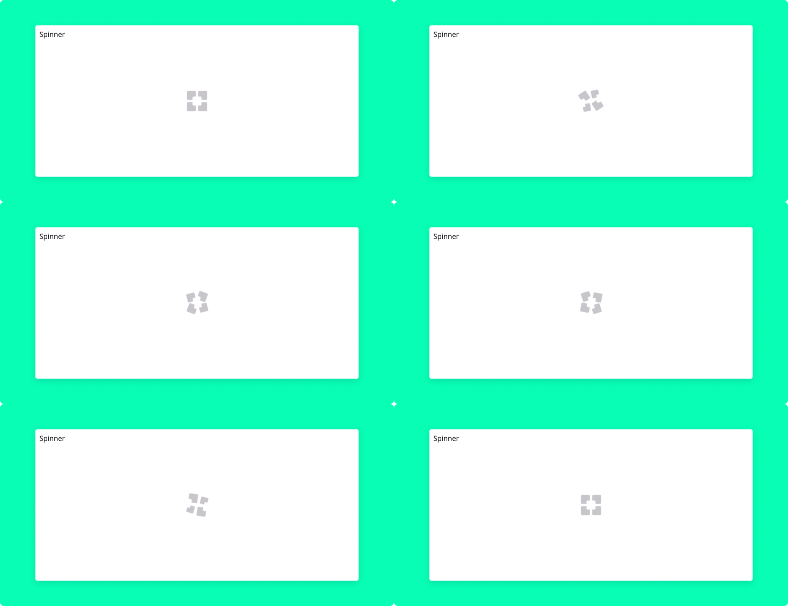
The Spinner component is a React component designed to display an animated spinner, typically used as a loading indicator. It uses lottie-react to render a Lottie animation, providing a visually appealing and smooth animation for indicating loading or processing states in your application.
Dependencies
lottie-react: This package is required to handle the Lottie animations. Ensure it is installed in your project.
Usage
The component does not accept any props and is used simply by rendering it where an animated spinner is needed:
import { Spinner } from "blocksin-system";

<Spinner />;
Switch Component
Overview
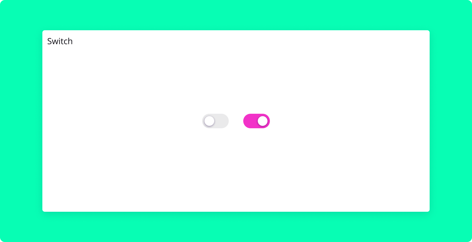
The Switch component is a customizable switch control for React applications, leveraging the capabilities of Radix UI's Switch component. It provides the option to include a label and can be used within a Flex container for better layout management. This component is suitable for toggling between two states such as enabling/disabling settings or features.
Properties
id (String - required):
- A unique identifier for the switch. It associates the switch with its label for accessibility.
checked (Boolean - required):
- Indicates the switch's state, either "on" (true) or "off" (false).
onCheckedChange (Function - required):
- Callback function triggered when the switch's state changes, receiving the new state as an argument.
children (Node - optional):
- Content displayed alongside the switch, typically used as a label. When provided, the switch and label are rendered inside a
Flexcontainer for layout purposes.
- Content displayed alongside the switch, typically used as a label. When provided, the switch and label are rendered inside a
Styling
The component uses the following CSS classes for styling, which can be customized in the SCSS file:
.SwitchRoot: Applies to the switch control itself..SwitchThumb: Targets the thumb of the switch, the part that moves..Label: Used for the label element whenchildrenare provided.
Adjust these classes in your SCSS to fit the design of your application.
Usage Examples
With Label
import { Switch } from "blocksin-system";

function ExampleWithLabel() {
  const [isToggled, setIsToggled] = React.useState(false);

  return (
    <Switch
      id="exampleSwitch"
      checked={isToggled}
      onCheckedChange={setIsToggled}
    >
      Toggle me
    </Switch>
  );
}
Table Component
Overview
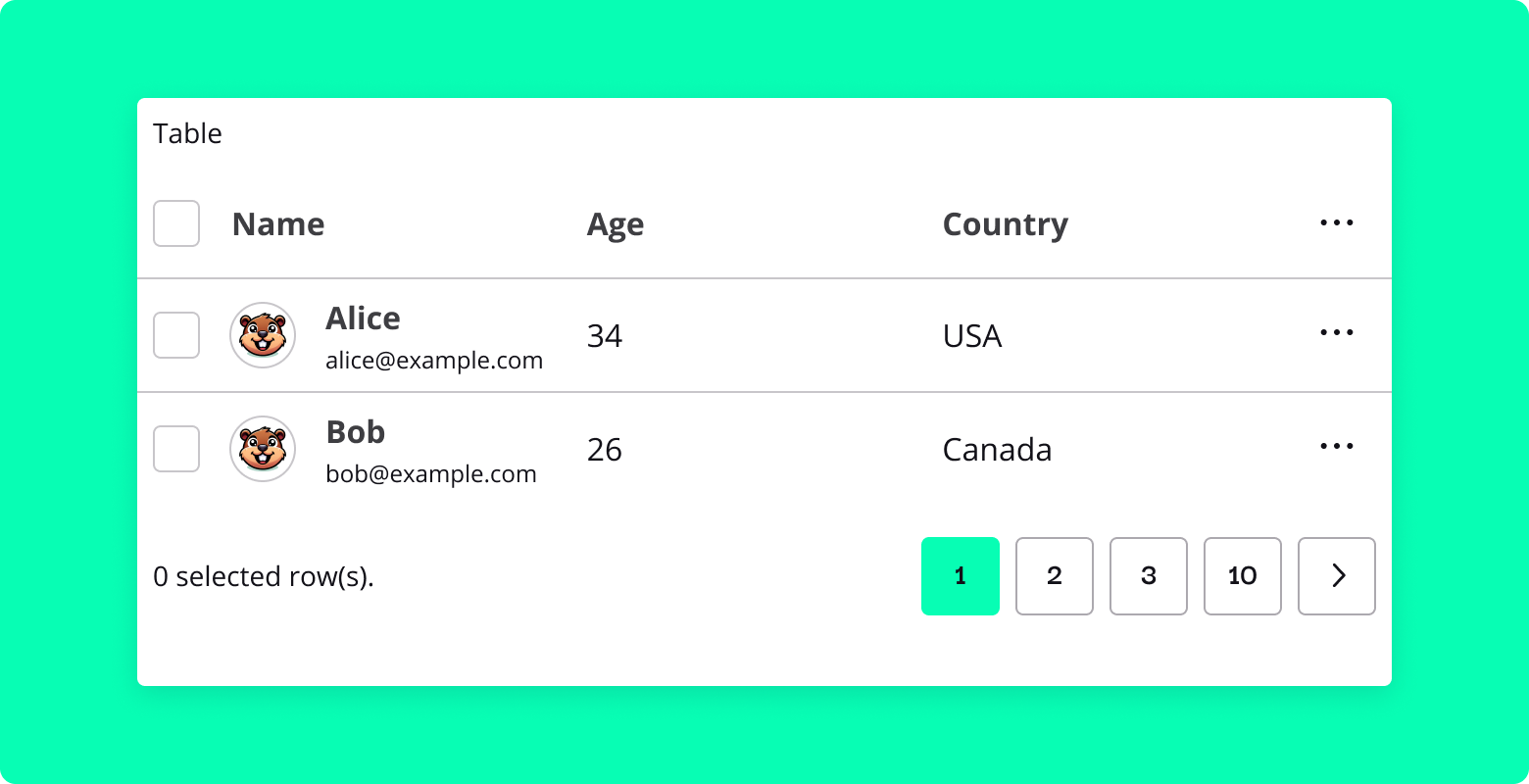
Table is a React component designed for displaying tabular data. It supports features such as pagination, sorting, filtering, and row selection.
Properties
- columns:
- Array of objects defining the columns of the table. Each object can have the following properties:
- Header: String or JSX - The header of the column.
- accessor: String - The key of the data to be accessed for this column.
- Cell: Function (optional) - Custom renderer for the cell. It receives the cell value and the row data as arguments.
- maxWidth: String (optional) - The maximum width of the column.
- data:
- Array of objects - The data to be displayed in the table.
- pageSize:
- Number - The number of rows to display per page.
- onRowClick: Function (optional):
- Callback function to be called when a row is clicked. It receives the row data as an argument.
- multiSelect: Boolean (optional):
- If
true, enables multiple row selection with checkboxes.
- If
- onMultiSelect: Function (optional):
- Callback function to be called when rows are selected or deselected. It receives an array of selected row data as an argument.
- maxPagination: Number (optional):
- The maximum number of pagination buttons to display.
- fluid: Boolean (optional):
- If
true, the table will take the full width of its container.
- If
- search: Boolean (optional):
- If
true, enables a filter input to search the table.
- If
- fullBorder: Boolean (optional):
- If
true, adds borders to all sides of the table cells.
- If
- sorting: Boolean (optional):
- If
true, enables sorting functionality on the table columns.
- If
Usage
Here's an example of how to use the Table component:
import { Table } from "blocksin-system";

const columns = [
  { Header: "Name", accessor: "name" },
  { Header: "Age", accessor: "age" },
  { Header: "Country", accessor: "country" },
];

const data = [
  { name: "John Doe", age: 30, country: "USA" },
  { name: "Jane Doe", age: 25, country: "Canada" },
];

<Table
  columns={columns}
  data={data}
  pageSize={5}
  onRowClick={(row) => console.log(row)}
  multiSelect={true}
  onMultiSelect={(selectedRows) => console.log(selectedRows)}
  maxPagination={5}
  fluid={true}
  search={true}
  fullBorder={true}
  sorting={true}
/>;
Here's an example of how to add components inside the Table component:
import { Table, Paragraph } from "blocksin-system";

const columns = [
  { Header: "Name", accessor: "name" },
  { Header: "Age", accessor: "age", maxWidth: "100px" },
  {
    Header: "Country",
    accessor: "country",
    Cell: (value) => <Paragraph size="large">{value}</Paragraph>,
  },
];

const data = [
  { name: "John Doe", age: 30, country: "USA" },
  { name: "Jane Doe", age: 25, country: "Canada" },
];

<Table columns={columns} data={data} pageSize={5} sorting={false} />;
Tabs Component
Overview
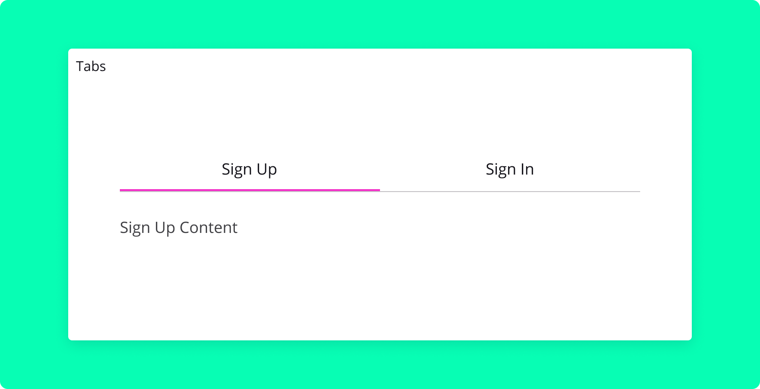
The Tabs component is a powerful and flexible React component for creating tabbed interfaces in your application. It allows users to easily switch between different views or content sections, providing an organized and intuitive user experience.
Properties
defaultValue: String (required)
- The default value of the currently selected tab.
fluid: Boolean (optional)
- If
true, the tabs will take up the full width of their container. - Default is
false.
- If
children: ReactNode (required)
- The content of the tabs, including
Tabs.List,Tabs.Trigger, andTabs.Contentcomponents.
- The content of the tabs, including
Usage
Here's an example of how to use the Tabs component:
import { Tabs } from "blocksin-system";

<Tabs defaultValue="tab1" fluid>
  <Tabs.List aria-label="Manage your account">
    <Tabs.Trigger value="tab1">Sign Up</Tabs.Trigger>
    <Tabs.Trigger value="tab2">Sign In</Tabs.Trigger>
  </Tabs.List>
  <Tabs.Content value="tab1">{/* Sign Up content */}</Tabs.Content>
  <Tabs.Content value="tab2">{/* Sign In content */}</Tabs.Content>
</Tabs>;
Tag Component
Overview
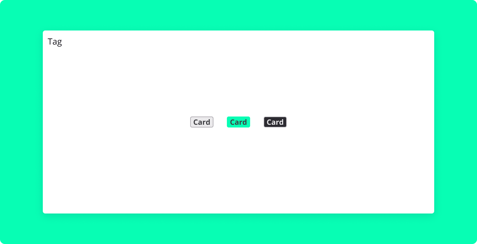
The Tag component is a simple yet versatile React component used for displaying tag-like elements in your application. It supports different visual variants, allowing it to be easily integrated and used in various contexts such as labeling, categorizing, or marking items.
Properties
text: String (required)
- The text content to be displayed inside the tag.
variant: String (optional)
- The visual style variant of the tag (
Normal,Highlighted, etc.). - Default is
"Normal".
- The visual style variant of the tag (
color: String (optional)
- Use to set custom background color.
Usage
Here's an example of how to use the Tag component:
import { Tag } from "blocksin-system";

<Tag text="Technology" variant="Highlighted" />;
TextArea Component
Overview
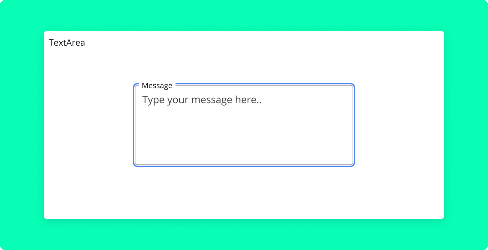
The TextArea component is a React component that renders a multi-line text input field, commonly used for collecting longer text entries like comments, messages, or descriptions. It includes customizable properties for labels, placeholders, and more.
Properties
label: String (optional)
- The label text displayed above the textarea.
- Default is
"Your Label".
placeholder: String (optional)
- The placeholder text displayed inside the textarea when it's empty.
- Default is
"Enter your text".
value: String (required)
- The current value of the textarea.
onChange: Function (required)
- Callback function that is called when the value of the textarea changes.
className: String (optional)
- Additional custom CSS class names to be applied.
disabled: Boolean (optional)
- Disables the textarea when set to
true.
- Disables the textarea when set to
Usage
Here's an example of how to use the TextArea component:
import { TextArea } from "blocksin-system";

<TextArea
  label="Message"
  placeholder="Type your message here"
  value={message}
  onChange={handleMessageChange}
/>;
Toggle Component
Overview
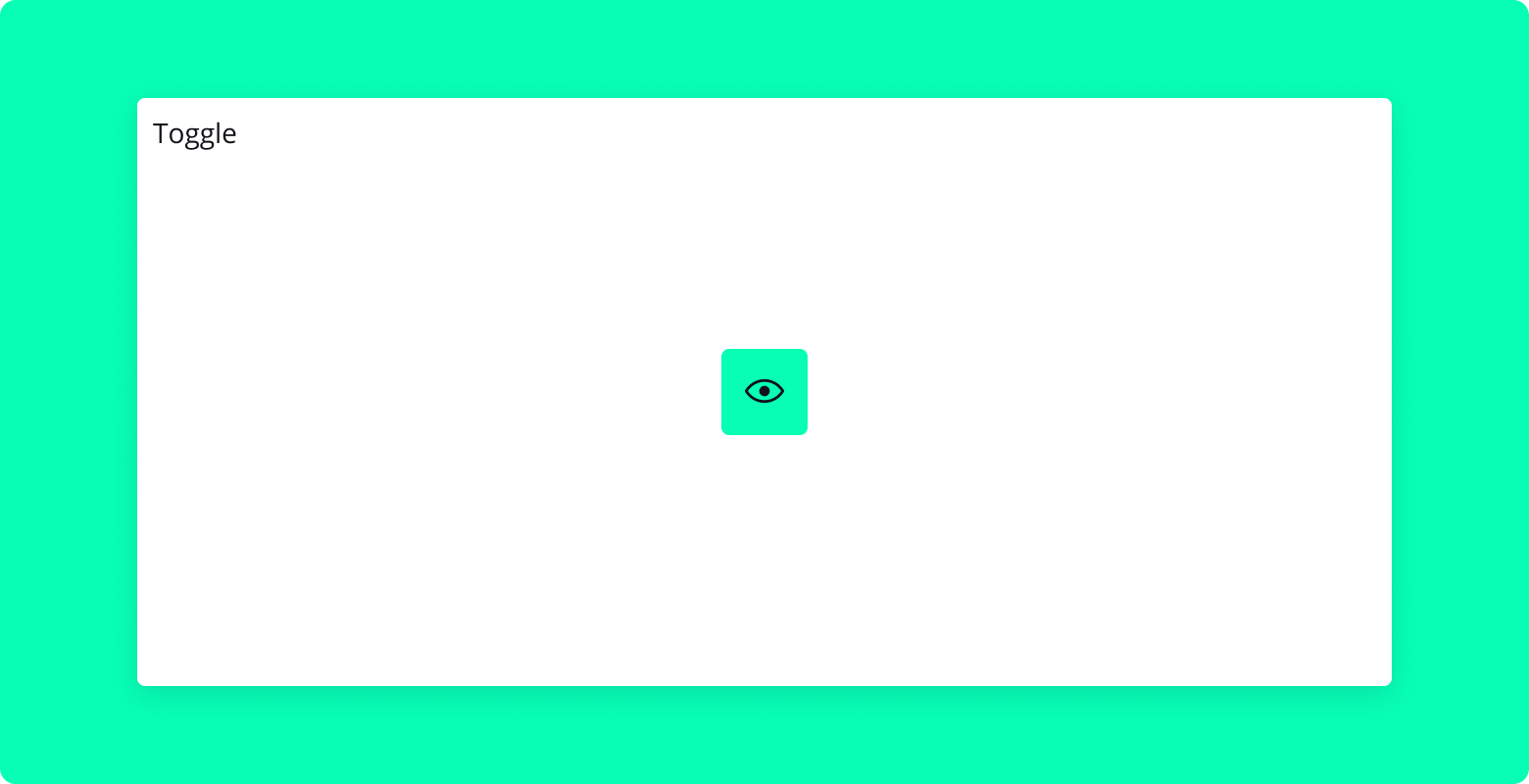
Toggle is a React component that provides a single toggle button, allowing the user to switch between an on and off state. It is built using Radix UI's Toggle primitive.
Properties
- children: ReactNode
- The content of the toggle button.
- onPressedChange: (pressed: boolean) => void
- A callback function that is called when the toggle button is pressed. It receives a boolean indicating the new pressed state.
- ref: React.Ref (optional)
- A ref to be forwarded to the root element of the
Toggle.
- A ref to be forwarded to the root element of the
Usage
Here's an example of how to use the Toggle component:
import Toggle from "./Toggle";
import { ViewGridIcon } from "@radix-ui/react-icons";

<Toggle onPressedChange={(pressed) => console.log(pressed)}>
  <ViewGridIcon />
</Toggle>;
ToggleGroup Component
Overview
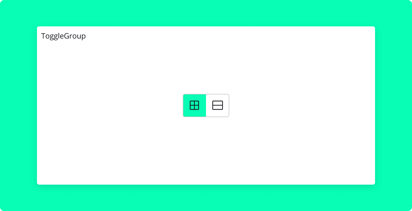
ToggleGroup is a React component that provides a group of toggle buttons, allowing the user to select one or multiple options. It is built using Radix UI's ToggleGroup primitive.
Properties
- children: ReactNode
- The toggle buttons to be grouped together.
- ref: React.Ref (optional)
- A ref to be forwarded to the root element of the
ToggleGroup.
- A ref to be forwarded to the root element of the
Usage
Here's an example of how to use the ToggleGroup component:
import ToggleGroup from "./ToggleGroup";
import { ViewGridIcon, ViewListIcon } from "@radix-ui/react-icons";

<ToggleGroup type="single" aria-label="View options">
  <ToggleGroup.Item value="grid" aria-label="Grid view">
    <ViewGridIcon />
  </ToggleGroup.Item>
  <ToggleGroup.Item value="list" aria-label="List view">
    <ViewListIcon />
  </ToggleGroup.Item>
</ToggleGroup>;
Toolbar Component
Overview
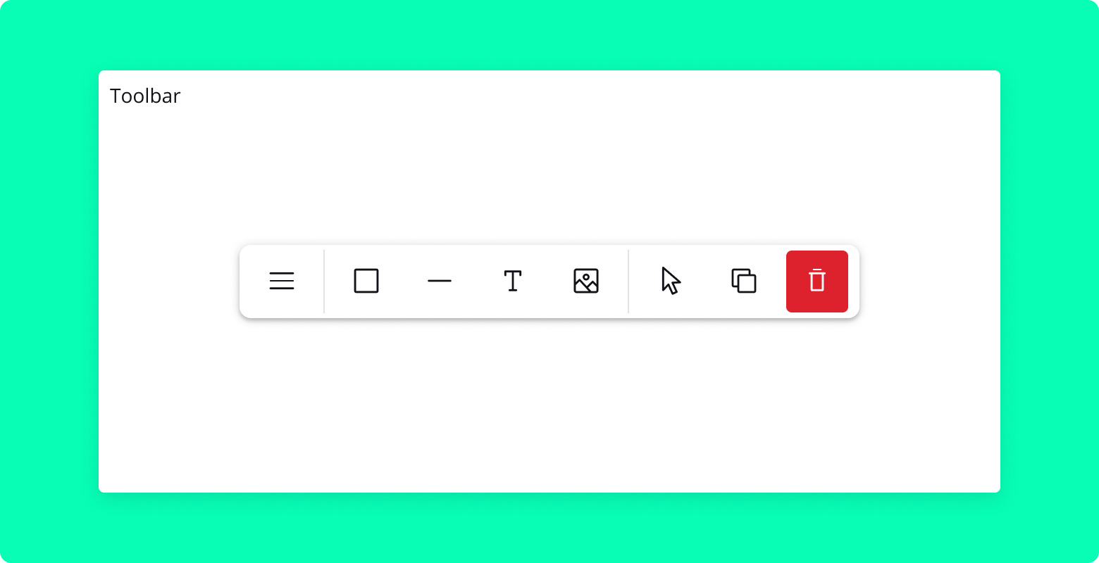
Toolbar is a flexible React component that provides a customizable toolbar for your application. It can include links, toggle groups, and separators, and supports both horizontal and vertical orientations. The Toolbar component is built on top of the Radix UI @radix-ui/react-toolbar primitives, offering a solid foundation for building interactive toolbars.
Properties
Toolbar.Root
orientation: String (optional)
- Determines the orientation of the toolbar, either
horizontalorvertical. Default ishorizontal.
- Determines the orientation of the toolbar, either
fluid: Boolean (optional)
- If
true, the toolbar will take the full width of its container.
- If
children: Node (required)
- The content of the toolbar, typically
Toolbar.Link,Toolbar.ToggleGroup,Toolbar.ToggleItem, andToolbar.Separatorcomponents.
- The content of the toolbar, typically
Toolbar.Link
href: String (optional)
- The URL that the link points to.
icon: Component (optional)
- An optional icon to display alongside the link text.
children: Node (required)
- The content of the link.
Toolbar.ToggleGroup
children: Node (required)
- The content of the toggle group, typically
Toolbar.ToggleItemcomponents.
- The content of the toggle group, typically
Toolbar.ToggleItem
value: String (required)
- The value that the toggle item represents.
icon: Component (optional)
- An optional icon to display alongside the toggle item text.
children: Node (required)
- The content of the toggle item.
Toolbar.Separator
No properties
- A visual separator to divide toolbar items.
Usage
Below are examples illustrating how to use the Toolbar component in various configurations.
Basic Toolbar
import React from "react";
import { Toolbar } from "blocksin-system";

// Renders a basic toolbar
<Toolbar>
  <Toolbar.Link href="/home">Home</Toolbar.Link>
  <Toolbar.Link href="/about">About</Toolbar.Link>
  <Toolbar.Separator />
  <Toolbar.ToggleGroup>
    <Toolbar.ToggleItem value="bold">Bold</Toolbar.ToggleItem>
    <Toolbar.ToggleItem value="italic">Italic</Toolbar.ToggleItem>
  </Toolbar.ToggleGroup>
</Toolbar>;
Tooltip Component
Overview
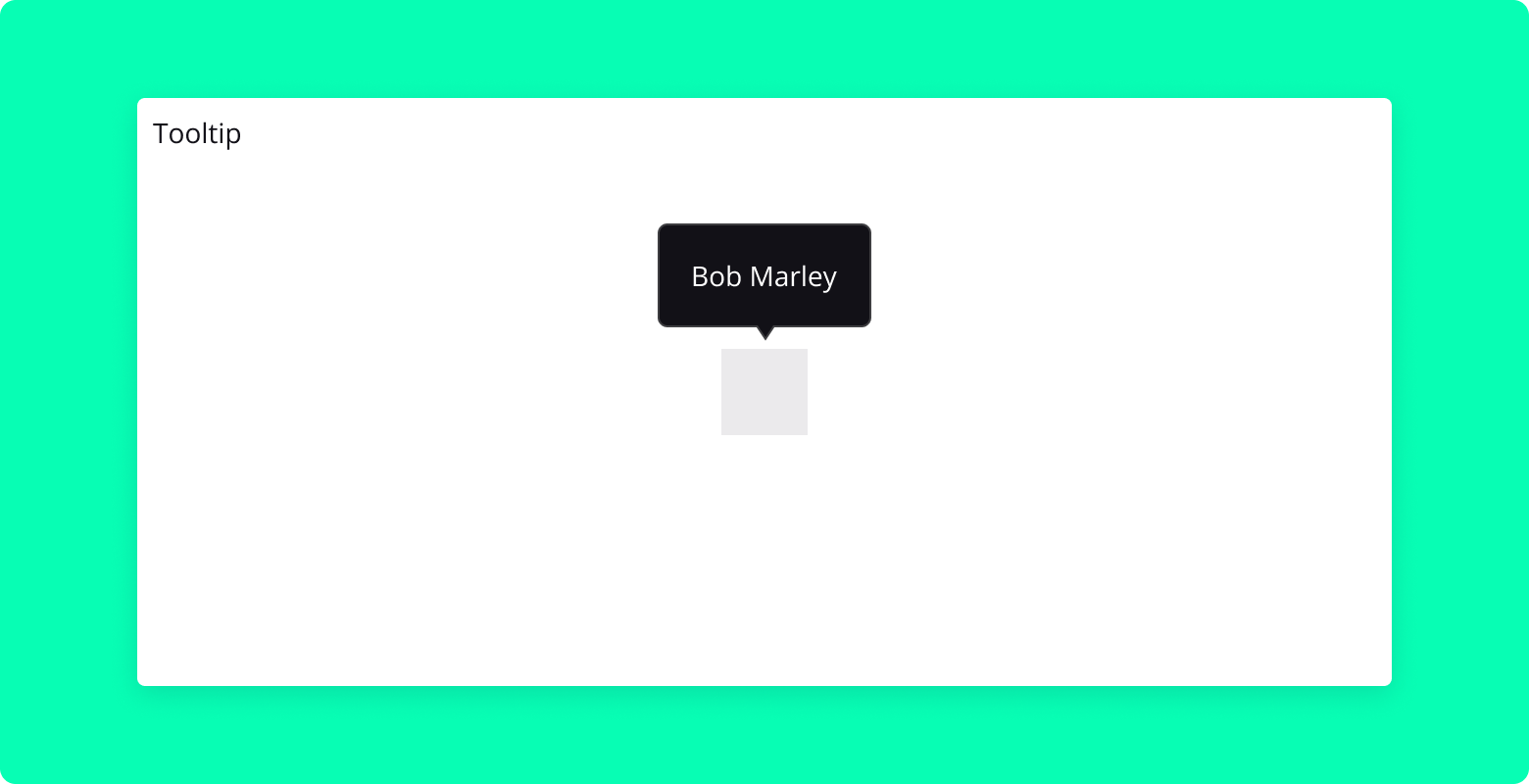
The Tooltip component is a lightweight and customizable React component used for displaying contextual information when hovering over or focusing on an element. It supports various positioning and can be easily integrated into any UI. Check radix-ui.com for more info.
Properties
delayDuration: Number (optional)
- The delay duration in milliseconds before the tooltip appears.
- Default is
300.
side: String (optional)
- The preferred side of the trigger element to position the tooltip (
top,right,bottom,left). - Default is
"top".
- The preferred side of the trigger element to position the tooltip (
Usage
Here's an example of how to use the Tooltip component:
import React from "react";
import { Tooltip, IconButton, Paragraph } from "blocksin-system";
import { ChatBubbleIcon } from "@radix-ui/react-icons";

const Example = () => {
  return (
    <Tooltip delayDuration={200}>
      <Tooltip.Trigger asChild>
        <IconButton>
          <ChatBubbleIcon />
        </IconButton>
      </Tooltip.Trigger>
      <Tooltip.Content side="right">
        <Paragraph size="medium">Test</Paragraph>
      </Tooltip.Content>
    </Tooltip>
  );
};

export default Example;
TopBanner Component
Overview
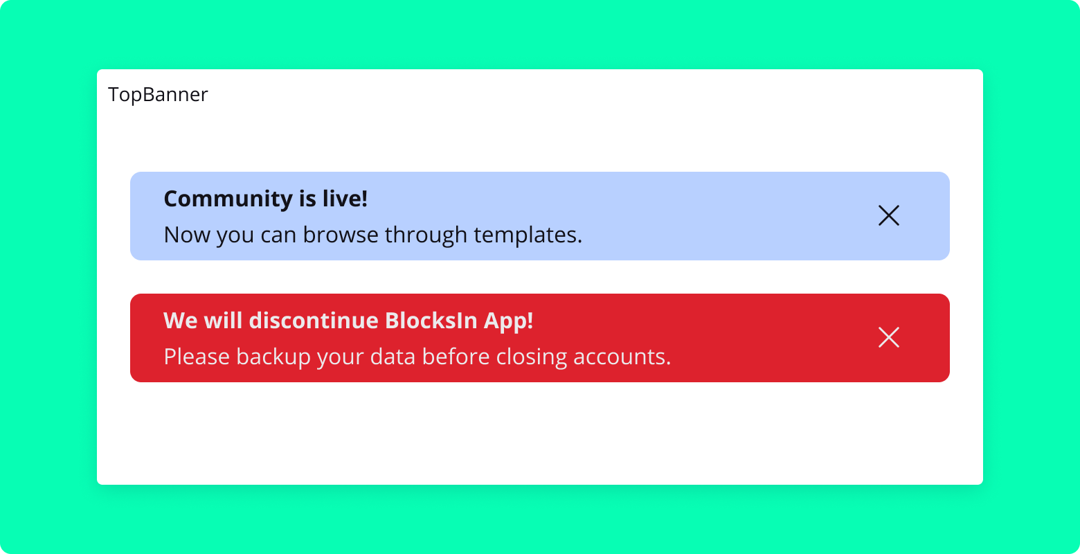
The TopBanner component is a React component designed to display notification banners at the top of the page. It is capable of handling dynamic content and styles and includes functionality to dismiss notifications permanently.
Properties
username: String (required)
- The username of the currently logged-in user, used for tracking dismissed notifications.
notifications: Array (required)
- An array of notification objects. Each object should contain
title,text,id, andstyle.
- An array of notification objects. Each object should contain
Usage
Here's an example of how to use the TopBanner component:
import { TopBanner } from "blocksin-system";

const notifications = [
  {
    title: "Community is live!",
    text: "Now you can browse through templates.",
    id: "1212121214",
    style: "info",
  },
  {
    title: "New Navigation",
    text: "New release comes with the brand new LeftSide Panel navigation.",
    id: "1212121212",
    style: "info",
  },
];

<TopBanner username="johndoe" notifications={notifications} />;
UserOnHoldItem Component
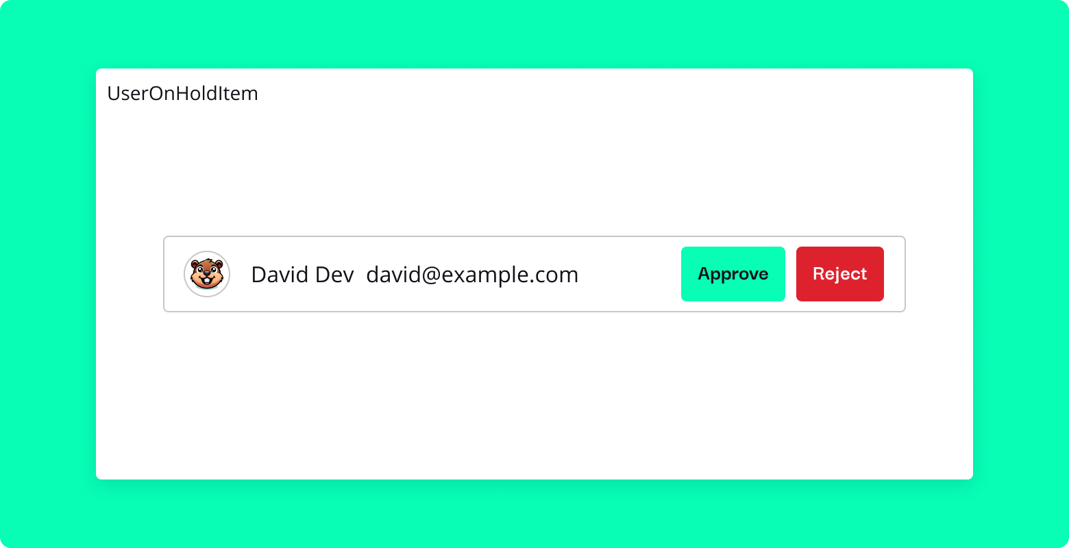
The UserOnHoldItem component is designed to manage user items in a hold or approval state within your application. It displays user information alongside actions to approve, reject, or remove a user, providing a convenient way to handle user management tasks.
Properties
fluid: Boolean (optional)
- If
true, the component will take the full width of its container. Default isfalse.
- If
user: Object (required)
- An object representing the user. Should include
firstName,email,avatar,role, andisApprovedproperties.
- An object representing the user. Should include
onApprove: Function (required)
- Callback function called when the "Approve" button is clicked. Receives the
userobject as an argument.
- Callback function called when the "Approve" button is clicked. Receives the
onReject: Function (required)
- Callback function called when the "Reject" button is clicked. Receives the
userobject as an argument.
- Callback function called when the "Reject" button is clicked. Receives the
onRemove: Function (required)
- Callback function called when the "Remove User" button is clicked. Receives the
userobject as an argument.
- Callback function called when the "Remove User" button is clicked. Receives the
Usage
Here's how you can use the UserOnHoldItem component within your application:
import { UserOnHoldItem } from "blocksin-system";

const user = {
  firstName: "Jane Doe",
  email: "[email protected]",
  avatar: "/path/to/avatar.jpg",
  role: "User",
  isApproved: false,
};

function handleApprove(user) {
  console.log("Approving user:", user);
}

function handleReject(user) {
  console.log("Rejecting user:", user);
}

function handleRemove(user) {
  console.log("Removing user:", user);
}

<UserOnHoldItem
  fluid={true}
  user={user}
  onApprove={handleApprove}
  onReject={handleReject}
  onRemove={handleRemove}
/>;
UserListItem Component
Overview
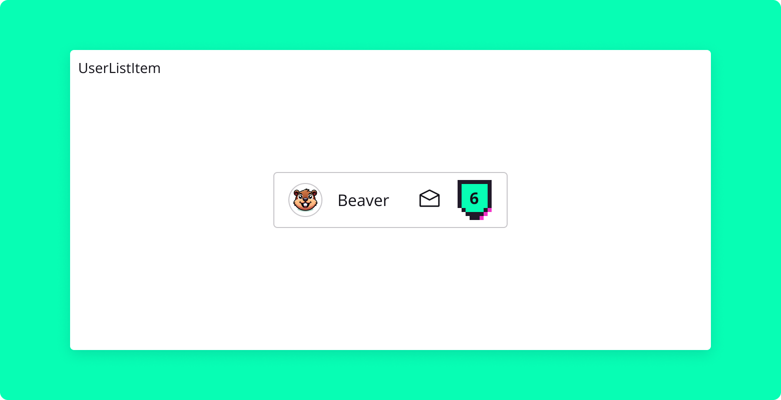
UserListItem is a React component designed to display a user item in a list format. It includes an avatar, user name, user role, badge level, and an interactive dropdown menu with action items. This component is ideal for user lists in applications like social networks, team management tools, or any platform that displays user information.
Properties
name: String (required)
- The name of the user to be displayed.
badge: Number (required)
- The badge level of the user, represented numerically.
avatar: String (optional)
- The URL or path to the user's avatar image.
role: String (optional)
- The role or title of the user.
Usage
Here's an example of how to use the UserListItem component:
import { UserListItem } from "blocksin-system";

<UserListItem
  name="John Doe"
  badge={3}
  avatar="/path/to/avatar.jpg"
  role="Developer"
/>;
UserItem Component
Overview
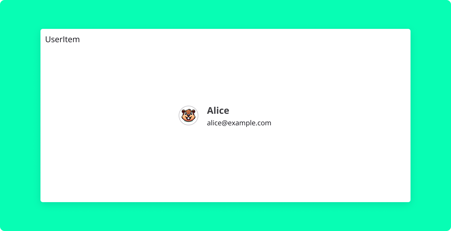
UserItem is a React component that displays a user's information, including their avatar, name, and helper text (such as a role or status). It is designed to be used in various contexts, such as inside tables or dropdown menu items.
Properties
- name: String:
- The name of the user.
- avatar: String:
- The URL or path of the avatar image.
- helper: String (optional):
- Additional text to display, such as the user's role or status.
- role: String (optional):
- The role or title associated with the user, displayed in the tooltip of the avatar.
Usage
Here's an example of how to use the UserItem component:
import UserItem from "./UserItem";

<UserItem
  name="John Doe"
  avatar="/path/to/avatar.jpg"
  helper="Software Engineer"
  role="Team Lead"
/>;
Youtube Component
Overview
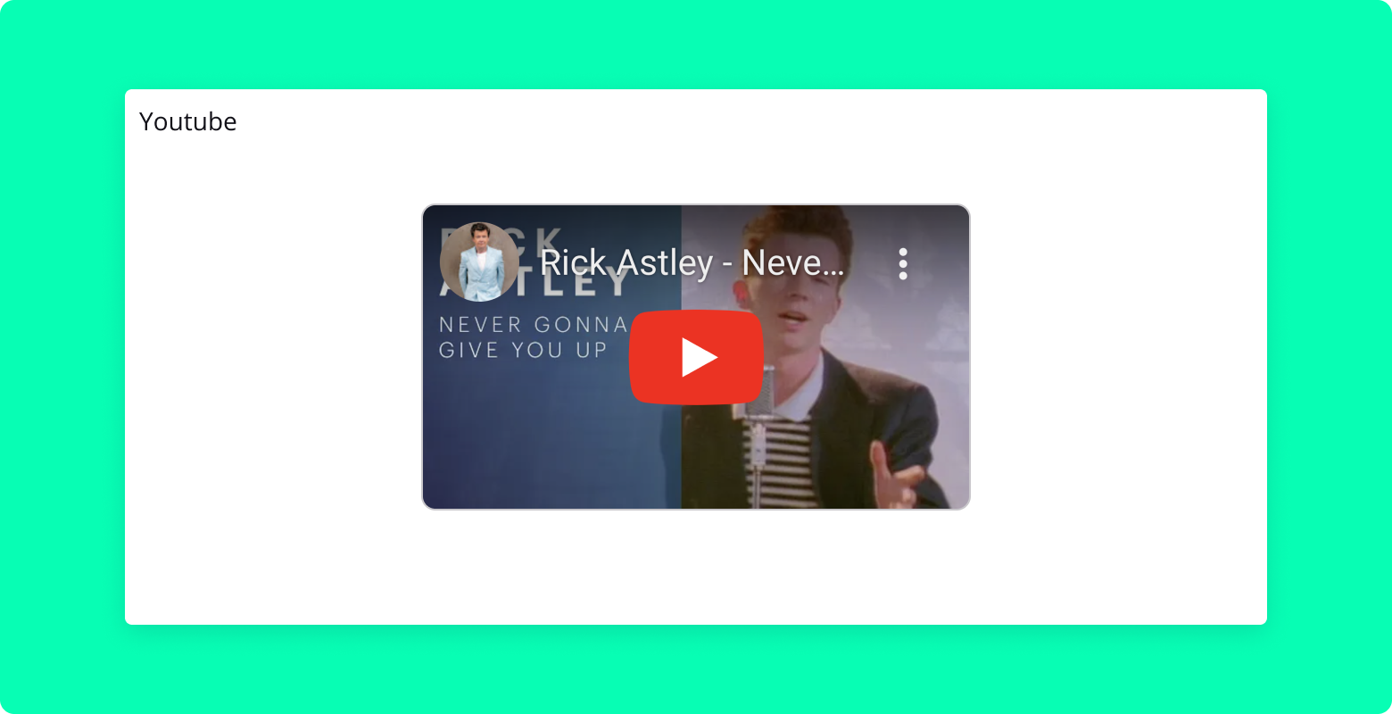
The Youtube component is a React component for embedding YouTube videos in your application. It allows for seamless integration of YouTube content by simply providing the video ID.
Properties
videoId: String (required)
- The unique identifier (ID) of the YouTube video to be embedded.
Usage
Here's an example of how to use the Youtube component:
import { Youtube } from "blocksin-system";

<Youtube videoId="dQw4w9WgXcQ" />;
ScrollArea Component
Overview
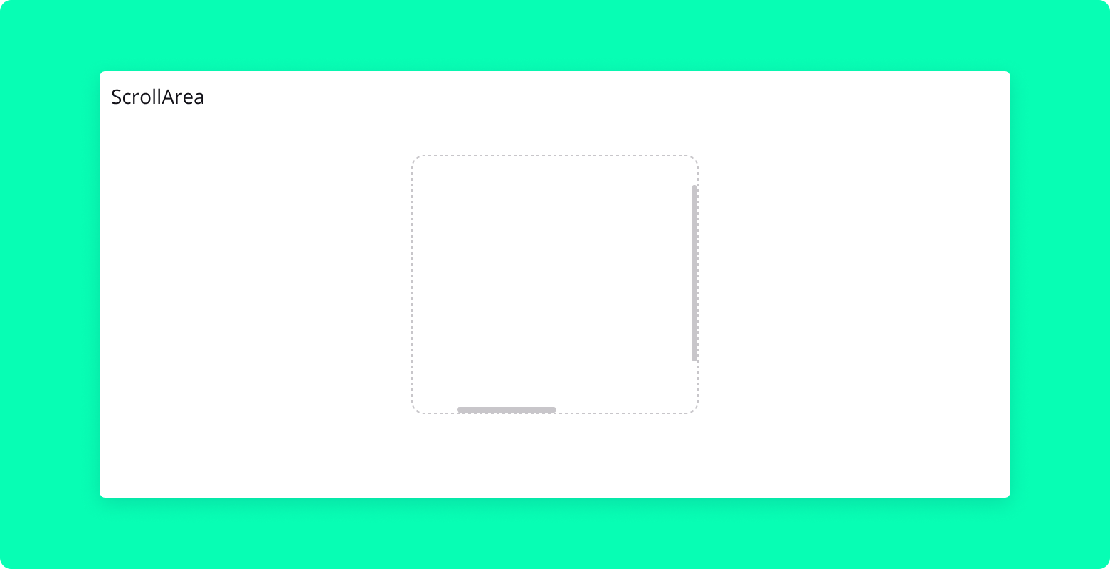
ScrollArea is a React component that provides a customizable scrollable area with optional custom scrollbars. It is built using Radix UI's ScrollArea primitive.
Properties
- children: ReactNode
- The content to be displayed inside the scrollable area.
- style: CSSProperties (optional)
- Additional styles to be applied to the root element of the
ScrollArea.
- Additional styles to be applied to the root element of the
- ref: React.Ref (optional)
- A ref to be forwarded to the root element of the
ScrollArea.
- A ref to be forwarded to the root element of the
Usage
Here's an example of how to use the ScrollArea component:
import ScrollArea from "./ScrollArea";
import { Flex } from "./Flex";

<ScrollArea style={{ height: "200px", width: "150px" }}>
  <Flex
    style={{
      height: "900px",
      width: "200px",
      background: "var(--gray-200)",
    }}
  >
    Long rectangle
  </Flex>
</ScrollArea>;
Select Component
Overview
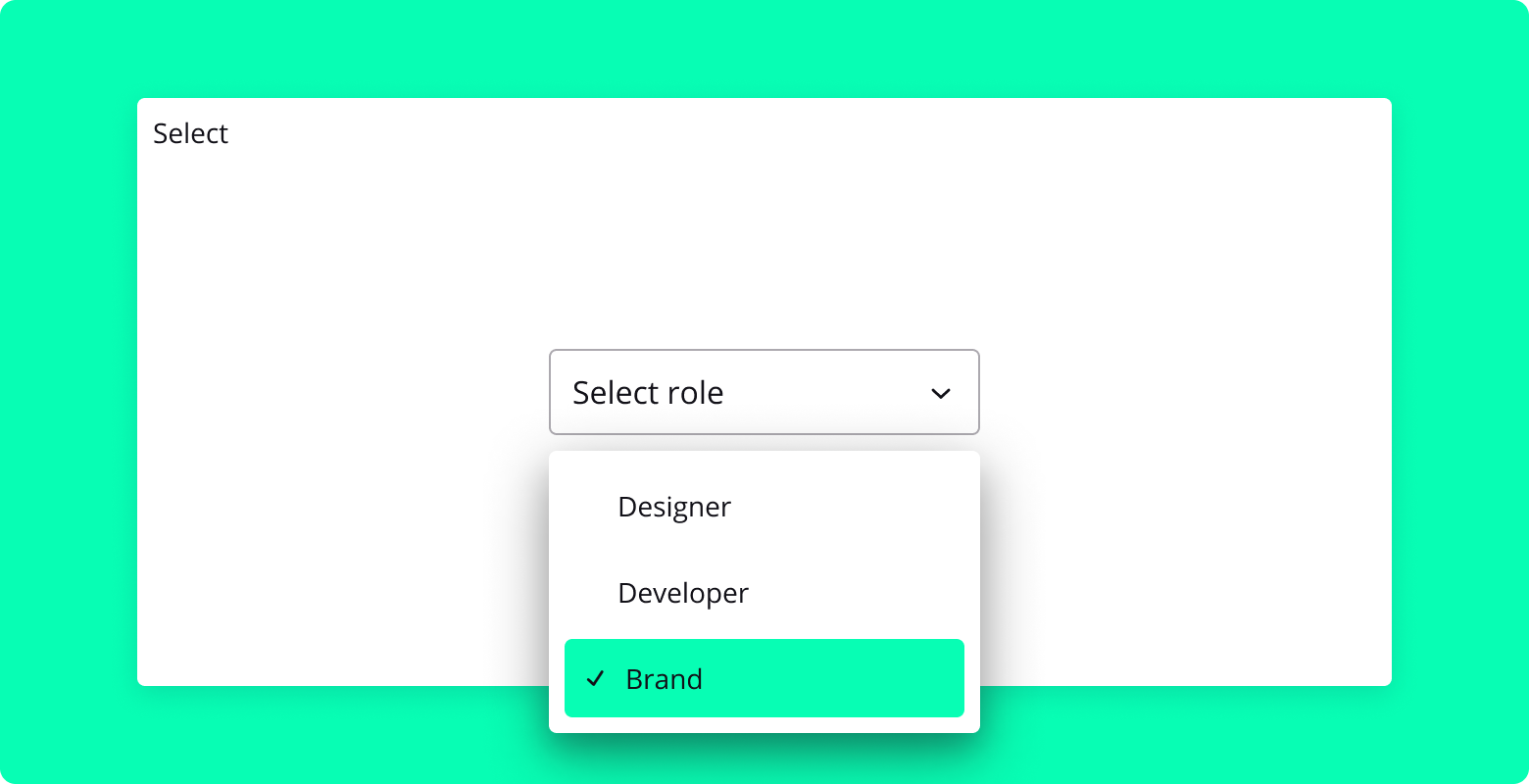
Select is a React component that provides a customizable dropdown menu for selecting an option from a list. It is built using the Radix UI Select primitive and includes features such as custom icons, scrolling buttons, and item indicators.
Properties
value: String (required)
- The value of the currently selected item.
onValueChange: Function (required)
- Callback function that is called when the selected value changes.
Usage
Here is an example of how to use the Select component:
import { Select } from "blocksin-system";
import { useState } from "react";

const MyComponent = () => {
  const [role, setRole] = useState("");

  return (
    <Select value={role} onValueChange={setRole}>
      <Select.Trigger aria-label="Role">
        <Select.Value placeholder="Select a role" />
      </Select.Trigger>
      <Select.Content side="bottom" sideOffset={8} align="start">
        <Select.Item value="Design">Product Designer</Select.Item>
        <Select.Item value="Developer">Developer</Select.Item>
        <Select.Item value="PM">PM</Select.Item>
        <Select.Item value="Brand">Brand Designer</Select.Item>
      </Select.Content>
    </Select>
  );
};
Separator Component
Overview
Separator is a simple React component designed to visually divide content within layouts. It renders as a horizontal line, helping to organize and separate different sections or elements on a page.
Properties
vertical: Boolean (optional)
- Determines the orientation of the separator. When set to
true, the separator is displayed vertically. By default, it is rendered horizontally.
- Determines the orientation of the separator. When set to
Usage
Below are examples illustrating how to use the Separator component in both horizontal and vertical orientations.
Horizontal Separator
import { Separator } from "blocksin-system";

// Renders a horizontal separator
<Separator />;
Slider Component
Overview
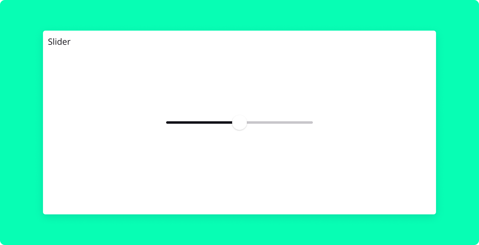
Slider is a customizable React component based on the Radix UI slider. It allows users to select a value or range of values within a defined range by dragging a handle along a track. This component is ideal for settings that involve continuous or discrete values, such as volume controls, price ranges, or any numerical input.
Properties
defaultValue: Array (optional)
- The initial value of the slider.
value: Array (optional)
- The controlled value of the slider.
min: Number (optional)
- The minimum value of the slider. Default is
0.
- The minimum value of the slider. Default is
max: Number (optional)
- The maximum value of the slider. Default is
100.
- The maximum value of the slider. Default is
step: Number (optional)
- The step increment value of the slider. Default is
1.
- The step increment value of the slider. Default is
onValueChange: Function (optional)
- Callback function triggered when the slider's value changes.
disabled: Boolean (optional)
- If
true, the slider will be disabled. Default isfalse.
- If
fluid: Boolean (optional)
- If
true, the slider will expand to fit the width of its container.
- If
Usage
Below are examples illustrating how to use the Slider component in various configurations.
Basic Slider
import { Slider } from "blocksin-system";

// Renders a slider with default settings
<Slider defaultValue={[50]} max={100} step={1} />;
Stepper Component
Overview
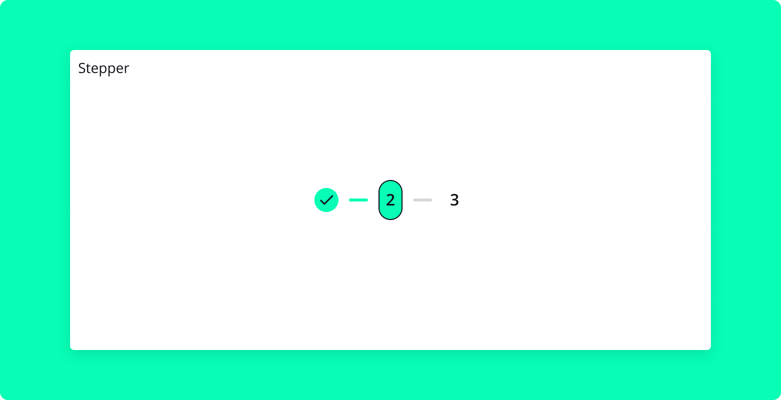
Stepper is a versatile React component designed to guide users through a series of steps or stages in a process. It can be used for multi-step forms, onboarding processes, or any sequential workflow where progress needs to be tracked visually. The Stepper component supports both horizontal and vertical orientations, dynamic step interactions, and customizable icons, providing a flexible and intuitive way to enhance user experience.
Properties
steps: Number (required)
- The total number of steps in the stepper.
currentStep: Number (required)
- The current active step in the stepper.
orientation: String (optional)
- Determines the orientation of the stepper, either
horizontalorvertical. Default ishorizontal.
- Determines the orientation of the stepper, either
icons: Array of Components (optional)
- An array of custom icon components to display in each step.
dynamic: Boolean (optional)
- If
true, allows steps to be clickable and navigable via keyboard.
- If
onStepClick: Function (optional)
- Callback function triggered when a step is clicked, receiving the step number as an argument.
Usage
Below are examples illustrating how to use the Stepper component in various configurations.
Basic Horizontal Stepper
import { Stepper } from "blocksin-system";

// Renders a horizontal stepper with 5 steps, currently on step 3
<Stepper steps={5} currentStep={3} />;
Vertical Stepper with Custom Icons
import { Stepper } from "blocksin-system";
import {
  ChevronLeftIcon,
  ChevronRightIcon,
  CheckIcon,
} from "@radix-ui/react-icons";

// Renders a vertical stepper with custom icons
<Stepper
  steps={5}
  currentStep={3}
  orientation="vertical"
  icons={[
    ChevronLeftIcon,
    ChevronRightIcon,
    ChevronLeftIcon,
    ChevronRightIcon,
    CheckIcon,
  ]}
/>;
Dynamic Stepper
import React, { useState } from "react";
import { Stepper } from "blocksin-system";
import {
  ChevronLeftIcon,
  ChevronRightIcon,
  CheckIcon,
} from "@radix-ui/react-icons";

const DynamicStepperExample = () => {
  const [currentStep, setCurrentStep] = useState(3);

  const handleStepClick = (step) => {
    setCurrentStep(step);
  };

  return (
    <Stepper
      steps={5}
      currentStep={currentStep}
      orientation="horizontal"
      icons={[
        ChevronLeftIcon,
        ChevronRightIcon,
        ChevronLeftIcon,
        ChevronRightIcon,
        CheckIcon,
      ]}
      dynamic={true}
      onStepClick={handleStepClick}
    />
  );
};

export default DynamicStepperExample;