basic-star-rating
v3.3.1
Published
A Star ratings custom element
Downloads
4
Readme
star-rating 
Installing
To install via NPM
$ npm i basic-star-ratingRequirements
Use NPM to install all dependencies
$ npm installAdd webcomponentsjs polyfills to your website with local dependencies using loaders or script tags. If you prefer you can use a CDN as well. Keep in mind that this polyfill will need to load BEFORE other related assets so it is preferrable to add it in the head of the document and as close to the opening of the head tag as possible.
<script async src="https://cdnjs.cloudflare.com/ajax/libs/webcomponentsjs/0.7.21/webcomponents.min.js"></script>ES6, Babel, & WebPack
star-rating element is built with ES6/ES2015 modules. You may use the either the source files or the transpiled es5 file. When using the ES6/ES2015 source files, you will most likely need to use a module loader like Babel with Webpack or SystemJS.
Usage
It is recommended that you use module loaders for this element. That said, you can alternatively use the star-rating as an HTML Import (See Web Components Standards for more details) or load it through bower if that is your workflow.
When you want to use star-rating simply add it to your markup
<star-rating maxvalue="5"></star-rating>Browser Support*
| | | | | | |
|:---:|:---:|:---:|:---:|:---:|:---:|
| Latest ✔ | Latest ✔ | Latest ✔ | IE 10+ ✔ | Latest ✔ | Latest ✔ |
*Includes both Mobile & Desktop versions with webcomponents.js polyfill. Note that IE10 will have flaky behavior for Custom Elements & HTML Imports
API
Attributes
| Attribute Name | Required | Type | Example | Comments | | --- | --- | --- | --- | --- | | maxvalue | No | integer | 5 | maxvalue is the total number of stars you wish to display. | | src | No | string | "/images/my-star.png, /images/my-star-selected.png" | This attribute is a string consisting of two urls that are comma separated in a single string value. These two image paths get added as 'background-image' url's in the css | | size | No | string | 36px | size defines the height & width values in css units for each individual star |
Methods
| name | description | usage |
| ---- | ----------- | ----- |
| rateAs | 'rateAs' sets a given value to the star-rating by passing in an integer value between 1 and the maxValue attribute | document.querySelector('star-rating').rateAs(3) |
| reset | 'reset' sets the value property to zero and resets the star-rating to its original state | document.querySelector('star-rating').reset() |
Events
ratingUpdated
ratingUpdated is a DOM Custom Event that fires whenever the value of the star-rating element is updated.
| event detail | default value | type |
| --- |:---:|:---:|
| event.detail.maxValue | 5 | number |
| event.detail.value | 0 | number |
Usage Example
Add an event listener as seen below. When you tap or click on a star, the console should output the correct state information of that element.
    document.querySelector('star-rating').addEventListener('ratingUpdated', function(evt){
        // do something with the event information `evt.detail`
        console.log(evt.detail.maxValue, evt.detail.value);
    });
Development
Use an existing application server to load the demos and set the root to the folder. Then you can navigate with your browser to the localhost & port. If you want a quick and easy server user serve. Serve uses port 3000 by default.
Download webpack & serve (optional)
$ npm i serve webpack -gRunning the server locally (using serve)
$ npm run demoTo view the demo in the browser using the serve module, navigate in your browser to localhost:3000 after running the above command. Most API examples are testable on the demo page.
Online examples are on the the project github pages
Demos
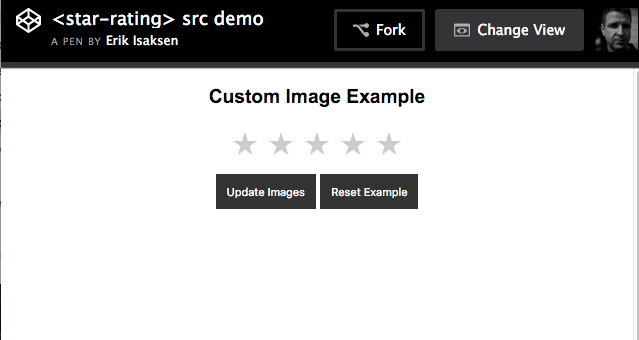
Changing the image src attribute
Contributing
To contribute to this project all you will need is NPM installed and a love of web components. Please submit any suggestions or changes with a pull request (when possible). Here is the Code of Conduct for contributions

