
app-tutorial
v1.0.17
Published
app-tutorial is a library which will help you with creating a demo for your application.
Downloads
3
Maintainers
 fjollsfinn
Readme
app-tutorial
app-tutorial is a library which will help you with creating a demo for your application.
Installation
npm install app-tutorialUsage
Basic usage
Wrap your whole application with <AppTutorialProvider />, then you can use <TutorialTooltip /> component in your app to lock the UI until the user finish the tutorial step.
You could pass any valid React.ReactNode as a children.
Remember to pass lastStep prop to your last <TutorialTooltip />.
import { AppTutorialProvider, TutorialTooltip } from 'app-tutorial';
function App(): JSX.Element {
return (
<>
<AppTutorialProvider>
<TutorialTooltip
autostart
step={0}
lastStep
content={{
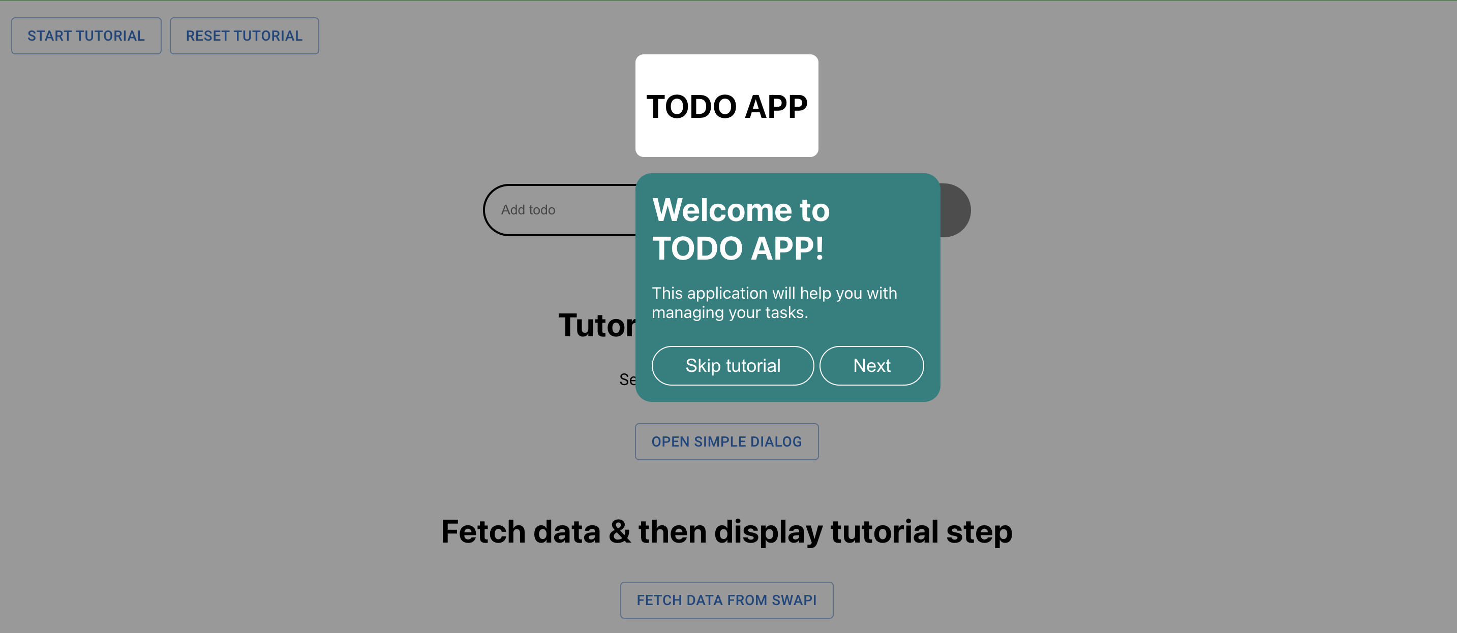
title: 'Welcome to TODO APP! ',
text: 'This application will help you with managing your tasks.',
}}
>
<h1>TODO APP</h1>
</TutorialTooltip>
</AppTutorialProvider>
</>
);
}
If you pass autostart prop to <TutorialTooltip /> component, the tutorial step will be displayed immediately after the UI is rendered. Once the tutorial is finished, it won't be displayed anymore. The tutorialStatus will be set to DONE, and stored in the Local Storage. If you want to display it one more time, just remove the tutorialStatus from the Local Storage.
It's also possible to restart the tutorial with the UI. For that, you will need to use useTutorialContext(). Learn about startTutorial and resetTutorial functions in the API section
result:
Advanced usage - with context (fire next step on callback)
Once you wrapped your app with the <AppTutorialProvider /> you can start using useTutorialContext() to deal with triggering nextStep() function eg. when user click on the button.
import React from 'react';
import { Todo } from '../../App';
import { v4 as uuidv4 } from 'uuid';
import Wrapper from '../../styles/Wrapper.styled';
import Button from '../../styles/Button.styled';
import Input from '../../styles/Input.styled';
import { useTutorialContext, TutorialTooltip } from 'app-tutorial';
interface AddTodoFormProps {
onAddTodo: (todo: Todo) => void;
}
const AddTodoForm = ({ onAddTodo }: AddTodoFormProps): JSX.Element => {
const { nextStep, isTutorialStarted } = useTutorialContext();
const [value, setValue] = React.useState<string>('');
const handleAddTodo = (event: React.FormEvent) => {
event.preventDefault();
if (isTutorialStarted) {
nextStep();
}
const newTodo: Todo = {
id: uuidv4(),
title: value,
isDone: false,
};
onAddTodo(newTodo);
setValue('');
};
const handleChange = (event: React.FormEvent<HTMLInputElement>) =>
setValue(event.currentTarget.value);
return (
<Wrapper>
<TutorialTooltip
step={1}
nextButtonDisabled={!value}
content={{
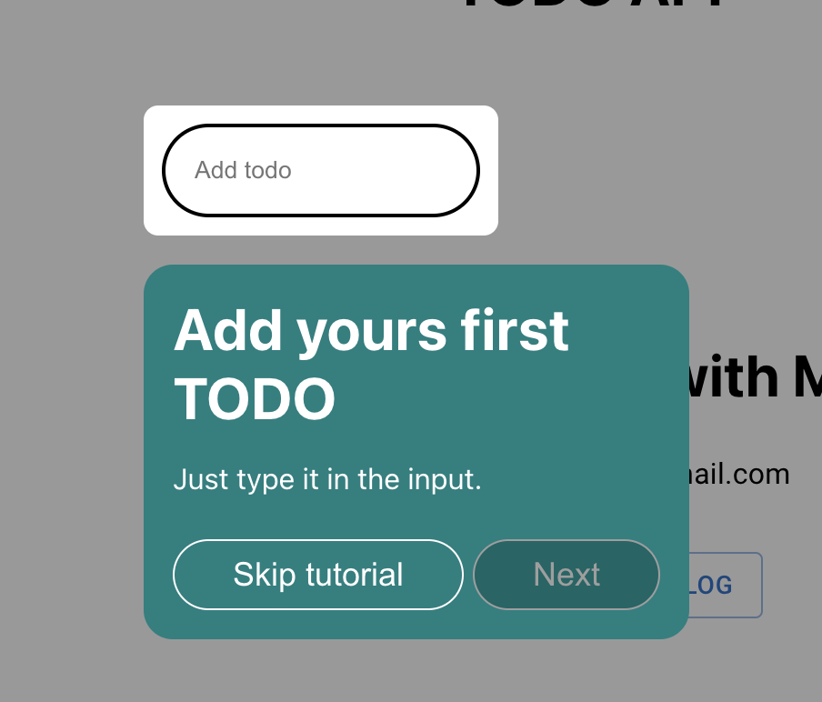
title: 'Add yours first TODO',
text: 'Just type it in the input.',
}}
>
<Input
id="add-todo"
type="text"
value={value}
onChange={handleChange}
placeholder="Add todo "
/>
</TutorialTooltip>
<TutorialTooltip
step={2}
content={{
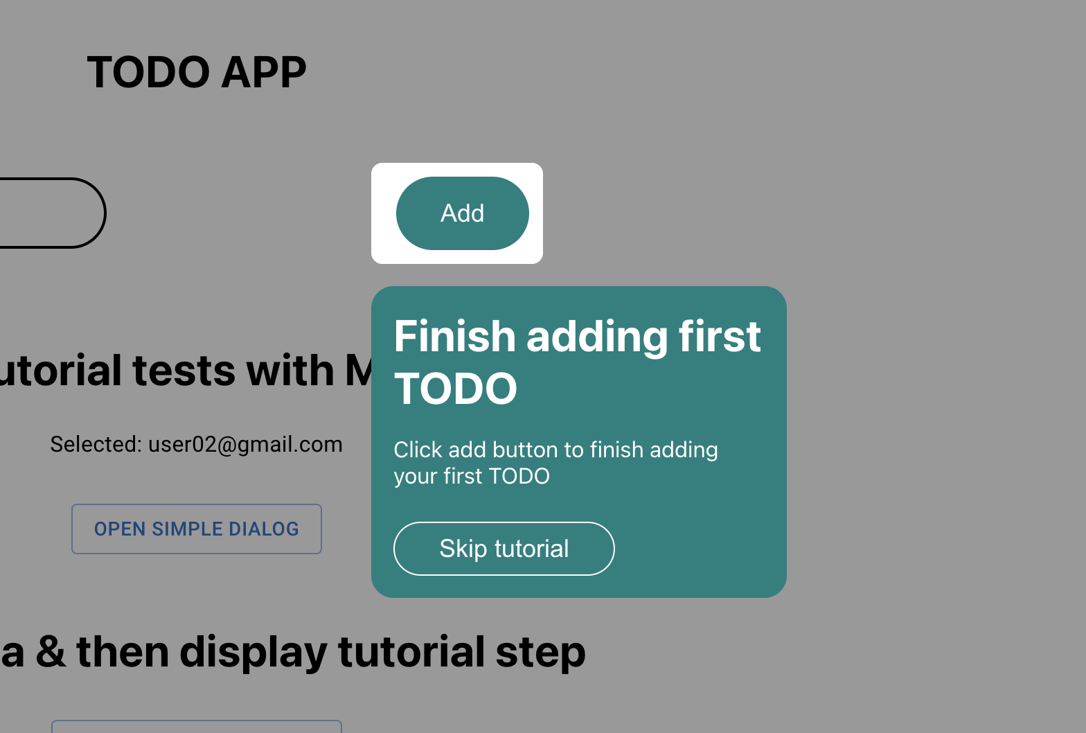
title: 'Finish adding first TODO',
text: 'Click add button to finish adding your first TODO',
}}
hideNextButton
>
<Button onClick={handleAddTodo} disabled={!value}>
Add
</Button>
</TutorialTooltip>
</Wrapper>
);
};
export default AddTodoForm;If the your last tutorial step component is not rendering next button and you are using useTutorialContext(), then pass true to nextStep() function to set tutorial as finished. See nextStep api
Note that with nextButtonDisabled prop you can lock next button until eg. user enter a value to the input. (<TutorialTooltip /> with step 1).
With hideNextButton prop you can hide next button, so user has to click on the wrapped UI to trigger the nextStep() function (<TutorialTooltip /> with step 2).
results:
Advanced usage - styling
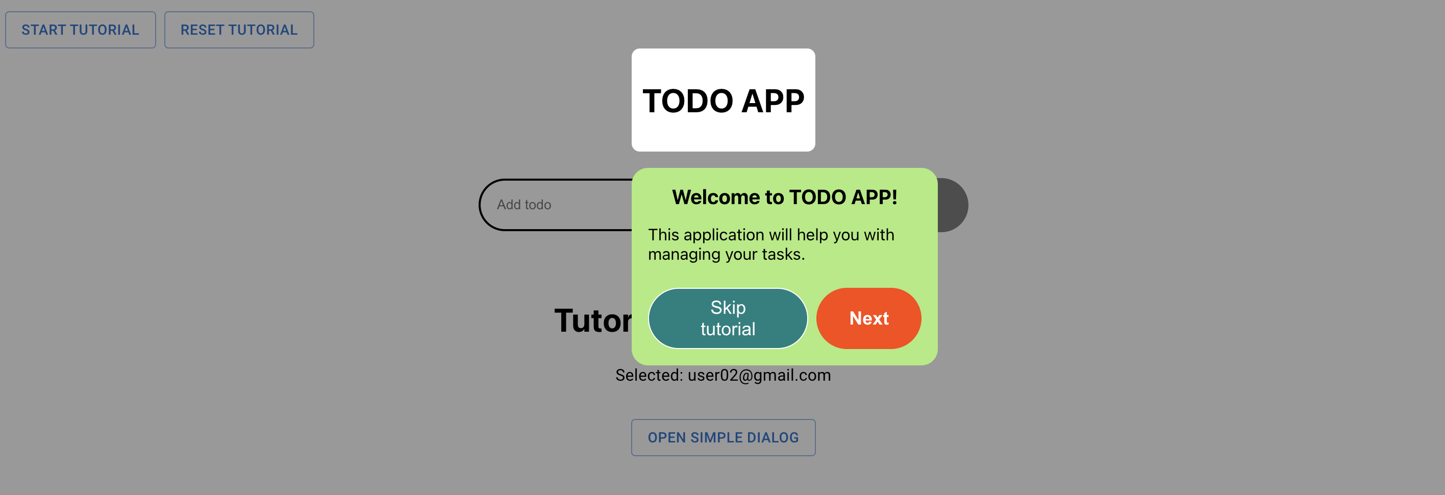
You can style <TutorialTooltip /> with styled-components. Just import <TutorialTooltip /> and pass it to styled function.
const CustomizedTutorialTooltip = styled(TutorialTooltip)`
  .tutorial-tooltip {
    background-color: #aceb7b;
  }

  .title {
    font-size: 20px;
    text-align: center;
    color: black;
  }

  .text {
    color: black;
  }

  .buttons-wrapper {
    justify-content: flex-end;
  }

  .skip-tutorial-btn {
    margin-right: 8px;
  }

  .next-btn {
    border: none;
    background-color: orangered;
    font-weight: bold;
  }
`;
Result:
The library has its own ThemeProvider. You could pass your own theme to it. By default the theme looks like this:
const theme = {
  colors: {
    primary: {
      main: '#008080',
      light: '#009999',
      dark: '#006666',
    },
    common: {
      black: '#000000',
      white: '#ffffff',
    },
    disabled: {
      main: '#9e9e9e',
    },
  },
};

export default theme;
More info about styling with styled-components
API
Components API:
<AppTutorialProvider />
| Name | Type | Description |
| -------- | -------------------------------- | -------------------------------------------------------------------------------------------------------------------------------------------------------------------------------------------- |
| children | JSX.Element or JSX.Element[] | Component to be wrapped with <TutorialProvider />. Usually you want to wrap whole Application by this provider. |
| theme | object | Theme object. If you won't pass any styles, app-tutorial package will use its internal styles. More info about theming with styled-component: https://styled-components.com/docs/advanced. |
<TutorialTooltip />
| Name | Type | Description |
| ---------------------- | ----------------- | ---------------------------------------------------------------------------------------------------------------------------------------------- |
| children | React.ReactNode | Element to be exposed. |
| step | number | Current tutorial step. |
| content | object | Content of current tutorial step to be displayed in tooltip. |
| className | string | The className of the component (see more details in styled-components library). |
| skipTutorialBtnText | string | Text displayed in skip tutorial button. |
| nextBtnText | string | Text displayed in next step button. |
| autostart | boolean | If true, tutorial will start automatically. You could for example make this prop conditionally decide at what point the tutorial should start. |
| lastStep | boolean | Info if this step is the last one. |
| nextButtonDisabled | boolean | If true, the next step button will be disabled. |
| hideButtons | boolean | If true, the buttons won't be rendered. |
| hideNextButton | boolean | If true, next step button won't be rendered. |
| hideSkipTutorialButton | boolean | If true, skip tutorial button won't be rendered. |
TutorialTooltipContent object
| Name | Type | Description |
| --------- | ------------- | ------------------------ |
| text | string | Tutorial step text. |
| title | string | Tutorial step title. |
| component | JSX.Element | Tutorial step component. |
useTutorialContext()
| Name | Description |
| Name | Description | Type | Arguments |
|--------------------|----------------------------------------------------------------------------------------------------------------------------------------------------------------------------------------------------------------------------------------------------------------------------------------------------------------------------------------------------------------------------------------------------------------------------------------------------------------------------------------------------------------------------------------------------------------------------------------------|-------------------------|---------------|
| nextStep | A function that increments the activeStep state by 1 if activeStep is not null, and it's not the last step. If lastStep is true, it calls the endTutorial function. | () => void | lastStep?: boolean |
| activeStep | A state that holds the number of the active step of the tutorial. If the tutorial has not started, it is set to null. | number \| null | - |
| setActiveStep | A function that sets the value of activeStep to the given argument. | (value: number \| null) => void | value: number \| null |
| isTutorialStarted| A state that holds a boolean indicating whether the tutorial has started or not. | boolean | - |
| setIsTutorialStarted | A function that sets the value of isTutorialStarted to the given argument. | (value: boolean) => void | value: boolean |
| startTutorial | A function that sets isTutorialStarted to true, stores the tutorial status in local storage as "playing", and sets the active step to the given argument (default is 0). | (step?: number) => void | step?: number |
| endTutorial | A function that sets isTutorialStarted to false, stores the tutorial status in local storage as "done", and sets the active step to null. | () => void | - |
| resetTutorial | A function that sets isTutorialStarted to false, clears the tutorial status from local storage, and sets the active step to null. | () => void | - |