
antd-data-table
v1.0.1
Published
[](https://www.npmjs.com/package/antd-data-table) [](https://www.npmjs.com/package/antd-data-table) [


Readme
antd-data-table


A component that combines antd's Table and Form to do the search, display, and operating jobs for data.
Feature
Free from:
- Handling pagination
- Handling table row selection
- Writing search field form item components
- Writing row actions components
Just focus on:
- Doing the data fetching request and return the data
- Rendering a specific data field if needed
- Writing plugin to operate one or many data object(s)
Install
$ yarn add antd-data-table --saveSimplest data table
import { DataTable } from 'antd-data-table'

const searchFields: SearchField[] = [
  {
    label: 'ID',
    name: 'id',
    type: 'input',
    payload: {
      props: {
        placeholder: 'placeholder'
      }
    }
  },
  {
    label: 'Select',
    name: 'select',
    type: 'select',
    payload: {
      options: [
        { key: '1', label: 'one', value: '1' },
        { key: '2', label: 'two', value: '2' },
        { key: '3', label: 'three', value: '3' }
      ]
    }
  }
]

const columns: TableColumnConfig<any>[] = [
  {
    key: 'id',
    title: 'ID',
    dataIndex: 'id'
  }, {
    key: 'title',
    title: 'Title',
    dataIndex: 'title'
  }
]

const expands: Expand[] = [
  {
    title: 'Body',
    dataIndex: 'body',
    render (value) {
      return value && `${value.substr(0, 100)} ...`
    }
  },
  {
    title: 'User ID',
    dataIndex: 'userId'
  }
]

const onSearch = async ({ page, pageSize, values }) => {
  const res = await axios.get('http://jsonplaceholder.typicode.com/posts', {
    params: {
      _page: page,
      _limit: pageSize,
      ...values
    }
  })
  return {
    dataSource: res.data,
    total: Number(res.headers['x-total-count'])
  }
}
render(
  <DataTable
    rowKey={record => record.id}
    searchFields={searchFields}
    initialColumns={columns}
    initialExpands={expands}
    onSearch={onSearch}
  />
, mountNode)
Guide
Collapsable search field
Sometimes there are many search fields, you could set a maxVisibleFieldCount to automatically have a collapsable form:
import { DataTable } from 'antd-data-table'

render(
  <DataTable
    rowKey={record => record.id}
    searchFields={searchFields}
    initialColumns={columns}
    onSearch={onSearch}
+   maxVisibleFieldCount={4}
  />
, mountNode)
Row actions
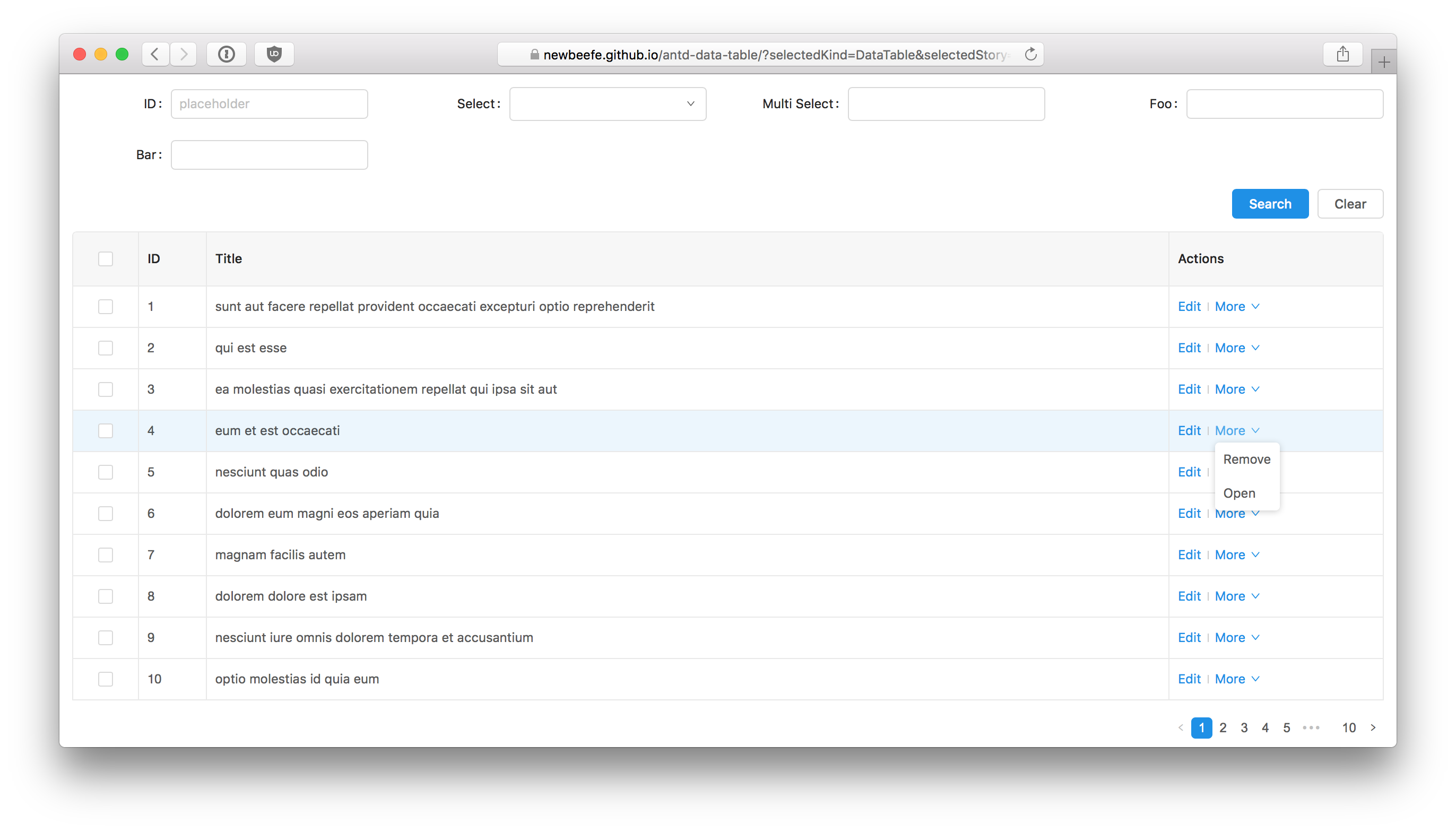
We usually need to write some action buttons for operating a specific record. antd-data-table made it super easy:
const actions: RowAction[] = [
  {
    label: 'Edit',
    action (record) {
      action('onClick edit')(record)
    }
  },
  {
    label: 'More',
    children: [
      {
        label: 'Remove',
        action (record) {
          action('onClick remove')(record)
        }
      },
      {
        label: 'Open',
        action (record) {
          action('onClick open')(record)
        }
      }
    ]
  }
]

render(
  <DataTable
    rowKey={record => record.id}
    searchFields={searchFields}
    initialColumns={columns}
    initialExpands={expands}
    onSearch={onSearch}
    actions={actions}
  />
, mountNode)
Plugins
Plugins are for operating multiple records. Every plugin will render a component at the top of table.
Let's write a simplest plugin: A button that show current selected rows' ids:
const ShowIdsBtn = ({ selectedRows, clearSelection }) => {
  const showIds = () => {
    message.info(selectedRows.map(row => row.id).join(','))
    // clear selection after the action is done
    clearSelection()
  }

  return <Button onClick={showIds}>Show Ids</Button>
}

const plugins = [
  renderer (selectedRowKeys, selectedRows, clearSelection) {
    return <ShowIdsBtn selectedRows={selectedRows} clearSelection={clearSelection} />
  }
]

render (
  <DataTable
    rowKey={record => record.id}
    searchFields={searchFields}
    plugins={plugins}
    initialColumns={columns}
    initialExpands={expands}
    onSearch={onSearch}
  />
, mountNode)
Props
name?: string
Unique table name.
rowKey: (record) => string
The key value of a row.
searchFields: SearchField[]
SearchField is an object that contains:
- label: string Pass to
<Form.Item>'slabelproperty. - name: string Pass to
getFieldDecoratoras the decorator name. - type?: RenderType antd-data-table comes with some common form item type. Such as
input,select. - initialValue?: any Inital form value.
- renderer?: (payload?: object) => React.ReactNode When the form item types are not statisfied, your could write your own renderer. the
ReactNodethat returned will be wrapped bygetFieldDecorator. - validationRule?: ValidateionRule[] antd validation rules. Pass to
getFieldDecorator(name, { rules }). - payload?: { props: any, [key: string]: any } Some params that pass to the renderer.
- span?: number Form Item Col span value. 6 by default.
out of the box render type
input
interface payload {
  props: object // antd Input props
}
datePicker
interface payload {
  props: object // antd DatePicker props
}
treeSelect
interface payload {
  props: object // antd TreeSelect props
}
select
interface payload {
  props: object, // antd Select props
  options: {
    key: string,
    label: string,
    value: string
  }[]
}
initialColumns: TableColumnConfig[]
antd's TableColumnConfig. See more at https://ant.design/components/form/
initialExpands: Expand[]
type Expand = {
  /** Title of this column **/
  title: string,
  /** Display field of the data record, could be set like a.b.c **/
  dataIndex: string,
  /** Renderer of the column in the expanded. The return value should be a ReactNode **/
  render?: (text: any, record?: {}) => React.ReactNode
}
onSearch<T> (info: SearchInfo): Promise<SearchResponse<T>>
onSearch property need a function that return a Promise, which resolves an object that contains total and dataSource. This function receive a SearchInfo:
type SearchInfo = {
  /** values from `getFieldsValue()` */
  values: any,
  /** current page */
  page: number,
  /** page size */
  pageSize: number
}
title?: React.ReactNode
searchBtnText?: string
clearBtnText?: string
listSelectionBtnText?: string
onError? (err): void
Error handler that trigger when onSearch throw error.
loadDataImmediately?: boolean
Load list data immediately, default is false
onValidateFailed?: (err: ValidateError) => void
Form validation failed handler
pageSize?: number
default is 10
plugins?: Plugin[]
rowActions?: RowAction[]
enableListSelection?: boolean
If true, a list selection button will display on table title.
Be sure to pass the name props if it is enable.
rowSelection?: TableRowSelection
Custom rowSelection.
affixTarget?: () => HTMLelement
For Affix. Specifies the scrollable area dom node
affixOffsetTop?: number
Pixels to offset from top when calculating position of scroll
affixOffsetBottom?: number
Pixels to offset from bottom when calculating position of scroll
FAQ
How to trigger the onSearch action imperatively?
There is a public fetch method in DataTable to do this action. So you could get it from ref:
// ...
render () {
  let dataTableRef: DataTable | null = null

  const saveDataTableRef = (ref: DataTable) => {
    dataTableRef = ref
  }

  const onClickCustomSearch = () => {
    if (dataTableRef) {
      dataTableRef.fetch(1)
    }
  }

  return (
    <div style={{ padding: '1em' }}>
      <DataTable
        ref={saveDataTableRef}
        name='customSearch'
        rowKey={record => record.id}
        searchFields={searchFields}
        initialColumns={columns}
        initialExpands={expands}
        onSearch={onSearch}
        pageSize={10}
        onError={onError}
      />
      <Button onClick={onClickCustomSearch}>Custom Search</Button>
    </div>
  )
}
fetch: async (page: number, values: object = this.state.currentValues, clearPagination: boolean = false)
Build
$ yarn

$ yarn start # start the storybook

$ yarn test # run the test

$ yarn run build # build the distribution file

$ yarn run build:storybook # build storybook
Release workflow
$ yarn run build:storybook # build storybook

$ npm publish
License
MIT License