
angular-hold-button
v1.0.1
Published
An AngularJS directive that turns a regular <button> into one that has to be held for a configurable amount of time before it performs an action. It can be used instead of a confirmation dialog for destructive actions.
Downloads
8

Readme
Angular Hold Button
An AngularJS directive that turns a regular <button> into one that has to be held for a configurable amount of time before it performs an action. It can be used instead of a confirmation dialog for destructive actions.
Demo
Preview
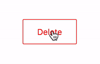
Live demo
Live view of examples/demo.html.
Installation
npm
npm install angular-hold-button --savebower
bower install angular-hold-button --saveManual
Copy dist/angular-hold-button.min.js to your project.
How to use
Include the JS and CSS files:
<script src="angular-hold-button.min.js"></script>
<link rel="stylesheet" href="angular-hold-button.min.css">
Add rmHoldButton to dependencies
var app = angular.module('ExampleApp', [
    'rmHoldButton',
]);
Add rm-onhold attribute to a <button> in your template
<button rm-onhold="deleteSomething()">Hold me tight!</button>Options
You can customise how long the button has to be held:
<button rm-onhold="deleteSomething()" rm-onhold-options="{ duration: 2000 }">Hold me tight for 2s!</button>duration is a value in milliseconds.
Customise the look
Basics
The button
.rm-hold-button {
    border: 1px solid red;
    color: red;
    line-height: 24px;
    padding: 10px 20px;
}
Colour of the fill
.rm-hold-button-fill {
    background-color: red;
}
Colour of text in the filled portion of the button
.rm-hold-button-text {
    color: white;
}
Use a line indicator instead of whole background
Along the top
.rm-hold-button-fill {
    height: 3px;
}
Along the bottom
.rm-hold-button-fill {
    bottom: 0;
    height: 3px;
    top: auto;
}