alloy-widget-nl.fokkezb.loading
v1.8.4
Published
Displays a simple loading mask.
Downloads
35
Maintainers
Readme
Loading Mask Widget 

Overview
This is a widget for the Alloy MVC framework of Appcelerator's Titanium platform.
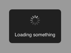
The widget provides a simple loading mask that can be easily styled and configured.
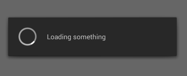
By default it uses the native ProgressIndicator for Android but you can easily switch to use the same cross-platform version on both iOS and Android.
Screenshot


Features
- Fully stylable via your
app.tss. - Can be set to be cancelable by user, setting a function to be called in that case.
- Message and ability to be cancelled can be set every time it's used.
- Can be via single global instance or local instances.
- Available as native ProgressIndicator (Android), Window and View.
Quick Start 
Use
gittio install nl.fokkezb.loadingto install via gitTio or:Download the latest release of the widget.
Unzip the folder to your project under
app/widgets/nl.fokkezb.loading.Add the widget as a dependency to your
app/config.jsonfile:```javascript "dependencies": { "nl.fokkezb.loading":"*" } ```
Create a global instance of the widget in
alloy.js:Alloy.Globals.loading = Alloy.createWidget("nl.fokkezb.loading");Show and hide the loading mask when you need it:
function cancel() {
    alert('Why?!');
}

function load() {
    Alloy.Globals.loading.show('Your message', false);

    setTimeout(function(){
        Alloy.Globals.loading.hide();
    }, 6000);
}
In Titanium 3.3.0 you need to hide the Android Actionbar as described in this blog. If you use Titanium 3.3.1 or later the widget automatically requests for a theme with no actionbar.
Global vs Local
The Quick Start shows how to use the global-mode. You only have to create one global widget instance that will (try to) make sure that there's always one loading mask showing. You can also use one of the 3 available types of loading masks directly as a local instance, as we'll see when we look at the types.
Types
The widget exposes different types of loading masks. All types share the same API so you can easily switch between them.
Native Progress (Android-only)
The global default for Android is to use ProgressIndicator. You can disable this by setting the progress property of the global widget to false or using one of the 2 other types directly in a local instance. The Native Progress type itself can also be used as a local instance:
var myInstance = Alloy.createWidget('nl.fokkezb.loading', 'progress');
myInstance.show('My message', myCancelCallback);
Window
The only available global mode for iOS is to show a Window. You can also create a local instance:
var myInstance = Alloy.createWidget('nl.fokkezb.loading', 'window');
myInstance.show('My message', myCancelCallback);
View
You can also create the widget as a local view which you can require in any (composite) layout. The typical use case for this is to display the widget over a modal window since the window-type would open behind such a window and be invisible.
index.xml
<Alloy
    <Window>
        <Widget src="nl.fokkezb.loading" name="view" id="myInstance" />
    </Window>
</Alloy>
index.js
$.myInstance.show('My message', myCancelCallback);Public API
All types share the same public API:
visible
You'll get TRUE if the loading mask is currently shown. If set to TRUE or FALSE it will call show() or hide().
progress (global-only)
Set to FALSE to use the cross-platform loading mask for Android instead of the default native ProgressIndicator.
show([message],[cancelable]])
Shows the loading mask or updates the existing, if it's still the top window. If the second argument is a function, the mask is user-cancelable at which event this method would be called.
update([message],[cancelable]])
Updates the existing message and cancelable function. Not available in global-mode, where you'd simply call show() again.
success([message])
Updates the existing message or uses the default one (Success). This will also hide the activity indicator and display a checkmark icon instead.
hide()
Hides the loading mask.
Styling
You can style all views from your app.tss. The default styles can be found in window.tss. Be aware that the default styles are applied to classses, but to override from your app.tss you need to following (identical) IDs:
#progressIndicator: The native Android ProgressIndicator.#loadingWindow: The window if using the (default) window mode.#loadingMask: The full-screen mask.- Set
imagestotrueto use the#loadingImagesindicator.
- Set
#loadingOuter: The dark box containing the activityIndicator and message.#loadingInner: Wraps arround the activityIndicator and message to provider padding.#loadingIndicator: The activityIndicator.#loadingImages: The indicator variant using images.#loadingMessage: The message.
Internationalization
You can override the default message (Loading..) by setting the loadingMessage in your strings.xml files. Same thing for (Success) which is using loadingSuccessMessage in strings.xml.
Changelog
- 1.8:
- New
viewmode to get the loading mask as a view instead of a window. - Consistent public API's for all types and modes.
- New
- 1.7:
- Uses native ProgressIndicator for Android
- Uses the
themeproperty to select a theme with no ActionBar.
- 1.6: Complete rewrite
- Widget creation now only in controller
- Styling now only in TSS
- Setting message and blocking now only via
show() - Cancel event replaced by callback as second argument for
show() - Second
show()argument nowcancelable, reverse ofblocking(!!) - On Android, hitting the back button on a non-cancelable loading mask will move app to the background
- 1.5.2: Fixes empty loading mask on second show on Android
- 1.5.1: Reverted 1.5 change thanks to
opacityfix. - 1.5: Falls back to
Ti.UI.Android.ProgressIndicatorfor Android - 1.4: Support for image indicator
- 1.3: Fully override widget style from
app.tssand reset to default message upon show. - 1.2: View replaced by Window, otherwise won't work in non-absolute layout modes.
- 1.1: New parameter
showto automatically show loading mask upon creation. - 1.0: Initial version
