
alerts-are-easy
v2.0.0
Published
This package will help you to show success, warning, error and info messages in your react-native application with a beautiful UI.
Downloads
8
Maintainers
 vyshakh.vj
Readme
alerts-are-easy
This package will help you to show success, warning, error and info messages in your react-native application with a beautiful UI.


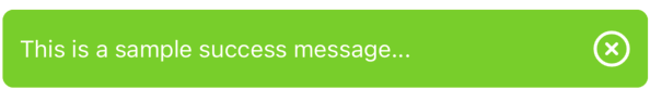
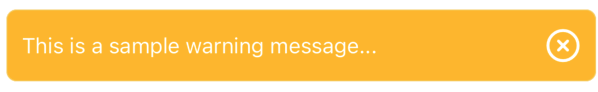
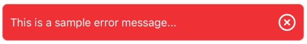
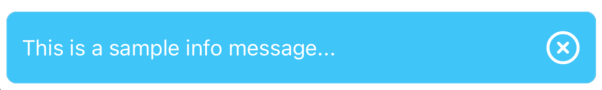
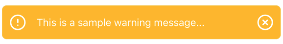
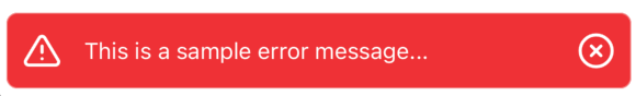
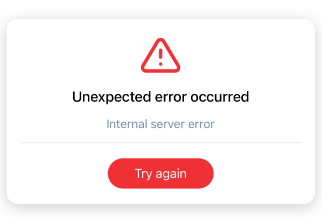
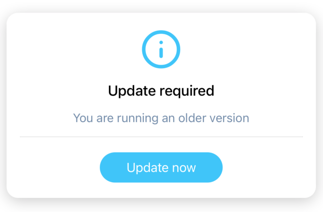
SimpleAlert


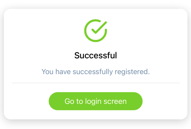
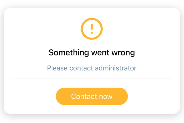
LargeAlert
Installation
npm install --save alerts-are-easyalerts-are-easy requires react-native-vector-icons to show the icons. Install this peer dependency and start using alerts-are-easy.
Usage
import {SimpleAlert} from 'alerts-are-easy';<SimpleAlert
position="top" // -> Can be top,center or bottom
message="This is a sample message..." // The message you want to show
type="success" // -> Can be success, warning, error or info
showIcon={true} // -> Can be true or false
/>import {LargeAlert} from 'alerts-are-easy';<LargeAlert
title="Successful"
message="You have successfully registered."
actionText="Go to login screen"
type="success"
actionTriggered={this.actionTriggered}
/>Props
SimpleAlert
| Prop | Description | Value |
| ------ | ------ |------ |
| position | Helps to position your alert |top, center, bottom |
| message | The message you want to show | eg: "This is a sample message..." |
| type | The type of alert |success, warning, error, info |
| showIcon | Helps to show left icon |true, false |
LargeAlert
| Prop | Description | Value |
| ------ | ------ |------ |
| title | The title you want to show | eg: "Successful" |
| message | The message you want to show | eg: "You have successfully registered." |
| actionText | The text you want to show on button | eg: "Go to login screen" |
| type | The type of alert |success, warning, error, info |
| actionTriggered | The button click action | You can define the function and pass it in this prop. |
Under way
- [ ] Detailed Alerts
License
ISC
Donation
Buy me a cup of coffee :)