
ag-input
v1.0.1
Published
ag-input
Downloads
17
Maintainers
 anandg1981
Readme
Angular Icon Inputs
This module contains a couple of Angular Input box components that allow to add an icon inside a text input, which helps better identify common input fields like for example email, etc.
This small module contains only the HTML and CSS necessary to implement this very common HTML pattern.
The default theme of the input is designed to look just like a plain HTML input, including the focus blue border (tab and shift-tab are supported).
Any icon available on the Font Awesome Icon library can be used.
Features:
- The components have minimum styling and are themable
- there is no need to include a component-specific external stylesheet, only the Font Awesome icons stylesheets
- As the input component takes a plain input and projects it, this means that by design the component supports all standard HTML input attributes, including custom attributes (data-), all the accessiblity properties, etc.
- This also means that these components are Compatible with Angular Forms
- This repo is based on the angular-quickstart-lib, which is a seed repo (under development) for a library in the Angular Package Format v4.0.
- This means for example that this module is compatible with AOT, and includes UMD bundles for use with SystemJs
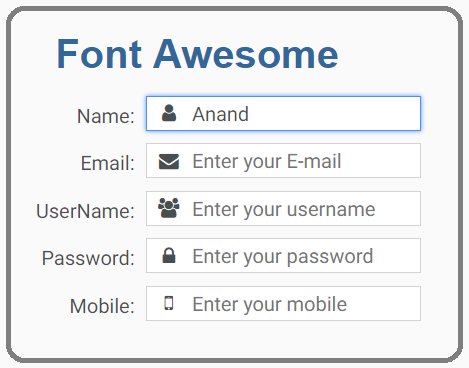
Demo
Here is what the inputs with the icons look like on screen: ##Input with default theme and no highlight
##Input highlight with green and red theme
Installation
This is how to install the components:
npm install [email protected]or
yarn add [email protected]And on your application module:
import {AgInputModule} from 'ag-input/dist';

@NgModule({
  declarations: [ ...],
  imports: [
    BrowserModule,
    ....,
     AgInputModule
],
})
export class AppModule { }
See below for SystemJs / UMD installation.
Using the Font Awesome Inputs
We will need to add first a version of Font Awesome to our page, for example:
<link href="https://maxcdn.bootstrapcdn.com/font-awesome/4.7.0/css/font-awesome.min.css" rel="stylesheet">Then we can use the Font Awesome Input like this:
<ag-fa-input icon="user" id="name-field">
  <input agInput placeholder="Enter your name">
</ag-fa-input>

<ag-fa-input icon="envelope" id="email-field">
  <input agInput type="email" name="email" placeholder="Enter your E-mail">
</ag-fa-input>

<ag-fa-input icon="users">
  <input agInput placeholder="Enter your username">
</ag-fa-input>

<ag-fa-input icon="lock" id="password-field">
  <input agInput placeholder="Enter your password">
</ag-fa-input>

<ag-fa-input icon="mobile">
  <input agInput placeholder="Enter your mobile">
</ag-fa-input>
If we want to apply red or green highlight on any fields, use either ag-fa-input-green-theme or ag-fa-input-red-theme in the class
<div class="container">
  <h1>Font Awesome</h1>
  <div class="form">
    <div class="form-row">
      <label>Name:</label>
      <ag-fa-input icon="user" id="name-field">
      <input agInput placeholder="Enter your name">
      </ag-fa-input>
    </div>
    <div class="form-row ag-fa-input-green-theme">
      <label>Email:</label>
      <ag-fa-input icon="envelope" id="email-field">
      <input agInput type="email" name="email" placeholder="Enter your E-mail">
      </ag-fa-input>
    </div>
    <div class="form-row ag-fa-input-red-theme">
      <label>UserName:</label>
      <ag-fa-input icon="users">
      <input agInput placeholder="Enter your username">
      </ag-fa-input>
    </div>
    <div class="form-row">
      <label>Password:</label>
      <ag-fa-input icon="lock" id="password-field">
      <input agInput placeholder="Enter your password">
      </ag-fa-input>
    </div>
    <div class="form-row">
      <label>Mobile:</label>
      <ag-fa-input icon="mobile">
      <input agInput placeholder="Enter your mobile">
      </ag-fa-input>
    </div>
  </div>
</div>
The inputs receive an input property named icon that identifies which Font Awesome icon we want to apply.
The value envelope will add the email icon by adding the CSS class fa-envelope to the icon, etc.
The input that you pass inside the component is just a plain HTML input that will be projected inside the component, so all the standard HTML properties of an input apply.
To make sure that the focus functionality is working correctly, make sure to apply the attribute directive agInput like in the examples.
Running the Demo Application
This command will build and start the demo application:
npm startRunning This Module In Development
First let's build the library using this command:
npm run buildThen let's link it:
cd dist
npm link
On another folder on the same machine where we have for example a running Angular CLI, we then do:
npm link ag-inputRunning the Tests
The tests can be executed with the following commands:
npm test
npm integration
Using SystemJs via the UMD bundle ?
Make sure to add this to your map configuration, if you need the module served from a CDN:
map: {

   ...
   'ag-input': 'https://unpkg.com/ag-input@<version number>/ag-input.umd.min.js'
}
Otherwise if serving from node_modulesdirectly:
map: {
   ...
   'ag-input': 'node_modules/ag-input/bundles/ag-input.umd.min.js'
}
And in our packages property:
packages: {
   ...
  'ag-input': {
    main: 'index.js',
    defaultExtension: 'js'
  }

}