
admin-table-page
v1.0.3
Published
An admin table page component based on vue3 and element-plus
Downloads
7

Readme
Admin Table Page
基于Vue3和element-plus二次封装的一个表格页面组件
- 通过简单配置,能快速完成一个带字段搜索、工具栏按钮、分页功能以及刷新功能的后台管理页面
- 只需要配置一个从服务端获取数据的promise函数,就可以自动完成表格数据的获取和渲染
- 远程获取数据时,支持自动刷新和手动刷新表格数据
- 自动分页控制
- 即使在远程获取数据时,也可以跨页进行多选
- 当搜索框内容变化或者分页状态变化时,自动触发表格数据的筛选和更新
- 通过不同name的slot来自定义组件的各部分
- 支持中/英文切换
- 自适应布局
Issue Reporting
如果在使用过程中发现bug,请来这里反馈,非常感谢!
本地Demo
npm install / yarn install
npm run dev / yarn run dev
浏览器打开http://localhost:8173 查看Demo
安装
NPM
npm install admin-table-pageYarn
yarn add admin-table-page用法
全局引入
import AdminTablePage from "admin-table-page";

// 以下两种样式文件,只需引入其中一种即可

// 如果项目不需要更改element-plus组件的主题,或者没有使用element-plus,可引入下面的css文件
import "admin-table-page/lib/style.css";
// 如果项目使用element-plus,并需要自定义主题色,可引入下面的scss文件
import "admin-table-page/style/index.scss";

import { createApp } from "vue";

const app = createApp(...);
app.use(ConfigTable);
局部引入
<template>
<admin-table-page
:columns="columns"
:fetch-method="getDataApi"
:tool-buttons="toolButtons"
:refresh="5000"
:action-column="actionColumn"
selectable="multiple"
row-key="id"
/>
</template>
<script setup>
import { AdminTablePage } from "admin-table-page";
// 以下两种样式文件,只需引入其中一种即可
// 如果项目不需要更改element-plus组件的主题,或者没有使用element-plus,可引入下面的css文件
import "admin-table-page/lib/style.css";
// 如果项目使用element-plus,并需要自定义主题色,可引入下面的scss文件
import "admin-table-page/style/index.scss";
import { getDataApi } from "@/api/data";
const columns = [{
prop: "name",
label: "Name",
}, {
prop: "age",
label: "Age"
}];
const toolButtons = [{
text: "New Record",
icon: "Plus",
onClick: handleAdd
}]
const actionColumn = [{
text: "Edit",
onClick: row => handleEdit(row)
}, {
text: "Delete",
onClick: row => handleDelete(row)
}]
const getDataApi = () => {
return new Promise((resolve, reject) => {
resolve({
total: 2,
list: [{
name: "name1",
age: 1
}, {
name: "name2",
age: 2
}]
})
})
}
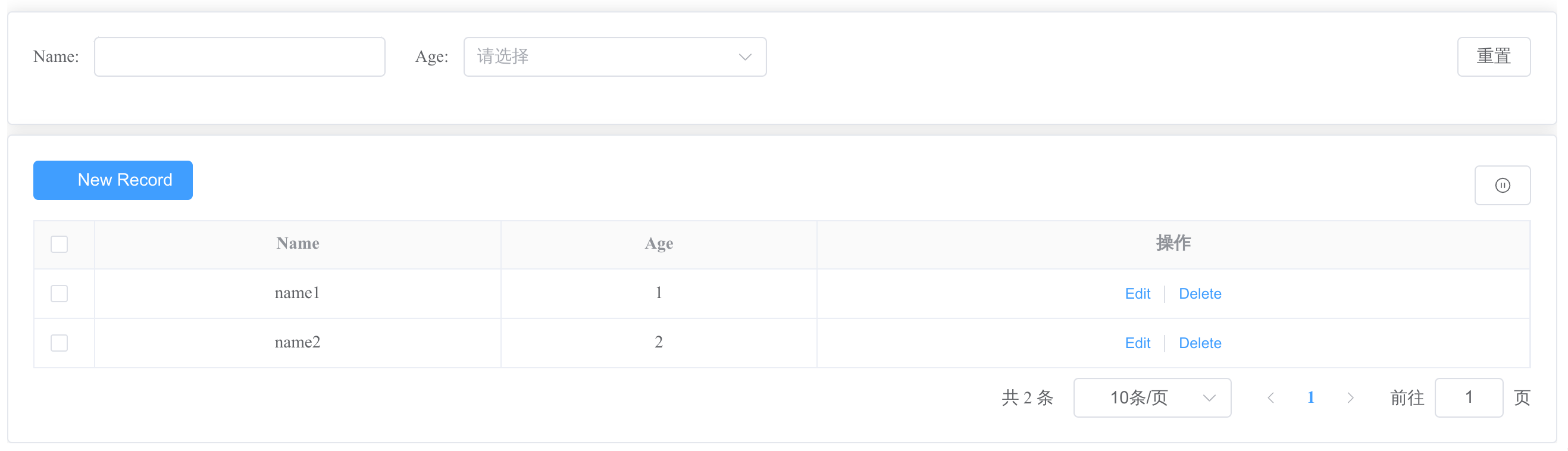
</script>然后,你可以得到下面这样一个页面:
属性
| 属性 | 描述 | 数据类型 | 可选值 | 默认值 | | --- | --- | --- | --- | --- | | columns | 表格列定义。数组中的每个Object代表一列,每列的定义除了原有el-table-column的属性,增加了filterable和filterOptions来定义列的筛选,参考筛选 | array | - | [] | | local-data | 表格所有数据,会自动分页显示,同el-table的data属性 | array | - | [] | | total-key | 远程获取数据时,如果服务端返回的数据总行数的key不是”total“,则需要设置该属性来指明服务端返回的key。 | string | - | "total" | | list-key | 远程获取数据时,如果服务端返回的当前页数据列表的key不是”list“,则需要设置该属性来指明服务端返回的key。 | string | - | "list" | | fetch-method | 远程获取数据的方法,该方法返回Promise。由于需要分页展示,因此服务端必须返回数据总行数(total),和当前页数据列表(list)。 |(query: object) => Promise<{totalKey: number, listKey: array}> | - | - | | refresh | 如何刷新表格数据 | string/number | string value:"" - 不显示刷新功能 "manual" - 显示刷新按钮,点击后手动刷新一次 number value: 自动刷新频率,单位ms. 例如, 设置:refresh="5000",即每5秒自动刷新一次数据 | "" | | tool-buttons | 工具栏按钮列表。 每一个工具栏对象参考工具栏按钮对象 | array | - | - | | show-index | 显示行序号 | boolean | false true | false | | row-key | 同el-table的row-key属性。如果需要对表格数据进行多选或单选,必须设置该属性。 | string | - | - | | selectable | 如何选择表格数据 | boolean/string | string value: "single" - 单选某一行数据 "multiple" - 选择多行数据 boolean value: false: 不可选择表格数据 | false | | locale | i18n国际化设置,目前仅支持中/英文切换 | string | "zhCn", "en" | "zhCn" | | action-column | 每一行的操作列里显示的操作按钮列表。每一个操作按钮对象仅需传入{text, onClick}。onClick函数的参数是当前行对象。如果需要其他样式,可通过name为“actions”的slot自定义 | array | - | - | | action-column-label | 操作列的列名 | string | - | en - "Actions" zhCn - "操作" | | extra-query | 远程获取数据时,除字段搜索和分页信息,额外需要传给服务端的参数。注意:不会监听这个对象的变化,如果需要,可以在项目中自行监听变化并调用组件提供的reload方法 | object | - | - | | el-pagination-props | 其他el-pagination属性 | object | - | - | | tips | 提示信息 | string | - | - |
除此之外,其他原el-table组件的属性也可以以透传attributes的方式配置。
方法
| Function | Description | Type | | --- | --- | --- | | reload | 重新加载表格数据。支持传入一个除搜索字段、分页以及extra-query属性以外的参数对象。 | (params) => void | | getSelections | 返回选择的行。单选返回对象,多选返回列表。 如果是多选模式,该方法会返回在不同页面上的选择行。 | () => array or object |
除此之外,还支持原el-table组件的所有方法调用。
事件
| Event | Description | Parameters | | --- | --- | --- | | select-change | 当选择的表格数据变化时触发。 如果是单选,则返回当前选择行对象。 如果是多选,返回已选行列表 | row/rows |
自定义Slot
| Name | Description | | --- | --- | | search | 搜索域。此时组件不会响应自定义搜索域的变化。需要自行监听搜索域变化,并调用reloada方法做筛选 | | tools | 工具栏 | | actions | 操作列 | | actions_header | 操作列的列头 | | tips | 提示信息 | | extra_columns | 除columns定义的列、操作列以外,其他需要自定义的列 | | [column.prop] | 除操作列和额外列,每一列都可通过一个与该列prop属性同名的具名slot进行自定义 | | [column.prop]_header | 除操作列和额外列, 每列的列头 |
工具栏按钮对象
| Attributes | Required | Description | Type | Default Value | | --- | --- | --- | --- | --- | | text | true | 按钮文案 | String | - | | onClick | true | click事件的回调函数 | Function | - | | show | false | 是否显示按钮 | Boolean | true |
除此之外,还支持el-button的所有属性。例如,
const toolButtons = [{
  text: "test button",
  onClick: () => { console.log("it's toolbar button")},
  icon: "Plus",
  type: "danger",
  link
}]
筛选
目前仅支持el-input、el-select以及el-date-picker(type="date")这三种类型的筛选组件 可以对columns数组中的每个元素设置filterable或者filterOptions属性,来定义列的筛选行为
- filterable 类型为boolean。如果设置为true,则为该列开启一个默认的el-input筛选组件
- filterOptions 类型为object。可以设置该列对应筛选组件的其他属性,或者选择el-input以外的其他筛选组件
| Attributes | Type | Required | Description | Accepted Value | Default | | --- | --- | --- | --- | --- | --- | | type | string | false | 筛选组件类型 | "input" "select" "date" | "input" | | defaultHidden | boolean | false | 筛选组件是否默认隐藏 | true false | false | | options | array | false | 下拉选择框选项列表。搜索框类型为下拉选择框时,必填。选项列表的每一项可以是一个包含label、value两个key的对象,也可以是value列表。| - | - |
除此之外,el-input/el-select/el-date-picker(type="date")的其他属性也支持配置。例如,
const columns = [{
  prop: "username",
  label: "Username",
  filterable: true
}, {
  prop: "age",
  label: "Age",
  filterOptions:{
    type: "select",
    options: ["18", "19"],
    defaultHidden: true
  }
}]