@wpmudev/shared-header
v1.3.1
Published
WPMU DEV Global Header
Downloads
96
Keywords
Readme
SUI Shared Header
This React module is distributed with npm. After installing npm, you can install this package without a hassle.
Install
This package works with SUI Icons Pack. You can install both packages with the following command:
npm i --save-dev @wpmudev/shared-header @wpmudev/sui-iconsFor further instructions on how to load the SUI Icons Pack in your project, please, refer to the package Installation & Usage instructions.
Properties
title
Type: string
This property displays the page title on the header.
login
Type: boolean
Use this property to let module know if the user is logged in (true) or not (false).
pro
Type: boolean
With this property you can indicate the module if the user has a free account or not to properly display required information such as upsell menu item.
tutorials
Type: object
Use this property to edit the information for the tutorials icon button. You can use cbFunc key to pass the actions you want to perform when clicking the button or use href key to convert it in a link.
Examples:
- Button settings:
tutorials={{
	label: 'Tutorials',
	cbFunc: () => console.log('Hello world!')
}}- Hyperlink settings:
tutorials={{
	label: 'Tutorials',
	href: 'https://wpmudev.com/',
	target: '_blank'
}}
sourceUser
Type: object
This property passes the logged user information to the header and displays it in the dropdown menu.
sourceUser={{
	name: 'John Doe',
	email: '[email protected]',
	avatar: ''
}}
When the avatar key is undefined (does not exists) or is empty, the module loads instead a global icon to identify the user in the dropdown button.
sourceUnplug
Type: object
When the user is not connected, the module displays a log-in button. To edit this button information use the sourceUnplug property:
sourceUnplug={{
	label: 'Log-in to your account',
	tooltip: ''
}}
sourceMenu
Type: object
There are four items pre-defined in the menu for connected users. These are:
- The Hub (key:
hub) - Roadmap (key:
roadmap) - Support (key:
support) – Pro users only - Unlock Pro Features (key:
upsell) – Free users only
Use this property to overwrite existing keys values or add new ones at the end of the menu list.
In addition, you can use the cbFunc key to convert the item to button and pass an onClick function or else use href key to convert the item into a link.
Options
| Key | Type | Description |
| --- | ---- | ----------- |
| label | string | (Required) Name of the menu item. |
| icon | string | Name of the icon without the suicons- prefix. |
| href | string | Specify the URL of the page the link goes to. |
| target | string | Specifies where to open the linked document. |
| cbFunc | function | Execute a function when clicking on the item. |
| falsy | boolean | Hides the item if required. For example, show it to free users only. |
| highlight | boolean | Highlights the item by painting it with purple color. |
Examples:
- Overwrite existing key.
sourceMenu={{
	'upsell': {
		label: 'Documentation',
		icon: 'docs',
		cbFunc: () => console.log('Open usage docs')
	}
}}- Add new key.
sourceMenu={{
	'docs': {
		label: 'Documentation',
		icon: 'docs',
		cbFunc: () => console.log('Open usage docs')
	}
}}
Slots
You can add additional content to specific sections of the module using the slot property in children elements. There are three available slots: left, right, and modal.
left
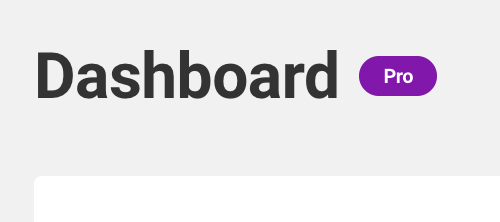
An slot with this value will place content next to the title. For example, a "Pro" tag.
Sample code:
<Header title="Dashboard">
	<div slot="left">
		<span className="sui-tag sui-tag-purple sui-tag-sm">Pro</span>
	</div>
</Header>
Result:

right
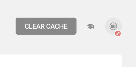
To place content at the right of the container (next to the buttons), simply use this slot.
Sample code:
<Header title="Dashboard">
	<div slot="right">
		<button
			className="sui-button"
			onClick={() => console.log( 'Clear page cache' )}>
			Clear Cache
		</button>
	</div>
</Header>
Result:

modal
When users are not connected to their account, a module displays when clicking on the session button. To add all required content inside use this slot.
<Header title="Dashboard">
	<div slot="modal">
		<p>Any content that goes here passes directly to the modal body section.</p>
	</div>
</Header>
Perks
"Perks" is an additional component that comes as part of the Shared Header module. This component allows you to create a list of highlighted content to display on the CTA Modal as seen on the library Storybook.
Sample code:
<div slot="modal">
	<Perks title="List main title">
		<div title="Perk #1" icon="logo">
			Feature listed with SUI 2 icon.
		</div>
		<div title="Perk #2" icon="logo" suicon={true}>
			Feature listed with SUI 3 icon thanks to setting "suicon" property to "true".
		</div>
		<div title="Perk #3">
			Feature listed with only text and without an icon.
		</div>
	</Perks>
</div>
Button
The "Button" component from the SUI Shared Header package allows you to trigger the modal for logged out users from outside the "Header" component as seen on Storybook.
Properties
type
Type: string
Use this option to differentiate the type of the button you'd like to display. Set the value to icon and display the icon button element or else leave it empty to show the default button.
login
Type: boolean
Use this property to let module know if the user is logged in (true) or not (false). When is set to true it will stop displaying the button for users.
label
Type: string
Use this property to modify the button label.
toggle
Type: boolean
Use this option to show toggle button. When is set to true it will show the toggle button.
description
Type: boolean
Use this property to modify the button description.
children
Type: object
When use the Header component normally adds content to the modal through the modal slot, but for this component that won't be necessary since there are no other slots enabled.
Examples
Standard Button
This is a regular button with visible label. If use the icon property, you can easily include an icon next to the label.
Sample code:
// Label only
<Button login={ false } label="Click Here">
	{ /** Display modal content here */ }
</Button>

// Label and icon
<Button login={ false } label="Click Here" icon="chevron-down">
	{ /** Display modal content here */ }
</Button>

// Toggle only
<Button login={ false } toggle={ true }>
	{ /** Display modal content here */ }
</Button>
Toggle Button
This is a button which looks like a toggle. If use the description property, you can easily add the description next to the label.
Sample code:
// Toggle only
<Button toggle={ true } login={ false }>
	{ /** Display modal content here */ }
</Button>

// Label only
<Button toggle={ true } login={ false } label="Click Here" >
	{ /** Display modal content here */ }
</Button>

// Label and description
<Button toggle={ true } login={ false } label="Click Here" description="This is a description.">
	{ /** Display modal content here */ }
</Button>
To change button default styles like (color, style, icon, etc.) refer to SUI React Button component.
Icon Button
Sample code:
<Button login={ false } type="icon" label="Click Here" icon={ icon }>
	{ /** Display modal content here */ }
</Button>
To change icon button default styles like (color, style, icon, etc.) refer to SUI React Icon Button component.