@vuesence/sliding-header
v1.4.3
Published
Vue.js component representing sliding header(s)
Downloads
7
Readme
Sliding Header
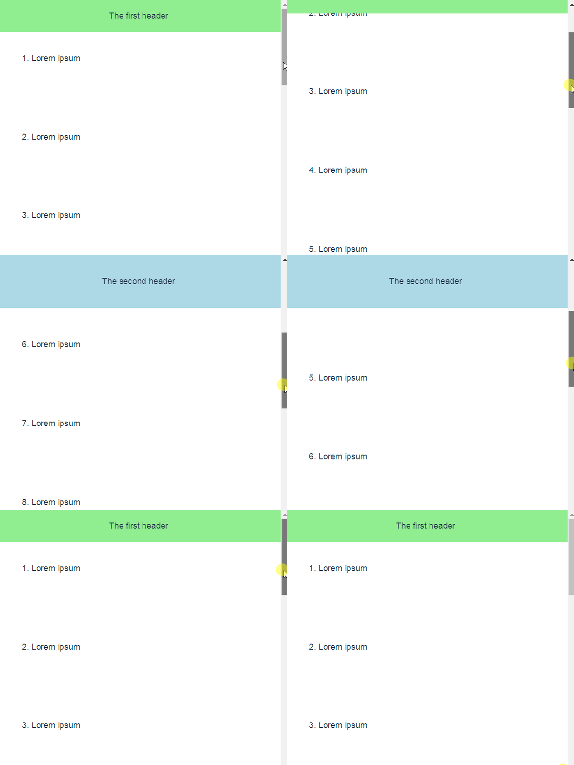
Vue.js component representing sliding header (or two different headers) for top navigation bar

How to use
This Vue component consists of one SlidingHeader.vue file that can be copy-pasted into your Vue.js project or can be plugged in as an NPM package:
npm install @vuesence/sliding-header --saveThen you can use it in the your Vue code:
<template>
	<div id="app">
		<sliding-header :threshold-hide="200" :threshold-open="400">
			<template v-slot:first-header>
				<p>The first header</p>
			</template>

			<template v-slot:second-header>
				<p>The second header</p>
			</template>
		</sliding-header>
	</div>
</template>

<script>
	import SlidingHeader from "@vuesence/sliding-header";

	export default {
		name: "App",
        components: {
            SlidingHeader
        }
	};
</script>

<style>
.sliding-header {
	display: flex;
	justify-content: center;
	align-items: center;
	transition: 0.3s;
}
.sliding-header.first-header {
	background-color: lightgreen;
	height: 60px;
}
.sliding-header.second-header {
	background-color: lightblue;
	height: 100px;
}
.sliding-header.hidden {
	top: -100px;
}
</style>
Each template contains code for corresponding header / top navigation bar
Two props - threshold-hide and threshold-open - define vertical scrolling thresholds for hiding the first and opening the second header.
It is possible to use just one header - either the first or the second. Just omit one of the templates
sliding-header CSS class selector is shared by both headers, .first-header and .second-header are dedicated.
.sliding-header.hidden's top property should be maximum of headers' height with "-" sign.
You can play with height, transition, opacity and other CSS properties to adjust the animation to your needs.
Demo
https://vuesence.github.io/sliding-header/
Playground
Try it on codesandbox.io
Check out my other Vue.js components
- Vuesence book - minimalistic Vue.js based documentation component
- Cloud Sync Button - a button with cloud synchronization animation
- Modal Window - simple lightweight Modal Window Vue.js component
Troubleshooting
Any bugs, issues, feature and pull requests are welcome
Please use GitHub's issue reporter or send me an email
Contribution
Contribution is always welcome and recommended. Here is how:
- Fork the repository
- Clone to your machine
- Make your changes
- Create a pull request
License
@vuesence/sliding-header package is freely distributable under the terms of the MIT license.
