
@unicef-polymer/etools-content-panel
v5.1.0
Published
A simple panel with header to display a collapsible content.
Downloads
4
Maintainers
 insightfeatures
 robertavram
 dci_npm
 drzackyll
 glebp
glebp andrei.laza
 uladzimir_u
 adriana.trif
 adrian-hangan
Keywords
Readme
<etools-content-panel>
A simple panel with header to display a collapsible content.
The header can also have buttons on the right side on the title (slotted content slot="panel-btns"",
check first usage example).
Usage
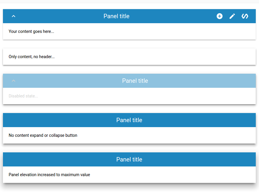
<etools-content-panel panel-title="Panel title" show-expand-btn>
  <div slot="panel-btns">
    <paper-icon-button icon="add-circle"></paper-icon-button>
    <paper-icon-button icon="create"></paper-icon-button>
    <paper-icon-button icon="polymer"></paper-icon-button>
  </div>
  <div>Your content goes here...</div>
</etools-content-panel>

<etools-content-panel panel-title="Panel title" no-header elevation="2">
  <div>Only content, no header...</div>
</etools-content-panel>

<etools-content-panel panel-title="Panel title" elevation="3" disabled show-expand-btn>
  <div>Disabled state...</div>
</etools-content-panel>

<etools-content-panel panel-title="Panel title" elevation="4">
  <div>No content expand or collapse button</div>
</etools-content-panel>

<etools-content-panel panel-title="Panel title" title-style="align-center" elevation="5">
  <div>Panel elevation increased to maximum value</div>
</etools-content-panel>
Attributes:
- elevation - Number Default: 1
- disabled - Boolean, Default: false
- noHeader - Boolean, Default: false
- open - Boolean, Default: true - notifies
- showExpandBtn - Boolean, Default: false
- panelTitle - String, Default: Panel title
Styling
You can use defined variables and mixins to change panel style.
Custom property | Description | Default
----------------|-------------|----------
--ecp-header-height | Header height | 48px
--ecp-header-bg | Header background color | #0099ff
--epc-header-color | Header color | #ffffff
etools-content-panel::part(ecp-header) | Mixin applied to header | {}
--ecp-title-white-space | Header title white space | nowrap
etools-content-panel::part(ecp-toggle-btn) | Mixin applied to expand content button | {}
etools-content-panel::part(ecp-header-title) | Mixin applied to the header title | {}
etools-content-panel::part(ecp-header-btns-wrapper) | Mixin appplied to panel header right btns container | {}
etools-content-panel::part(ecp-content) | Mixin applied to content | {}
--ecp-content-bg-color | Content Header color | #ffffff
etools-content-panel::part(ecp-header):disabled | Mixin applied in disabled state | {}
Install
$ npm i --save @unicef-polymer/etools-content-panelLinting the code
Install local npm packages (run npm install)
Then just run the linting task
$ npm run lintPreview element locally
Install needed dependencies by running: $ npm install.
Make sure you have the Polymer CLI installed. Then run $ polymer serve to serve your element application locally.
Running Tests
TODO: improve and add more tests
$ polymer testCircle CI
Package will be automatically published after tag push (git tag 1.2.3 , git push --tags). Tag name must correspond to SemVer (Semantic Versioning) rules.
Examples:
| Version match | Result |
| ------------------ | -------- |
| 1.2.3 | match |
| 1.2.3-pre | match |
| 1.2.3+build | match |
| 1.2.3-pre+build | match |
| v1.2.3-pre+build | match |
| 1.2 | no match |
You can see more details here