@tri-bit/drizop
v1.1.0
Published
React file drop component, includes list and image gallery modes, file extension filtering and progress bar.
Downloads
7
Maintainers
Readme
Drizop
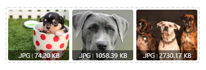
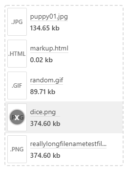
Easy to use file drop for React. Includes list and image gallery modes, file extension filtering and progress bar.

Images source: Pexels.com
Files can be removed by hovering, and then clicking the 'x' icon:

Usage
import  Drizop  from '@tri-bit/drizop';

//list mode example with filtered extensions
<Drizop onLoadCallback={handleFileDrop} allowedFileTypes="txt, doc, rtf"/>

//image gallery example with additional props
<Drizop
	mode="image"
	onLoadCallback={handleFileDrop}
	message="Drop your image(s) here"
	fileLimit={3}
	style={{border:"3px solid black"}}
/>
Props
| props | description | --- | --- | mode | "image" or "list" (Default value: "list") | onLoadCallback | Use this callback to send the dropped files to your application (for uploading, etc.) Every time a new file is dropped or a file removed this callback will send the updated file array. | allowedFileTypes | a comma seperated string of the allowed extensions (Example: "png, txt, jpg") | clearPreviousOnDrop | reset the file list on a new file drop (Default value: "false") | progress | You can display upload progress percentage (0-100) Setting above zero will lock file drops / removal. | message | Text in the center of component. (Default value: 'Drop File(s) Here') | button | Set to "true" to add a clickable button to the uploader - uses the browsers file open dialog (Default value: "false") | buttonMessage | Text inside the optional button (Default value: "Click Here To Upload") | fileLimit | Sets max number of files allowed (Default value: 8) | style | style object applied to Drizop component (Default value: {})
Notes
- .dmg, .exe, .php extensions are automatically blocked (your backend should still do safety checks on uploaded files just to be safe.)
- You can use the optional style prop to easily change Drizop's width or border style (and more.)
