@tlaukkan/aframe-material-collection-ts
v0.5.17
Published
Material UI based primitives and components for use in your aframe projects.
Downloads
33
Readme
AFRAME Material Collection.

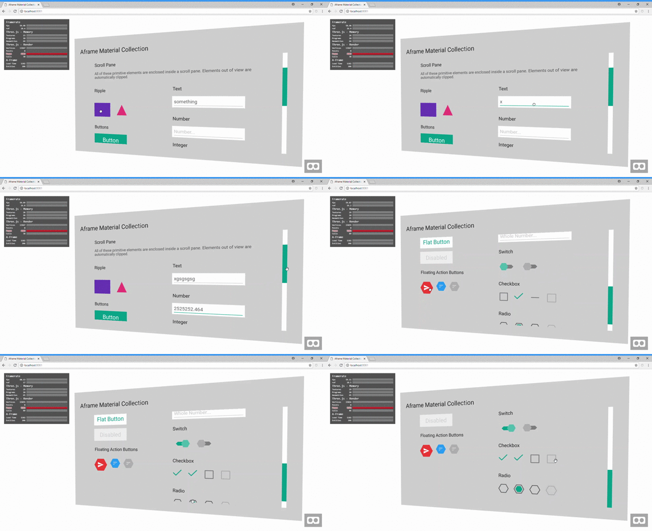
Aframe Material Collection uses material design and the yoga layout engine to make prototyping UI configurations much easier inside aframe. It goes further than providing some reusable components for your UI, but also integrates yoga for easy and powerful flex layouts. 2D primitives used inside the a-ui-scroll-pane are automatically measured for width and height to allow the layout engine to automatically place them with default settings, but all of these can be overridden with the ui-yoga component to allow granular control over the layout properties. Note only a subset of 2D primitives are supported for auto layout including a-plane, a-circle, a-ring, a-text ( width width and height explicitly set ) and all the primitives below.
Live Demo
Inspiration
I wanted to port my scene editor built in Altspace VR to the browser as a standalone aframe based project. AltspaceVR
provided a renderTarget based solution allowing you to render a browser to a texture. This made prototyping UIs as easy as making web apps.
Without this solution available in the browser, I had to make my own UI components so I could re-create the editor UI in a WebGL context -
as such aframe-material-collection was born.
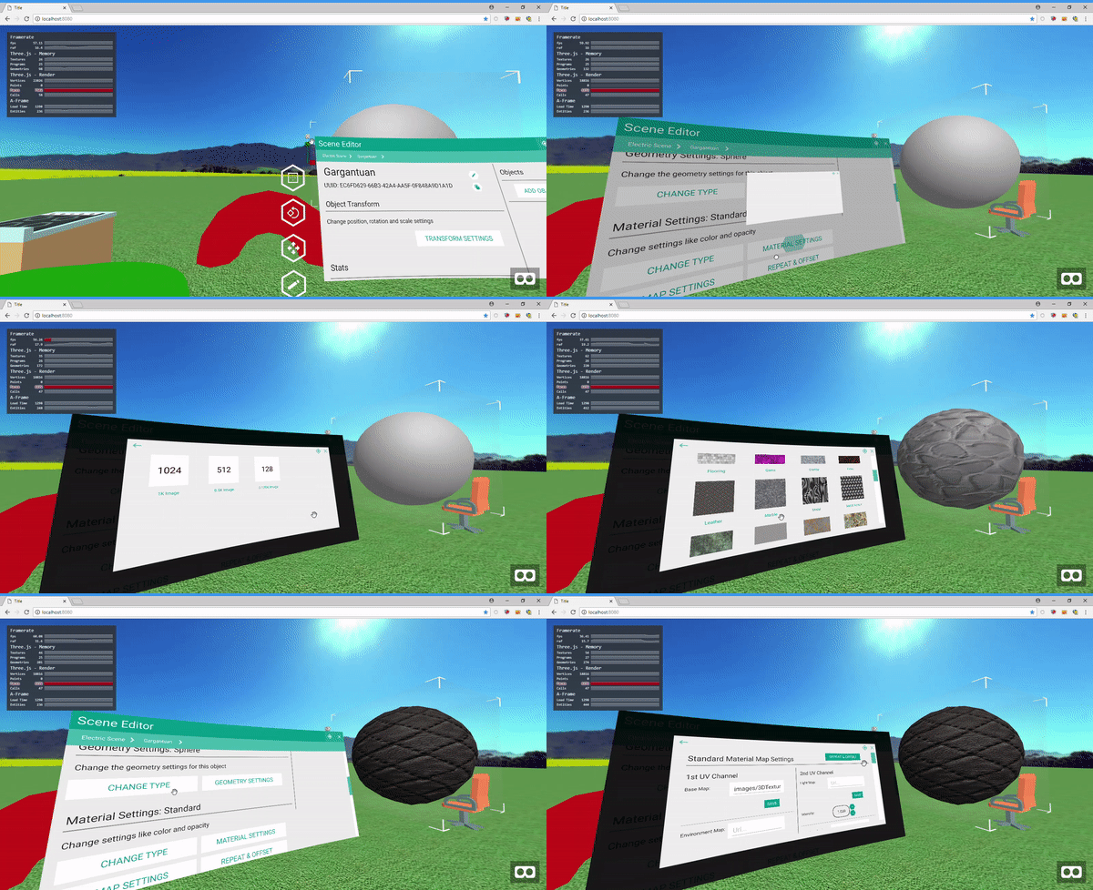
Here is a demo of the new aframe based Shane's Editor with a more complex UI:

The Shane's Editor project is also open source and you can get involved at github, join our discord or take it for a test drive in the live demo
Getting Started
CDN for browser
<script src="https://aframe.io/releases/0.8.0/aframe.min.js"></script>
<!-- Include yoga layout for scroll pane layouts after aframe -->
<script src="https://unpkg.com/aframe-material-collection/dist/aframe-yoga-layout.min.js"></script>
<!-- Include aframe-material-collection after aframe and yoga layout-->
<script src="https://unpkg.com/aframe-material-collection/dist/aframe-material-collection.min.js"></script>
Installing
npm i aframe-material-collectionRunning
npm startBuilding
npm config set yoga-layout:platform standalone
npm install
npm run build
Documentation
Examples
<!-- Button -->
<a-ui-button text-value="Button" class="intersectable"></a-ui-button>

<!-- FAB Button -->
<a-ui-fab-button color="#f44336" class="intersectable"></a-ui-fab-button>

<!-- Small FAB Button -->
<a-ui-fab-button-small class="intersectable" color="#2196f3"></a-ui-fab-button-small>

<!-- Switch -->
<a-ui-switch class="intersectable"></a-ui-switch>

<!-- Checkbox -->
<a-ui-checkbox class="intersectable" indeterminate="true"></a-ui-checkbox>

<!-- Radio -->
<a-entity width="1.8">
    <a-ui-radio selected="true" class="intersectable"></a-ui-radio>
    <a-ui-radio class="intersectable"></a-ui-radio>
    <a-ui-radio disabled="true" class="intersectable"></a-ui-radio>
</a-entity>

<!-- Text Input -->
<a-ui-input-text width="0.9" height="0.15" value="something"></a-ui-input-text>
TODOs:
- Need to add touchpad/joystick support for scrolling.
- Need to document yoga layout properties/strategies.
- Look at unit testing with Karma
