
@swzj/smart-ball
v0.1.0
Published
一个通用悬浮球组件
Downloads
4

Readme
SmartBall 一个通用悬浮组件
安装及使用
npm i @swzj/smart-ball@latest

// 局部使用
import { SmartBall } from "@swzj/smart-ball";

// 全局注册
import SmartBall from "@swzj/smart-ball";
Vue.use(SmartBall);
最简单的使用方式
<smart-ball @click="onClick" />效果展示


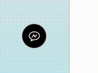
适用场景描述
提供以下悬浮球通用功能
- 拖动
- 边界限制
- 贴边粘滞
- 覆盖边角
- 右键菜单
- 键盘快捷键
- 自定义样式
约定:
custom: 自定义内容,与 half, show 互斥
half:半显——非 hover 态时的状态
show:全显——hover 态时的状态
Attribute
下述所有属性(除了特别标注的)皆为响应式
基本属性
| 属性名称 | 说明 | 类型 | 默认值 | 备注 | | ----------------- | -------------------------------------- | ------------------------- | ------------------- | ----------------------------------------------------- | | position | 组件位置(默认右下角) | String | right bottom | 包含 left,right,top,bottom 关键字即可 | | initOffset | 组件初始位置偏移量 | Array | String | [40, 40] | "40,40" | [水平, 垂直]相对于 position 非响应式 | | type | 组件类型 | String | icon | icon: 图标态; custom: 自定义态 | | asyncClick | 异步点击事件 | Function | AsyncFunction | - | 传入异步函数将触发组件 loading 状态 | | appendToBody | 组件自身是否插入至 body 元素上 | Boolean | true | 避免父元素 transform 属性影响 fixed 定位 非响应式 | | useTopWindow | 是否使用最顶层浏览器窗口 | Boolean | false | ifream 嵌套时使用 非响应式 | | initHidden | 组件初始化时是否隐藏 | Boolean | false | 只是隐藏,dom 元素会渲染 非响应式 | | drag | 组件是否可拖动 | Boolean | true | | | dragLimit | 拖动是否需要视口边界限制 | Boolean | true | | | weltSticky | 是否贴边粘滞 | Boolean | true | 处于视口边界时触发粘滞动画 | | coverCorner | 是否覆盖边角 | Boolean | true | 处于视口四个边角时组件只有对角出现圆角 | | resizeKeepTouch | 视口改变触边后是否保持触边 | Boolean | true | | | contextMenu | 是否可呼出菜单 | Boolean | true | | | mutex | 是否互斥(只存在一个 smart-ball 组件) | Boolean | false | 将销毁原本已存在的 smart-ball 组件 dom 元素 | | hotkey | 是否开启快捷键 | 配置 | Boolean | Object | true | hotkey 配置 | | canChangeType | 是否可切换组件类型 | Boolean | false | | | canChangeSpecial | 是否可切换组件特殊样式 | Boolean | false | | | special | 使用内置的特殊样式类 | String | Number | - | 可选值:1 |
样式相关属性
| 属性名称 | 说明 | 类型 | 默认值 | | ------------------ | -------------------------------- | ---------------- | ---------- | | customStyle | 自定义样式(低优先级) | Object | {} | | width | 组件宽度(只能通过属性值修改) | String | Number | 40px | | height | 组件高度(只能通过属性值修改) | String | Number | 40px | | background | 背景颜色 | String | #000000ee | | backgroundHover | 背景颜色(hover 态) | String | - | | border | 边框 | String | - | | borderHover | 边框(hover 态) | String | - | | zIndex | 深度属性 | String | Number | 1121 | | cursor | 光标形状 | String | help | | fontSize | 字体大小 | String | Number | 14px | | iconSize | 图标大小(只对<i>标签有效) | String | Number | 22px | | color | 默认颜色 | String | #e80115 | | colorHover | 默认颜色(hover 态) | String | - | | halfColor | 半显图标颜色(高优先级) | String | - | | showColor | 全显图标颜色(高优先级) | String | - | | loadingColor | 加载图标颜色(高优先级) | String | - | | loadingColorHover | 加载图标颜色(hover 态) | String | - | | transformHover | 鼠标移入时的形变 | String | scale(1.1) | | transitionDuration | 过渡时间 | String | Number | 0.5s |
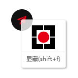
hotkey-键盘快捷键配置
组件可使用热键控制显隐,默认热键是 Shift + F。
此属性不为 Object 类型时只有为 Boolean 的 false 时才能取消热键控制
hotkey 为 Object 类型时 配置如下:
以下属性不需全部使用,按需使用即可,但 shiftKey,ctrlKey,altKey,metaKey 需包含至少一个且 key,unicode 也需包含至少一个,否则修正为默认热键
例::hotkey="{ shiftKey: true, key: 'f' }"
| 属性名称 | 说明 | 类型 | | -------- | ------------------ | ------- | | disable | 是否禁用键盘快捷键 | Boolean | | shiftKey | Shift 键 | Boolean | | ctrlKey | Ctrl 键 | Boolean | | altKey | Alt 键 | Boolean | | metaKey | Meta 键 | Boolean | | key | 物理按键的值 | String | | unicode | 键盘 Unicode 值 | Number |
Events
| 事件名称 | 说明 | 回调参数 | | ------------- | ---------------------- | ------------------------------ | | drag | 组件拖动时触发 | event, {left, top}:组件坐标 | | sticky | 组件粘滞时触发 | position, {left, top}:组件坐标 | | showHide | 组件显隐时触发 | visible | | typeChange | 组件类型改变时触发 | type | | specialChange | 组件特殊样式改变时触发 | special | | openMenu | 菜单打开时触发 | event, {left, top}:菜单坐标 | | closeMenu | 菜单关闭时触发 | - |
Methods
| 方法名 | 说明 | 参数 | | -------------- | --------------------------------------------------------------- | --------------------------- | | toggleShowHide | 组件显隐切换(visible 可指定显隐) | - | visible:boolean | | changeType | 组件类型切换(type 可指定类型:icon: 图标态; custom: 自定义态) | - | type:string | | changeSpecial | 组件特殊样式切换(special 可指定:1: 特殊样式类 1) | - | special:string|number | | openMenu | 打开菜单 | - | | closeMenu | 关闭菜单 | - |
Slots
| name | 说明 | | ------- | ------------------ | | loading | 自定义加载内容 | | custom | 自定义文字内容 | | half | 自定义半显内容 | | show | 自定义全显内容 | | menu | 添加自定义菜单内容 |
SmartBall 用法
<template>
  <div>
    <!--
      position: 组件位置(默认右下角:"right bottom")
      initOffset: 组件初始位置偏移量(默认不偏移)
      type: 组件类型(icon: 图标态(默认); custom: 自定义态)
      asyncClick:异步点击事件
      append-to-body: 组件自身是否插入至body元素上(避免父元素transform属性影响fixed定位)
      useTopWindow: 是否使用最顶层浏览器窗口
      initHidden: 组件初始化时是否隐藏
      drag: 组件是否可拖动
      dragLimit: 拖动是否需要视口边界限制
      weltSticky: 是否贴边粘滞
      coverCorner: 是否覆盖边角
      resizeKeepTouch: 视口改变触边后是否保持触边
      contextMenu: 是否互斥(只存在一个smart-ball组件)
      mutex: 是否可呼出菜单
      hotkey: 键盘快捷键配置
      canChangeType: 是否可切换组件类型
      canChangeSpecial: 是否可切换组件特殊样式
      special: 特殊的样式模式(数字)

      自定义样式方法:
      1.利用预留的属性设置
      customStyle:自定义主体样式对象
      width、height、background、border:高优先级样式
      zIndex:深度属性
      backgroundHover、borderHover:高优先级样式 hover态
      transformHover:hover态transform样式 默认:scale(1.5)
      fontSize:字体大小
      iconSize:图标大小
      color:默认颜色
      colorHover:默认颜色(hover 态)
      loadingColor:加载图标颜色,高优先级
      loadingColorHover:全显时加载图标颜色,高优先级
      halfColor:半显图标颜色,高优先级
      showColor:全显图标颜色,高优先级
      transitionDuration: 过渡时间
      2.直接添加class覆盖原有样式
     -->

    <!-- slot插槽 -->
    <!-- loading-加载时的内容占位 custom-自定义内容占位 half-半显时的内容占位 show-全显时的内容占位 -->
    <!-- <i slot="loading" class="el-icon-loading"></i> -->
    <!-- <template slot="custom">custom</template> -->
    <!-- <i slot="half" class="el-icon-s-opportunity"></i> -->
    <!-- <i slot="show" class="el-icon-s-promotion"></i> -->
    <!-- <li slot="menu" @click="">菜单插槽</li> -->

    <!-- 全参用法 -->
    <!-- <smart-ball
      position="left top"
      :initOffset="[0, 0]"
      type="icon"
      append-to-body
      useTopWindow
      :initHidden="false"
      drag
      dragLimit
      weltSticky
      coverCorner
      resizeKeepTouch
      contextMenu
      mutex
      hotkey
      canChangeType
      canChangeSpecial
      width="40px"
      height="40px"
      background="#e80115"
      border="1px solid #000"
      zIndex="1121"
      cursor="help"
      fontSize="14px"
      iconSize="22px"
      color="#000"
      loadingColor="#000"
      halfColor="#000"
      showColor="#366CB3"
      transformHover="scale(1.5)"
      backgroundHover="#fff"
      borderHover="1px solid #366CB3"
      loadingColorHover="blue"
      :customStyle="{
        width: '100px', // 无效 必须通过传参设置width
        height: '100px', // 无效 必须通过传参设置height
        background: '#123456', // 优先级低于传参
        border: '5px solid #000', // 优先级低于传参
        // ...
      }"
      transitionDuration="1s"
    >
    </smart-ball> -->

    <!-- 自写class覆盖样式 -->
    <!-- <smart-ball class="smart-ball-custom" /> -->

    <!-- 使用特殊样式 -->
    <!-- <smart-ball special="1" /> -->

    <!-- 过渡示例 -->
    <!-- <smart-ball
      :position="position"
      :width="width"
      :height="height"
      class="smart-ball-custom"
      :transitionDuration="transitionDuration"
    /> -->

    <!-- 默认用法 -->
    <smart-ball />

    <!-- 测试 -->
    <!-- <smart-ball
      ref="smart-ball"
      position="right bottom"
      :initOffset="[40, 40]"
      special="1"
      transformHover="scale(1.1)"
      :width="50"
      :height="50"
      :fontSize="16"
      :iconSize="24"
      :canChangeType="true"
      :canChangeSpecial="true"
    > -->
    <!-- <i slot="loading" class="el-icon-loading"></i> -->
    <!-- <template slot="custom">自定义</template> -->
    <!-- <i slot="half" class="el-icon-s-opportunity"></i> -->
    <!-- <i slot="show" class="el-icon-s-promotion"></i> -->
    <!-- <li slot="menu" @click="">菜单插槽</li> -->
    <!-- </smart-ball> -->
  </div>
</template>
<script>
import SmartBall from './index.vue';

export default {
  components: { SmartBall },
  data() {
    return {
      count: 0,
      position: 'right bottom',
      width: 25,
      height: 25,
      transitionDuration: 0.5,
      testArr: [
        {
          width: 50,
          height: 50,
          position: 'right top',
          transitionDuration: 2,
        },
        {
          width: 25,
          height: 25,
          position: 'left bottom',
          transitionDuration: 1,
        },
        {
          width: 100,
          height: 100,
          position: 'right bottom',
          transitionDuration: 0.5,
        },
        {
          width: 100,
          height: 100,
          position: 'left top',
          transitionDuration: 5,
        },
        {
          width: 50,
          height: 50,
          position: 'right bottom',
          transitionDuration: 0.5,
        },
      ],
    };
  },
  mounted() {
    this.timer = setInterval(() => {
      if (this.count + 1 > this.testArr.length) {
        clearInterval(this.timer);
        return;
      }
      const obj = this.testArr[this.count++];
      const { width, height, position, transitionDuration } = obj;
      this.width = width;
      this.height = height;
      this.position = position;
      this.transitionDuration = transitionDuration;
    }, this.testArr[this.count].transitionDuration * 1000 + 1000);
  },
  methods: {},
};
</script>

<style lang="scss" scoped>
// 添加class覆盖样式
::v-deep.smart-ball-custom {
  border: 1px solid #aaa !important;
  background: #000 !important;
  // 加载区域(loading插槽父元素样式类)
  .smart-ball-loading {
    color: #fff;
    path {
      fill: #fff;
    }
  }
  // 半显区域(half插槽父元素样式类)
  .smart-ball-half {
    color: #fff;
    path {
      fill: #fff;
    }
  }
  // 全显区域(show插槽父元素样式类)
  .smart-ball-show {
    color: #000;
    path {
      fill: #000;
    }
  }
  // 自定义区域(custom插槽父元素样式类)
  .smart-ball-custom {
    color: #fff;
  }
  // 鼠标移入时的样式
  &:hover {
    background: #e80115 !important;
    border: 1px solid #333 !important;
    .smart-ball-loading {
      color: #000 !important;
      path {
        fill: #000 !important;
      }
    }
    .smart-ball-custom {
      color: #000;
    }
  }
}
</style>

<style>
* {
  margin: 0;
  padding: 0;
}
html,
body {
  height: 100%;
}
body {
  background-image: linear-gradient(to top, #a8edea 0%, #fed6e3 100%);
  background-attachment: fixed;
}
</style>
注意事项
直接添加 class 覆盖原有样式
直接在 smart-ball 组件上添加 class 自写样式类覆盖即可,详情请参考以下预设样式:
// 特殊的样式类-1
.special-class-1 {
  border: 1px solid #aaa !important;
  background: #000 !important;
  // 加载区域(loading插槽父元素样式类)
  .smart-ball-loading {
    color: #fff;
    path {
      fill: #fff;
    }
  }
  // 半显区域(half插槽父元素样式类)
  .smart-ball-half {
    color: #fff;
    path {
      fill: #fff;
    }
  }
  // 全显区域(show插槽父元素样式类)
  .smart-ball-show {
    color: #000;
    path {
      fill: #000;
    }
  }
  // 自定义区域(custom插槽父元素样式类)
  .smart-ball-custom {
    color: #fff;
  }
  // 鼠标移入时的样式
  &:hover {
    background: #e80115 !important;
    border: 1px solid #333 !important;
    .smart-ball-loading {
      color: #000 !important;
      path {
        fill: #000 !important;
      }
    }
    .smart-ball-custom {
      color: #000;
    }
  }
}
如果设置无效请添加:!important